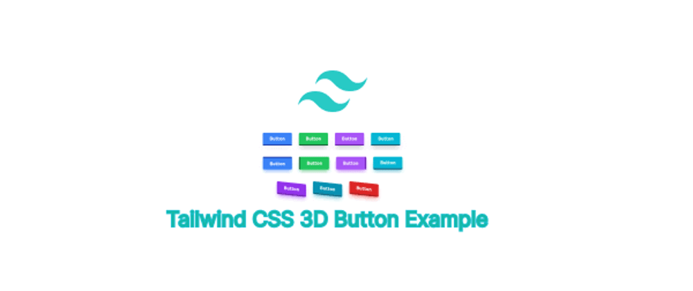
In this section we will create tailwind 3D button, tailwind 3d button effect, 3d button with skew, 3d button animation tailwind example with Tailwind CSS 3.
view
Example 1
Tailwind simple 3 button with hover effect.
<button
    class="px-6 py-2 font-semibold text-white bg-blue-500 border-b-4 border-blue-800 rounded hover:border-blue-600">Button</button>
<button
    class="px-6 py-2 font-semibold text-white bg-green-500 border-b-4 border-green-800 rounded hover:border-green-600">Button</button>
<button
    class="px-6 py-2 font-semibold text-white bg-purple-500 border-b-4 border-purple-800 rounded hover:border-purple-600">Button</button>
<button
    class="px-6 py-2 font-semibold text-white border-b-4 rounded bg-cyan-500 border-cyan-800 hover:border-cyan-600">Button</button>

tailwind 3d button with different positions.
<button
    class="px-6 py-2 font-semibold text-white bg-blue-500 border-t-4 border-blue-800 rounded shadow-lg shadow-blue-500/50 hover:border-blue-600">Button</button>
<button
    class="px-6 py-2 font-semibold text-white bg-green-500 border-l-4 border-green-800 rounded shadow-lg shadow-green-600/50 hover:border-green-600">Button</button>
<button
    class="px-6 py-2 font-semibold text-white bg-purple-500 border-r-4 border-purple-800 rounded shadow-lg shadow-purple-600/50 hover:border-purple-600">Button</button>
<button
    class="px-6 py-2 font-semibold text-white border-b-4 rounded shadow-lg bg-cyan-500 border-cyan-800 shadow-cyan-600/50 hover:border-cyan-600">Button</button>

Example 2
Tailwind CSS 3d button with 3d skew effect.
<button
    class="px-6 py-2 font-sans font-semibold text-white transition duration-300 ease-in-out delay-300 skew-y-6 bg-purple-600 border-b-4 border-purple-800 rounded shadow-lg shadow-purple-600/50 hover:skew-x-6 hover:border-purple-600">Button</button>
<button
    class="px-6 py-2 font-sans font-semibold text-white transition duration-300 ease-in-out delay-300 skew-y-6 border-b-4 rounded shadow-lg bg-cyan-600 border-cyan-800 shadow-cyan-600/50 hover:skew-x-6 hover:border-cyan-600">Button</button>
<button
    class="px-6 py-2 font-sans font-semibold text-white transition duration-300 ease-in-out delay-300 skew-y-6 bg-red-600 border-b-4 border-red-800 rounded shadow-lg shadow-red-600/50 hover:skew-x-6 hover:border-red-600">Button</button>

tailwind 3d button animation.
<button
    class="px-6 py-2 font-sans font-semibold text-white transition duration-300 ease-in-out delay-300 skew-y-6 bg-purple-600 border-b-4 border-purple-800 rounded shadow-lg shadow-purple-600/50 hover:transform-none hover:border-purple-600">Button</button>


Top comments (1)
How much time it will take to make the same button in pure CSS?