
Written by Pelumi Akintokun✏️
It is now possible to easily animate properties and create smooth transitions in CSS grid without writing even one line of animation code. Yay!
In this article, we’ll demonstrate how to use the Animate CSS Grid package to animate all the properties of our grid. We’ll take a look at the package’s features and see how easy it is to use. Animate CSS Grid enables us to achieve smooth transitions between the state changes of our CSS grid container without writing any CSS animation code. We’ll also look at how we can configure the CSS package to suit our specific needs.
Let’s get started!
Jump ahead:
- What is CSS grid?
- Is it possible to animate a CSS grid layout?
- How does Animate CSS Grid work?
- Animate CSS Grid demo
What is CSS grid?
If you are reading this article, you’re likely already familiar with CSS grid. But, for those readers who are new to CSS, here’s a brief introduction.
CSS grid allows us to make layouts in CSS using a grid-based layout system involving rows and columns, thus making it easier to design web pages without using floats and positioning. CSS Flexbox was designed for building layouts in one dimension (either a row or a column), whereas CSS grid was designed for building layouts simultaneously in two dimensions (rows and columns).
A grid-based layout comprises a parent element that has one or more child elements. Some CSS grid properties include grid-column, grid-row, grid-template-column, and grid-gap. Most, of the CSS grid properties can be animated; we’ll demonstrate animating a few of them later in this article. To learn more about each of the CSS grid properties and which may be animated, see the official documentation.
Is it possible to animate a CSS grid layout?
Previously, animating CSS grid properties was nearly impossible because the feature lacked browser support. It has only recently gained support in Firefox v66+ and later in other browsers like Chrome ≥v107, Safari ≥v16.1, and Edge ≥v107.
As of this writing, nearly all of the CSS grid properties are included in the Animatable CSS Properties. However, for this article, we will not animate the grid properties by writing CSS animation for our transitions. Instead, we’ll use the Animate CSS Grid open source package.
How does Animate CSS Grid work?
Animate CSS Grid allows you to conveniently transition the state of your CSS grid from one state to another. If your grid's content changes, or one of its children is updated by adding or removing a class, the grid will automatically transition to its new configuration.
This package allows you to animate CSS grid properties, including grid-column, grid-row, grid-template-column, and grid-gap.
animate-css-grid handles all the animation for you, saving you the time and the stress of writing your own animation code. This is especially important if you are like me and do not like configuring pure animations in CSS!
To use animate-css-grid, all you have to do is wrap your grid container with the wrapGrid method provided by the package. Whenever any of the grid properties in your code change, it automatically has an animated effect when it transitions from one state to another.
Another way to configure the animation with the animate-css-grid package is by passing an object into the wrapGrid method. We’ll discuss this option later in the article.
Animate CSS Grid demo
Animate CSS Grid can be used in vanilla JavaScript, React, and Vue.js projects. For the scope of this article, we’ll build a project using vanilla JavaScript.
Building the project
To start, let’s create a folder called animate-css-grid where we can create the following files: index.html, style.css, and script.js.
Open the folder in your preferred code editor (I’m using VS Code). Now, let’s write some code.
In the index.html file, import the style file inside the <head> tag:
Now, add the following code inside the <body> tag, and import the <script> tag just below the HTML:
    Animating CSS Grid

      Toggle Grid Column
      Toggle Grid Row
      Toggle Grid Gap
Our <body> tag has an <h1> tag containing the name of the package and a <div> tag called buttons wrapping around three buttons. Later, we’ll configure this tag to modify the properties of our grid when any of the buttons are clicked.
There’s also another <div> tag named grid representing our grid parent container with all our grid items inside.
Add the following code to the style.css file:
html,
body {
  font-size: 16px;
  color: hsl(60, 58%, 0%);
}
body {
  padding: 20px;
  background-color: rgb(99, 232, 203);
}
h1 {
  font-size: 2rem;
  text-align: center;
}
.buttons {
  display: flex;
  flex-wrap: wrap;
  gap: 10px;
  margin: 40px 0;
}
button {
  padding: 10px;
  border-radius: 5px;
  border: 2px solid hsl(60, 58%, 17%);
  background-color: navajowhite;
}
.grid {
  display: grid;
  grid-template-columns: repeat(auto-fit, minmax(10rem, 1fr));
  grid-auto-rows: 10rem;
  grid-gap: 20px;
  margin: 40px 0;
}
.grid__item {
  background-color: hsl(40, 58%, 17%);
  border-radius: 5px;
}
.grid__item:nth-child(1),
.grid__item:nth-child(4) {
  background-color: hsl(10, 58%, 17%);
}
.grid__item:nth-child(2),
.grid__item:nth-child(6) {
  background-color: hsl(150, 58%, 17%);
}
.grid__item:nth-child(3),
.grid__item:nth-child(7) {
  background-color: hsl(200, 58%, 17%);
}
.grid__item:nth-child(4),
.grid__item:nth-child(8) {
  background-color: hsl(305, 58%, 17%);
}

/* transition styles that would be animated */
.toggle-column {
  grid-template-columns: repeat(auto-fit, minmax(16rem, 1fr));
}
.toggle-row {
  grid-auto-rows: 16rem;
}
.toggle-gap {
  grid-gap: 40px;
}
We’ve added styling to every element in our document, and we’ve also written styles that will be added to or removed from our grid parent container via JavaScript when any of the buttons are clicked.
Here’s how our current code looks in the browser: 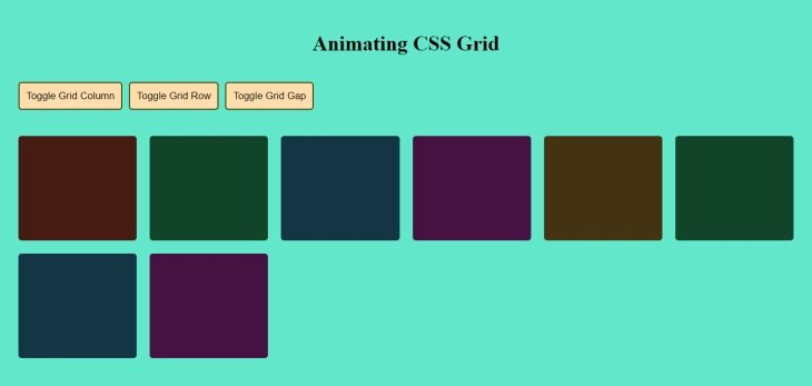 Next, add the following code to the
 script.js file:
// selecting our elements
const gridButton = document.querySelector(".column-button");
const rowButton = document.querySelector(".row-button");
const gapButton = document.querySelector(".gap-button");
const gridCntr = document.querySelector(".grid");

// adding event listeners to the buttons
gridButton.addEventListener("click", function () {
  gridCntr.classList.toggle("toggle-column");
});

rowButton.addEventListener("click", function () {
  gridCntr.classList.toggle("toggle-row");
});

gapButton.addEventListener("click", function () {
  gridCntr.classList.toggle("toggle-gap");
});
In the above code, we’ve selected our buttons and saved them as gridButton, rowButton, and gapButton respectively. We’ve also selected our grid parent container and named it gridCntr.
We’ve also added event listeners to each button. Here’s how they work:
- When the
Toggle Grid Columnbutton is clicked, we add or remove thetoggle-columnstyle property on our grid, increasing and reducing the width of our grid items - When the
Toggle Grid Rowbutton is clicked, we add or remove thetoggle-rowstyle property on our grid, increasing and reducing the height of our grid items - When the
Toggle Grid Gapbutton is clicked, we add or remove thetoggle-gapstyle property on our grid, increasing and reducing the space between each grid item
Now, let’s view the changes in our browser: 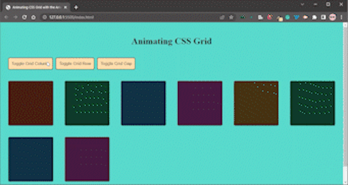 We can see that our buttons work as expected. But, there needs to be a smooth transition between the different states our grid changes to. That's where the animate-css-grid package comes into play.
Importing Animate CSS Grid and wrapping the container
There are two ways to use the animate-css-grid package in a project. One option is to install the package by running one of the following commands:
yarn add animate-css-grid
npm install animate-css-grid
A second option is to use a script tag instead of installing the package. You can read more about this option in the package’s GitHub README.
For this article, we’ll use the script tag approach.
At the bottom of the <body> tag, include the following script tags:
      const grid = document.querySelector(".grid");
      animateCSSGrid.wrapGrid(grid);
You’ll notice that we not only imported the package via our script tag, but we also targeted our grid container and wrapped it with the animateCSSGrid.wrapGrid() method.
Going back into our browser, we can finally see a transition effect when we change the state of our grid. This transition is made possible by Animate CSS Grid: 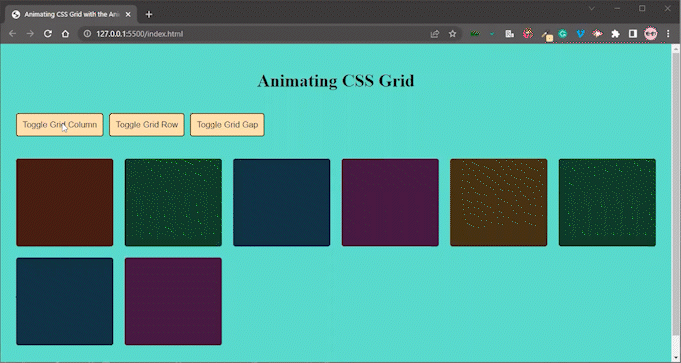
Configuring Animate CSS Grid by passing an object
As I mentioned earlier, we can also configure the CSS animation by passing in an object. The object requires the following values:
-
stagger: represents the amount of time that should elapse between each animation of an item in a grid; the default value is0ms - duration: represents the total time the animation will last; the default value is
250ms -
easing: represents the animation-timing-function of the transition; the default value is[ease-in-out](https://developer.mozilla.org/en-US/docs/Web/CSS/easing-function). You can learn more about available easing functions here -
onStart: represents a function to be called when an element is about to animate -
onEnd: represents a function to be called when an element has finished animating
Let’s pass the following config into our wrapGrid method:
animateCSSGrid.wrapGrid(grid, {
        stagger: 100,
        duration: 500,
        easing: "backInOut",
        onStart: (animatingElementList) => {
          console.log("starting animation");
        },
        onEnd: (animatingElementList) => {
          console.log("ending animation");
        },
      });
Now, let’s view the change in our browser: 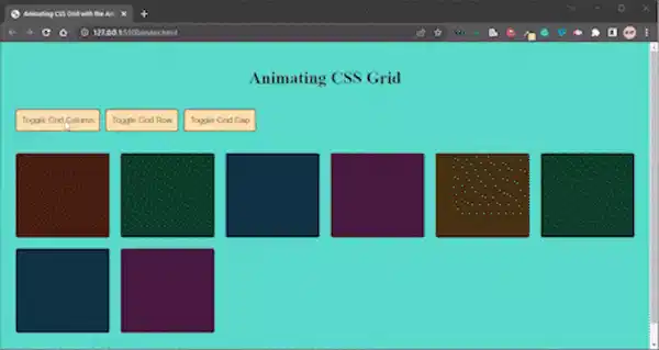 And there you have it, easy peasy!
Conclusion
Animation certainly makes our CSS grid more visually appealing! We can use Animate CSS Grid to achieve this while writing less code.
In this article, we demonstrated how to use the Animate CSS Grid package to animate and create smoother transitions for our grid and also how to configure its settings.
You can play with the code here on GitHub and in this live demo. Click the demo buttons to see the animation and transitions.
Is your frontend hogging your users' CPU?
As web frontends get increasingly complex, resource-greedy features demand more and more from the browser. If you’re interested in monitoring and tracking client-side CPU usage, memory usage, and more for all of your users in production, try LogRocket.

LogRocket is like a DVR for web apps, recording everything that happens in your web app or site. Instead of guessing why problems happen, you can aggregate and report on key frontend performance metrics, replay user sessions along with application state, log network requests, and automatically surface all errors.
Modernize how you debug web apps — Start monitoring for free.

Latest comments (1)
cool!