
Images require various sizing modes to fit in a responsive layout. Here we'll look at the relationship between the element and visual and the basic sizing options. I'll also look at some additional helpful features, not all of which I've implemented before.
The element and visual content
When considering the box model, it's common to confuse the context-box with the visual content itself. If the element is collapsing to the size of the visual content, there will not be a difference in size. However, if the element is expanding to fill space, the visuals may not fill the available area.
Before we get into images, let's consider this concept with a circle element first. The circle will always be a circle, as opposed to being an ellipse.
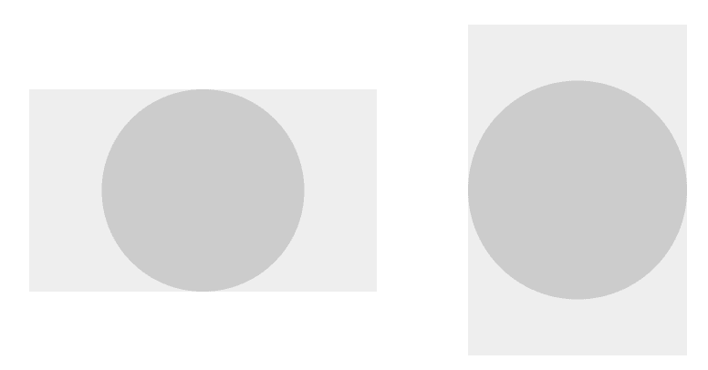
The circle element can be larger than the visual; the circle centers itself within the available element area, expanding to either the width or height.
An image element must deal with the same situations: the element size is not necessarily the same size as the image. The correct way to size and position the visual depends on the design; we must provide properties to specify what happens. In Fuse I called this the StretchMode; In CSS this is the background-size or object-fit property.
Pixel and Point precise
Perhaps the most apparent sizing mode is just using the natural size of the image; regardless of the element size, we'll draw the image as-is and either clip the edges or leave empty spaces.

This sizing mode is most frequently used in layout where the element ends up the same size as the image. For example, you may use icons in a title bar and let them define its size.
We need to resolve the question of what "natural size" we're talking about though. We could use either pixels or points. A pixel precise sizing mode is needed when you want an image to be crisp on the display, with no resizing. A point precise mode is used when you want the image to define the size of the element and be consistent across devices.
Pixel precise mode is hard to work with on mobile as the devices have wildly different pixel-to-point densities. If desired it must be used in conjunction with multiple density images: an image element that uses different source files depending on the target density. In Fuse, I added a
PointPrefermode to get the best of both worlds: it uses a pixel-precise mode if one of the pixel sizes is close enough to the point size; otherwise, it stretches the closest image to the desired point size.
Fill and Scale9
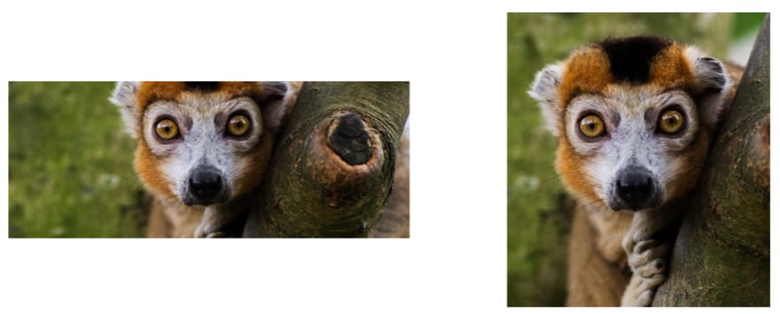
Images are often used to fill an area, providing a background, border, or perhaps divider. This requires the image to stretch, filling the entire element area, even if the image itself is distorted.

The above photo helps show the distortion, but the fill feature is not likely suitable for such images.
A helpful feature of stretching is a 9-grid stretching: the image is divided into nine areas and stretched on their own. This allows the creation of borders for a dynamically sized element. CSS provides a rather robust feature with border-image.
Uniform and UniformToFill
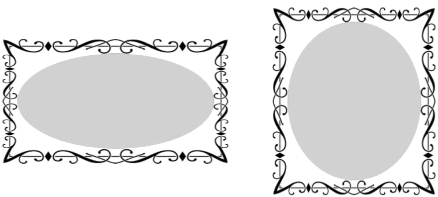
If the entire image must fit within the element, and the aspect ratio must be preserved, we use the Uniform mode (called contain in CSS). This scales up the size of the image so that it touches two sides of the available area, leaving the remainder of the element empty.

If instead, you wish to fill the entire element and still retain the aspect ratio, we use a UniformToFill mode (called cover in CSS). This scales the image until it reaches all the edges of the element, clipping those parts outside of the element.
Content Alignment
Other than the Fill or Scale9 mode, the image doesn't fit exactly into the available space. This leaves open the question of where to position the image? Should a Uniform image be positioned to the left, or right? Should a UniformToFill image prefer to show the bottom or top of the image?
Adding a ContentAlignment to an Image allows the user to specify this option. A good default is inheriting the alignment of the image element. If you align an image to the bottom right, you'd expect the visual to also be aligned to the bottom right.

One option I never got to implement myself is anchoring; basic alignment doesn't cover the nuances of design well enough. An anchor allows us to choose a spot of interest on a photo and ensure it's centered, such as the face for a profile image.
Extending this concept is an anchoring area: instead of just a point we mark a rectangle of interest in the source image. This would open up the possibility of a Uniform mode that ensures the area of interest is fully shown, and the rest of the image can be used to fill up the empty areas.
I suspect most services require square profile photos as they don't have anchoring available. With anchoring, you can accept photos of arbitrary sizes, let the user mark the face area, or detect it, and then use the whole image in a responsive design.
Options
For Fuse, we also had a StretchDirection option. It could be one of Both (the default), UpOnly, or DownOnly. An image would only stretch in the allowed directions. For example, if we have an Image {StretchMode=Uniform StretchDirection=DownOnly}, the visual would shrink to fit an element, but would never expand beyond its natural size. In practice, there are limited use-cases for this.
An optional Fill flag provides an alternative way to fill in the empty area of the element. After positioning the element with the stretching mode, it will be repeated to cover the remaining space. This makes the most sense for a background image, or when used as a brush.
In addition to anchoring, an Offset property would allow for creating simple animations. Position and size the visual normally, then apply an offset to the resulting position. This would most likely be combined with the Fill flag on tiled images.
Other elements
If you are writing a UI engine you might be interested in knowing how to do all these calculations. Let me know if you'd like such an article -- it'd be rather math dominant, though not complicated. In Fuse, you can lookup the
SizingContainerclass which encapsulates most of the logic -- albeit the layout calculation code is also part of it.
An interesting point about these sizing modes is that they could equally well apply to any number of element types, not just images. The generic CSS object-fit property goes in that direction. I even implemented a Viewbox once which scaled arbitrary elements, which supported StretchDirection but forced a Uniform fill mode.
The concept repeats; merging all the diverse uses into a single set of properties would be a good goal for a new UI-engine. Even if some combinations don't make sense for certain elements, having a common set of properties reduces the learning curve and ensures a rich set of features.
Read more articles about writing a UI Engine. Follow me on Twitter, and to keep me writing, consider becoming a patron.

Top comments (0)