CSS Flexbox is a uni-directional way layout components of your website one at a time. Elements can only be ordered in either a row or in a column when the display is set to "flex" then ordered and spaced to it's desired position. For ease and brevity, I quickly learned the importance of creating containers for all of my items/child elements.
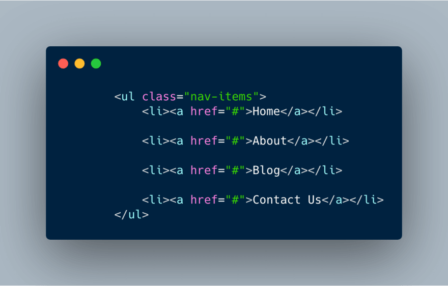
The first feature I tackled in creating my blog was the nav bar. Creating a nav bar in CSS Flexbox was simpler than I thought. Here's a snippet of the code I used.
HTML
CSS
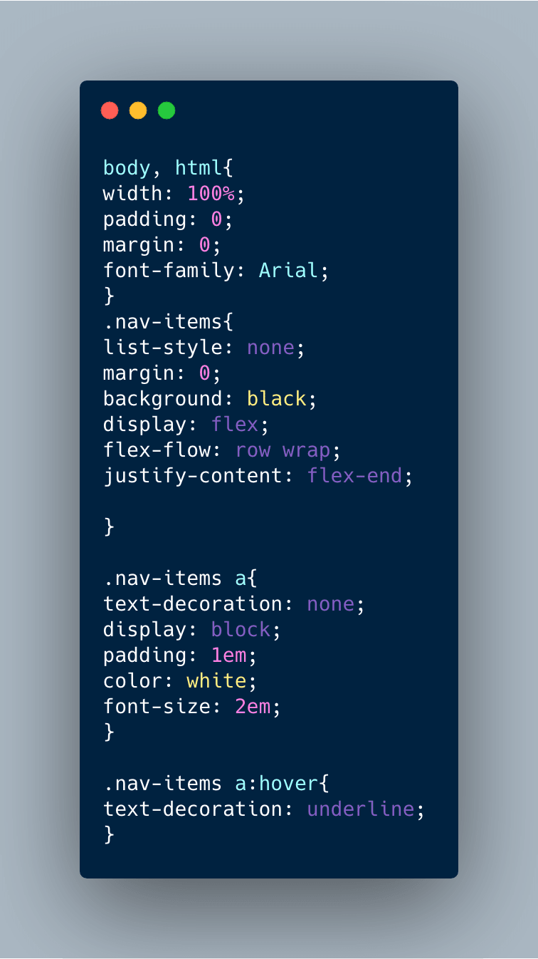
For the nav bar, I didn't need to style the nav container itself, instead, we're just going to apply flex as the display for the nav items. "Flex-flow" is a shorthand element that combines "flex-direction" and "flex-wrap". It determines whether the direction is going to be in a horizontal row or in a vertical column and also if the items will wrap around to the next line, wrap in reverse, or not wrap at all.
"nowrap" is the default, so I changed it to "wrap". I also applied a wrap to the row for responsitivity (hamburger menu for mobile coming soon).
"Justify-content" sets the alignment of the items in the container. Just like with text, there's right, center, and left, but we use "flex-start" to align items towards the beginning, "center", and "flex-end" for alignment towards the end of the flex container; there are a few other options that set the spacing of items, but they are not necessary here. For this nav bar, I chose "flex-end" for the nav-items and added 1 em of padding between each a tag.
For demonstration purposes, I changed my original colors so they'd stand out more.
If you know any other cases for flexbox let me know on Twitter
Prefer video? Watch me code on Youtube


Top comments (0)