
Hello there!
A while ago, I wrote a simple flexbox grid system. Recently, I faced the same task again, but this time, we could rewrite it in native CSS grids. Additionally, an important addition is that we should be able to use subgrids because many of our designs contain sections that use the main grid.
Why not to use a subgrid instead? Well, the support is very poor and I don't want to use JS polifills in a pure CSS task.

Main grid
First, let's define general variables:
// Define the number of columns at each breakpoint
$grid-desktop-columns: 12;
$grid-tablet-columns: 12;
$grid-mobile-columns: 6;

// Define the max-width of the grid container at each breakpoint
$grid-desktop-width: 1440px;
$grid-tablet-width: 1024px;
$grid-mobile-width: 620px;

// Define the column width and gutter for the grid
$grid-column-width: 1fr;
$grid-gutter: 20px;
Now, let's write a .grid class that will serve as the main container for our grid system. This class will be used to wrap elements where we'll use our grid system.
.grid {
  display: grid;
  grid-template-columns: repeat(12, $grid-column-width);
  grid-gap: $grid-gutter;
  padding: 0 50px;
  margin: 0 auto;
  max-width: $grid-desktop-width;
  width: 100%;

  @media only screen and (max-width: $grid-tablet-width) {
    padding: 0 40px;
  }

  @media only screen and (max-width: $grid-mobile-width) {
    grid-template-columns: repeat($grid-mobile-columns, $grid-column-width);
    padding: 0 20px;
    max-width: $grid-mobile-width;
  }
}
Column classes
Next, we'll write code that generates class names for elements that won't include children that use subgrids, but just should take the position like from column 2 to column 12. In order to do so, we'll use SCSS loop function:
// MAIN GRID
@for $i from 1 through $grid-desktop-columns {
  @for $j from $i through $grid-desktop-columns {
    .grid-desktop-#{$i}-#{$j} {
      grid-column: #{$i} / span #{$j - $i + 1};
    }
  }
}

@for $i from 1 through $grid-tablet-columns {
  @for $j from $i through $grid-tablet-columns {
    .grid-tablet-#{$i}-#{$j} {
      @media only screen and (max-width: $grid-tablet-width) {
        grid-column: #{$i} / span #{$j - $i + 1};
      }
    }
  }
}

@for $i from 1 through $grid-mobile-columns {
  @for $j from $i through $grid-mobile-columns {
    .grid-mobile-#{$i}-#{$j} {
      @media only screen and (max-width: $grid-mobile-width) {
        grid-column: #{$i} / span #{$j - $i + 1};
      }
    }
  }
}
output for this code is:
.grid-desktop-1-1 {
  grid-column: 1/span 1;
}

.grid-desktop-1-2 {
  grid-column: 1/span 2;
}

.grid-desktop-1-3 {
  grid-column: 1/span 3;
}

.grid-desktop-1-4 {
  grid-column: 1/span 4;
}

.grid-desktop-1-5 {
  grid-column: 1/span 5;
}

//... etc

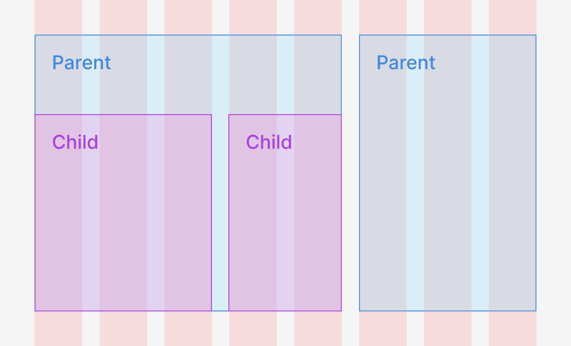
Subgrid
In order to use subgrid for children elements we'll generate basically the same classes as above but they will include display: grid as well and create amount of columns they take from the class name. Here is the class example:
.subgrid-desktop-3-8 {
  display: grid;
  grid-template-columns: repeat(6, 1fr);
  grid-gap: 20px;
  grid-column: 3/span 6;
}
number 6 + 1 here, is the last column number the element takes 8 minus the first column the element should take 3.
So, here is the code for subgrid classes:
// SUBGRID
@for $i from 1 through $grid-desktop-columns {
  @for $j from $i through $grid-desktop-columns {
    .subgrid-desktop-#{$i}-#{$j} {
            display: grid;
            grid-template-columns: repeat($j - $i + 1, $grid-column-width);
      grid-gap: $grid-gutter;
      grid-column: #{$i} / span #{$j - $i + 1};
    }
  }
}

@for $i from 1 through $grid-tablet-columns {
  @for $j from $i through $grid-tablet-columns {
    .subgrid-tablet-#{$i}-#{$j} {
      @media only screen and (max-width: $grid-tablet-width) {
                display: grid;
                grid-template-columns: repeat($j - $i + 1, $grid-column-width);
                grid-gap: $grid-gutter;
        grid-column: #{$i} / span #{$j - $i + 1};
      }
    }
  }
}

@for $i from 1 through $grid-mobile-columns {
  @for $j from $i through $grid-mobile-columns {
    .subgrid-mobile-#{$i}-#{$j} {
      @media only screen and (max-width: $grid-mobile-width) {
                display: grid;
                grid-template-columns: repeat($j - $i + 1, $grid-column-width);
                grid-gap: $grid-gutter;
        grid-column: #{$i} / span #{$j - $i + 1};
      }
    }
  }
}
Now we can use these subgrid classes instead of our grid-#breakpoint-#from-to classes. We can use grid-#breakpoint-#from-to classes if we don't have any subgrid children inside.

Here is a link to the demo and full code:

Top comments (2)
Nice breakdown on building a gris step by step
thanks