Today we're going to take a look at React JS, a popular Javascript library. Before getting started with React, you should feel comfortable with Javascript.
If you didn't master Javascript, it's possible you'll still learn React just fine. But in my opinion, and I'm not the end all be all on the topic by any means, it's much easier to understand how to use React when your already familiar, and hopefully proficient, in JavaScript, CSS, and HTML.
Download Node.js
To check you've got node installed type in node -v into your terminal.

You should your version appear. If not, download Node here.
Next we are going to go ahead and get React downloaded.
Type in: npx create-react-appand then name your folder.
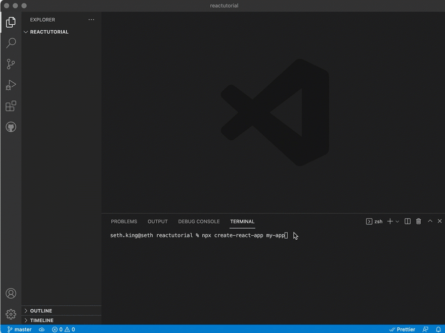 I'll call ours new-app so the full line of code will be:
npx create-react-app my-app
Npx stands for node package execute.
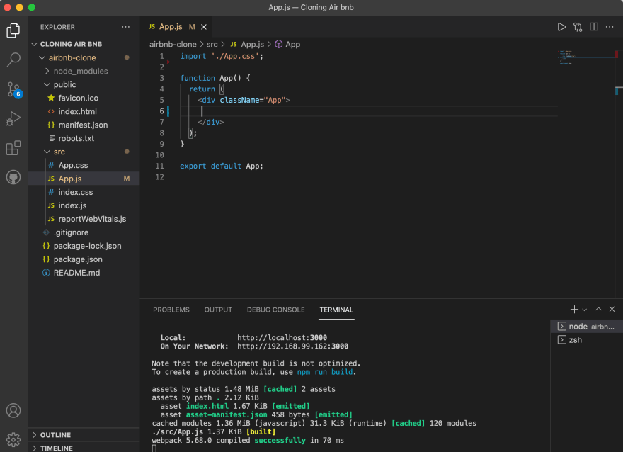
You'll see several dependencies start to load and you'll have 4 scripts you can run. The first one you'll want to try is npm start which will run the react app on your local machine.
Run npm-start
To do this, make sure you first change directory to the app folder you just created. Then run npm start. You'll see this:

Set up Firebase
Now you'll want to set up a Firebase server so you can see what you create and actually share it with people. Firebase will let you create the project as long as you have a Gmail account and firebase is a suite of free tools. Don't worry too much about the initial setup.
When your done, register your app:


Delete Test Files
You won't need all the files that you've downloaded with npx create-react-app. So, we'll go ahead and delete the files related to testing.

Also, delete the images in your "public" folder. We won't need them.
Remove information in the App.js div
Since you've deleted the images in the "public" folder, the app will present you with an error. Delete the image file from the top, and as well as the information between the divs.
Add an H1 tag in the div and include some information here, nothing crazy. When you reload the page you'll see something like this:
As you might be able to tell, the text is centered and there is margins to the left and right of it.
Delete everything in App.css
This will left-align your text.
Go into your index.css and we will remove the margin everywhere using * which tells the CSS to apply the changes to the entire code.

Begin building your application
You'll want to begin by planning out the components of your application. So let's start with the Home component. Inside of this component are several other components: Header, Banner, Cards, Footer. Laying it out like this will help out as we go to fill out this information.
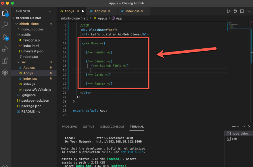
Each of these components will be their own Javascript file inside your SRC folder.
Creating the Home component
If you don't have it yet, download the ES7 extensions from VS Code. Then type in rfce which will get you started.

We will also create a Home.css file so we can style the Home component. Then import it to your Home.js file.

Re-useable Header
Airbnb's header appears on every page that displays. 
So let's go ahead and create the Header component i.e Header.js.
At the top, import Header.css so we can change the styling for the header and utilize it.
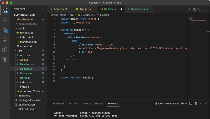
In the Header.js file, set the div className to 'header'.
Inside the div, create an img element and set the className to 'header__icon' so we know it's an icon in the header. Give it an src tag with the url of the logo. The alt tag can be left blank (or fill it it in).
The import the Header.js file to App.js to add the component in.

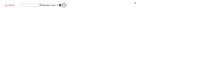
You should now see a massive logo above the Home component in your local host. I couldn't even see it on my page it was so large.

To fix this, we will target the header icon in the Header.css file and give it the below properties:
object-fit: contain;

 height: 100px;

 margin-left: 20px;
object-fit will keep the image within the screen, and we're using margin-left 20px to push it off the left border a bit.
Here's what it looks like now.

Understanding the Header

When we look at this more closely we can see the Header split into 3 parent container with 1-4 children.
The first container (1) just has 1 child - the image. The second (2) has two: search and it's icon. The third (3) has four, three icons and one text element.
Adding the property Flex 1 to the 2nd element will allow it to grow when we click on it and select a date.
Giving the entire Header align-items: center will make sure everything looks good. Every container will need these rules.
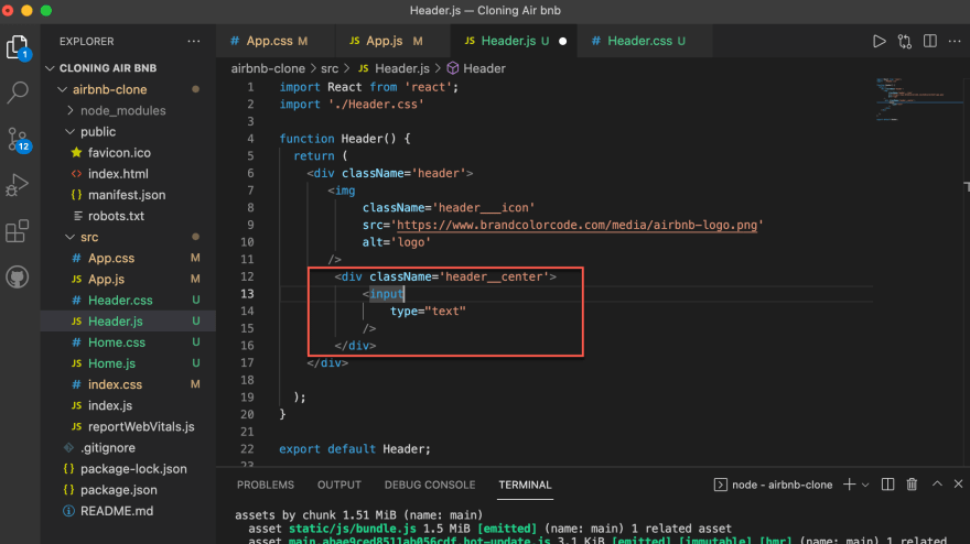
Creating the search bar component
Create a 2nd div under the header_icon div. Give it a className of headercenter and an input with a type text.
Next, we will utilize Material UI to get the search icon. Following their documentation we will type in $ npm install @material-ui/core. Then search through this lit of icons to find the one matching Airbnb.

When you find an icon you want, click on it and it'l give you the code to import at the top of your JS file.

Note: it's import you remember to use npm install --save @material-ui/icons otherwise your going to wonder why you it's not working which happened to me and left me screwed for at least an hour. You also need to CD into your project file folder before the npm install, otherwise its worthless.
Next, create a div with the className of header___right as this will be the icons and "Become a Host" section of their site.
Once you've added the search icon, go ahead and add 2 more:
<ExpandMoreIcon /><Language />
Then add a component of Avatar which is available through the Material UI core package.

Now jump into the Header.css folder since we'll want to align-items:center everything and make sure it has a display:flex so it's in a row.
Then it should be looking like this:
When we then add justify-content:space-between it will push all these containers the farthest space away from each other.

Since we want to the header to stay throughout the page, even when scrolling we'll need to add the tags below to the header container.
position: sticky;

top: 0;

background-color: white;

z-index: 100;

width: 100%;
Tweaking the Header component
The Header will need to styled with lots of specific tags, and we will refrain from going into each of them now for the sake of time. However, note that in the header___center container you'll want to add max-width: fit-content. This will constrain your search field to the middle of the header.
To wrap an oval around it with a border:
border-radius: 999px;

border: 1px solid blue;

Keep playing around with the CSS for the Header.js folder, but besides position:sticky it should be straightforward. You'll be aiming for the header to look something like this:

Building the Home Component
All we've done is create a Home.js file and added the component to the App.js file. In the Home.js file, add a quick h1 with some text to make sure it's set up properly.

Then add a banner component then below the h1 and create the banner file.
Afterwards, import the banner in to the Home js file since it'l live inside that file.
Now go to the banner.css file for styling the banner and add this:
.banner {

    height: 50vh;

    position: relative;

    background: url("http://cdn.home-designing.com/wp-content/uploads/2017/10/white-sectional-sofa.jpg");

}
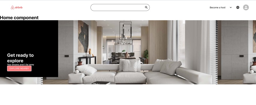
This gives the banner a background image and sets the height to about 50% of the page.
To center the image properly, add center center to the end of the background tag. This is approximately what you'll see:

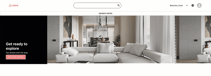
Next, we'll go ahead and create a div within the banner and include some text within it (Airbnb does this, so we are too):
<div className='banner'>

        <div className='banner__info'/>

        <h1> Get ready to explore </h1>

        <h5> Your dreams aren't far away </h5>

    </div>

We've came along way. Import a button from the material UI core folder then put it in underneath the text you added.
Afterwards, we're going to need to style everything to make sure it looks similar to how Airbnb has their site set up.
`.banner {
height: 50vh;
position: relative;
background: url("http://cdn.home-designing.com/wp-content/uploads/2017/10/white-sectional-sofa.jpg")center center;
}
.banner__info {
background-color: black;
color: white;
padding-top: 25vh;
padding-left: 50px;
padding-right: 50px;
padding-bottom: 40px;
width: 300px;
}
.banner__info > button {
background-color: #ff7779;
color: white;
border: 2px solid white;
}`
For the banner, we're setting the height to 50% of the page. The rest should be explanatory.
For banner info, we're giving it a background color of black, and the text color of white. Then we're going to give it some padding.
For the banner button, we've given it the colors to match Airbnb. And this is where we're at.
The Banner
Note: Anything styled with a Material UI button needs the CSS property of !important to override its native CSS.
Underneath the Home Component placehodler text, add a Search Dates button.
Then in the Banner, create a div container with a className of 'banner__search'.

Now, inside that div we will have a button with a classNAme of 'banner__searchButton' so we can style it later.
.banner__searchButton {

    background-color: white !important;

    font-weight: 900 !important;

    text-transform: capitalize imo !important;

    color: #ff7779;

    width: 100vh;

}
The styling above's use of !important makes sure it overrides the CSS associated with Material UI. Now when you hover over the button, you'll see it matches Airbnb's branding outline.
Get the Search Dates button to span the entire column of the page
.banner__search{

    flex-direction: column;

    display: flex;

    top: 0;

}
Currently when you click on it, you get a nice animation effect since we're using the button from Material UI, which already has code associated with the button.
But we'll want to change the start on it, so when its clicked, it shows the calendar. When it's not click, it stayed on this state.
To do this we'll start by importing { useState } from 'react'.
Then underneath the banner__search div we'll say if it's true, show the search bar component (we'll create this later). If it's false, hide it.

To add the functionality, we'll say that the Button onClick will set setShowSearch to the opposite of showSearch.
onClick={() => setShowSearch(!showSearch)}
Creating the Date Range component
Type in npm i react-date-range which is a handy npm library to have around.
To import it write:
import { DateRangePicker } from 'react-date-range'

import "react-date-range/dist/styles.css"

import "react-date-range/dist/theme.css"
Now, let's write a function that will set the startDate/endDate to the selection someone would choose as they're looking over the calendar.
function setSelection(ranges) {

      setStartDate(ranges.selection.startDate)

      setEndDate(ranges.selection.endDate)

  }
This is also done by the library we've set up via NPM.

center)
Top comments (0)