
The filter property is used to set the visual effect of an element. This property is mostly used to adjust the rendering of images, backgrounds, and borders. Also you can use the filter on SVG elements.
Syntax:
filter: none|blur()|brightness()|contrast()|drop-shadow()|
grayscale()|hue-rotate()|invert()|opacity()|saturate()|sepia()|
url();
How filters work?
What does a filter do exactly? The easiest way to think of a filter is as a post processing step that does something magical after all your page content has been laid out and drawn.
When a browser loads a web page it needs to apply styles, perform layout and then render the page. Filters kick in after all those steps and just before the page is copied to the screen.
What they do, is take a snapshot of the rendered page as a bitmap image, then perform some graphics magic on the pixels in the snapshot and then draw the result over the top of the original page image. (One way to think of them is like a filter placed on the front of a camera lens)
We will be discussing following properties here:
- Blur
- Brightness
- Contrast
- Drop-shadow
- Grayscale
- Hue-rotate
- Invert
- Opacity
- Saturate
- Sepia
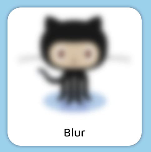
1. Blur
The blur() CSS function applies a Gaussian blur to the input image
syntax:
blur(radius)
Larger radius value will create more blur. A value of 0 leaves the input unchanged. The lacuna value for interpolation is 0.
example:
filter: blur(5px);
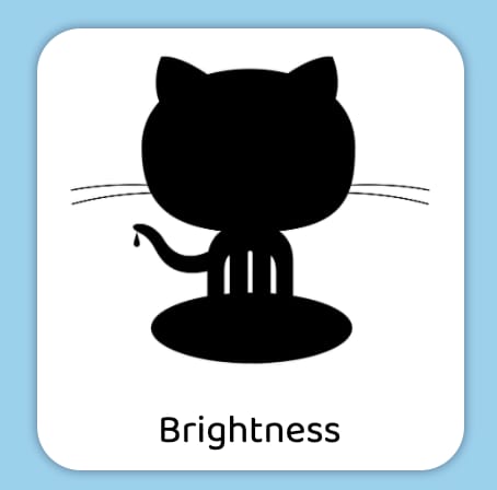
2. Brightness
The brightness() CSS function applies a linear multiplier to the input image, making it appear brighter or darker.
syntax:
brightness(amount)
A value under 100% darkens the image, while a value over 100% brightens it. A value of 0% will create an image that is completely black, while a value of 100% leaves the input unchanged. The lacuna value for interpolation is 1.
example:
brightness(1)    /* No effect */
brightness(150%) /* brightness will be high by 50% */
brightness(0%)   /* Completely black */
3. Contrast
The contrast() CSS function adjusts the contrast of the input image.
syntax:
contrast(amount)
Amount can be specified as number or percentage.
A value under 100% decreases the contrast, while a value over 100% increases it.
A value of 0% will create an image that is completely gray, while a value of 100% leaves the input unchanged. The lacuna value for interpolation is 1.
example:
filter: contrast(1); // no change
filter: contrast(115%) // contrast will be high 15%
filter: contrast(0); // completely gray

4. Drop-shadow
The drop-shadow() CSS function applies a drop shadow effect to the input image. Also you can apply drop-shadow to SVG. 👻
syntax:
drop-shadow(offset-x offset-y blur-radius spread-radius color)
blur-radius and spread-radius are optional
Blur-radius: The larger the value, the larger and more blurred the shadow becomes. Negative values are not allowed.
spread-radius: Positive values will cause the shadow to expand and grow bigger, while negative values will cause the shadow to shrink. If unspecified, it defaults to 0, and the shadow will be the same size as the input image.
NOTE: Most browser does not support spread-radius, the effect will not render if used.
example:
filter: drop-shadow(12px 12px 5px #1c8c9e);

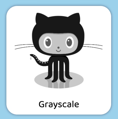
5. Grayscale
The grayscale() CSS function converts the input image to grayscale
syntax:
grayscale(amount)
amount can be number or percentage.
A value of 100% is completely grayscale, while a value of 0% leaves the input unchanged.
The lacuna value for interpolation is 0.
example:
grayscale(0)     /* No effect */
grayscale(1)     /* Completely grayscale */
grayscale(100%)  /* Completely grayscale */
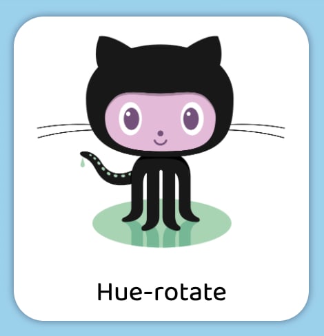
6. Hue-rotate
The hue-rotate() CSS function rotates the hue of an element and its contents.
hue-rotate shifts the hue of all the colors in the image. But why is the value in degrees? As we pick the color from wheel chart.
Here is the color wheel:

Using hue-rotate you can push one color by x degrees on the color wheel. 360 degrees will make a complete rotation, which will mean no change at all. The value for this property also works in the negatives and -90 for example is the equivalent of 270.
NOTE: Positive degree moves in anti-clockwise direction and negative degree moves clockwise direction
syntax:
hue-rotate(angle)
A value of 0deg leaves the input unchanged.
A positive hue rotation increases the hue value, while a negative rotation decreases the hue value. The lacuna value for interpolation is 0.
example:
filter: hue-rotate(0deg)    /* No effect */
filter: hue-rotate(.5turn)  /* 180deg rotation */
filter: hue-rotate(405deg)  /* Same as 45deg rotation */
filter: hue-rotate(-90deg); /* Same as 270deg rotation */
7. Invert
The invert() CSS function inverts the color samples in the input image
syntax:
invert(amount)
A value of 100% is completely inverted, while a value of 0% leaves the input unchanged. Values between 0% and 100% are linear multipliers on the effect. The lacuna value for interpolation is 0.
example:
filter: invert(0)     /* No effect */
filter: invert(100%)  /* Completely inverted */

8. Opacity
The opacity() CSS function applies transparency to the samples in the input image
syntax:
opacity(amount)
A value of 0% is completely transparent, while a value of 100% leaves the input unchanged. Values between 0% and 100% are linear multipliers on the effect. The lacuna value for interpolation is 1.
example:
filter: opacity(0%)   /* Completely transparent */
filter: opacity(1)    /* No effect */
filter: opacity(30%); /* 30% transparent */

9. Saturate
The saturate() CSS function super-saturates or desaturates the input image
syntax:
saturate(amount)
A value under 100% desaturates the image, while a value over 100% super-saturates it. The lacuna value for interpolation is 1.
example:
filter: saturate(0)     /* Completely unsaturated */
filter: saturate(100%)  /* No effect */
filter: saturate(200%)  /* Double saturation */
10. Sepia
The sepia() CSS function converts the input image to sepia, giving it a warmer, more yellow/brown appearance.
syntax:
sepia(amount)
A value of 100% is completely sepia, while a value of 0% leaves the input unchanged. The lacuna value for interpolation is 0.
example:
sepia(0)     /* No effect */
sepia(.95)   /* 95% sepia */
sepia(100%)  /* Completely sepia */
filter: sepia(70%);

Multiple Property:
You can also apply multiple filter at a time.
When a single filter property has two or more functions it's results will be different from when two or more filter properties are separately applied with the same functions
example:
filter: hue-rotate(-30deg) sepia(75%) contrast(150%) saturate(300%)
    hue-rotate(30deg);

Please keep in mind that the filter property values are applied in a sequence, meaning that the input for one filter is the output of the previous filter.
Performance considerations
One thing that every web developer cares about is performance of their web page or application. CSS filters are a powerful tool for visual effects, but at the same time might have an impact on the performance of your site.
Firstly, not all filters are created equal. Most filters will run really quickly on any platform and have very minor performance impact.
example:
When you do a ‘blur’, it mixes the colors from pixels all around the output pixel to generate a blurred result. So, say if your ‘radius’ parameter is 2, then the filter needs to look at 2 pixels in every direction around each output pixel to generate the mixed color. This happens for each output pixel, so that means a lot of calculations that just get bigger when you increase the ‘radius’. Since ‘blur’ looks in every direction, doubling the ‘radius’ means you need to look at 4 times as many pixels so in fact it’s 4 times slower for each doubling of the ‘radius’. The ‘drop-shadow’ filter contains a ‘blur’ as part of its effect, so it too behaves just like ‘blur’ when you change the ‘radius’ and ‘spread’ parts of the ‘shadow’ parameter.
Reference:
https://developer.mozilla.org/en-US/docs/Web/CSS/filter
https://www.html5rocks.com/en/tutorials/filters/understanding-css/
I have added the code in codepen.
Thanks for reading this article ♥️
I hope you love the article. If you have any question, please feel free to ping me on @suprabhasupi 😋
| 👩🏻💻 Suprabha.me |

Top comments (7)
Really amazing... in-depth on CSS filter.
Yes, Thanks for sharing your thought👻
Really really amazing. Loved it.
nice, thanks for the write-up.
I was wondering if these basically do the same as a shader can do. Performance-wise especially
This is so awesome
Thanks 👻
Thankyou so much for your view. 😋