
TLDR: Gathering the data on the Arctic Sea ice cover since 2000 and visualizing the data by customizing the appearance of the Syncfusion .NET MAUI Fast Line Chart.
Welcome to our Chart of the Week blog series!
Today, we will visualize the extent of Arctic Sea ice using the Syncfusion .NET MAUI Fast Line Chart.
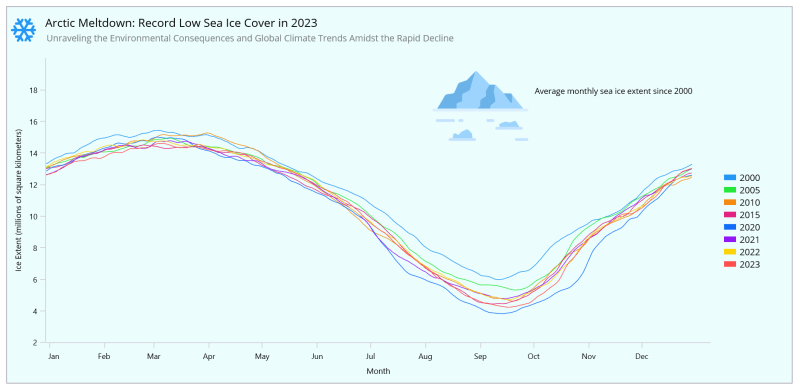
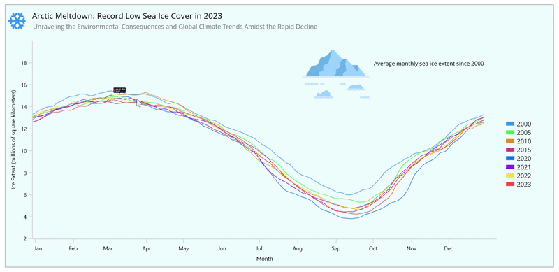
Arctic sea ice extent is the area covered by ice in the Arctic Ocean, typically measured in million square kilometers. The sea ice cover is an integral part of the polar climate system. It has received much attention lately because the Arctic Sea ice has been shrinking rapidly.
It varies throughout the year, reaching its peak in late winter or early spring and its lowest point in late summer or early autumn. Warmer temperatures are leading to a reduction in the extent of the Arctic Sea ice. In this example, we will utilize the .NET MAUI Fast Line Chart to visualize a huge volume of data effectively.
Let’s create visual evidence to demonstrate this phenomenon.
Step 1: Gathering data on Arctic Sea ice extent
Before proceeding, we need to gather information on the extent of the Arctic Sea ice since 2000.
Step 2: Preparing data for the chart
Design a Model class with properties to store information about ice extent for each Month, Year, and Date, along with their corresponding Value.
Refer to the following code example.
public class Model
{
    public string Month { get; set; }
    public string Year { get; set; }
    public string Date { get; set; }
    public double Value { get; set; }
    public Model(string month, string year, string date, double value)
    {
        Month = month;
        Year = year;
        Date = date;
        Value = value;
    }
}
Next, use the ViewModel class to create a data collection for storing data from the year 2000. Subsequently, use the ReadCSV method to assign the CSV data to the corresponding properties and create a function that builds a dictionary to hold information for each year.
Refer to the following code example.
public class ViewModel
{
    public ObservableCollection<Model> Year2000 { get; set; }
    public ObservableCollection<Model> Year2005 { get; set; }
    public ObservableCollection<Model> Year2010 { get; set; }
    public ObservableCollection<Model> Year2015 { get; set; }
    public ObservableCollection<Model> Year2020 { get; set; }
    public ObservableCollection<Model> Year2021 { get; set; }
    public ObservableCollection<Model> Year2022 { get; set; }
    public ObservableCollection<Model> Year2023 { get; set; }
    public ViewModel()
    {
        Year2000 = new ObservableCollection<Model>(ReadCSV(2));
        Year2005 = new ObservableCollection<Model>(ReadCSV(3));
        Year2010 = new ObservableCollection<Model>(ReadCSV(4));
        Year2015 = new ObservableCollection<Model>(ReadCSV(5));
        Year2020 = new ObservableCollection<Model>(ReadCSV(6));
        Year2021 = new ObservableCollection<Model>(ReadCSV(7));
        Year2022 = new ObservableCollection<Model>(ReadCSV(8));
        Year2023 = new ObservableCollection<Model>(ReadCSV(9));
    }
public IEnumerable<Model> ReadCSV(int value)
{
    Assembly executingAssembly = typeof(App).GetTypeInfo().Assembly;
    Stream? inputStream = executingAssembly.GetManifestResourceStream("ArcticSeaIceCover.Resources.Raw.Sea_Ice_Data.csv");
    string line;
    List<string> lines = new List<string>();
    if (inputStream != null)
    {
        using StreamReader reader = new StreamReader(inputStream);
        while ((line = reader.ReadLine()!) != null)
        {
            lines.Add(line);
        }
    }
    lines.RemoveAt(0);
    return lines.Select(line => {
        string[] data = line.Split(',');
        var month = data[0];
        var date = data[1];
        var seaIceData = Convert.ToDouble(data[value]);
        return new Model(month, getYear(value), date, seaIceData);
    });
}
public string getYear(int value)
{
    Dictionary<int, string> yearMap = new Dictionary<int, string>
    {
        {2, "2000"},
        {3, "2005"},
        {4, "2010"},
        {5, "2015"},
        {6, "2020"},
        {7, "2021"},
        {8, "2022"},
        {9, "2023"}
    };
    return yearMap.ContainsKey(value) ? yearMap[value] : "";
}
Step 3: Configure the Syncfusion .NET MAUI Cartesian Charts
Let’s configure the Syncfusion .NET MAUI Cartesian Charts control using this documentation.
Refer to the following code example.
<chart:SfCartesianChart>
 <chart:SfCartesianChart.XAxes>
  <chart:DateTimeAxis>
  </chart:DateTimeAxis>
 </chart:SfCartesianChart.XAxes>
 <chart:SfCartesianChart.YAxes>
  <chart:NumericalAxis>
  </chart:NumericalAxis>
 </chart:SfCartesianChart.YAxes>
</chart:SfCartesianChart>
Step 4: Bind the data to the Fast Line Chart
Now, we will use multiple FastLineSeries to showcase the extent of Arctic Sea ice. Following that, we’ll configure the ViewModel class to bind its properties to the chart’s BindingContext.
The ItemsSource property is bound to the data for each year from the ViewModel. The XBindingPath and YBindingPath properties are bound to the Month and Value properties, respectively.
Refer to the following code example.
 <!--series 1-->
 <chart:FastLineSeries ItemsSource="{Binding Year2000}" XBindingPath="Month" YBindingPath="Value"/>
 <!--series 2-->
 <chart:FastLineSeries ItemsSource="{Binding Year2005}" XBindingPath="Month" YBindingPath="Value"/>
 <!--series 3-->
 <chart:FastLineSeries ItemsSource="{Binding Year2010}" XBindingPath="Month" YBindingPath="Value"/>
 <!--series 4-->
 <chart:FastLineSeries ItemsSource="{Binding Year2015}" XBindingPath="Month" YBindingPath="Value"/>
 <!--series 5-->
 <chart:FastLineSeries ItemsSource="{Binding Year2020}" XBindingPath="Month" YBindingPath="Value"/>
 <!--series 6-->
 <chart:FastLineSeries ItemsSource="{Binding Year2021}" XBindingPath="Month" YBindingPath="Value"/>
 <!--series 7-->
 <chart:FastLineSeries ItemsSource="{Binding Year2022}" XBindingPath="Month" YBindingPath="Value"/>
 <!--series 8-->
 <chart:FastLineSeries ItemsSource="{Binding Year2023}" XBindingPath="Month" YBindingPath="Value"/>
Step 5: Customizing the chart appearance
We can customize the chart’s appearance by changing the chart title, axis, legend, and more to enhance the readability of the data.
Customize the chart title
To improve the readability of the plotted data, we must incorporate the title into the chart.
Refer to the following code example. Here, we’ve added a title and description to the plotted data.
<chart:SfCartesianChart.Title>
 <Grid Padding="{OnPlatform Default='0,0,0,20',Android='10,0,0,0',iOS='10,0,0,0'}" ColumnDefinitions="60,*" RowDefinitions="60,*">
  <Path Data="{StaticResource PathData}" Grid.RowSpan="1" Grid.Column="0" HeightRequest="{OnPlatform Default=40}" WidthRequest="40" Margin="0,15,10,0" Fill="#2196F3">
   <Path.RenderTransform>
    <ScaleTransform ScaleX="{OnPlatform Default=1.3,Android = 1.1,iOS=1.1}" ScaleY="{OnPlatform Default=1.3,Android=1.1,iOS=1.1}"/>
   </Path.RenderTransform>
  </Path>
  <VerticalStackLayout Grid.Row="0" Grid.Column="1">
   <Label Text="Arctic Meltdown: Record Low Sea Ice Cover in 2023" FontSize="18" Margin="0,12,0,0"/>
   <Label Text="Unraveling the Environmental Consequences and Global Climate Trends Amidst the Rapid Decline" TextColor="Grey" FontSize="{OnPlatform Android=13,iOS=13}" Margin="2"/>
  </VerticalStackLayout>
 </Grid>
</chart:SfCartesianChart.Title>
Customize the chart axis
To customize the chart axis, we will configure the following properties:
- Minimum and Maximum – To set the minimum and maximum period displayed on the axis.
- Interval – To adjust the interval between axis labels.
- LabelFormat – To define numeric or datetime format for the axis labels.
- IntervalType – To customize the interval type.
- ShowMajorGridLines – To customize the visibility of the major grid lines.
- EdgeLabelsDrawingMode – To determine the rendering position of the edge labels.
- AxisTitle – To set a title for the axis.
- LabelStyle – To adjust the style of the axis labels.
- PlotOffsetEnd – To provide padding to the axis at the end position.
Refer to the following code example.
<chart:SfCartesianChart.XAxes>
 <chart:DateTimeAxis ShowMajorGridLines="False" PlotOffsetEnd="30" IntervalType="Months">
  <chart:DateTimeAxis.LabelStyle>
   <chart:ChartAxisLabelStyle TextColor="Black" LabelFormat="MMM"/>
  </chart:DateTimeAxis.LabelStyle>
  <chart:DateTimeAxis.Title>
   <chart:ChartAxisTitle Text="Month" TextColor="Black" FontSize="{OnPlatform Android=10,Default=12.5,iOS=10}"/>
  </chart:DateTimeAxis.Title>
 </chart:DateTimeAxis>
</chart:SfCartesianChart.XAxes>
<chart:SfCartesianChart.YAxes>
 <chart:NumericalAxis EdgeLabelsDrawingMode="Center" ShowMajorGridLines="False" PlotOffsetEnd="{OnPlatform Default=50,Android=5,iOS=5}" Minimum="2" Maximum="18" Interval="2">
  <chart:NumericalAxis.Title>
   <chart:ChartAxisTitle Text="Ice Extent (millions of square kilometers)" TextColor="Black" FontSize="{OnPlatform Android=10,Default=12.5,iOS=10}"/>
  </chart:NumericalAxis.Title>
  <chart:NumericalAxis.LabelStyle>
   <chart:ChartAxisLabelStyle TextColor="Black"/>
  </chart:NumericalAxis.LabelStyle>
 </chart:NumericalAxis>
</chart:SfCartesianChart.YAxes>
Customize the Fastline color
The Background property is used to customize the chart background’s appearance, and each series appearance can be customized using the PaletteBrushes property.
Refer to the following code example.
XAML
<chart:SfCartesianChart PaletteBrushes="{Binding PaletteBrushes}" Background="#8CDDFBFB">
</chart:SfCartesianChart>
C#
public class ViewModel
{
    public ObservableCollection<Brush> PaletteBrushes { get; set; }
    public ViewModel()
    {
        PaletteBrushes = new ObservableCollection<Brush>()
        {
            new SolidColorBrush(Color.FromArgb("#2196F3")),
            new SolidColorBrush(Color.FromArgb("#25E739")),
            new SolidColorBrush(Color.FromArgb("#F4890B")),
            new SolidColorBrush(Color.FromArgb("#E2227E")),
            new SolidColorBrush(Color.FromArgb("#116DF9")),
            new SolidColorBrush(Color.FromArgb("#9215F3")),
            new SolidColorBrush(Color.FromArgb("#FCD404")),
            new SolidColorBrush(Color.FromArgb("#FF4E4E"))
        };
    }
}
Customize the chart legend
Then, customize the chart legend using the ItemTemplate property and place it at the right using the Placement property.
Refer to the following code to enable and customize the legend to indicate the meaning of the series colors.
<chart:SfCartesianChart.Legend>
 <chart:ChartLegend Placement="Right" ToggleSeriesVisibility="True">
  <chart:ChartLegend.ItemTemplate>
   <DataTemplate>
    <Grid ColumnDefinitions="Auto,Auto" Padding="{OnPlatform Default='20,0,5,0',Android='20,1,0,0',iOS='20,1,0,0'}">
     <Rectangle Fill="{Binding IconBrush}" Margin="0,0,0,0" WidthRequest="{OnPlatform Default=20,Android=15,iOS=15}" HeightRequest="{OnPlatform Default=10,Android=7,iOS=7}"/>
     <Label Grid.Column="1" Text="{Binding Item.Label}" TextColor="Black"
          FontSize="{OnPlatform Android=9,iOS=9,Default=14}" Padding="5,0,45,0"/>
    </Grid>
   </DataTemplate>
  </chart:ChartLegend.ItemTemplate>
 </chart:ChartLegend>
</chart:SfCartesianChart.Legend>
<chart:FastLineSeries Label="2000"/>
<chart:FastLineSeries Label="2005"/>
<chart:FastLineSeries Label="2010"/>
<chart:FastLineSeries Label="2015"/>
<chart:FastLineSeries Label="2020"/>
<chart:FastLineSeries Label="2021"/>
<chart:FastLineSeries Label="2022"/>
<chart:FastLineSeries Label="2023"/>
Adding interactivity support
To improve the readability of our chart, let’s enhance it by adding and customizing the tooltip. We have used a converter to get the fill color for each series, strengthening the tooltip view and making our line chart more user-friendly for understanding the extent of Arctic Sea ice based on the mentioned years.
<chart:SfCartesianChart.Resources>
 <ResourceDictionary>
  <model:TooltipConverter x:Key="converter"/>
  <DataTemplate x:Key="template">
   <StackLayout Orientation="Horizontal">
    <Rectangle HeightRequest="30" WidthRequest="8" Fill="{Binding Item, Converter={StaticResource converter}}"/>
    <StackLayout Orientation="Vertical">
     <HorizontalStackLayout>
      <Label Text="{Binding Item.Month}" TextColor="White" FontFamily="Helvetica" FontSize="12.5" Padding="5,0,0,0"/>
      <Label Text="{Binding Item.Date}" TextColor="White" FontFamily="Helvetica" FontSize="12.5" Padding="5,0,0,0"/>
      <Label Text=", " TextColor="White" FontFamily="Helvetica" FontSize="12.5"/>
      <Label Text="{Binding Item.Year}" TextColor="White" FontFamily="Helvetica" FontSize="12.5" Padding="5,0,0,0"/>
     </HorizontalStackLayout>
     <Label Text="{Binding Item.Value}" TextColor="White" FontFamily="Helvetica" FontSize="12" Padding="5,0,0,0" Margin="0,2,0,0"/>
    </StackLayout>
   </StackLayout>
  </DataTemplate>
 </ResourceDictionary>
</chart:SfCartesianChart.Resources>
<chart:FastLineSeries EnableTooltip="True" TooltipTemplate="{StaticResource template}"/>
Customize the PlotAreaBackgroundView
Finally, enhance the Fast Line Chart appearance by adding a view to the plot area using the PlotAreaBackgroundView property, making it more attractive and informative. This feature allows for the inclusion of different views in the chart’s plot area, improving the presentation of relevant data.
Refer to the following code example.
<chart:SfCartesianChart.PlotAreaBackgroundView>
 <Grid HorizontalOptions="End" VerticalOptions="Start">
  <Grid.ColumnDefinitions>
   <ColumnDefinition Width="{OnPlatform Default=170,Android=100,iOS=100}"/>
   <ColumnDefinition Width="{OnPlatform Default=275,Android=170,iOS=170}"/>
  </Grid.ColumnDefinitions>
  <Grid.RowDefinitions>
   <RowDefinition Height="Auto"/>
   <RowDefinition Height="Auto"/>
  </Grid.RowDefinitions>
  <Image Grid.Row="1" Grid.Column="0" Source="mountain.png" HeightRequest="{OnPlatform Default=150,Android=100,iOS=100}" WidthRequest="{OnPlatform Default=200,Android=150,iOS=150}" />
  <Label Grid.RowSpan="2" Grid.Column="1" Text="Average monthly sea ice extent since 2000" HeightRequest="{OnPlatform Default=65,Android=45,iOS=45}" FontSize="{OnPlatform Default=12.5,Android=11,iOS=11}" />
 </Grid>
</chart:SfCartesianChart.PlotAreaBackgroundView>
After executing the previous code examples, the output will look like the following GIF image.
GitHub reference
For more details, refer to the visualization of the Arctic Sea ice cover since 2000 using .NET MAUI Fast Line Chart GitHub demo.
Conclusion
Thanks for reading! In this blog, we have seen how to use the Syncfusion .NET MAUI Fast Line Chart to visualize the Arctic Sea ice cover since 2000. We encourage you to try the steps discussed and share your thoughts in the comments below.
Our existing customers can download the new version of Essential Studio from the License and Downloads page. If you are not a Syncfusion customer, try our 30-day free trial to check out our incredible features.
If you require assistance, please don’t hesitate to contact us via our support forum, support portal, or feedback portal. We are always eager to help you!

Top comments (0)