Material Design is a design language developed in 2014 by Google and is very popular for web and mobile applications.
Material Design is inspired by the physical world and its textures, including how they reflect light and cast shadows. Material surfaces reimagine the mediums of paper and ink.
With the components from the Material-UI library it’s very easy to make use of Material Design elements in your React web or mobile application.
Material UI is one of the famous React UI frameworks with 6 million monthly npm downloads and 43k GitHub stars.
Material UI provides us React components that implement google material design.
In this tutorial, we are going to learn about how to use the Material UI framework in React apps. Happy? Lets get started...
Getting started
First install the Material UI framework by using below commands:
npm install @material-ui/core
We need to set up and install the new react app by using the create-react-app command line tool.
Open your terminal and run following commands:
npx create-react-app react-material
Next, we need to change our working directory by using below commands:
cd react-material
npm start
Let’s design our App header using Material UI components
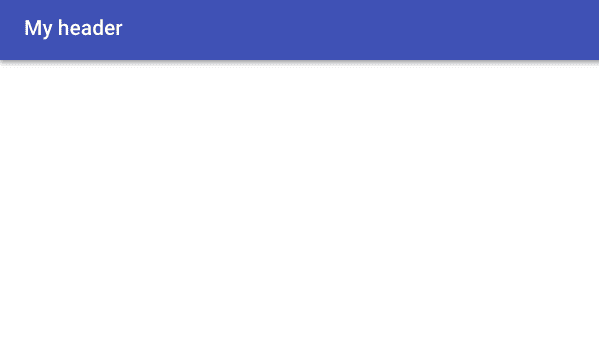
Now in App.js file we are importing AppBar component from the ‘@material-ui/core/AppBar’.

In AppBar component we passed two props color and position
Now you can see a Header with primary color is rendered on the screen.

Let’s replace our h1 element with Material UI TypoGraphy Component

In the above code first we imported two component which are ToolBar and TypoGraphy from ‘@material-ui’ framework.
In TypoGraphy component we passed two props variant and color.
Have you seen how we got more spacing over our heading?
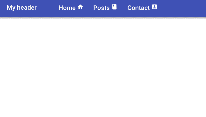
Adding Nav bar
Let’s add the Navbar to our Header.
create a new file called navbar.js in your src folder.
Add the following line of codes:

Inside the navbar.js we imported ListItem and ListItemText component.
In ListItem component we added component prop value to nav so that we can get html nav element.

Material ui svg icons
Material UI provides us with SVG material icons to use in our react app.
Let’s install the icons package in our app so that we can use icons as React components:
npm install @material-ui/icons
Let’s Import the icons inside our navbar.js file.

Grid
The Material UI supports responsive grid layouts which adapt to the device screen size and orientation.
Let’s use the Grid component.
Create a two new files called dummy-post.js, posts.js and add the following code:
dummy-post.js

post.js

In the above code, we imported Grid and Card related components.
In Grid Component we passed container prop so that it become grid container.
justify prop helps us to make our grid items center
spacing prop helps us to create the spacing between individual grid items (supporting values are 8, 16, 24, 32 or 40).
Inside the Grid container component, we passed item prop to the Grid component so that they become grid items

Contact form
Let’s design a contact form using Material UI FormControl and Input components.
create a new file called contact.js in your src folder.
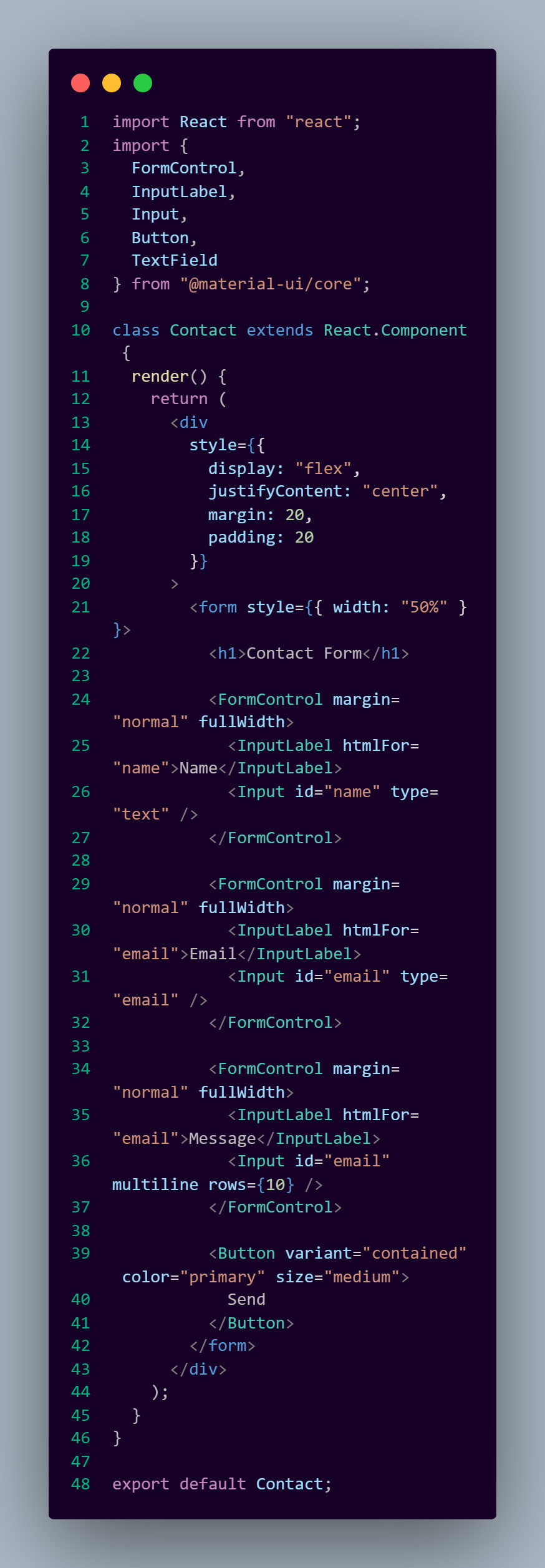
Here we first imported the FormControl,InputLabel,Input,Button and TextField components from the material UI framework.
FormControlComponent: In FormControl component we passed margin prop value to normal so that it maintains the distance between input fields, we also passed fullWidth it means to occupy the available space.
InputLabel : The InputLabel component helps us to display the label for our input field.
Input: The Input component helps us display the HTML input field.
if we pass multiline prop to the Input component it will render textarea element instead of input field.
rows prop is used to increase the rows in textarea element.
Output


Top comments (0)