
Using patterns 📊 in your codes is always a pretty great thing👍 because your code looks much better 👀, in the future, you won't be confuse 🧠, and other developers 🧑💻 that contribute to your project will understand it better, especially in open source projects 📖.
Some patterns are confusing 🧠, and hard to remember 😡 since one of the goals of the tailwindCSS is not to be complicated 🦾, I try a lot to make as much as easy, and easy to customize 🖌️.
I also made a GitHub repository for you guys to be able to contribute and make it better. 😉
Basics
Let's take a look at it.
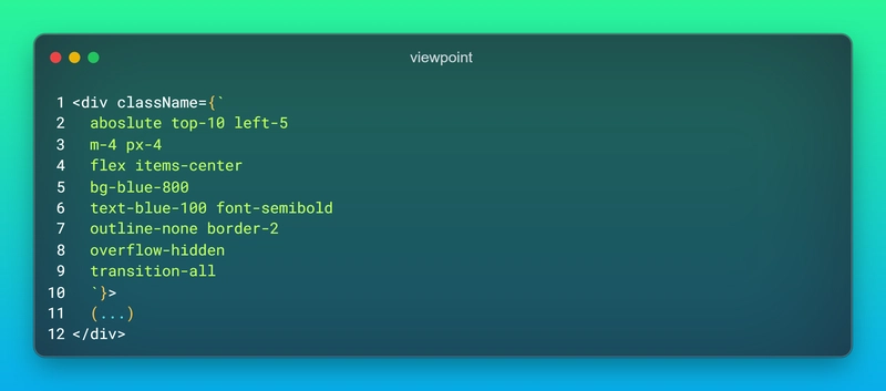
You may say what is special about this piece of code 🤔💭, the answer is that during coding we have no pattern and methodology we just type class names that we thinking of, and this will make our code dirty 💩.
Logic
the logic behind orders and patterns is we go from outside to inside 📥. It means first we define positions, after that margin, padding, outline, and border, and then we define element inner styles like display, align-items, background-color, text-color, font properties, etc. 🚌 Next we define class names like transitions, animations, and external CSS classes.
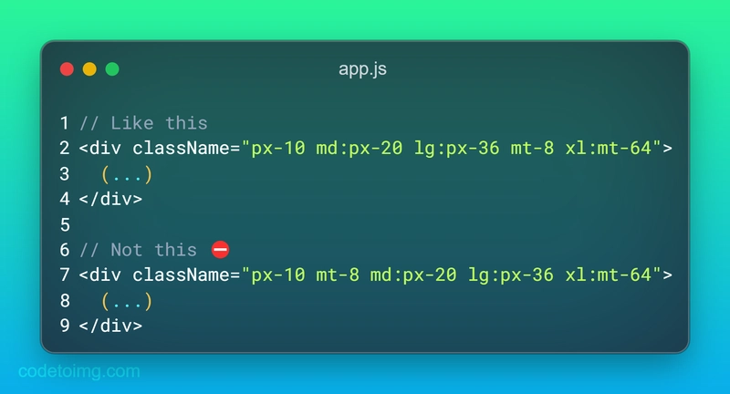
Responsive
Some developers prefer to use media queries at the end of the string which is not perfect 🔔 because it's easier to have all media queries of one element in one look 👁️. like below.
Orders
The most important thing in this pattern is orders but how do we categorize them in groups, and what are the categories? 👆
1. position, inset, top, bottom...
Including position, inset, top, left, bottom, and right.
1️⃣ position => absolute, relative, static...
2️⃣ inset => inset-2, inset-4...
3️⃣ top => top-6, top-10...
4️⃣ right => right-6, right-10...
5️⃣ bottom => bottom-6, bottom-10...
6️⃣ left => left-6, left-10...
<div className="absolute top-10 right-10">
   <h1>Position</h1>
</div>
2. Margin, Padding, outline, and border
the Order of the directions are clockwise 🔃, like: mt-0 => mr-0 => mb-0 => ml-0
1️⃣ Margin
2️⃣ Padding
3️⃣ Outline
4️⃣ Border
<div className="my-10 p-24 outline-none border-2">
   <h1>Margin, Padding, Outline, and Border</h1>
</div>
3. Height, width, min and max-width, and min and max-height
1️⃣ width => w-10
2️⃣ height => h-10
3️⃣ min-width => h-5
4️⃣ min-height => h-5
5️⃣ max-width => h-16
6️⃣ max-height => h-16
<div className="w-10 h-4 min-h-2 max-w-36 max-h-10">
   <h1>Width, Height, min-..., and max-...</h1>
</div>
4. Display (grid or flexbox items in addition)
The order in this category does not matter 🫠, because it may be different. 🛫
<div className="flex items-center justify-content flex-col">
   <h1>Flex, and Grid</h1>
</div>
5. Background-color, and box-shadow
1️⃣ background color
2️⃣ box shadow
3️⃣ drop-shadow
<div className="bg-red-900 shadow-xl drop-shadow-lg">
   <h1>background-color, and box-shadow, and drop-shadow</h1>
</div>
6. Text, and font
First, we define text color, then text font-size, and last but not least font-weight.
1️⃣ color => text-red-600, text-white...
2️⃣ font-size => text-lg, text-3xl...
3️⃣ font-height => leading-9, leading-5...
4️⃣ font-weight => font-semibold, font-medium...
<div className="text-red-600 text-sm leading-4 font-semibold">
   <h1>Color, font-size, font-height, and font-weight</h1>
</div>
these most common classes, so for more classes you can add them at the end of the category.
7. Transitions, and animations
1️⃣ transition => transition-all duration-750...
2️⃣ animation => animate-spin
<div className="transition-all duration-1000 animation-ping">
   <h1>Transition, and Animation</h1>
</div>
8. Filters
Due to a large number of cases, it's not great.
<div className="backdrop-blur-lg">
   <h1>Filters</h1>
</div>
Conclusion
I developing a react project with this method, and after finishing it I will share the link here. So be sure to save it 😉😈.
Keep Coding Y'All 👨🏻💻

Top comments (6)
Just use 'Headwind" - a VSCode extension ;)
Good tip!
I’ve always followed “the order of f$?kery” even back without Tailwind. Just so happens that’s what the Headwind extension uses too. Order your CSS files in the amount of “f@&kery” they can cause. Position, display, flex, width, height, border, font size, background, color. Everything higher up the chain is likely to cause the most issues.
I thought I use emojis heavely ... till I read your post 😅
Good post by the way :)
Yeah, because I found it boring, so added many more emojis
Сongratulations 🥳! Your article hit the top posts for the week - dev.to/fruntend/top-10-posts-for-f...
Keep it up 👍