In this post, we will learn essential CSS properties and how to use the class selector.
This is the tenth post and video in a series on learning web development. Learn more about the series and see the post schedule >
You may need to check out the first post to learn how to get set up to begin coding:

You may watch the following video or follow along with the expanded transcript that follows.
To begin this lesson, open the starter project you began in episode 1, or review the source files from episode 9.
To begin this lesson, open our project in VSCode.
If you are just joining us you can download the starter project to catch up, see the link in the video description.
In the Terminal, type the start command npm run start to run the project.
Then, open the index.html file. For this lesson, we will be styling the elements on this page.
Next, open the style.css file. All styles created in today's lesson will be added here.
Now that we're actively getting into styling, it may be helpful to arrange your screen so that VSCode is on one side, and the browser window is on the other, like so:

You may also wish to toggle the file browser to hidden by clicking the top left icon in VSCode that looks like two stacked papers. This will give you more working space if you've reduced the overall window size.
In the style.css file, we had started styling our h1. Let's continue to learn about the rest of the common typography-related properties.
But first, a quick note about our font-family rule. If you are unfamiliar with typography design, the term "sans-serif" may be new to you. Sans-serif is a category of fonts where the characters do not have small lines at the end, and those are called serifs.
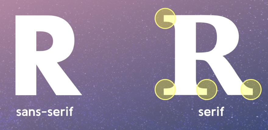
Looking at our h1 compared to the browser default, you'll see that the browser default is a serif font.

If we define "serif" or "sans-serif" instead of a specific font name, then it is up to the operating system - as in Mac, Windows, iOS, or Android to name a few - to decide the font to use.
Alternatively, we can define a font name, however, it is important to note that not all fonts are available across all operating systems. But there are a few relatively safe choices which you can review.
Another option is to use web-hosted fonts, with a popular free choice being Google fonts. We will explore using a Google font in the capstone project.
Ok, let's move on to more typography properties. The next common one is font-weight which has value options such as bold or normal or a number such as 300 if supported by the font you're using. You may have noticed that the heading elements all appear bold. If we look at them with Inspector, sure enough - there is a "user agent stylesheet" definition for font-weight: bold for all of them!

For demonstration purposes, let's change our h1 to use font-weight: normal which will return it to an un-bolded style. Save, and you can see a clear thinner difference to the bold style.
Next, CSS has a property available to change the character casing, so we can use text-transform to change the h1 to uppercase. While content in all uppercase is generally discouraged, if you must do it for design requirements then the CSS method is preferred over actually typing in all-caps.
Following that, let's use a property called letter-spacing to give the characters some breathing room. For this, we'll introduce a new unit of measurement. Instead of a pixel, we'll use what's called an em. An em is a relative unit and 1em is equal to the font-size of the current element, and 2em would be twice the size set for font-size. This means em will proportionately adjust for any font-size value.
For letter-spacing its common to use a decimal value, and even negative values are allowed. Let's define letter-spacing: 0.03em and save.
You'll see there's been just a touch of space added between each character in the h1.

The h1 is starting to feel a little out of place. Let's add a rule as the first thing in our CSS file:
body {
  font-family: sans-serif;
}
Save, and instantly we have a bit more cohesion.
Typographic styles set in the body tag will automatically apply to other HTML elements unless you've included additional rules on those other elements, like we have with the h1. With this update, we can actually remove the font-family rule from the h1. Save, and you'll see it's font-family appearance is still sans-serif.
As we learned in the last lesson, the inherited box model for heading tags includes margin. Let's create a rule that selects all the heading tags, and apply an updated margin definition. The em unit can be appropriate for setting margins due to the proportionate behavior previously described.
Our selector will be all the heading element names separated by a comma: h1, h2, h3, h4, h5, h6 with the definition: margin: 0 0 0.85em which is shorthand for margin-top: 0; horizontal margin: 0; margin-bottom: 0.85em
    h1, h2, h3, h4, h5, h6 {
      margin: 0 0 0.85em;
    }
Save, and you'll see we've tightened up the margin around each heading significantly.
The h1 still feels out of place, so let's bump up the font-size of the other headings. We'll create one rule per heading tag.
    h2 {
      font-size: 32px;
    }

    h3 {
      font-size: 28px;
    }

    h4 {
      font-size: 20px;
    }

    h5{
      font-size: 18px;
    }

    h6 {
      font-size: 16px;
    }

That wraps up headings for this lesson, and we're going to skip the paragraph as there's nothing unique to add right now.
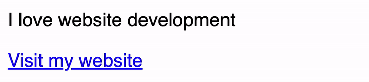
After that, we encounter our a tag, and link tags do have a couple of unique properties. Since a link is interactive, it has what's called "states" meaning different appearances based on the current state of its behavior.
The first one we'll modify is the hover state which appears when a user moves their mouse over the link. The selector for this and all states begins with a : so the full selector is a:hover.
We want to make the color a bit darker blue, and we'll be using the hex color format which is created with the # followed by a 3 or 6 digit color code representing single or pair values for red, green, and blue. Review this link to learn more about the hex color format.
For our hover rule, we'll add the definition color: #1313a0. Save, and you can view the effect by moving your mouse over - or hovering - the link.
a:hover {
  color: #1313a0
}
There are a few more states for links which we will cover in upcoming lessons and the capstone project.
We're not going to style the lists today, but we had previously wrapped each of them in a div tag. So let's focus on the divs to learn some container styling properties.
Before we get into the properties, we need a way to uniquely identify each of these divs. If we just wrote the selector of div it would apply any style definitions to both these divs, and any future divs we added to the page.
Instead, it's time to add class attributes to each div. Class attributes are added just like other HTML attributes we've learned about.
CSS classes:
- are custom names that you create
- can be shared among multiple HTML elements
- are used as the selector for applying specific rules
There are many suggested ways to go about naming CSS classes, but we're going to keep it simple for this lesson.
Open index.html and on the first div, let's add class="container" and on the second div add class="container container--raised".
<div class="container">

<div class="container container--raised>
Let's first use the shared class of "container" for our first rule. Class selectors are denoted by prepending the class name with a . so our selector will be .container.
.container {

}
Then let's add the following definitions:
- First we'll add
borderwhich we learned in the box model lesson, with the value2px solid blueviolet - Then, we'll add a common container property to alter the container
backgroundwhich has several sub properties but for this lesson we'll usebackground-color: #f9f9f9. Future lessons will explore other ways of usingbackgroundproperties. - Next we'll use a property to round the corners of the box, and that is called
border-radius. While there are expanded options to set different values on each corner, for now we'll use one value to set the radius on all four corners -7px. - Finally, we'll add
color: blueviolet.
    .container {
      border: 2px solid blueviolet;
      background-color: #f9f9f9;
      border-radius: 7px;
      color: blueviolet;
    }
Save, and notice how the color value was inherited by the list text.
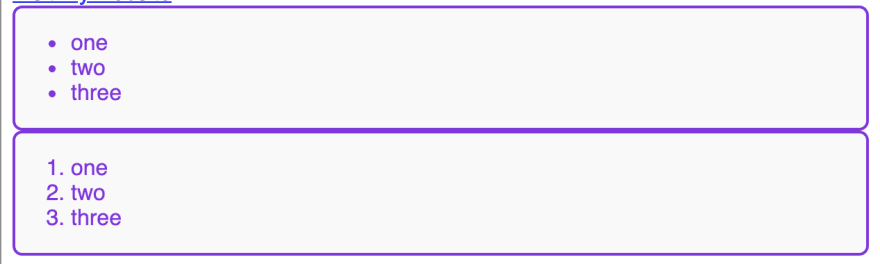
Now let's create the definitions for the second class, .container--raised. We'll add one property called box-shadow which will define a shadow effect. Our definition will be:
.container--raised {
  /* x-axis | y-axis | blur-radius | spread-radius | shadow color */
  box-shadow: 3px 3px 8px 1px rgba(0,0,0,0.3);
}
This box-shadow definition means a horizontal, or x-axis, offset of 3px, a vertical, or y-axis, offset of 3px, a blur-radius of 8px which causes the blurred appearance, a 1px spread radius which will expand the shadow size, and finally the color to use for the shadow.
This is our first example of using rgba which defines in order the red, green, and blue values of a color, with the fourth value being alpha which creates transparency. An rgb value of 0,0,0 means black because it says "use the least intensity for all colors" and an rgb value of 255,255,255 means white because it means "use the highest intensity for all colors" and 255 is the maximum for color range values. So, our rgba value will produce black that is dialed down to 30% alpha transparency. Transparency also means that any color under this element would be able to show through. Review this link to learn more about rgba.
Save, and with that rule in place you can see that the second div has both the styles defined in .container as well as the addition of box-shadow defined in .container--raised. This demonstrates the power of classes to share common, reusable styles.
It may have already crossed your mind, but it would be nice to have a bit of space between the two divs. We could add a margin-top rule to the container--raised definition since that div is below the first div, but that may not always be true.
Instead, let's create one more class:
    .margin-top {
      margin-top: 16px;
    }
Then go to the second div in the index.html file and add the margin-top class name.

Save, and then congratulate yourself on learning some essential CSS properties and about the class selector! We will continue to expand your knowledge of these properties and new ones in future lessons.
Next up in Episode 11: Understanding the CSS Cascade - aka the "C" in CSS!

Latest comments (0)