
This tutorial series was inspired by the React Native Eccomerce template which helps us build some awesome and powerful ready to deploy eCommerce applications that anyone can use to build eCommerce startups or sell the application templates. We all know about the Amazon app which allows customers to select from thousands of products and purchase from anywhere across the globe. The UI of the Amazon app is very appealing and well-structured.
This tutorial replicates the coding implementations and designs from the Youtube video tutorial byUnsure programmer for the Amazon UI clone. The video tutorial is very easy to follow and intuitive. So, in this tutorial series, we will try to implement the Amazon App UI clone using React Native. This tutorial series will provide step by step guide to implement our very own Amazon App UI using React Native. Moreover, we can make customization in different sections of UI to create our own version of an eCommerce app. Hence, this tutorial series will be very fruitful and interesting.
This tutorial is the first part of our implementation of the Amazon UI clone series. In this first part, we will try to replication the top Menu bar along with all the UI sections necessary. The idea is to start with a new boilerplate react-native application. Then, we will add the required dependencies to the app and start on implementing different UI sections.
So, let’s get started!!
Setting Up Boilerplate App
First, we need to set up a react-native boilerplate application. You can either use expo or React Native CLI to set the boilerplate react-native project into your system. The overall guidance on how to set up the project is provided in React Native documentation.
Now, after the setup completion of a new project, we need to go to the package.json file of the project directory. Some of the required dependencies will already be installed when downloading the boilerplate project. But, we need to include the dependencies which are not yet installed into the project. All the required dependencies which includes native-base package, react-navigation and so on are provided in the code snippet below:
"dependencies": {
    "native-base": "^2.13.8",
    "react": "16.9.0",
    "react-native": "0.61.2",
    "react-native-gesture-handler": "^1.4.1",
    "react-native-reanimated": "^1.3.0",
    "react-navigation": "^4.0.10",
    "react-navigation-drawer": "^2.2.2"
  },
We can either use npm or yarn to install the packages. The example commands are provided in the code snippet below:
npm install <package-name> --save       //Using NPM
yarn add <pakage-name>                  //Using yarn
Next, we need to launch the iOS emulator into our system and then run the following command in our project directory:
react-native run-ios
This will launch our project on an iOS emulator.
Setting up Navigation
Now, we are going to set up the navigation for the project in our App.js file. Here, we are going to use the drawer menu so we are going to set up a drawer navigator by using the react-navigation-drawer package. We have not yet created any screen files in our project. But, we are going to set up some screens into the drawer navigator which we are going to create later in the ‘./screens/ directory. The screen we are going to work on this tutorial is the Home screen. So, we are going to import the Home screen and set it up in the MyDrawerNavigator using createDrawerNavigator method provided by the react-navigation-drawer package. Then, we are going to use the createAppContainer method provided by the react-navigation package in order to create a navigation container with MyDrawerNavigator as a parameter as shown in the code snippet below:
import {createDrawerNavigator} from 'react-navigation-drawer';
import {createAppContainer} from 'react-navigation';
import Home from './screens/Home';
const MyDrawerNavigator = createDrawerNavigator({
  Home: {
    screen: Home,
  },
});
export default createAppContainer(MyDrawerNavigator);
Creating a Home Screen UI with Menu bar
In this step, we are going to create the Home Screen UI which will include the menu bar at the top. For that, we need to create a file named Home.js in the ‘./screens/ directory of our project. In Home.js, we are going to make use of components from the native-base package.
The native-base package is an open-source UI component library for react native in order to build native mobile apps for both iOS and Android platforms. This package makes it easy to theme the components with very little changes to the components themselves. Now, we need to import the different components from the native-base package as shown in the code snippet below:
import {Container, Content, Header, Left, Right, Icon} from 'native-base';
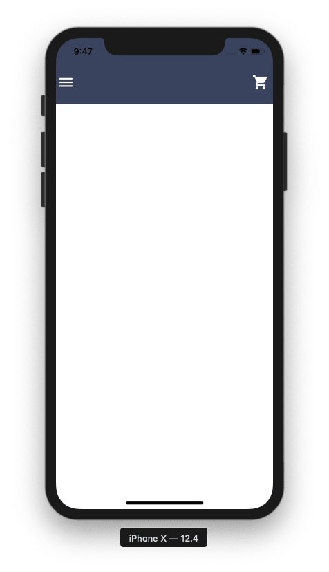
Then, we are going to set up a container for the Home screen using the Container component provided by the native-base package. The Container element will be the parent component wrapping the Header component. The Header component from the native-base package allows us to set up the app header. Here, we are going to add the Header component with some color styles as shown in the code snippet below:
render() {
   return (
     <Container>
       <Header style={{backgroundColor: 'grey'}}></Header>
     </Container>
   );
 }
Hence, we get the following result in our emulator screen:

Adding Header Icons
Now, we are going to add icons to the Header component that we set up earlier. The native-base package provides us with Icon component which allows us to add the material design icons into our project. We do not need to install any other package for icons once we have a native-base package as a dependency. The native-base package provides us with Icon library with numerous icons to use. Here, we are going to add two other components Left and Right from the native-base package which allows us to align the elements inside it to the left or right side. The Left and Right components wrap the Icon component required in the menu bar as shown in the code snippet below:
<Left style={{ flexDirection: 'row' }}>
    <Icon name="md-menu" style={{ color: 'white', marginRight: 15 }} />
</Left>
<Right>
    <Icon name="md-cart" style={{ color: 'white' }} />
</Right>
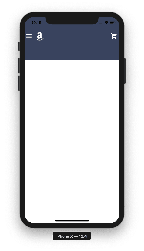
Hence, we get the menu icon to left and cart icon to the roght of the menu bar as shown in the emulation screenshot below:
Now, as the Icon library from native-base package provides lots of icons for us to use. We also require an Amazon logo icon which is not available in the native-base package. So, we are going to use the Amazon logo from the react-native-vector-icons package. For that, we need to install the react-native-vector-icons package by using the following code in our project command prompt:
npm install react-native-vector-icons
And, we also need to add the icon fonts to the Xcode. In order to set up the react-native-vector-icons, we also need to add Font manually to Xcode version 0.6+ as shown in the code snippet below:

Adding Amazon Logo Icon
Now, we need to import the react-native-vector-icons package into our Home.js screen file as shown in the code snippet below:
import FAIcon from 'react-native-vector-icons/FontAwesome'
Here, we import the FontAwesome icon package from the react-native-vector-icons package and assign it to FAIcon component.
Next, we need to add the Amazon logo icon to the Left component including the menu icon. We are going to add the FAIcon component to the right of the menu icon inside Left component with some inline styles as shown in the code snippet below:
<Left style={{flexDirection: 'row'}}>
  <Icon name="md-menu" style={{color: 'white', marginRight: 15}} />
  <FAIcon name="amazon" style={{fontSize: 32, color: 'white'}} />
</Left>
As a result, we get the Amazon logo icon to the right side of the menu icon in the menu bar as shown in the code snippet below:

Creating the Second Menu section
In this step, we are going to create the second menu section in the menu bar which will include a Category selection option and a search bar. For that, we need to enlarge the height of the menu bar by including a View component with some inline styles below the Header component inside the Container component. The code to include a View component is shown in the code snippet below:
<View
 style={{
   position: 'absolute',
   left: 0,
   right: 0,
   top: 110,
   height: 70,
   backgroundColor: '#3a455c',
   flexDirection: 'row',
   alignItems: 'center',
   paddingHorizontal: 5,
 }}></View>
As a result, we will get the enlarged menu bar section as shown in the emulator screenshot below:
Adding Category Option Button
Now, we are going to add the Category option button inside the View component. For that, we are going to use another View component wrapped by TouchableOpacity component in order to make it clickable. The View component inside the TouchableOpacity component will contain some inline styles to make it look like a proper button. And this View component will also contain the Text component for some button text as shown in the code snippet below:
<TouchableOpacity>
  <View
    style={{
      width: 100,
      backgroundColor: '#e7e7eb',
      height: 50,
      borderRadius: 4,
      padding: 10,
      marginLeft:10
    }}>
    <Text style={{fontSize: 12}}>Shop by</Text>
    <Text style={{fontWeight: 'bold'}}>Category</Text>
  </View>
</TouchableOpacity>
Hence, we will get the Category option button in the enlarged section of the menu bar as shown in the emulator screenshot below:

Adding Search bar
Now, we need to implement a search bar on the right side of the Category option button. For that, we need to define another View component below the TouchableOpacity component for the search bar. This View component will contain some inline styles to position the search bar alongside Category options. Then, the Item component with some inline styles for padding and color is enclosed inside the View component which in turn wraps the search icon and Input component. The search icon is placed using Icon component from the native-base package which will appear to the left side of the Input component with placeholder ‘search’. The overall coding implementation of the search bar is provided in the code snippet below:
<View
  style={{
    flex: 1,
    height: '100%',
    marginLeft: 5,
    justifyContent: 'center',
  }}>
  <Item
    style={{
      backgroundColor: 'white',
      paddingHorizontal: 10,
      borderRadius: 4,
    }}>
    <Icon name="search" style={{fontSize: 20, paddingTop: 5}} />
    <Input placeholder="Search" />
  </Item>
</View>
Hence, we get the following result in our emulator screen:

Now, we have successfully completed the implementation of a menu bar containing different icons, category selection option and search bar in our Amazon app UI clone project.
Implementing Content Section
In this step, we are going to add a small content section containing a greeting message for the user as well as a navigation link to the account screen. For that, we are going to make use of Content component provided by the native-base package. The Content component will contain some inline styles for color and position which wraps the View component containing some inline styles for position. The View component will wrap the Text component containing the greeting message for the use and another child View component as well. The innermost child View component has the flex style property wrapping Text component and Icon component for setting up the arrow icon. The overall coding implementation is provided in the code snippet below:
 <Content style={{backgroundColor: '#d5d5d6', marginTop: 70}}>
  <View
    style={{
      height: 50,
      backgroundColor: 'white',
      flexDirection: 'row',
      paddingHorizontal: 5,
      alignItems: 'center',
      justifyContent: 'space-between',
    }}>
    <Text>Hello, Kriss</Text>
    <View style={{flexDirection: 'row'}}>
      <Text>Your Account </Text>
      <Icon name="arrow-forward" style={{fontSize: 18}} />
    </View>
  </View>
</Content>
Hence, we will get the following result in our emulator screen:

Finally, we have successfully implemented the menu bar and a small content section in our Amazon app UI clone project using React Native.
Conclusion
This is the first part of our Amazon app UI clone tutorial series. In this part, we first learned how to set up the drawer navigator using the react-navigation and react-native-drawer packages. Then, we learned about different components provided by the native-base package and how to use them to implement the Menu bar section of the Amazon app. Moreover, we also got insight into different react-native style properties as well as components. Finally, by utilizing all the packages and components along with styles, we successfully implement the menu bar and a content section that has resemblance with the actual Amazon app.
The post Amazon UI Clone with React Native # 1: Setting up Menu bar appeared first on Kriss.
Disclosure
This post includes affiliate links; I may receive compensation if you purchase
products or services from different links provided in this article

Top comments (0)