This tutorial is the seventh part of our React Native Plant App tutorial series. In the previous part, we successfully implemented the Login Screen as well as configured the default custom header for each screen in the stack navigator. This tutorial is the continuation of the same tutorial from where we left off in the last part. So, it is recommended to go through the previous part in order to get insight and knowledge of the overall project.
In case of wanting to learn from the beginning, all the previous parts for this tutorial series are available below:
- [React Native Plant App UI #1: Getting Started](https://dev.to/absek/react-native-plant-app-ui-1-getting-started-516i-temp-slug-4395585)
- [React Native Plant App UI #2: Implementing Custom Components](https://dev.to/absek/react-native-plant-app-ui-2-implementing-custom-components-1j63-temp-slug-9774652)
- [Building React Native Plant App UI #3: Implementing Welcome Screen](https://kriss.io/react-native-plant-app-ui-3-implementing-welcome-screen/)
- [React Native Plant App UI #4: Illustration Slider and Animated Steps](https://kriss.io/react-native-plant-app-ui-4-illustration-slider-and-animated-steps/)
- [React Native Plant App UI #5: Terms of Service Modal](https://dev.to/absek/react-native-plant-app-ui-5-terms-of-service-modal-4g5m)
- [Building React Native Plant App UI #6: Login Screen](https://dev.to/absek/react-native-plant-app-ui-6-login-screen-405h)
As mentioned in the previous parts, the inspiration to work on this tutorial series came from React Native App Templates that provide a wide variety of mobile application templates written in React Native and powered by universal features and design. These app templates allow us to implement our own apps and even start our own startups. And, this seventh part is also the continuation of coding implementations and designs from the Youtube video tutorial by React UI Kitfor the Plant App. The video tutorial delivers the coding implementation of the overall app very thoroughly. However, there is no verbal guidance for coding and implementation. Hence, this tutorial series is the implementation of the same coding style and designs in the form of the article. Thus, the learners can go through each step and take their time understanding the implementations.
Overview
In this sixth part of this tutorial series, we are going to implement the Forgot Password Screen with different UI sections. The Forgot Password screen will be more or less similar to the Login Screen. There is not much change in anything. In fact, this screen is easier to implement as it will have only one input field and buttons. We will also implement the error handling as well as the loading state at the end.
So, let us begin!!
Adding Navigation to Forgot Password Screen
Here, we are going to add the navigation to Forgot Password Screen from our Login Screen. *But first, we need to uncomment the Forgot screen in index.js file of ‘./navigation/’ folder. * Now, we are going to add the navigation configuration in order to navigate to the Forgot Password Screen in our Login.js file:
<Button onPress={() => navigation.navigate('Forgot')}>
    <Text gray caption center style={{ textDecorationLine: 'underline' }}>
      Forgot your password?
    </Text>
  </Button>
Here, we have used the navigate function provided by navigation prop with ‘Forgot’ parameter.
Adding Simple React Native Template to Forgot.js file
Since our Forgot.js file is empty and cannot be recognized as a react native file, we need to add the react-native template to it. The simple template for the Forgot screen is provided in the code snippet below:
import React from 'react';
import { StyleSheet } from 'react-native';
import { Button, Block, Text } from '../components';
export default class Forgot extends React.Component {
  render(){
    return (
      <Block middle>
        <Text>Forgot Password Screen</Text>
      </Block>

    );
  }

}
const styles = StyleSheet.create({
});
Here, we have already imported some required components from our predefined custom components and created a simple template.
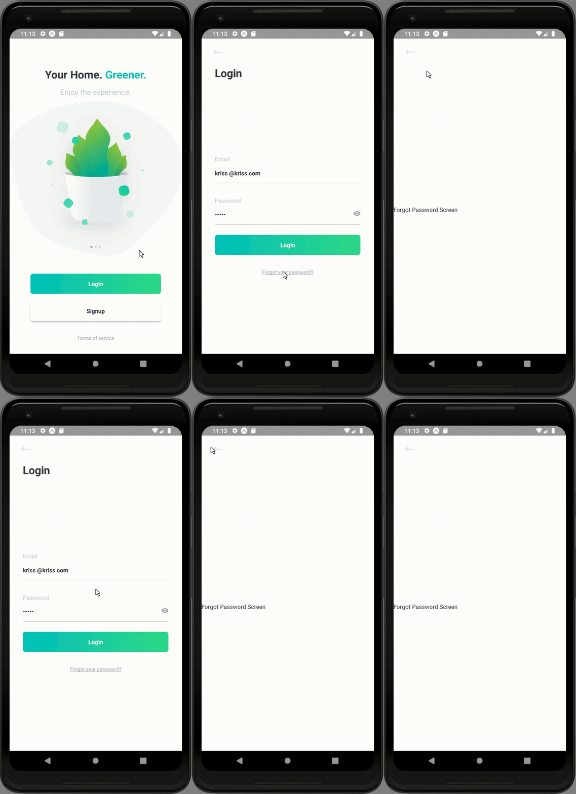
Hence, we will get the following result in our emulator screen:
As we can see, we have successfully configured the navigation to Forgot Password screen. And, there is the presence of custom default back button in our Forgot Password screen as well.
Implementing Forgot Password Screen
Here, we are going to implement the different UI sections of the Forgot Password Screen. This screen is more or less similar to Login Screen. So, we are going to copy some of the codes from our Login screen to Forgot Password Screen. First, we are going to import the necessary components as shown in the code snippet below:
import { Alert, ActivityIndicator, Keyboard, KeyboardAvoidingView, StyleSheet } from 'react-native';
import { Button, Block, Input, Text } from '../components';
import { theme } from '../constants';
Then, we are going to define the valid email as a constant as shown in the code snippet below:
const VALID\_EMAIL = "kriss@kriss.com";
Now, we are going to define and initialize the required state variables as shown in the code snippet below:
state = {
    email: VALID_EMAIL,
    errors: [],
    loading: false,
  }
Here, we have defined the email state set to valid email value, errors array and loading state as false.
Adding Header and Input Section
Here, we are going to add the header section as well as the input field. This screen will only contain one input field which is for entering the email. The style of the input field will be similar to that in the Login screen. Now, in order to implement these sections, we need to make use of the code from the following code snippet in the render() function of Forgot.js file:
render(){
    return (
        <KeyboardAvoidingView style={styles.forgot} behavior="padding">
        <Block padding={[0, theme.sizes.base * 2]}>
          <Text h1 bold>Forgot</Text>
          <Block middle>
            <Input
              label="Email"
              style={[styles.input]}
              defaultValue={this.state.email}
              onChangeText={text => this.setState({ email: text })}
            />
          </Block>
        </Block>
      </KeyboardAvoidingView>

    );
  }
Here, we have used the KeyboardAvoidingView as the parent component. This component helps to shift the content inside it shift above the keyboard when the actual keyboard is triggered in the app. Then, we have the Block component wrapping the Text component and another child Block component. The child Block component wraps the Input component for our email entry. The Input component has some props from the label and defaultValue. We receive the value of email by changing the email state value in the onChangeText event.
There are some styles configured to the components as well which is provided in the code snippet below:
forgot: {
   flex: 1,
   justifyContent: 'center',
 },
 input: {
   borderRadius: 0,
   borderWidth: 0,
   borderBottomColor: theme.colors.gray2,
   borderBottomWidth: StyleSheet.hairlineWidth,
 },
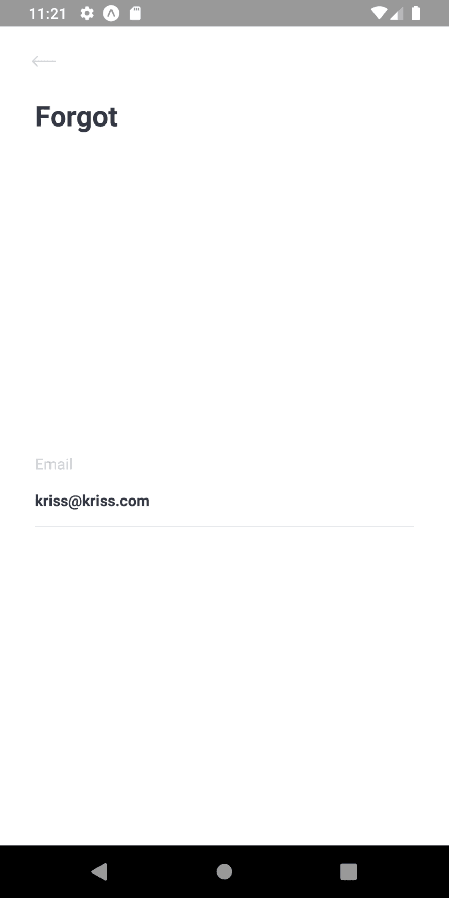
Hence, we will get the following result in our emulator screen:
As we can see, we have got the Header as well as the input field with a valid email in our Forgot password screen.
Adding Buttons
In this step, we are going to add buttons to the Forgot Password screen. We are going to add two buttons. One is the Forgot button and another is navigation back to the Login Screen button. This button will be placed below the input fields. In order to add buttons, we need to use the code from the following code snippet:
<Block middle>
     <Input
       label="Email"
       style={[styles.input]}
       defaultValue={this.state.email}
       onChangeText={text => this.setState({ email: text })}
     />
     <Button gradient onPress={() => this.handleForgot()}>
       {loading ?
         <ActivityIndicator size="small" color="white" /> :
         <Text bold white center>Forgot</Text>
       }
     </Button>
     <Button onPress={() => navigation.navigate('Login')}>
       <Text gray caption center style={{ textDecorationLine: 'underline' }}>
         Back to Login
       </Text>
     </Button>
   </Block>
Here, we have used the Button component. The Button component with some style props wraps the Text component in order to display text inside the button. The Back to Login button has the navigation configured to its onPress event.
Hence, we will get the following result in our emulator screen:
As we can see, we have the required buttons in the Forgot Password screen. Taping on the Back to Login button enables us to navigate back to the Login screen.
Configuring the Login button
As we might have seen that, we have called the handleForgot() function in the onPress event of the Forgot button. But, we still have not defined any sort of function named handleForgot(). Here, we are going to defined and configure the handleForgot() function. Now, in the handleLogin() function, we need to configure the valid email and invalid email with errors. We are also going to configure the loading state by changing the states of the loading state before and after the successful sending of an email. For that, we need to use the code from the following code snippet:
handleForgot() {
    const { navigation } = this.props;
    const { email } = this.state;
    const errors = [];
    Keyboard.dismiss();
    this.setState({ loading: true });
    // check with backend API or with some static data
    if (email !== VALID_EMAIL) {
      errors.push('email');
    }
    this.setState({ errors, loading: false });
    if (!errors.length) {
      Alert.alert(
        'Password sent!',
        'Please check you email.',
        [
          {
            text: 'OK', onPress: () => {
              navigation.navigate('Login')
            }
          }
        ],
        { cancelable: false }
      )
    } else {
      Alert.alert(
        'Error',
        'Please check you Email address.',
        [
          { text: 'Try again', }
        ],
        { cancelable: false }
      )
    }
  }
Here, we have also used the dismiss() function of the Keyboard component in order to hide the keyboard when we press the Forgot button. Then, on the basis of the length of the email, we have shown the respective alerts.
Handling errors
Now, we need to show some sort of message or style change when the wrong email is entered. First, we need to import the state variables in the render() function as shown in the code snippet below:
render(){
    const { navigation } = this.props;
    const { loading, errors } = this.state;
    const hasErrors = key => errors.includes(key) ? styles.hasErrors : null;
Here, we have imported the loading and errors states. Then, we have defined a new function called hasErrors() and it returns the value depending on the key value of the errors state array. Now, we are going to change the style of the input field in order to show the error. For that, we need to use code from the following code snippet:
<Input
    label="Email"
    error={hasErrors('email')}
    style={[styles.input, hasErrors('email')]}
    defaultValue={this.state.email}
    onChangeText={text => this.setState({ email: text })}
  />
Here, we have added the error prop to the Input the component which calls the hasError() function with specific parameters Then, we have also added the error style which is provided in the code snippet below:
hasErrors: {
    borderBottomColor: theme.colors.accent,
  }
Hence, we will get the following result in the emulator screen:
As we can see, when the email address is valid the success alert is shown on the screen. And when we tap the ‘OK’ button on the alert message, we are navigated back to the Login screen.
Now, we need to test the Forgot Password with invalid email which is shown in the emulator simulation below:
As we can see, if we enter the invalid email, we get the error message alert.
We can set the setTimeout function in order to display the loading state just as in the Login screen. In the real scenario, when we are requesting some data from the server, it will automatically show up. With this, we have come to the end of this part of the tutorial.
Finally, we have successfully completed the implementation of the Forgot Password Screen in our React Native Plant UI App.
Conclusion
This tutorial is the seventh part of the React Native Plant App UI tutorial series. In this part, we continued from where we left off in the sixth part of this tutorial series. In this part of the tutorial, we got stepwise guidance on how to use different custom components to implement the overall UI of the Forgot Password screen. This Screen implementation is similar to that of the Login Screen from our previous tutorial part. Lastly, we also learned how to handle the errors and show success and error alert messages.
In the next part of this tutorial series, we are going to implement the overall UI of the SignUp screen in the Signup.js file.
The post React Native Plant App UI #7 : Forgot Password Screen appeared first on Kriss.
Disclosure
This post includes affiliate links; I may receive compensation if you purchase
products or services from different links provided in this article.


Top comments (0)