Hello :)
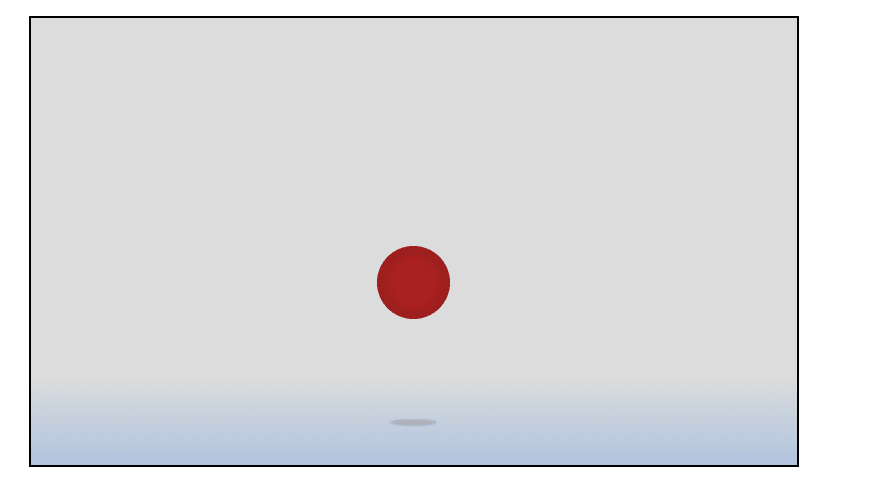
With HTML and CSS you can do lots of fun stuff without the need of JavaScript. Using CSS Animations, we can for example create a bouncing ball. This tutorial walks you through the steps to create a bouncing ball animation without JavaScript that will look like this:
Lets start with the tutorial.
HTML code
To begin with, we need to set up our HTML. We need a div that acts as the containing box for our animation. Inside this div, we need two other divs. One for the ball and one for the shadow the ball throws when coming near the floor. Our HTMl now looks like this:
<div class="animation-container">
        <!-- Ball -->
        <div class="ball">
        </div>
        <!-- Shadow -->
        <div class="shadow"></div>
    </div>
CSS
Moving on to the more important stuff, we now start writing some CSS. To start with, I define a CSS variable in the :root Selector for our ball size. The ball should be smaller on small devices and grow when we are on a device with a large screen.
:root {
            --height: clamp(25px, 5vw, 100px);
        }
Next up, we take care of the animation container. We select our container and make sure it has position: relative so we can absolutely position the ball and shadow later on. Another important property we have to think of here is the z-index. This is important because the ball should of course always be a layer above our container. I also decided to add a Pseudoelement to the container with a linear gradient to act as a floor the ball will bounce on. The CSS for the container div now looks like this:
 div.animation-container {
            position: relative;
            max-width: 50vw;
            margin: 0 auto;
            height: 50vh;
            background-color: gainsboro;
            padding: 1em;
            z-index: 0;
            border: 2px solid black;
        }

 div.animation-container::after {
            content: "";
            position: absolute;
            width: 100%;
            background-color: rgba(0, 0, 0, 0.1);
            background: linear-gradient(transparent, lightsteelblue);
            height: 20%;
            bottom: 0;
            left: 0;
            z-index: 1;
        }
Now we can tackle the ball. FIrst of all, we give the div a background-color of firebrick and a position value of absolute. The size of the ball is controlled by the CSS variable defined in the root. We position the ball in the middle of our container by adding the left and right properties. We use border-radius: 100% to make the div round and box-shadow inset 0 0 25px rgba(0, 0, 0, 0.25) for an inset shadow that creates a little 3D effect. The ball gets a z-index of 3 so it is always on top of everything else in the container.
    div.ball {
            background-color: firebrick;
            border-radius: 100%;
            height: var(--height);
            width: var(--height);
            left: calc(50% - (var(--height)/2));
            right: calc(50% - (var(--height)/2));
            position: absolute;
            box-shadow: inset 0 0 25px rgba(0, 0, 0, 0.25);
            top: 10%;
            z-index: 3;
 }
Next, we style the shadow div. Therefore, we give the div a position value of absolute and a blur-Filter (filter: blur(2px)). The shadow width is equal to the width of the ball div, but the height should be less than the height of the ball. For the background-color we use RGBA to make the shadow transparent background-color: rgba(0, 0, 0, 0.5);. The z-index value of 2 makes sure, the shadow is above the floor but not above the ball.
 div.shadow {
            border-radius: 100%;
            left: calc(50% - (var(--height)/2));
            right: calc(50% - (var(--height)/2));
            position: absolute;
            top: calc(90% - 2px);
            background-color: rgba(0, 0, 0, 0.5);
            filter: blur(2px);
            width: var(--height);
            height: 8px;
}
Now we have a ball and a shadow, but nothing is moving yet. To fix that, we now create the CSS animations. For the ball we add some keyframes to start at top: 10% and move down to the floor. When the ball hits the floor, we smoosh the ball a little bit. The keyframes animation looks like this:
      @keyframes bounce {
            0% {
                top: 10%;
            }

            90% {
                transform: scaleX(100%) scaleY(100%);
            }

            100% {
                transform: scaleX(110%) scaleY(90%);
                top: calc(90% - var(--height));
            }
        }
The ball div now gets some more styles for the animation to work.
        /* Bouncing animation */
        animation: bounce 2s ease-in-out infinite;
        animation-fill-mode: both;
        animation-direction: alternate;
The CSS animation for the shadow is mostly the same, but this time we also change the opacity value for the shadow to disappear when the ball is far away from the floor.
   @keyframes shadow {
            from {
                opacity: 0;
                transform: scale(0);
            }

            to {
                opacity: 0.6;
                transform: scale(100%);
            }
        }
The shadow div also gets some properties to control the animation:
        transform-origin: center;
        animation: shadow 2s ease-in-out infinite;
        animation-fill-mode: both;
        animation-direction: alternate;
Conclusion
That's it, we have coded everything we need to let the ball bounce off the floor in our animation container div. I hope you foiund this tutorial helpful. If you have any ideas how to improve the code, feel free to comment.
The source code for this tutorial is on codepen: https://codepen.io/bernhard759/pen/gOjoddJ
Update
I plan to make a second tutorial on how to use JavaScript to grab and drag the ball around and then let it bounce again when releasing it. Stay tuned :)

Top comments (0)