
One of the most used components in React is undoubtedly modals because they can be used in different contexts, from messages to user input.
Like many other components in React, a dependency can be installed that helps in this process, however we always end up being limited in several ways and one of them is styling.
For this reason I had the idea to create in this article, we are going to use the knowledge we already know, from css, props and hooks.
Let's code
Today the only thing we are going to install is an icon library to make it easier to use (however the same works if you use webfonts):
npm install react-icons
Now we can immediately start working on our Modal.jsx. But first let's talk about CSS.
One of the classes we're going to have is called .darkBG that's because once the modal is open I'll add a background color to slightly hide all the other components that are on the page. This is to focus the user's attention only on the modal.
Then our component will be divided into three areas, the first one will be the header, where you can put the modal title. The second part will be the content, here you can put the message you want.
The third and last part will be the actions that can be performed in the modal, that is, cancel the modal in order to close it and another action (save, update, delete, etc).
Now that we have a few notions in mind, you can copy this same css (you can play freely with it to customize your modal):
/* @src/components/Modal.module.css */

.darkBG {
  background-color: rgba(0, 0, 0, 0.2);
  width: 100vw;
  height: 100vh;
  z-index: 0;
  top: 50%;
  left: 50%;
  transform: translate(-50%, -50%);
  position: absolute;
}

.centered {
  position: fixed;
  top: 50%;
  left: 50%;
  transform: translate(-50%, -50%);
}

.modal {
  width: 250px;
  height: 170px;
  background: white;
  color: white;
  z-index: 10;
  border-radius: 16px;
  box-shadow: 0 5px 20px 0 rgba(0, 0, 0, 0.04);
}

.modalHeader {
  height: 50px;
  background: white;
  overflow: hidden;
  border-top-left-radius: 16px;
  border-top-right-radius: 16px;
}

.heading {
  margin: 0;
  padding: 10px;
  color: #2c3e50;
  font-weight: 500;
  font-size: 18px;
  text-align: center;
}

.modalContent {
  padding: 10px;
  font-size: 14px;
  color: #2c3e50;
  text-align: center;
}

.modalActions {
  position: absolute;
  bottom: 2px;
  margin-bottom: 10px;
  width: 100%;
}

.actionsContainer {
  display: flex;
  justify-content: space-around;
  align-items: center;
}

.closeBtn {
  cursor: pointer;
  font-weight: 500;
  padding: 4px 8px;
  border-radius: 8px;
  border: none;
  font-size: 18px;
  color: #2c3e50;
  background: white;
  transition: all 0.25s ease;
  box-shadow: 0 5px 20px 0 rgba(0, 0, 0, 0.06);
  position: absolute;
  right: 0;
  top: 0;
  align-self: flex-end;
  margin-top: -7px;
  margin-right: -7px;
}

.closeBtn:hover {
  box-shadow: 0 5px 20px 0 rgba(0, 0, 0, 0.04);
  transform: translate(-4px, 4px);
}

.deleteBtn {
  margin-top: 10px;
  cursor: pointer;
  font-weight: 500;
  padding: 11px 28px;
  border-radius: 12px;
  font-size: 0.8rem;
  border: none;
  color: #fff;
  background: #ff3e4e;
  transition: all 0.25s ease;
}

.deleteBtn:hover {
  box-shadow: 0 10px 20px -10px rgba(255, 62, 78, 0.6);
  transform: translateY(-5px);
  background: #ff3e4e;
}

.cancelBtn {
  margin-top: 10px;
  cursor: pointer;
  font-weight: 500;
  padding: 11px 28px;
  border-radius: 12px;
  font-size: 0.8rem;
  border: none;
  color: #2c3e50;
  background: #fcfcfc;
  transition: all 0.25s ease;
}

.cancelBtn:hover {
  box-shadow: none;
  transform: none;
  background: whitesmoke;
}
As you can see, the css classes are all very simple, now we can start working on our Modal.jsx.
// @src/components/Modal.jsx

import React from "react";

const Modal = () => {
  return <h1>Hello Modal</h1>;
};

export default Modal;
One of the first things we're going to add is our styles and in this article we're going to use css modules.
// @src/components/Modal.jsx

import React from "react";
import styles from "./Modal.module.css";

const Modal = () => {
  return <h1>Hello Modal</h1>;
};

export default Modal;
In our modal we will have to have a close button and for that we will need an icons, this way we will import the icon that will be used:
// @src/components/Modal.jsx

import React from "react";
import styles from "./Modal.module.css";
import { RiCloseLine } from "react-icons/ri";

const Modal = () => {
  return <h1>Hello Modal</h1>;
};

export default Modal;
One thing I want you to keep in mind is that we're going to have to receive props so we can close the modal as soon as it's open. So we will receive a single props which will be a function called setIsOpen().
// @src/components/Modal.jsx

import React from "react";
import styles from "./Modal.module.css";
import { RiCloseLine } from "react-icons/ri";

const Modal = ({ setIsOpen }) => {
  return <h1>Hello Modal</h1>;
};

export default Modal;
With all that done we can start working on our template. First we'll add our dark background to give the modal more emphasis when it's open.
As soon as the user clicks on the dark background, we'll want to close the modal, so we'll add the onClick react event and pass a boolean as the only argument of the setIsOpen() function (which in this case will be false).
// @src/components/Modal.jsx

import React from "react";
import styles from "./Modal.module.css";
import { RiCloseLine } from "react-icons/ri";

const Modal = ({ setIsOpen }) => {
  return (
    <>
      <div className={styles.darkBG} onClick={() => setIsOpen(false)} />
      // ...
    </>
  );
};

export default Modal;
Now we're going to work on our modal, so we're going to add the wrapper to center the modal on the screen (.centered), as well as the body of our modal (.modal) and its header (.modalHeader).
// @src/components/Modal.jsx

import React from "react";
import styles from "./Modal.module.css";
import { RiCloseLine } from "react-icons/ri";

const Modal = ({ setIsOpen }) => {
  return (
    <>
      <div className={styles.darkBG} onClick={() => setIsOpen(false)} />
      <div className={styles.centered}>
        <div className={styles.modal}>
          <div className={styles.modalHeader}>
            <h5 className={styles.heading}>Dialog</h5>
          </div>
          // ...
        </div>
      </div>
    </>
  );
};

export default Modal;
Now we can add the button that will contain the icon to close the modal, which will contain an onClick event as well as pass the setIsOpen() function as false so that we can close the modal as soon as this button is clicked.
// @src/components/Modal.jsx

import React from "react";
import styles from "./Modal.module.css";
import { RiCloseLine } from "react-icons/ri";

const Modal = ({ setIsOpen }) => {
  return (
    <>
      <div className={styles.darkBG} onClick={() => setIsOpen(false)} />
      <div className={styles.centered}>
        <div className={styles.modal}>
          <div className={styles.modalHeader}>
            <h5 className={styles.heading}>Dialog</h5>
          </div>
          <button className={styles.closeBtn} onClick={() => setIsOpen(false)}>
            <RiCloseLine style={{ marginBottom: "-3px" }} />
          </button>
          // ...
        </div>
      </div>
    </>
  );
};

export default Modal;
Now we can add the content of our modal (.modalContent) and add a message.
// @src/components/Modal.jsx

import React from "react";
import styles from "./Modal.module.css";
import { RiCloseLine } from "react-icons/ri";

const Modal = ({ setIsOpen }) => {
  return (
    <>
      <div className={styles.darkBG} onClick={() => setIsOpen(false)} />
      <div className={styles.centered}>
        <div className={styles.modal}>
          <div className={styles.modalHeader}>
            <h5 className={styles.heading}>Dialog</h5>
          </div>
          <button className={styles.closeBtn} onClick={() => setIsOpen(false)}>
            <RiCloseLine style={{ marginBottom: "-3px" }} />
          </button>
          <div className={styles.modalContent}>
            Are you sure you want to delete the item?
          </div>
          // ...
        </div>
      </div>
    </>
  );
};

export default Modal;
We can already start working on our actions. This way, we will add the wrapper styles and its buttons.
// @src/components/Modal.jsx

import React from "react";
import styles from "./Modal.module.css";
import { RiCloseLine } from "react-icons/ri";

const Modal = ({ setIsOpen }) => {
  return (
    <>
      <div className={styles.darkBG} onClick={() => setIsOpen(false)} />
      <div className={styles.centered}>
        <div className={styles.modal}>
          <div className={styles.modalHeader}>
            <h5 className={styles.heading}>Dialog</h5>
          </div>
          <button className={styles.closeBtn} onClick={() => setIsOpen(false)}>
            <RiCloseLine style={{ marginBottom: "-3px" }} />
          </button>
          <div className={styles.modalContent}>
            Are you sure you want to delete the item?
          </div>
          <div className={styles.modalActions}>
            <div className={styles.actionsContainer}>
              <button className={styles.deleteBtn} onClick={() => setIsOpen(false)}>
                Delete
              </button>
              <button
                className={styles.cancelBtn}
                onClick={() => setIsOpen(false)}
              >
                Cancel
              </button>
            </div>
          </div>
        </div>
      </div>
    </>
  );
};

export default Modal;
Now with our modal component finished just add it to our App.jsx but first let's create the following styles to have a more handy button on our page:
/* @src/App.module.css */

.primaryBtn {
  margin: 20px 10px;
  cursor: pointer;
  font-weight: 500;
  padding: 13px 25px;
  border-radius: 15px;
  font-size: 0.8rem;
  border: none;
  color: white;
  background: #185adb;
  transition: all 0.25s ease;
}

.primaryBtn:hover {
  transform: translateY(-5px);
  box-shadow: 0 10px 20px -10px rgba(24, 90, 219, 0.6);
}
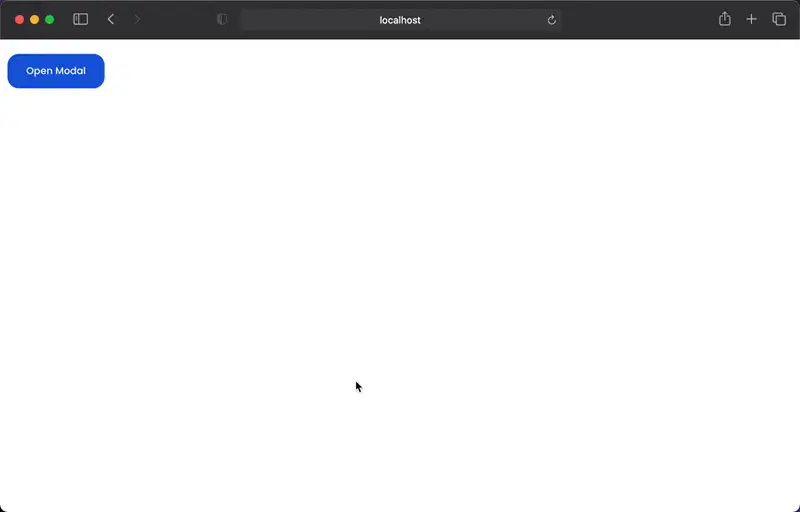
Now we can start working on our App.jsx. First we're going to import the useState() and we're going to create a state called isOpen and the setIsOpen function.
// @src/App.jsx

import React, { useState } from "react";
import styles from "./App.module.css";

const App = () => {
  const [isOpen, setIsOpen] = useState(false);
  return (
    <main>
      <button className={styles.primaryBtn} onClick={() => setIsOpen(true)}>
        Open Modal
      </button>
      // ...
    </main>
  );
};

export default App;
Then we just do conditional rendering to show the modal only when the isOpen state is true. In the same way we will pass the setIsOpen() function as a prop.
// @src/App.jsx

import React, { useState } from "react";
import styles from "./App.module.css";

import Modal from "./components/Modal";

const App = () => {
  const [isOpen, setIsOpen] = useState(false);
  return (
    <main>
      <button className={styles.primaryBtn} onClick={() => setIsOpen(true)}>
        Open Modal
      </button>
      {isOpen && <Modal setIsOpen={setIsOpen} />}
    </main>
  );
};

export default App;
You should get a result similar to this:
Conclusion
As always, I hope you found it interesting. If you noticed any errors in this article, please mention them in the comments. 🤩
Hope you have a great day! 🪗 🙌

Top comments (19)
Thanks for this tut it was supper useful.
One thing I noticed, at least on my setup, the .darkBG style leaves 1px line not darkened on the top and left side of the browser client area. This is dependent on the size of the window as resizing can make it go away.
I simplified the .darkBG style and this went away for me:
hope this helps
You should consider portals (reactjs.org/docs/portals.html) for modal as it scopes it out of usual DOM structure including its events.
I considered using it, but since I don't have other elements that use z-index like notifications and toasts, I decided to take a simpler approach. But if I had one of the ones mentioned before, I wouldn't hesitate to use Portals. 😎
Thanks for the comment, it is quite relevant. 🙌
can you tell me if the above solution works which I also did in my practice setup, why would we go for portals instead?
If you increase the padding a little bit and decrease the
border-radiuson the modal and buttons (about 6-7px) it will look even more sleek. Considering it being a React tutorial, mainly, you actually went ahead to discuss the styling; it won't hurt to beautify it a little bit more 😉Thanks for the tip and feedback! 👊
I'm puzzled by the nameless tag <>....</> introduced in step 7
I'm just starting React so it could be some special React syntax I've not learned about yet. It's not something I've ever encountered in HTML.
Can someone explain that one please.
Dear John, the <>...</> tag is a 'reference' tag. React needs a binding start and close tag so if you want to push < img src={background.image} alt='alternative info'. / > in a return this would cause an error. To overcome this an empty set of tags is used.
I hope this explains the tag.
kind regards,
David Verhage
The term you're looking for is Fragment
reactjs.org/docs/fragments.html
I like the design of your modal. Looks very modern but simple.
Thanks so much for the feedback! 🙏 It's the small details that make the difference 💪
I also noticed that design is about the details like spacing, font, composition...
That was just not so obvious for me before because I have been more of a backend developer.
Did great job, man 👌Thanks a lot.
Glad to know! 😊 Thanks!
I thought we have to npm install react-modal. That wasn't mentioned here.
Thanks for this useful article.
when I click toggle it makes re rendering its parent. Is it okay ?
I am worried about all the rerendering that is going to happen in the parent component
You are storing the open/close modal state up in the parent, if you update it, the whole parent re-renders
what could be a solution to avoid this setup?