Hello everyone👋 I'm Gaurav Gupta. In this blog post, I'll be sharing the latest high-fidelity model of our desktop application (if you want to haven't checked out what our product is about, you can check this).
Since the previous blog post, from the valuable insights offered by others and our colleagues, we made a few changes in the UI of the application and finished a high-fidelity prototype of the application.
Color Palette

We have used the above color palette to stylize our application consisting of different shades of blue.
Dashboard

If you compare the above image with the low-fidelity design of our application, you'll notice that we have removed the 'Bookmarks' and 'Personal Notes' sections from the sidebar. We decided to move those tabs under the 'Profile' section on the top right. They will be available as a sub-section under it rather than as separate sections in the Navbar. This allows us to reduce the clutter on the navigation panel on the left and show the most important sections of our application to the users.
The top banner in the dashboard shows newly added or the trending notes/lecture among the user base in one of the user's subjects of interest. We also decided to remove the classrooms previews to minimize the content available on the dashboard.
Explore
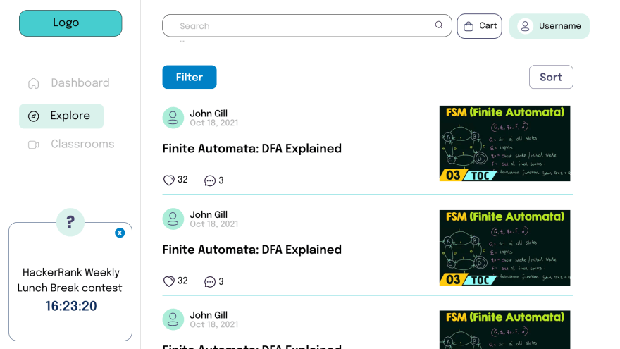
Each 'Note Card' shows the thumbnail of the video provided, the video/notes title, the number of likes given by the users on the note, and the comments given by the users. We plan to add the bookmark button, and the ' Add to Cart ' button when the Note Card is opened (the design for this section will be shared at a later date).
Classrooms
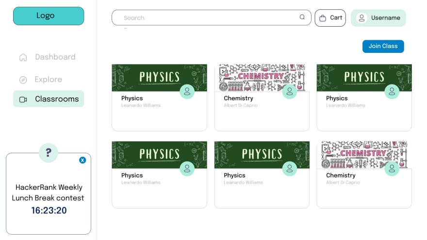
Each classroom will have a banner that the admin of the classroom can choose, the profile picture of the admin of that classroom, the name of the classroom, and the admin name.
We decided to move the tags of each classroom inside the classroom settings which would be available to the admin of the respective classroom.
Classroom Info - Stream

According to the inputs provided by my colleagues, we decided to change the 'Stream' tab of the classroom. We concluded on a discord-style stream which made the classroom more of a discussion forum but decided on the removal of channels feature which made the screen too cluttered.
Classroom Info - Notes

We kept the google classroom-style 'Notes' tab where all the notes from the entire classroom would be available.
Bookmarks

Like in the previous iteration, we are using the same bookmarks page. It offers a 'Recent' section for the learner to jump right in the notes they were studying earlier. The 'Bookmarks' section contains all the bookmarked notes which are provided by us. Bookmarks tab consists of a separate 'Classroom Bookmarks' section, which solely consists of the bookmarks of the user from classrooms (since these are not made by us but fellow learners, this helps the user to avoid confusion between which notes are provided by us and which are provided by other learners).
Personal Notes
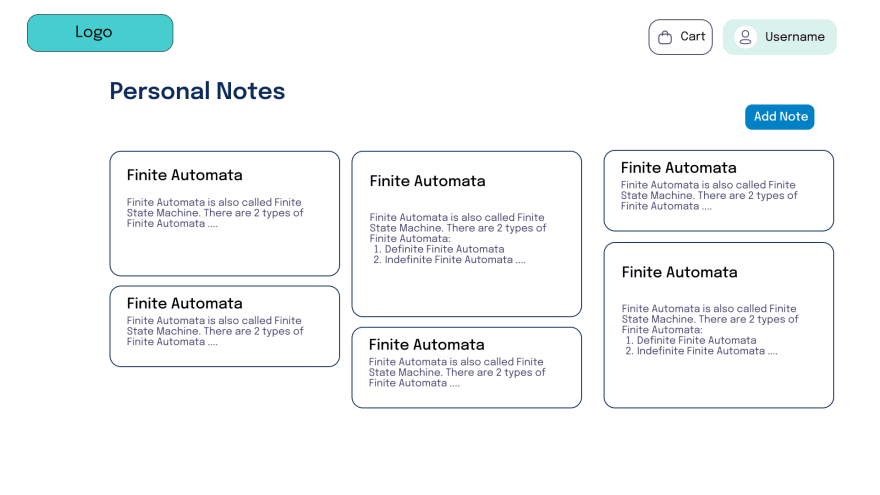
The 'Personal Notes' section consists of notes made by the user for their use. These notes can be shared with others in classrooms. We decided to make it 'Google Keep' style like mentioned earlier allowing different lengths of note previews depending on their content size.
Conclusion
The design is made by complete beginners so all suggestions regarding any changes to be made are greatly appreciated. So, do give us your inputs on how you feel about the design as it encourages us to keep moving forward with the project and keep improving.
❗ Note: All the sub-menus like the settings page, and Notes Info page, and sub-menu designs will be shared at a later date as we are still working on their designs.
Connect with me on: HashNode and LinkedIn

Top comments (0)