
From one project to another, I see the need to create my own set of shared UI components. For the first time, common public UI frameworks and libraries work well. But none of these projects work for me in the long run because it is always not enough flexibility. Sooner or later, you will face a situation when business requirements do not match available component props. You will create the wrapper with basically broke logic of the original one component and overwrite a bunch of styles. That is why better to put effort into improving knowledge in creating components from scratch. In my experience, 99% chances that you will hit that road.
Without dispute about correctness, this is my recipe for on shared components:
- React, because that how I wired up.
- Typescript because it provides better instrument then PropTypes for controlling props. And the code becomes self-documented. Even though typescript !== documentation tool, it is better than nothing
- Styled-components because it provides fully isolated components. Isolated on javascript and style levels. Even though some global styles are still been in use.
Setup platform for UI playground without going to details:
- Create-react-app with typescript configuration.
- Install the styled-component and add theme provider.
- Install normalize.css, add fonts.
Let's create a simple, straightforward react button:
export type ButtonComponentProps = {
  children?: HTMLCollection | string,
  onClick: (e?: React.MouseEvent) => void
} & React.ButtonHTMLAttributes<HTMLButtonElement>;

const ButtonComponent = ({ onClick, children, ...otherProps }: ButtonComponentProps) => {
  return (
    <Button onClick={onClick} {...otherProps}>{children}</Button>
  );
}

export default ButtonComponent;
Add some styles:
const Button = styled.button<ButtonComponentProps>`
  padding: 5px 12px;
  color: white;
  font-size: 14px;
  font-weight: 700;
  background-color: ${({ theme }) => theme.color1};
  border: 0px;
  border-radius: 3px;
  appearance: none;
  cursor: pointer;
`;
Use the main page for a demonstration. Add state for a click's visual response. Just to make sure that it works:
function App() {
  const [simpleButtonState, toggleSimpleButtonState] = useState(false);
  const handleSimpleButtonClick = () => toggleSimpleButtonState(!simpleButtonState)

  return (
    <ThemeProvider theme={theme}>
      <Main>
        <h1>Buttons</h1>
        <Box>
          <p>Button based on button tag with custom focus behavior:</p>
          <Button onClick={handleSimpleButtonClick}>Click me!</Button>
          {simpleButtonState && <Event>clicked</Event>}
        </Box>
      </Main>
    </ThemeProvider>
  );
}

export default App;
That is it. Or not?
What is about input and div button?
Short answer, you should avoid them as much as possible. Both have other semantic meaning. And if you don't care about semantic, there could be accessibility disadvantages. For example, inputs should be provided with additional attributes:
<input type="button" value="Click me!" />
And for the div button, you should manually control keyboard events, such as press Enter or Space keys:
<div tabindex="0" role="button" aria-pressed="false">Click me!</div>
More information you can find here.
What about outline:none? Will it provide poor accessibility?
Yes, it is a pity to confirm, but even so many years past, we still have this problem. There is no automatic way to split click and keyboard focusing events. There is no existing native problem solution yet. What we can do:
- Leave outline. Actually, it not so bad. If you have rectangular buttons without rounded corners, it can work for you well. Just change color to be appropriate for our buttons and find peace with it.
- Disable outline and implement your focus styling. It is how most of the sites do right now. The problem is that it has an absolutely different behavior. There are millions of sites, and you must figure out is button focused or not each time you visit a new one. So, if you decided to create our own focus styling, please make it recognizable. Use a contrast ratio of 3:1 with surrounding text and providing additional visual cues on focus buttons where color alone is used to identify them. More information here.
- Use
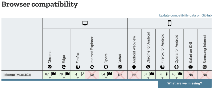
:focus-visible. There is an existing solution on the horizon. This pseudo-class selector fires when the user focuses on button using a keyboard. And that means that you can disable outline in default:focusselector and enable it in the:focus-visibleselector. Better without changing, just well known blue borders. But… it hasn't work yet. This is an experimental feature.
The solution is focus-visible polyfill. This prototype adds a focus-visible class to the focused element, in the situation where :focus-visible pseudo-class selector should match. Or [data-focus-visible-added] attribute with is better for me. The main plus of this approach is that we leave native outline behavior as-is for keyboard events and hide it for clicks — a win-win situation.
Add polyfill import:
import 'focus-visible/dist/focus-visible';
Add global styling:
const Main = styled.div`
  ...
  *:focus:not([data-focus-visible-added]) {
    outline: none;
  }
  ...
`;
When the happy bright future will come, then I remove this polyfill and all :focus-visible work natively. And we should be prepared for that. I will do that when Chrome, Firefox, and Safari provide support. Even though, after dropping polyfill, we still want some backward compatibility. You know, IE, Edge, and many other browsers. They let's say... exist. More about that backward compatibility here.
const Button = styled.button<ButtonComponentProps>`
  ...
  /*
  Remove default focus styles for mouse users ONLY if
  :focus-visible is supported on this platform.
  */
  :focus:not(:focus-visible) {
    outline: none;
  }
`;
You can find all source code on my GitHub repo.

Top comments (0)