
Introduction
Authentication and File Storage are common features that developers think about while working on a project. Cloudinary is a service that makes media management easy to integrate for web and mobile developers. Auth0 provides authentication and authorization services that are built into applications.
In this tutorial, we are going to build a real-world application that integrates with Auth0 and Cloudinary.
What We'll Be Building
One of the major reasons for creating content on the internet is to share it with others which often would be via social media. When sharing that URL link depending on the site shared it would most likely use rich previews to show more information about the site in a card view. The Open Graph Protocol was developed to standardize the display of link previews and other metadata within a webpage. You can read more about it in Colby's article here.
In this tutorial, we will build a Site Previewer App that displays link previews for social media sites and displays the page metadata.
You can find the Source Code of the project on Github and Live Environment Setup on CodeSandbox
Prerequisites
- Basic understanding of Javascript
- Basic knowledge of React and React Hooks
- The Latest version of Nodejs installed on your machine
- the Latest version of React
- A Cloudinary account. Creating an Account is free
- An Auth0 Account. Creating an Account is free
Set up the Project
We will be using TailwindCSS as our CSS Framework. Setup a New Create React App Project with TailwindCSS using this guide from the official Tailwind Docs.
Once you've completed setting up Tailwind from the guide above. Replace your
App.jscode to below to test your setup.
    //App.js
    function App() {
      return (
        <div>
          <h1 className="text-9xl font-bold text-yellow-400">Hello World!</h1>
        </div>
      );
    }

    export default App;
You should be getting this screen once you load http://localhost:3000.

- Install
@tailwindcss/formslibrary and add it to your tailwind.config.js file onto your plugins array. This will be helpful in styling form elements through TailwindCSS.
npm install @tailwindcss/forms
    //tailwind.config.js
    module.exports = {
     ...
      plugins: [require('@tailwindcss/forms')],
    };
Step 2. Setup Authentication with Auth0 and Views
- Sign Up/Login to Auth0. You can sign up here. Once Logged in, create an Application then navigate on Auth0 to your application section then copy your
DomainandClient IDinformation.

- In your project create an .env.local file with the following values. Insert your Copied Client ID & Domain in this file.
    # YOUR_AUTH_DOMAIN is e.g yourauthdomain.eu.auth0.com
    REACT_APP_AUTH_CLIENT_ID=YOUR_CLIENT_ID
    REACT_APP_AUTH_DOMAIN=YOUR_AUTH_DOMAIN
- Install the
@auth0/auth0-reactnpm package from Auth0 for React.
npm install @auth0/auth0-react
- In order to manage Authentication State within the Application the Auth0 React SDK uses React Context. We can configure the
Auth0ProviderComponent from the root component inindex.js.
    //index.js

    import { Auth0Provider } from "@auth0/auth0-react";

    ....
    ReactDOM.render(
      <Auth0Provider
        domain={process.env.REACT_APP_AUTH_DOMAIN}
        clientId={process.env.REACT_APP_AUTH_CLIENT_ID}
        redirectUri={window.location.origin}
      >
        <App />
      </Auth0Provider>,
      document.getElementById("root")
    );
The redirectUri is set to redirect to window.location.origin
- Update your
App.jsto have a basic authentication setup.
    //App.js
    import { useAuth0 } from '@auth0/auth0-react';
    import './App.css';

    function App() {
      const { loginWithRedirect, logout, isAuthenticated } = useAuth0();

      if (isAuthenticated) {
        return (
          <div>
            <h1 className="text-9xl font-bold text-yellow-400">Logged In !</h1>
            <button onClick={() => logout()}>Log Out</button>
          </div>
        );
      } else {
        return (
          <div>
            <h1 className="text-9xl font-bold text-yellow-400">Hello World!</h1>
            <button onClick={() => loginWithRedirect()}>Log In</button>
          </div>
        );
      }
    }

    export default App;
We can see we are able to pull Authentication State and Login/Logout actions from the useAuth0 hook. We use isAuthenticated to switch between showing Content that is Authenticated and that which isn't. Once you update this you should see the Authentication state changes once we log in and out.

Step 3. Set up Login and Home UI
- Add the UI below returned from when
isAuthenticatedis false.
    // App.js
    if(isAuthenticated){
    ....
    }else{
    return(
    <div className="">
            <main className="mx-auto max-w-5xl px-4 sm:mt-12 sm:px-6 md:mt-16 lg:mt-20 lg:px-8 xl:mt-28">
              <div className="flex flex-col items-center space-y-4 text-center">
                <div className="bg-yellow-300 p-4 rounded-lg shadow-md">
                  <svg
                    class="text-yellow-700 w-20 h-20"
                    fill="none"
                    stroke="currentColor"
                    viewBox="0 0 24 24"
                    xmlns="http://www.w3.org/2000/svg"
                  >
                    <path
                      stroke-linecap="round"
                      stroke-linejoin="round"
                      stroke-width="2"
                      d="M3.055 11H5a2 2 0 012 2v1a2 2 0 002 2 2 2 0 012 2v2.945M8 3.935V5.5A2.5 2.5 0 0010.5 8h.5a2 2 0 012 2 2 2 0 104 0 2 2 0 012-2h1.064M15 20.488V18a2 2 0 012-2h3.064M21 12a9 9 0 11-18 0 9 9 0 0118 0z"
                    ></path>
                  </svg>
                </div>

                <h1 className="text-4xl tracking-tight font-extrabold text-gray-800 sm:text-5xl md:text-6xl">
                  <span className="block xl:inline">Site Preview</span>{' '}
                </h1>
                <p className="mt-3 text-base text-gray-500 sm:mt-5 sm:text-lg sm:max-w-xl sm:mx-auto md:mt-5 md:text-xl lg:mx-0">
                  Preview and Generate Open Graph meta tags in seconds
                </p>
                <div className="mt-5 sm:mt-8 sm:flex sm:justify-center lg:justify-start">
                  <div className="rounded-md shadow">
                    <button
                      onClick={() => loginWithRedirect()}
                      className="w-full flex items-center justify-center px-8 py-3 border border-transparent text-base font-medium rounded-md text-white bg-yellow-600 hover:bg-yellow-700 md:py-4 md:text-lg md:px-10"
                    >
                      Log In
                    </button>
                  </div>
                </div>
              </div>
            </main>
          </div>
    );
    }
- Create a new file
Home.jsin the directorysrc. Setup the Home Component as below.
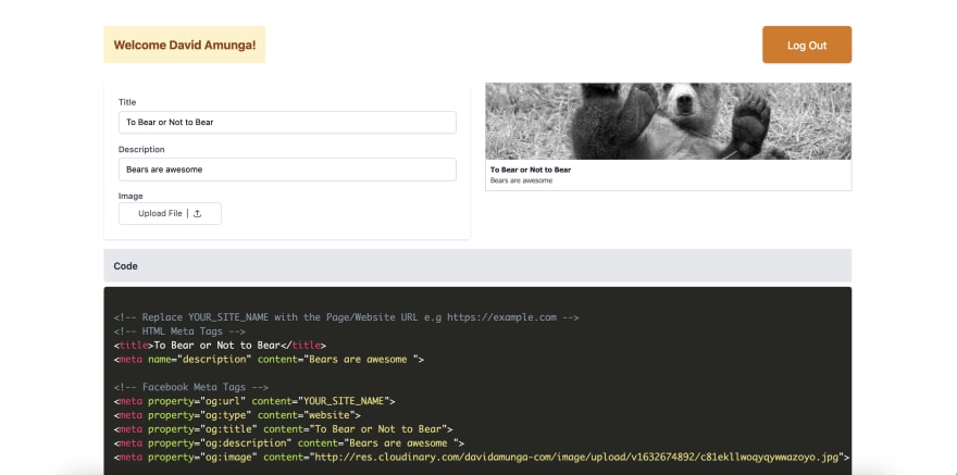
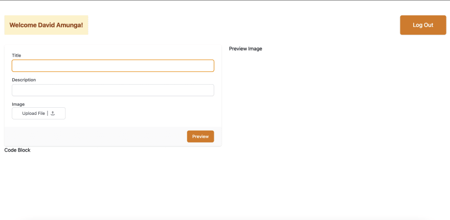
We are also able to fetch the user object from the useAuth0 Hook. We are able to extract the user name and display it once logged in. Your UI should appear like below once your run. We will be defining 3 fields for the Preview Tags which include : -
- Title (Should be less than 60 characters)
- Description(Should be less than 120 characters).
- Image (URL string)
Let us now work on the PreviewImage and CodeBlock component.
Setting up PreviewImage Component
For the preview image component we will create a folder components inside src directory.
- Add Custom Styling for the Preview Image in
App.css.
    /* App.css */
    .preview {
      font-size: 12px;
      font-family: tahoma;
      border: 1px solid #ccc;
      color: #555;
      box-sizing: border-box;
      text-decoration: none;
    }
- Create the Component
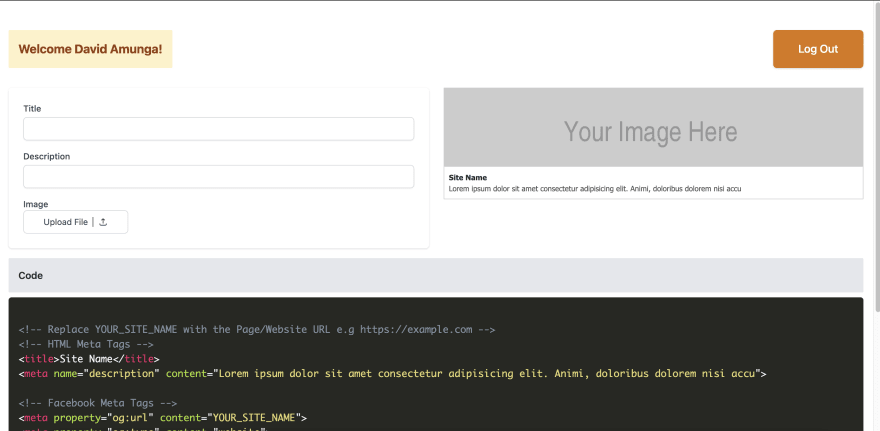
    // src/components/PreviewImage.js

    import React from 'react';

    const PreviewImage = ({ form }) => {
      return (
        <div class="preview flex flex-col">
          <img
            className="w-full object-cover h-32"
            src={form.image}
            alt="some description"
          />
          <div className="px-2 py-2 bg-white">
            <h3 className="text-gray-800 font-bold">
              {form.title.length === 0 ? `Enter A Title` : form.title}
            </h3>
            <p class="">
              {form.description.length === 0
                ? `Enter A Description`
                : `${form.description}`}
            </p>
          </div>
        </div>
      );
    };

    export default PreviewImage;
- Import the Component to
Home.js
    //Home.js
    import PreviewImage from './components/PreviewImage';

    const Home = ()=>{
    ...
    return (
    ...
    <div className="grid grid-cols-2 gap-6">
        <form>...
        <div>
                {/* Add Preview Image Component Here */}
                <PreviewImage form={form} />
        <div>
    </div>
    )
    }
Set up CodeBlock Component with Syntax Highlighting
The Last Part of the Home UI setup involves adding a CodeBlock section which displays the tags displayed by completing the form fields entered on the same page. We will display the Metadata Code using Prism which is an elegant syntax highlighter tool.
- Install
prismjspackage
npm install prismjs
- Download you syntax highlighter css from here. For this example we are going to use
Okaidia.Remember the download css option is near the bottom of the prismjs download page. Once downloaded place it at the root of thesrcdirectory.
    import React from 'react';
    import Prism from 'prismjs';
    import '../prism.css';

    const Codeblock = ({ form }) => {
      const { title, description, image } = form;
      React.useEffect(() => {
        Prism.highlightAll();
      }, [form]);

      return (
        <div className="flex flex-col mt-4">
          <div className="flex justify-between items-center bg-gray-200 p-4 rounded-sm">
            <h3 className="text-md text-gray-800 font-semibold">Code</h3>
          </div>
          <pre>
            <code className="language-html">
              {`
    <!-- Replace YOUR_SITE_NAME with the Page/Website URL e.g https://example.com -->
    <!-- HTML Meta Tags -->
    <title>${title}</title>
    <meta name="description" content="${description}">

    <!-- Facebook Meta Tags -->
    <meta property="og:url" content="YOUR_SITE_NAME">
    <meta property="og:type" content="website">
    <meta property="og:title" content="${title}">
    <meta property="og:description" content="${description}">
    <meta property="og:image" content="${image}">

    <!-- Twitter Meta Tags -->
    <meta name="twitter:card" content="summary_large_image">
    <meta property="twitter:domain" content="YOUR_SITE_NAME">
    <meta property="twitter:url" content="YOUR_SITE_NAME">
    <meta name="twitter:title" content="${title}">
    <meta name="twitter:description" content="${description}">
    <meta name="twitter:image" content="${image}">
      `}
            </code>
          </pre>
        </div>
      );
    };

    export default Codeblock;
- Import the Codeblock Component to
Home.js
    //Home.js
    import Codeblock from './components/Codeblock';

    const Home = ()=>{
    ...
    return (
    ...
    <div className="grid grid-cols-2 gap-6">
    ...
    </div>
    {/* Add Code Block Component Here */}
    <Codeblock form={form} />
    )
    }
Once you are done you should have both the PreviewImage and Codeblock rendered properly as below.
Step 4. Setup Image Uploads with Cloudinary
The application is nearly complete. All we are missing now is adding an Image Upload feature so that it can populate the final image url to the Codeblock and PreviewImage component.
Next head over to Cloudinary and create an account or login. Once logged in you can check from your Dashboard to see a summary of Account Details,Resources. Copy the Cloud name value you see in the Account Details.

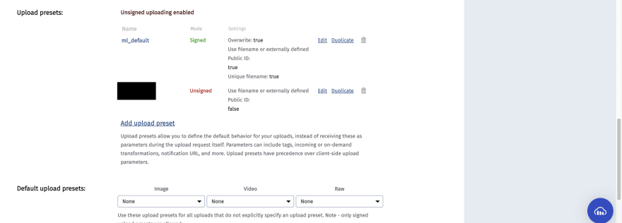
- Head over to the Settings section by clicking on your profile. Select the Upload Tab. Scroll down until you see the Upload Presets section and click on the
**Enable unsigned uploading**button which allows Unauthenticated uploads which will work for this demo. Copy the Name you get in the Unsigned Mode.
- Head over back to the project and add Cloudinary's widget script in your
index.htmlfile in thepublicfolder.
<script src="//widget.cloudinary.com/global/all.js" type="text/javascript"></script>
- In your .env.local file add your Copied Cloud Name and Upload Preset value in this file.
    REACT_APP_CLOUDINARY_UPLOAD_PRESET=
    REACT_APP_CLOUDINARY_CLOUD_NAME=
- In your
Home.jsyou can add the following function in the Component together with the onClickHandler to the Upload File button that should fires the same function.
    //Home.js

    ....
    const uploadWidget = () => {
        window.cloudinary.openUploadWidget(
          {
            cloud_name: process.env.REACT_APP_CLOUDINARY_CLOUD_NAME,
            upload_preset: process.env.REACT_APP_CLOUDINARY_UPLOAD_PRESET,
            tags: ['site-preview'],
            sources: ['local', 'url'],
          },
          function (error, result) {
            if (error) {
              return;
            }
            console.log('Upload Result is', result);
            setForm({ ...form, image: result[0].url });
          },
        );
      };

    ....
    return(
    ...
    <label className="block text-sm font-medium text-gray-700">
        Image
    </label>
    <button
       type="button"
       onClick={() => uploadWidget()}
         className="...">
    </button>
    )
This function opens the Cloudinary Widget with the specified cloud name and upload preset. It also adds options for local file upload or url upload. Once successful we update the form with the returned image from the result.
Conclusion
Once done the solution is completed. You now have built a powerful social media link previews generator with Authentication and File Storage. There are more features that can probably be added to the app which include
- Customising Image Feature Options through the powerful Cloudinary Transformation API . Might need to let the user choose the file format of image, crop, background overlays or even blur.
- View list of Images Selected depending on Auth0 Account Logged In.
Have any other ideas ? Feel free to clone the project and expand on the capabilities of the app using Cloudinary and Auth0.
Content created for the Hackmamba Jamstack Content Hackathon with Auth0 and Cloudinary

Top comments (0)