tl;dr: Everything in CSS is a box

When any browser’s layout engine renders a document, each rendered element becomes a rectangular box. How these boxes are shown to the viewer is determined by a set of rules known as the standard CSS basic box model. Cascading Style Sheets (CSS) take each HTML document’s element and treats it as a “box” with specific properties. That is, HTML by itself, when rendered, is just a tree of elements made one after the other starting with the root element. The box model is our way to customize this default layout.
📌 René Descartes once said, “I am, therefore, I am a box”. This is what a h2 element tells itself when it wants to exist.
Box model ≠ Box sizing property
This a place that easily confused me. I always associated the box model with the box-sizing property. After all, we usually see this at the top of any main.css file:
* {
box-sizing: border-box;
}
But there’s more to the box model than its box-sizing property. I’ll explain later what box-sizing property does specifically. For now, let’s focus on what the box model is.
Box model
The box model is a formula for how boxes should be laid out. This model consists of the content area (e.g., text, an image, etc.) along with the optional padding, border, and margin areas.

The content area is pretty much the “real” content of the element. The content could be text (“Hi, I luv u.”), or an image (alt=”cat in banana costume munching on banana”) or… you get the point.
The padding area is the space between the actual content and its border.
The border area extends the padding area to include the element’s borders.
The margin area is the space between an element and its neighbors.
The display property: What flavor would you like?
So everything rendered on the webpage is a box. We know this already. And what you’ve properly noticed are the two flavors or types of boxes we can have.
We can have the following, so chose wisely grasshopper: “block” boxes and “inline“ boxes.
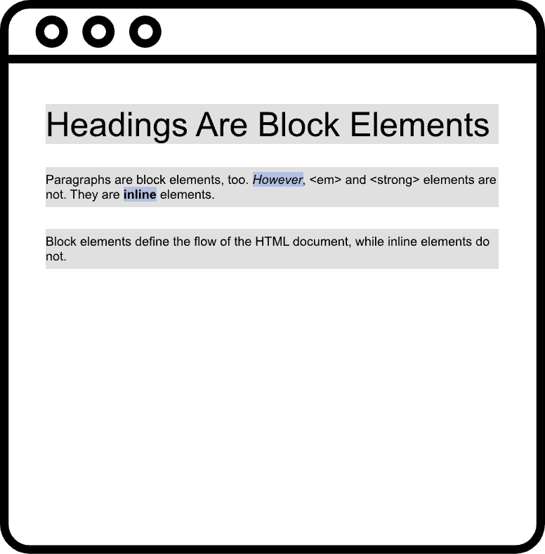
Every single element we work with is styled “inline” or “block” by default. <h1> and <p> are block-level elements, while <span> and <strong> are inline elements. We can see this when we open up the inspector toolbox 🧰.
Without even setting the CSS properties yourself, web browsers (e.g., Chrome, Firefox, IE, etc.) set out its own default styles to the HTML document. For example, in Chrome, the default user agent styles for <h1> elements look like this:
h1 {
display: block;
font-size: 2em;
margin-block-start: 0.67em;
margin-block-end: 0.67em;
margin-inline-start: 0px;
margin-inline-end: 0px;
font-weight: bold;
}
Let’s take a look at these formats.
A tale of two boxes
Let’s visualize the differences between both.
display: block;
Block-level elements, by default:
- take up all the available space
- are stacked one on top of the other, appearing below the previous element
- thus, defining the “natural” flow of the document
- the width is based on the width of its parent container
-
the height is based on the content it contains
display: inline;
Inline blocks:
- are only as wide and high as their content
- does not inherit width or height of parent element
- do not affect vertical spacing
- so even if you set the height, that height is not acknowledged at all, almost as if you did not set a height to begin with
- are not for determining document layout
- they just allow us to style stuff within a block element
-
follow the writing direction, lining up with the flow of other inline elements
h1, p {
background-color: grey;
}em, strong {
background-color: blue;
}
We also have the the absence of a box, display: none. and a relatively new addition, inline-block. Inline-block is a hybrid of the block and inline properties, in that the width and height can be played around with but the element remains laid out on the same line right next to the other inline-block and inline elements. display: none simply takes the element out of existence. The element is taken out of the document, such that even screen readers do not acknowledge its presence.
But what about Grid or Flexbox?
Grid and Flexbox are known as formatting contexts. They lay out boxes in their own particularly unique environment. For example, the grid formatting context lays out boxes according to grid layout rules as specified here.

So question: What happens when we apply display: grid to a div element? Does it remain a block element?
Yes. The div remains a block element. However, its child elements start to behave differently. Applying just display: grid, for example, I can line up block elements side by side without specifying their width.
The box-sizing property
Finally, we get to the box-sizing property 🙂 . in CSS, the default value of the box-sizing property is content-box.
content-box 🥊 vs. border-box 🥊
Content-box tells the HTML document that the dimensions of a box consist of the content itself + its padding and border. Such that, if we have a 10px box and we add 1px of padding, the box displayed to the viewer will now be 12px wide (10px + 1px of padding from right and left side). Whereas fo border-box, any padding adding will simply shrink the dimensions of the content box. The width will remain 10px regardless of the 1px padding you add to both sides.
Example

On the left and right we have the following:
index.html
...Casey
Mary
main.css
.content-box {
box-sizing: content-box;
width: 100px;
height: 100px;
border: 10px solid black;
}
.border-box {
box-sizing: border-box;
width: 100px;
height: 100px;
border: 10px solid red;
}
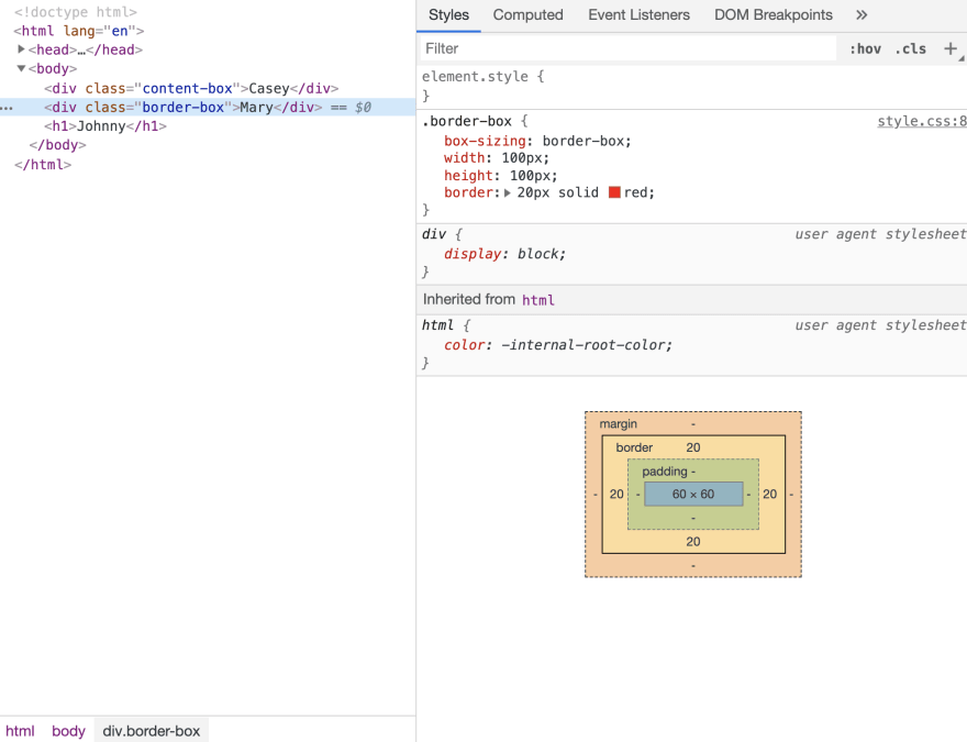
We have two div block elements.
The left side has box-sizing: content-box applied. Here, the size of the 100 x 100 content box stayed the same even after we applied the 20px border. Visually we no longer see a 100 x 100 black box on the screen but one that is 140 x 140.
The right side has box-sizing: border-box applied. Here, the size of the 100 x 100 content box changes after we applied the 20px border. If you take a look at the right image you can see that the width of the content box shrunk by 40px (20px from each side) to accommodate the border. Visually, we see the div stayed the same size but really its content box shrunk to 60 x 60 to fit in the added border dimensions.
In short, content-box implies that the padding and border become part of the content box dimensions once added. Border-box implies that the box’s dimensions that we see on the screen stay the same regardless of how much padding or border we add.
What’s the point of the two?
In the beginning, we only had content-box as a box-sizing value. Casey suggested that because back in the day, webpages were mostly just content and not any of the extra stuff (padding, or border) we did not have to worry much about the added width and height to the content-box and the box that we saw on the screen. People were not using padding or border that much. There was just a focus on the content itself. But as padding and border gained more usage and there started to be more of a diversity of screen sizes on the market, the growth of the box started to matter. It became inconvenient to keep track of dimensions of the represented box as we added padding and border. We just wanted to have the rendered box stay the same size visually to the viewer regardless of padding or border added.
And Voilà! border-box is so popular that developers have declared February 1st to be International box-sizing Awareness Day.
Really though, every day is box-sizing Awareness Day.
So keep this, from CSS Tricks, handy:
// Here's the browser support situation. "-" = "this version and down". "+" = "this version and up".
, *:before, *:after {
/ Chrome 9-, Safari 5-, iOS 4.2-, Android 3-, Blackberry 7- */
-webkit-box-sizing: border-box;
/* Firefox (desktop or Android) 28- */
-moz-box-sizing: border-box;
/* Firefox 29+, IE 8+, Chrome 10+, Safari 5.1+, Opera 9.5+, iOS 5+, Opera Mini Anything, Blackberry 10+, Android 4+ */
box-sizing: border-box;
}
Vendor Prefixes
You may be asking yourself what the prefixes (-webkit-, -moz-) in the code above mean.
These are known as “vendor prefixes” or “browser prefixes”.
We place these string of characters before CSS property names. Each prefix corresponds to a specific browser engine. Below is a table from MDN web docs that shows the different prefixes:
| Prefix | Browser(s) |
|---|---|
-webkit- |
Chrome, Safari, newer versions of Opera, almost all iOS browsers (including Firefox for iOS); basically, any WebKit based browser |
-moz- |
Firefox |
-o- |
Old, pre-WebKit, versions of Opera |
-ms- |
Internet Explorer and Microsoft Edge |
Browser manufacturers add this prefix to new or experimental CSS features that are not fully supported in all browsers. There’s a reason we have the website https://caniuse.com/. Caniuse’s search functionality allows us to find any CSS feature we want to use and get a sense of how standard the feature is now. For example, what so you see when you search for background-size?We see that these new background-image property options, such as background-size, are available to be used in all browsers and almost all browser versions. So go ahead and use background-image: background-size with the ease of mind it will work for 99% of your web users.
📌 As web developers, we provide a service. We want to be sure that service is accessible to all. This is not just moral but helps us secure more paying users.
As you research the market, you may find that most of your clients are Internet Explorer (IE) 11 users. You have to be extra careful, as many of the new CSS3 features are well supported by IE11. If you use them, your site or web app will break or now work in IE11 browsers.
Search for position: sticky in Caniuse. You’ll find some glaringly red areas. For IE, you find that the feature is not supported in versions 6 to 11, which is really the entirety of the IE ecosystem. If after researching your market, you find that most of your clients use Internet Explorer, you may want to stay away from position: sticky if you want things to work.
Why use them?
In Ire Aderinokun’s post, she takes back at when gradient backgrounds had just been introduced. Each browser from Safari to Firefox has its own way to add gradient backgrounds. To add a simple white gradient effect, each browser had its own syntax:
.example {
/* Safari 4-5, Chrome 1-9 */
background: -webkit-gradient(linear, left top, left bottom, color-stop(0%, #000), color-stop(100%, #fff));
/* Safari 5.1, Chrome 10+ */
background: -webkit-linear-gradient(top, #000 0%, #fff 100%);
/* Firefox 3.6+ */
background: -moz-linear-gradient(top, #000 0%, #fff 100%);
/* IE 6 - 9 */
filter: progid:DXImageTransform.Microsoft.gradient( startColorstr='#000000', endColorstr='#ffffff',GradientType=0 );
/* IE 10+ */
background: -ms-linear-gradient(top, #000 0%, #fff 100%);
/* Opera 11.10+ */
background: -o-linear-gradient(top, #000 0%, #fff 100%);
}
Vendor prefixes allow developers to test out new features before they have been officially released out into the wild. Each property above acted as its own property, with no property being equal to the other. That is to say, each browser only recognizes properties with its own prefix and ignores the rest.
This prevents code conflicts when the CSS features is made official. Now, we just use the same syntax across all browsers as all support the feature:
.example {
background: linear-gradient(top, #000 0%, #fff 100%);
}
This is much less code that is being transferred from server to client, and vice versa. But to test out new features before they officially come out and wow our users we use the browser specific syntax for that feature. When it becomes standard, we switch over to the standard syntax. Whether we change the old syntax to the new syntax, our feature will still work.
References used:
- https://absolutely.every-layout.dev/rudiments/boxes/
- https://www.smashingmagazine.com/2019/05/display-box-generation/
- https://www.w3.org/TR/CSS2/box.html#box-dimensions
- https://bitsofco.de/css-vendor-prefixes/
^ These are all good resources to utilize.

Top comments (0)