
I recently published a React Native app called Sweepy in the AppStore and the PlayStore. During its development, I shared my progress on my Twitter account. I had lots of impressions for the tweet that showed this animation:

In today's article I will show you how I did this. If you are too busy to read and immediately want to jump into the final code, here is the GitHub repository I created. In my tutorial, I slowed down all the GIFs, so you can see the animation better.
Let's start
Let's initialize our project. I will be coding it in TypeScript. If you are interested in how to set up a React Native project with TypeScript and the Airbnb linter, you can check my other tutorial here.
First of all, we install react-navigation and its dependencies:
yarn add @react-navigation/native react-native-reanimated react-native-gesture-handler react-native-screens react-native-safe-area-context @react-native-community/masked-view
We will be using a bottom tab navigator, so let's install @react-navigation/bottom-tabs as well as @react-navigation/stack:
yarn add @react-navigation/bottom-tabs @react-navigation/stack
If you develop for iOS, don't forget to run pod install.
cd ios && pod install
Let's start with App.tsx. First import 'react-native-gesture-handler' at the top of the file and create a router. As you can see in the example, I set up a stack navigator that contains a BottomTabNavigator and a modal screen inside the same Root Stack.
import 'react-native-gesture-handler';
import React from 'react';
import { NavigationContainer } from '@react-navigation/native';
import { createBottomTabNavigator } from '@react-navigation/bottom-tabs';
import { createStackNavigator } from '@react-navigation/stack';
import { View, Text } from 'react-native';

type TabBarStackParamList = {
  Home: undefined,
}

type RootStackParamList = {
  TabBar: TabBarStackParamList,
  Modal: undefined,
}


const HomeScreen = () => (
  <View style={{ flex: 1, justifyContent: 'center', alignItems: 'center' }}>
    <Text>Home</Text>
  </View>
);

const ModalScreen = () => (
  <View style={{
    flex: 1, justifyContent: 'center', alignItems: 'center', backgroundColor: 'navy',
  }}
  >
    <Text>Modal</Text>
  </View>
);

const TabBarStack = createBottomTabNavigator<TabBarStackParamList>();
const TabBarStackScreen = () => (
  <TabBarStack.Navigator>
    <TabBarStack.Screen name="Home" component={HomeScreen} />
  </TabBarStack.Navigator>
);

const RootStack = createStackNavigator<RootStackParamList>@();

// we are nesting TabBarStack in RootStack as a screen
const App = () => (
  <NavigationContainer>
    <RootStack.Navigator headerMode="none" mode="modal">
      <RootStack.Screen name="TabBar" component={TabBarStackScreen} />
      <RootStack.Screen name="Modal" component={ModalScreen} />
    </RootStack.Navigator>
  </NavigationContainer>
);

export default App;
Now let's add a button that will launch our modal screen. I will separate it in a different folder: src/components/add-button/index.tsx:
import React from 'react';
import { TouchableOpacity, Text, StyleSheet } from 'react-native';

// I put the button in absolute position because I want it to be on top of everything behind it

const styles = StyleSheet.create({
  container: {
    backgroundColor: 'navy',
    width: 55,
    height: 55,
    borderRadius: 28,
    position: 'absolute',
    right: 20,
    alignItems: 'center',
    justifyContent: 'center',
    bottom: 20,
    zIndex: 1,
    elevation: 1,
  },

  text: {
    color: 'white',
    fontSize: 24,
    fontWeight: 'bold',
  },
});

type AddButtonProps = {
  onAdd: () => void,
}

const AddButton = ({ onAdd } : AddButtonProps) => (
  <TouchableOpacity
    style={styles.container}
    onPress={onAdd}
  >
    <Text style={styles.text}>
      +
    </Text>
  </TouchableOpacity>
);

export default AddButton;
As you can see, our button has a prop called onAdd. This function will be called after we tap on the button. We will now add this AddButton component to our Home Screen:
// in App.tsx
...
import { NavigationContainer, CompositeNavigationProp } from '@react-navigation/native';
import { createBottomTabNavigator, BottomTabNavigationProp } from '@react-navigation/bottom-tabs';
import { createStackNavigator, StackNavigationProp } from '@react-navigation/stack';
import AddButton from './src/components/add-button';
...
type TabBarStackParamList = {
  Home: undefined,
}

type RootStackParamList = {
  TabBar: TabBarStackParamList,
  Modal: undefined,
}

interface HomeScreenProps {
  navigation: CompositeNavigationProp<
  BottomTabNavigationProp<TabBarStackParamList, 'Home'>,
  StackNavigationProp<RootStackParamList>
>;
}
// I hope I did all type checking properly.
// If not, let me know in the comment section.

const HomeScreen = ({ navigation }: HomeScreenProps) => {
  const onAdd = () => {
    navigation.navigate('Modal');
  };

  return (
    <>
      <View style={{ flex: 1, justifyContent: 'center', alignItems: 'center' }}>
        <Text>Home</Text>
      </View>
      <AddButton onAdd={onAdd} />
    </>
  );
};
...
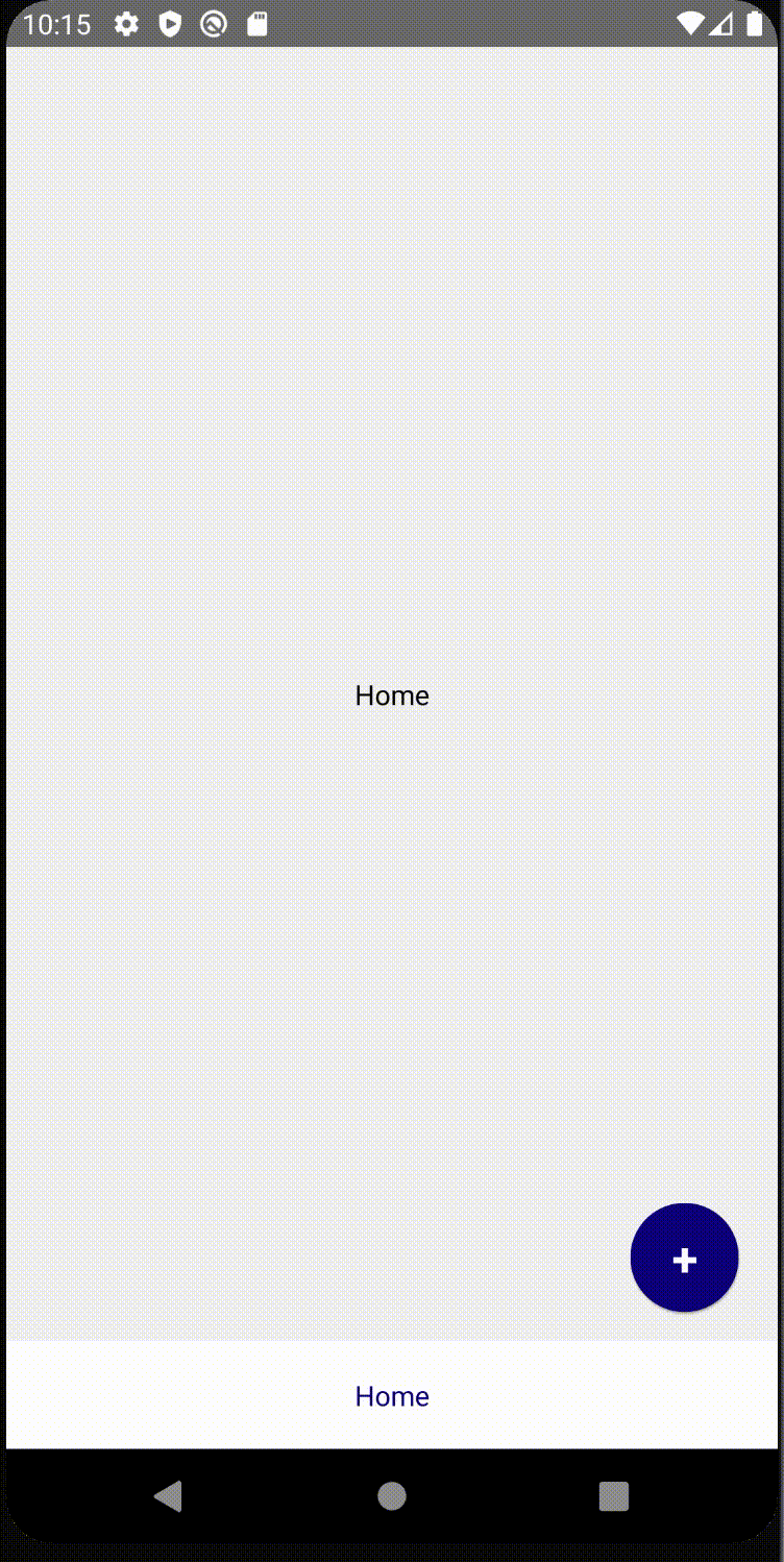
We did our base, it should look like this:
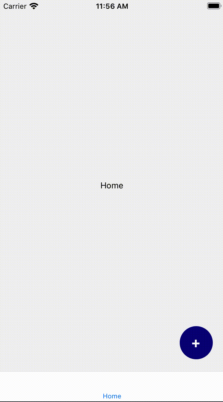
Screen Changing Animation
We are now going to code a custom screen transition between our 2 screens: home and modal. We want to have a fade-in and fade-out animation, so when the screen opens or closes it changes the opacity. To do this we will be using the screenOptions prop in RootStack.Navigator.
// in App.js
...
const opacityTransition: object = {
  gestureDirection: 'horizontal', // we will swipe right if we want to close the screen;
  transitionSpec: {
    open: {
      animation: 'timing',
    },
    close: {
      animation: 'timing',
      config: {
        duration: 300,
      },
    },
  },
  cardStyleInterpolator: ({ current } : {current: {progress: number}}) => ({
    cardStyle: {
      opacity: current.progress,
    }, // updates the opacity depending on the transition progress value of the current screen
  }),
};
...
const App = () => (
  <NavigationContainer>
    {/* Don't forget to set headerMode="none" and mode="modal" */}
    <RootStack.Navigator headerMode="none" mode="modal" screenOptions={{ ...opacityTransition }}>
      <RootStack.Screen name="TabBar" component={TabBarStackScreen} />
      <RootStack.Screen name="Modal" component={ModalScreen} />
    </RootStack.Navigator>
  </NavigationContainer>
);
If you want to learn about more complex screen animations, I invite you to read the react-navigation documentation on this topic.
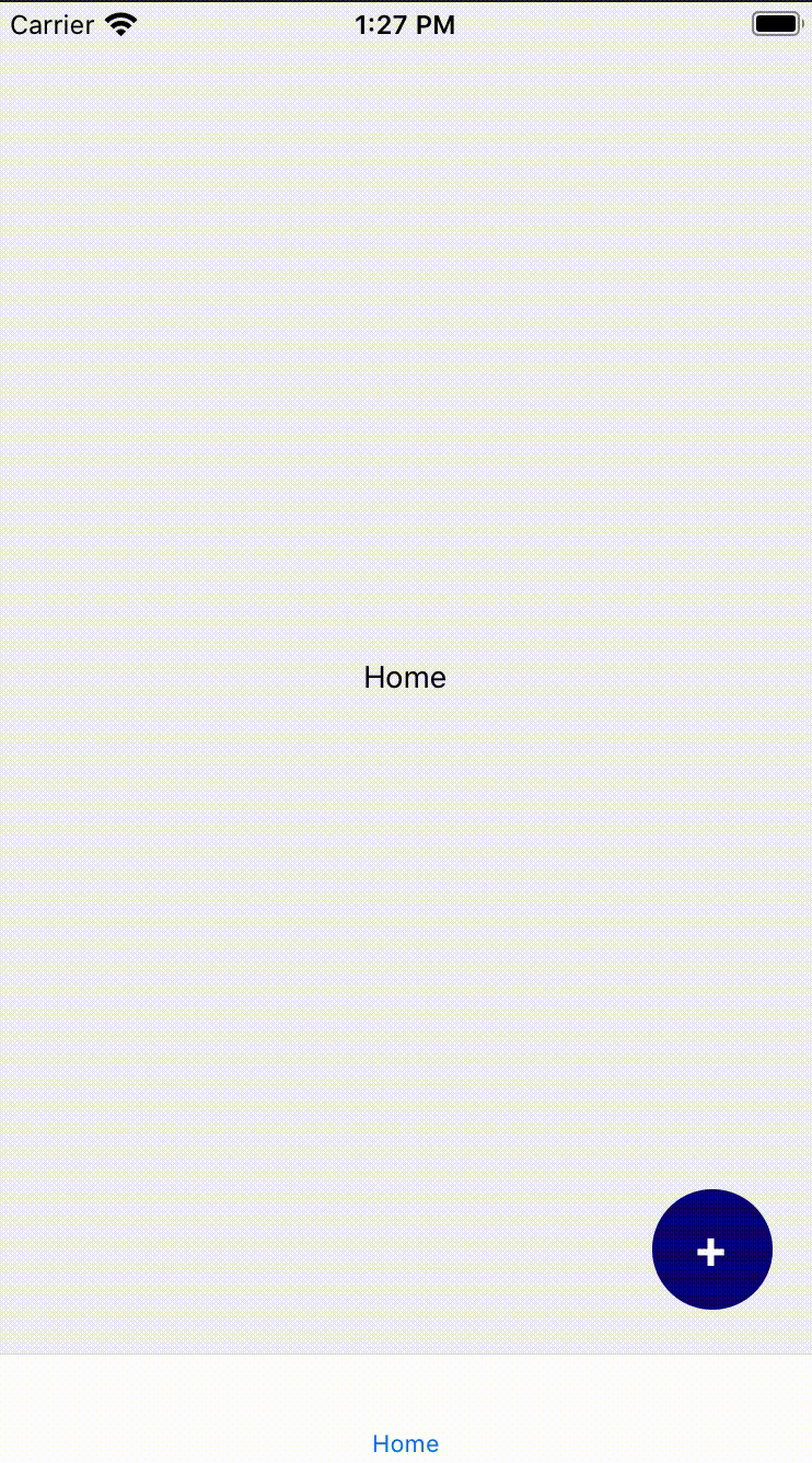
Here's the result after this step:

Button Animation
We will scale our button in order to give the impression that our button transforms into a screen. I will be using the React Native Animation library that is already pre-built in RN.
in src/components/add-button/index.tsx
import { Animated } from 'react-native';

const AddButton = ({ onAdd } : AddButtonProps) => {
  const [scaleValue] = useState(new Animated.Value(0));
  const onButtonClicked = () => {
    // Don't forget about the callback function for Animated.timing.
    // After we finish scaling, we need to set the scale value back to 0;
    // If we don't do that, when we go back to the Home screen our button will still be scaled
    Animated.timing(scaleValue, {
      toValue: 1,
      useNativeDriver: true,
      duration: 700,
    }).start(() => { scaleValue.setValue(0); });
    onAdd();
  };

// You can test different input and output values.
// Just don't forget that inputRange is from 0 to 1 and outputRange starts from 1;
// These ranges looks the best for me
  const scaleValueInterpolation = scaleValue.interpolate({
    inputRange: [0, 0.25, 1],
    outputRange: [1, 20, 30],
  });

  return (
    <>
      <Animated.View
        style={[styles.container,
          { transform: [{ scale: scaleValueInterpolation }] },
        ]}
      />
      <TouchableOpacity
        style={styles.container}
        onPress={onButtonClicked}
      >
        <Text style={styles.text}>
          +
        </Text>
      </TouchableOpacity>
    </>
  );
};

export default AddButton;
Why didn't I wrap my TouchableOpacity in Animated.View? I just don't want a scaling effect on the + sign.
For me, it looks much better when only the container scales, so I decided to put the animated scaling container behind our TouchableOpacity.
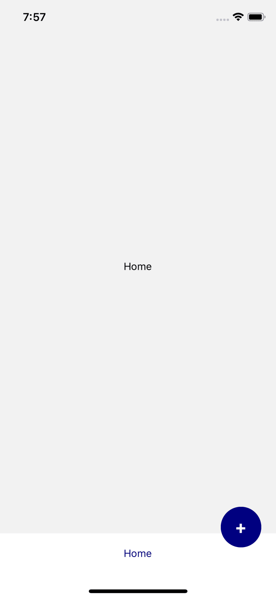
Here is our current result:

Putting the AddButton in the Tab bar
As we can see on the video the button scaling animation doesn't overlap the tab bar and it doesn't look great. So let's create a custom tab bar and put our AddButton component in it. I will create the TabBar component in src/components/tab-bar/index.tsx:
import React from 'react';
import {
  TouchableOpacity, StyleSheet, View, Text,
} from 'react-native';
import { BottomTabBarProps } from '@react-navigation/bottom-tabs';
import { SafeAreaView } from 'react-native-safe-area-context';
import AddButton from '../add-button';


const styles = StyleSheet.create({
  tabButton: { flex: 1, justifyContent: 'center', alignItems: 'center' },
});


const TabBar = ({ state, descriptors, navigation } : BottomTabBarProps) => {
  const onAdd = () => {
    navigation.navigate('Modal');
  };

  return (
    <>
      {/* show the AddButton only if it's the first screen (Home screen) */}
      {(state.index === 0) && (
        <AddButton onAdd={onAdd} />
      )}
      <SafeAreaView style={{ backgroundColor: 'white' }}>
        <View style={{ height: 55, flexDirection: 'row' }}>
          {/* here we are mapping through the routes, defining its labels, configure the onPress functions */}
          {state.routes.map((route, index) => {
            const { options } = descriptors[route.key];
            let label;
            if (options.tabBarLabel === undefined) {
              if (options.title === undefined) {
                label = route.name;
              } else { label = options.title; }
            } else { label = options.tabBarLabel; }
            const isFocused = state.index === index;

            const onPress = () => {
              const event = navigation.emit({
                type: 'tabPress',
                target: route.key,
                canPreventDefault: true,
              });

              if (!isFocused && !event.defaultPrevented) {
                navigation.navigate(route.name);
              }
            };

            const onLongPress = () => {
              navigation.emit({
                type: 'tabLongPress',
                target: route.key,
              });
            };

            return (
              <TouchableOpacity
                accessibilityRole="button"
                accessibilityState={isFocused ? { selected: true } : { selected: false }}
                accessibilityLabel={options.tabBarAccessibilityLabel}
                testID={options.tabBarTestID}
                onPress={onPress}
                onLongPress={onLongPress}
                style={styles.tabButton}
                key={route.key}
              >
                <Text style={{ color: isFocused ? 'navy' : 'grey' }}>
                  {label}
                </Text>
              </TouchableOpacity>
            );
          })}
        </View>
      </SafeAreaView>
    </>

  );
};

export default TabBar;
Now we need to put our custom tab bar in the router and also delete the AddButton from the HomeScreen.
// in App.tsx
...
const HomeScreen = () => (
  <>
    <View style={{ flex: 1, justifyContent: 'center', alignItems: 'center' }}>
      <Text>Home</Text>
    </View>
  </>
);
...
const TabBarStack = createBottomTabNavigator<TabBarStackParamList>();
const TabBarStackScreen = () => (
  <TabBarStack.Navigator tabBar={(props) => <TabBar {...props} />}>
    <TabBarStack.Screen name="Home" component={HomeScreen} />
  </TabBarStack.Navigator>
);
...
Also, we need to put our AddButton a little bit higher now as we should take into account the height of TabBar.
// in src/components/add-button/index.tsx
const styles = StyleSheet.create({
  container: {
    backgroundColor: 'navy',
    width: 55,
    height: 55,
    borderRadius: 28,
    position: 'absolute',
    right: 20,
    alignItems: 'center',
    justifyContent: 'center',
    // bottom: 20,
    bottom: 75,
    zIndex: 1,
    elevation: 1,
  },
});
It's almost ready! Now we need to think about the iPhone 10 and higher models, because they have different insets that we need to account.
Insets for iPhone 10+
For this reason, we will create a Higher Order Component called withInsets using react-native-safe-area-context, that we already installed for react-navigation. SafeAreaConsumer from this library will give us the bottom insets for the iPhone 10+. Let's create a new file in src/components/with-insets/index.tsx.
import React, { ComponentType } from 'react';
import { SafeAreaConsumer } from 'react-native-safe-area-context';

export type withInsetsProps = {
  insets: {
    bottom: number,
  }
};

const withInsets = (BaseComponent: ComponentType<any>) => (props: any) => (
  <SafeAreaConsumer>
    {(insets) => (
      <BaseComponent
        insets={{ bottom: insets?.bottom }}
        {...props}
      />
    )}
  </SafeAreaConsumer>
);

export default withInsets;
Now we need to wrap our TabBar component with withInsets and pass the insets to the AddButton:
// in src/components/tab-bar/index.tsx
...
import withInsets, { withInsetsProps } from '../with-insets';
...
export type TabBarProps = BottomTabBarProps & withInsetsProps;

const TabBar = ({
  state, descriptors, navigation, insets,
} : TabBarProps) => {
  ...
  return (
    {(state.index === 0) && (
        <AddButton onAdd={onAdd} bottomInset={insets.bottom} />
     )}
     ...
  )
};

export default withInsets(TabBar);
Next step is to add this insets in our AddButton Component:
// in src/components/add-button/index.tsx
...
type AddButtonProps = {
  onAdd: () => void,
  bottomInset: number
}

const AddButton = ({ onAdd, bottomInset } : AddButtonProps) => {
...
return (
    <>
      <Animated.View
        style={[styles.container,
          {
            transform: [{ scale: scaleValueInterpolation }],
            bottom: 70 + bottomInset,
          },
        ]}
      />
      <TouchableOpacity
        style={[styles.container, { bottom: 70 + bottomInset }]}
        onPress={onButtonClicked}
      >
        <Text style={styles.text}>
          +
        </Text>
      </TouchableOpacity>
    </>
  );
};

export default AddButton;
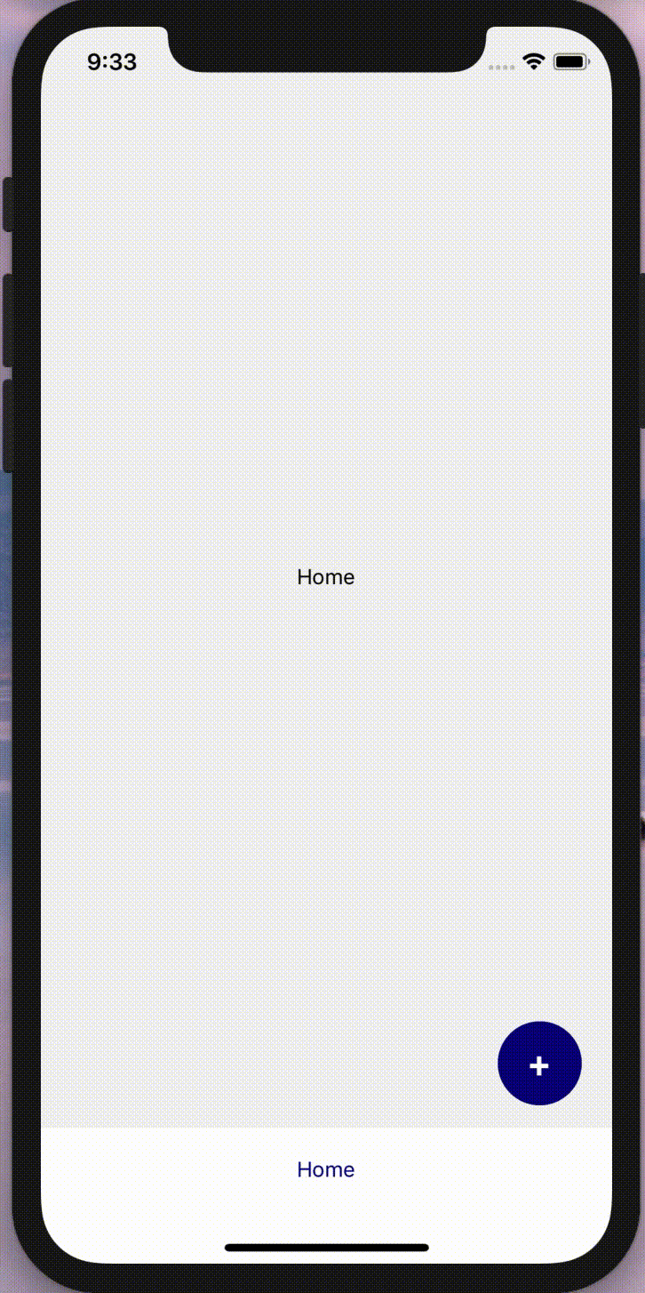
And here is the final result for iPhone 10 and higher:
And here how it looks like on Android:

Top comments (5)
Pretty neat✨
Good work Oksana, the end result is excellent, and your development process is very well documented.
This is great! Really impressed by your creativity.
Just what I needed!!!!
Exactly what I was looking to do, thank you for the tutorial