
Written by Njong Emy✏️
The web is constantly changing. From speed, to structure, to quality, nothing stays the same for too long. Speaking of structure, content that used to be spread over multiple pages can now be condensed into a single page.
In this article, we will look at single-page applications, most commonly known as SPAs, and what significant changes they have brought to the world of web development.
In this article, we will explore:
- What are SPAs?
- Where to use SPAs
- Using SPAs on mobile devices
- Tutorial for building SPAs
- Part I: Combining HTML, CSS, and JavaScript to create an SPA
- Part II: CSS page transitions
What are SPAs?
Before diving into anything, let’s see what SPAs are, and what developers used before them.
Do you know how, by default, the browser refreshes whenever you want to visit a new page? With SPAs, it’s different — the contents on the page are rewritten from the server, and the content changes without a browser refresh.
If you’ve used sites like GitHub, Twitter, or even Gmail, then you’ve already come in contact with SPAs. When you navigate between tabs on these sites, you don’t get browser reloads. The pages are joined together as if they were all written in one HTML file (and they were).
Before SPAs, multiple-page applications (MPAs) were used, and sometimes still are today. Most web browsers, are compatible with MPAs, and developers do not need to write extra functionalities for them, as is the case with SPAs. In MPAs, when new content needs to be displayed, such as a new page, the new page is requested from the server. The browser then displays the new page, which causes a reload.
In this article, we will create a cat-themed SPA and add animations to it using GreenSock Animation Platform (GSAP), a JavaScript animation library. The little GIF below is a preview of what our final site will look like. 
Where to use SPAs
As amazing as they sound, SPAs do not replace MPAs in certain aspects.
An excerpt from the eBook_ Architect Modern Web Applications with ASP.NET Core and Azure_ says you can use SPAs when:
- Your application aims at showing a rich interface with multiple features
- It is a website with small data volumes
- Your site doesn’t rely much on SEO. Because SPAs involve a single URL, SEO optimization is really tricky, as it lacks indexing and good analytics
- The website makes use of features like real-time alerts or notifications, similar to social media platforms
You know it’s time to use MPAs when:
- Your site’s client-side requirements are easy to meet
- Your application does not need JavaScript to function in the browser
Using SPAs on mobile devices
SPAs also allow users to seamlessly navigate through mobile device applications. If you log in to your Twitter account on your mobile phone from a browser, you still have the SPA effect. Navigation is as smooth as ever, and there are absolutely no reloads in the browser tab.
Tutorial for building SPAs
Now we are going to explore the steps involved in building single-page applications. The following steps assume no knowledge of frameworks and will cover building SPAs with HTML, CSS, and Vanilla JavaScript. Because we occasionally like to make things pretty, we will also add CSS page transitions.
The tutorial includes:
- Creating project directories
- Installing necessary dependencies. First, ensure that you have Node installed on your computer by typing
node -vin your terminal or command line. If a version of Node displays, then you are good to go. Typenpm install nodefor Linux users or visit this link to get the package manager for whatever operating system you are using - Setting up an Express server
- Creating HTML and CSS files according to your needs. This can be just a few tags or a small project to further your understanding. It is entirely up to you and what you want to build
- Testing your markup on the newly created server
- Diving into the JavaScript side of things
That’s it for this tutorial. These are the simplest steps you’ll see on the internet.
Just kidding! Of course, we’ll go through each step.
All hands on deck… I mean keyboard
This section will be in two parts. First, we will create our SPA with only Vanilla JavaScript. You do not need any previous knowledge of frameworks, as we will build everything up from the ground.
The second part is where we will add CSS page transitions to make navigation smoother and fancy-ish.
Part I: Combining HTML, CSS, and JavaScript to create an SPA
Everything starts with directories. We want containers where we will store our files. I’ll be using CodeSandbox for demonstrations, but feel free to open your code editor and code along.
In your terminal, we want to create a directory called SPA-tut, and another in it called src.
terminal commands
mkdir SPA-tut
cd SPA-tut
mkdir src
cd src
Open up SPA-tut with any IDE of your choice. And because no project is ever complete without an index.html file, we will create one in our src folder.
We will not build an entire site, just one with a small navbar and a few links to demonstrate. In our index.html, we have the following Markdown:
<nav class="navbar">
       <div class="logo">
           <p>Meowie</p>

       </div>

       <ul class="nav-items">
           <li><a href="/" data-link>Home</a></li>
           <li><a href="/about" data-link>About</a></li>
           <li><a href="/contact" data-link>Contact us</a></li>
       </ul>
   </nav>

   <div id="home"></div>
Notice how we added the data-link data attribute. This uses the History API pushState() method to navigate to a resource without a refresh. You don’t need to understand this now, but we will eventually get there.
Our style sheet is just as small.
*{
   padding: 0;
   margin: 0;
   box-sizing: border-box;
}

.navbar{
   background-color: pink;
   padding: 20px;
   display: flex;
   justify-content: space-between;
   align-items: center;
}
.nav-items{
   display: flex;
}

a{
   text-decoration: none;
   color: white;
   font-weight: bold;
   font-size: x-large;
}
.link{
   color: pink;
   font-size: medium;
}
.logo{
   color: white;
   font-weight: bold;
   font-size: xx-large;
   font-style: oblique;
}
ul{
   list-style: none;
}
.navbar ul li{
   margin-left: 15px;
}

#home{
   display: flex;
   align-items: center;
   margin: 20px;

}
.img{
   width: 80%;
   height: 80%;
}
Our website should look like this: 
Plain HTML and CSS will do us no good, so let’s jump into our JavaScript. We’ll create two more folders: a js folder inside a static folder all in the src folder, and an index.js file. Now, we want to connect this JS file to our index.html by using a script tag just above the closing body tag.
<script type="module" src="/static/js/index.js"></script>
We have added the type of module here because we will use the ES6 import and export functionalities in the course of our project.
For the sake of this tutorial, our site is not responsive but feel free to be the better dev and make your site compatible with other devices.
Creating an SPA server with Express
For this SPA, we are going to make use of the Express library to create our server. Don’t worry, you do not need extensive knowledge of Express to follow.
Create a server.js file out of the source directory. As I mentioned before, we will need Node installed before we can get any other required packages or libraries. In your terminal:
- Type
npm init -yto create apackage.json - Type
npm i expressto install Express
If you previously installed Node, these should install fine without much trouble.
For the server, we’ll need to create an Express app in the server.js file we just made.
const express = require('express');
const path = require('path');
const hostname = '127.0.0.1';
const port = 3000;

const app = express();

app.get("/*", (req, res) => {
   res.sendFile(path.resolve(__dirname, 'src', 'index.html'));
});

//listen for request on port 3000
app.listen(port, hostname, () => {
   console.log(`Server running at http://${hostname}:${port}/`);
 });
In order to import Express, we call require(). Our app listens to any request that is sent over port 3000 as we have specified above. app.get gets requests from the specified URL. In this case, it does so by calling the sendFile() function, which uses path.resolve() to process the sequence of paths from left to right until the absolute path is created. The reason our path is /* is because we want the page to redirect to index.html no matter what endpoint we add to the URL in the browser.
app.listen then listens for any request on port 3000 and logs a message passing in the host name and port number.
If you copy the path from your terminal and paste it into the browser, the output we had from the index.html file should display. It has no styling, but we can easily fix that in the end. Clicking on any of the links will only refresh the page. 
If we open up the console, we see an error that says Failed to load module script....
We can address this by adding the following line to our server.js file just before the app.get function:
app.use("/static", express.static(path.resolve(__dirname,'src', 'static')));
Editing the client-side SPA with JavaScript
Enough of the server already. Let’s get into the work that does something.
The very first step is to create a router. We will load the content for each view (or page) inside an asynchronous function. It is asynchronous because we might want to load certain content from the server side.
To define the various routes, let us create an array of objects, each being a route of its own.
const router = async () => {
   const routes = [
       {
           path: "/",
           view:  view: () => console.log("Home")
       },
       {
           path: "/about",
           view: () => console.log("About us")
       },
       {
           path: "/contact",
           view: () => console.log("Contact")
       }

   ];

};
view at this point is just a function that displays the views. We will adjust it to better serve us as we go on.
But say we changed our route to something totally out of context (by this, I mean adding "meaningless" endpoints to our URL). We want to check if a route that has been entered is an element of our array. To do this, we’ll use the map array method to go through each array element and return a new object.
//test each route for match
const checkMatches = routes.map(route => {
       return{
           route: route,
           isMatch: location.pathname === route.path //returns a boolean value
       };
   });

console.log(checkMatches);
If indeed the route is in the array, checkMatches will return the route name and a Boolean value of true. If we refresh the browser, we see nothing in the console. This is because we haven’t called the router function itself.
So, outside of the router function, let’s do this:
document.addEventListener('DOMContentLoaded', () => {

   router();
})
When our page loads, the router function will run.
Now, let’s try experimenting ourselves. 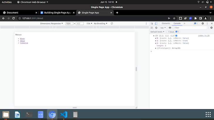
You see that if we add /about to the URL, the second element of our array is true and the others are set to false. If we set the URL to a route that was not in the array, then all the values for isMatch would be false.
But say we just wanted to grab the route name and perform a check.
let match = checkMatches.find(checkMatch => checkMatch.isMatch);

   console.log(match);
When we put in the path now, the find function picks out the matched route from the array and returns a Boolean telling us if that specific route is in the array or not.
But if we add a route that is not in the array, we get undefined in the console. We need to define a not found or 404 root.
if(!match){
       match = {
           route: routes[0]
       }
   }

   console.log(match.route.view);
If there is no match, our 404 page becomes the view at array index zero, which is the homepage. You might decide to create a custom 404 page for this case.
If we refresh the browser and click on any of the links, then the view function we declared above will run and the name of that view will display in the console.
Navigation using the History API
We want to navigate between views and change the URL without the browser reloading. To do that, we’ll need to implement the History API. Before the definition of the router function, let’s define a new function called navigateTo.
const navigateTo = url => {
   history.pushState(null, null, url);
   router();
};
To call this function, we will create an event listener.
document.addEventListener('DOMContentLoaded', () => {
   document.body.addEventListener('click', e => {
       if(e.target.matches('[data-link]')){
           e.preventDefault();
           navigateTo(e.target.href);
       }
   })

   router();
})
So, our click event checks if the link has the data-link attribute. If it does, we want to stop the default action, which is the browser reload, and target the href of that link. This is a delegated event listener so if we add content to our views that have these links, the links should work pretty much as we’ve been describing this entire time.
Try navigating between links on your page and keep your eyes on the browser tab. Does the page reload as you click? Remove the data-link from the HTML and try clicking again.
Using popstate to view different pages within your SPA
As you click between links, you can also see changes in the console. The names of the views are displayed. If we try hitting the back button to go to a previous view, the router function does not run, hence, the new view we clicked back to does not display.
So, before our DOMContentLoaded event listener, let’s listen to the popstate event.
window.addEventListener('popstate', router);
Refresh your browser, and try moving back and forth between pages. You see that, for each page, the view function runs and is displayed on the console.
Displaying the views of your SPA
Let’s switch up from a simple console.log to classes that actually display the views. Inside the js directory, we will create a new directory called pages.
We will create classes for each view, but first, let's create a class that the others will inherit. Create a view.js file inside the pages folder.
export default class{
   constructor(){

   }

   setTitle(title){
       document.title = title;
   }

   async getHtml(){
       return '';
   }
}
The setTitle method will update the page title of the view as we navigate between views. The getHTML method is where we are going to put in the HTML content for a particular view.
Let’s now create a Home.js file where we will create a class that extends the view class above.
import view from './view.js'

export default class extends view{
   constructor(){
       super();
       this.setTitle("Home");
   }

   async getHtml(){
       return `

       <div class="text">
           <h1>An album for your cuties</h1>
           <p>Meowies lets you upload pictures of your cats, so that you never lose them. Lorem ipsum dolor sit amet consectetur adipisicing elit. Consequatur commodi eveniet fugit veritatis. Id temporibus explicabo enim sunt, officiis sapiente.
           Read <a href="/about" data-link class="link">about</a> us here </p>
       </div>

       <div>
           <img src="/static/cats.jpg" alt="cat in ribbons" class="img">
       </div>

       `;
   }
}
In our constructor, we’ve set the title to Home to reflect the view. In our getHTML method we’ve returned a chunk of HTML.
We want to inject the HTML into our router now. At the top of the index.html file, we import the Home class.
import Home from './pages/Home.js'
In our routes array, we change the view function to the Home class as well.
      {
           path: "/",
           view: Home
       },
And as a final step:
  const view = new match.route.view();

   document.querySelector("#home").innerHTML = await view.getHtml();
If we refresh the browser, our Home view looks a bit like this: 
Notice how I added an about link at the end? If you click it, you will notice there are no browser refreshes. This is due to the delegated event I mentioned before.
Creating classes for the other views will be pretty much the same process from here. We will extend the view class for every new view we create and import the new view’s class in our index.html file.
Editing browser display with CSS
Let’s move our CSS file around a bit so that it takes effect on our index.html file. Let’s create a css folder inside the static folder and move our styles.css file to it. If we link our HTML file to the style sheet, then our website becomes something like this. 
It’s nothing fancy, but just enough to show you how it works.
To create the other views, we would do just as we did for Home.js. Say that is the simple assignment for this article. Yours should look better than mine.
After creating all the views, my About and Contact sections look a bit like this: 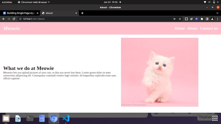

Like I said, nothing fancy. You will see that the link changes, and the page title is updated (not included in my screenshots).
There you have it. A fully functional single-page application. Now to add some page transitions.
Part II: CSS page transitions
This part is my all-time favorite. To create smooth page transitions, we’ll be using a JavaScript animation library, and a bit of CSS to help us along the way.
The animation library I’ll be using is GSAP. It makes it relatively easy to apply animations to your site, and in only a few lines of JavaScript. To learn more about GSAP and get their super cheat sheet for free, look them up here.
Installing GreenSock Animation Platform (GSAP)
For the sake of this tutorial, we will introduce GSAP to our project using CDN.
<script src="https://cdnjs.cloudflare.com/ajax/libs/gsap/3.10.4/gsap.min.js"></script>
You can add this before your closing <body> tag.
The fun part: Sliding effect with CSS
We want to create some sort of sliding effect in our app. To do that, we’ll need something that slides over our page before revealing its content.
Let's add one extra div tag at the bottom of our HTML and give it a class of slider.
<div class="slider"></div>
To our styles.css we are going to style the slider by adding:
.slider{
  position:fixed;
  top:0;
  left: 0;
  background-color: palevioletred;
  width: 100%;
  height: 100%;
  transform: translateY(100%);
}
If you refresh the page, nothing really changes. The slider is there, but the transform attribute keeps it below the page content, so we don’t actually see it.
We want the slider to slide upward over our page when we first open it. This is when GSAP comes into play. In our index.js, we must first initialize GSAP before we can start using it. Because we want animation on the page load, we will initialize our GSAP just below our class imports.
const tl = gsap.timeline({ defaults: {ease:'power2.out'} });
The line above simply defines our timeline and sets everything to defaults.
Our first animation will be the slider, sliding up from its position over our page.
tl.to('.slider', {y: "-100%", duration:1.2});
What we’ve done is use the timeline we declared to target the slider class. y: “-100%” replaces the translateY(100%) that we initially set to our CSS. The duration:1.2 is simply set for timing. So when our page first loads, our slider will slide upward over our page content.
But the animation still doesn’t look quite right to me. To make it better, we want our page content to slide up as well, just after the slider goes up. To do this, we will have to target the home ID in our HTML, since it contains our page content.
Just after the slider animation, we will add:
tl.to('#home', {y: "0%", duration:1.2}, "-=1");
Just as before, we targeted the home ID and set a duration to it. The additional -=1 is so that the page contents slide up immediately after the slider. If we take it out, you’ll notice some delay.
But is that it?
No. We haven’t added that smooth transition between the views we were talking about. Now that you’ve seen how the process works, adding transitions for the views won’t be as hard.
We want to create a smooth transition any time the user clicks on the links, so we’ll add animations inside our click event.
Our adjusted JavaScript will then look like this:
document.addEventListener('DOMContentLoaded', () => {
   document.body.addEventListener('click', e => {
       e.preventDefault();
       tl.to('.slider', {y: "100%", duration:0});

       if(e.target.matches('[data-link]')){
           tl.to('.slider', {y: "-100%", duration:1.2});
           tl.fromTo('#home', {opacity: 0}, {opacity:1, duration:0.5});

           navigateTo(e.target.href);
       }

   })

   router();
})
Remember that after our slider went up, it stayed in place. So when the user clicks, the slider comes down and goes up again. The duration of the first animation is set to zero, so you won’t notice it sliding down. The animation is set here so that it goes on every single time that the user clicks a link.
To make things even smoother, once the slider goes up on a click, we want the opacity of the page contents to quickly change and to create a nice fade-out.
tl.fromTo('#home', {opacity: 0}, {opacity:1, duration:0.5});
fromTo signifies that the animation has a start and endpoint. It starts with an opacity of zero and goes to an opacity of one in 0.5s.
After adjusting the animation, our SPA now looks like this: 
We have a nice slider and a nice fade on every page.
Conclusion
That marks the end of this article. We’ve gone over what SPAs are, how to create one from scratch, and how to add smooth page transitions between the views.
To check out the complete code for this project, use the Github repo link here.
I hope this article serves you well. Feel free to make alterations as needed and check out the GSAP docs here. They have a free cheat sheet that can help you make your animations smoother and better.
Is your frontend hogging your users' CPU?
As web frontends get increasingly complex, resource-greedy features demand more and more from the browser. If you’re interested in monitoring and tracking client-side CPU usage, memory usage, and more for all of your users in production, try LogRocket.

LogRocket is like a DVR for web and mobile apps, recording everything that happens in your web app or site. Instead of guessing why problems happen, you can aggregate and report on key frontend performance metrics, replay user sessions along with application state, log network requests, and automatically surface all errors.
Modernize how you debug web and mobile apps — Start monitoring for free.

Top comments (0)