
Written by Abhinav Anshul✏️
Today’s web applications are more interactive, user-centric, and data-heavy than ever. Therefore, handling input fields, forms, and other such elements is a crucial aspect of creating and managing dynamic web pages. These elements are simply native input elements used for data manipulation and interaction. In the context of React, “input state” refers to the current state of input elements, including input tags, checkboxes, radio buttons, and other such native form elements.
This article delves into how React manages input states and explores various strategies for handling state changes. You will also learn how React leverages the concept of controlled and uncontrolled components to improve React app performance and reduce re-rendering.
Jump ahead:
- Understanding controlled and uncontrolled components
- Exploring input state with
onFocusandonBlurevents - Leveraging third-party libraries to handle input state in React
You can check out the CodeSandbox demo we’ll use to explore how onFocus and onBlur events work with input elements. But first, let’s dive into understanding the difference between controlled and uncontrolled components.
Understanding controlled and uncontrolled components
Native HMTL input elements like input, select, and others maintain their own state and mutate it whenever the user types in them. However, this isn’t the case with React.
Instead, React keeps the input state in the component itself, passing it down to the input element and mutating the stored state using the setter function pattern. This setter function is usually a lazy callback function such as the useState Hook, which is widely used for mutating and managing input states.
With that in mind, let’s dive into the differences between controlled and uncontrolled components in React.
What are controlled components?
If you define the component state as the single source of truth, and data flows from the parent component to the element, we call it a controlled component. You usually need to store your state somewhere before it passes down to the element.
Controlled components are typically easier to debug, and the React team recommends this approach in most use cases. In the example below, the "single source of truth" is the name state. This name state is initialized using the useState Hook, then passed down and set as a value to the input element:
import { useState } from 'react'

function App(){
const [name, setName] = useState("");
return(
<div>
<h1>Controlled Component</h1>
<label>Name :</label>
<input name="name" type="text" value={name} onChange={(e) => setName(e.target.value)}
/>
</div>
)
}
This approach ensures that you maintain the state in the component itself, but outside the element. You can even use the same state to render it on the UI, which is not possible with an uncontrolled component.
What are uncontrolled components?
An alternative to the controlled component is the uncontrolled component, where the state is managed by the component's internal state. An uncontrolled component updates its state based on user manipulation.
In many use cases, an uncontrolled component is generally an anti-pattern and not the recommended approach. However, if you need to keep the "source of truth" in the DOM itself without relying on Hooks to manage the state, this can be a good option.
An uncontrolled component can also be useful for quick UI prototyping and porting HTML code to a React codebase.
In the example below, input is an uncontrolled component. You can access its value using the ref property:
import { useRef } from 'react'

function App(){
const inputRef = useRef(null)
useEffect(() => {
//log what the user types in
console.log(inputRef.current.value)
},[inputRef.current.value])

return(
<div>
<h1>Uncontrolled Component</h1>
  <label>Name :</label>
<input name="name" ref={inputRef} type="text" />
</div>
)
}
The useEffect Hook written above simply logs the currently typed value. To send your input data to an actual API, you can use the onSubmit attribute:
import { useRef } from 'react'

function App(){
const inputRef = useRef(null)
const handleSubmit = () => {
console.log(inputRef.current.value)
}

return(
<form onSubmit={handleSubmit}>
<h1>Uncontrolled Component</h1>
  <label>Name :</label>
<input name="name" ref={inputRef} type="text" />
</form>
)
}
The onSubmit attribute fires only when the form is submitted, whereas the onChange attribute fires at each keystroke — in other words, every time the data is manipulated.
Generally, you should opt for the controlled component pattern, which makes it easier to maintain states. States paired with the useState Hook make controlled components quite robust and maintainable, and this approach introduces fewer bugs compared to uncontrolled components.
Most importantly, do not mix and match both patterns at once in a form. If you are using a controlled component, follow it consistently throughout your form. Otherwise, React will give you a warning.
Exploring input state with onFocus and onBlur events in React
You have seen how onChange and onSubmit work both in controlled and uncontrolled component patterns. There are various other native HTML form attributes and events that make managing input cases easier. Let’s explore two types: onFocus and onBlur events.
Understanding how onFocus events work with input elements
onFocus is a native HTML event that triggers only when the target element is in focus. You can leverage this event to build UI interactions such as changing outline colors, providing tooltip feedback to the users, minor animations and interactions, and more.
In the example below, the UI should ideally render Focused whenever the input element is in focus and Not Focused whenever the input element is not in focus:
import { useState } from "react";

export default function App() {
  const [text, setText] = useState("");
  const [isFocus, setFocus] = useState(false);

  const handleFocus = () => {
    setFocus(true);
  };

  return (
    <div className="App">
      <input
        type="text"
        value={text}
        onFocus={handleFocus}
        onChange={(e) => setText(e.target.value)}
      />
      <div>{isFocus ? "Focused" : "Not Focused"}</div>
    </div>
  );
}
However, when this code is put into action, you might notice the text does not display Not Focused as we want it to when the input is not in focus. This is where the missing event attribute called onBlur comes into play.
Understanding how onBlur events work with input elements
onBlur works as a counterpart to onFocus events — it gets triggered when an element goes out of focus. You can pair these two event attributes together to track when an element is in focus and when it goes out of focus.
If you go back to the code above and add onBlur, the code will work as expected. In the example below, the two event attributes are working together to track the input element’s state — specifically, whether the element is in focus or not:
import { useState } from "react";

export default function App() {
  const [text, setText] = useState("");
  const [isFocus, setFocus] = useState(false);

  const handleFocus = () => {
    setFocus(true);
  };

  const handleBlur = () => {
    setFocus(false);
  };

  return (
    <div className="App">
      <input
        type="text"
        value={text}
        onFocus={handleFocus}
        onBlur={handleBlur}
        onChange={(e) => setText(e.target.value)}
      />
      <div>{isFocus ? "Focus" : "Not Focus"}</div>
    </div>
  );
}
Native JavaScript events such as onBlur and onFocus help when building forms or even simple input states. These events get triggered when users interact with input elements, providing visual feedback to guide the user: 
Providing visual feedback in this way can help in many situations — for example, if there are any issues with the data entered or other such formatting problems in the form.
Building out such interactions takes time and plenty of effort. If you are new to forms, make sure you understand how these interactions work natively before jumping to third-party solutions.
However, if you’re working on apps professionally that are intended for organizational or commercial use, it’s a much better idea to opt for third-party packages and leverage their APIs. This will save time and ensure you’re using production-ready solutions.
You can play around with the code example above on Code Sandbox to try out different ideas for using these native events in your React app.
Leveraging third-party libraries to handle input state in React
As I mentioned before, instead of reinventing the wheel, it’s best to utilize an already-built, production-ready form and input management solution for more complex data handling.
Popular libraries such as React Hook Form, Formik, and React Final Form are very efficient when it comes to managing complex use cases.
Established form handling libraries typically provide high-level APIs for error handling and pattern matching. They are also usually unstyled, so you can easily pair them with your favorite component library.
Let’s see an example of a form built with Formik:
import React from "react";
import { Formik } from "formik";
import "./styles.css";
const LoginForm = () => (
  <div className="login-container">
    <Formik
      initialValues={{ email: "", password: "" }}
      validate={(values) => {
        const errors = {};
        if (!values.email) {
          errors.email = "Email cannot be empty";
        } else if (
          !/^[A-Z0-9._%+-]+@[A-Z0-9.-]+\.[A-Z]{2,}$/i.test(values.email)
        ) {
          errors.email = "Oops! Email address is invalid";
        }
        return errors;
      }}
      onSubmit={(values, { setSubmitting }) => {
        // Send values to an API here
        console.log("email sent");
      }}
    >
      {({
        values,
        errors,
        touched,
        handleChange,
        handleBlur,
        handleSubmit,
        isSubmitting
        /* and other goodies */
      }) => (
        <form onSubmit={handleSubmit}>
          <input
            placeholder="email"
            type="email"
            name="email"
            onChange={handleChange}
            onBlur={handleBlur}
            value={values.email}
          />
          <br />
          {errors.email && touched.email && errors.email}
          <br />
          <input
            placeholder="password"
            type="password"
            name="password"
            onChange={handleChange}
            onBlur={handleBlur}
            value={values.password}
          />
          {errors.password && touched.password && errors.password}
          <br />
          <button type="submit" disabled={isSubmitting}>
            Submit
          </button>
        </form>
      )}
    </Formik>
  </div>
);
export default LoginForm;
As you can see, by doing the bare minimum, Formik removes the pain points of complex input data handling scenarios, such as error handling, warning, and pattern checking. For exampe:
- You have high-level APIs to manage custom error messages
- You can trigger texts when fields are being touched using a cursor
- You can format data before sending it to the backend API
Check out the result of our Formik form below: 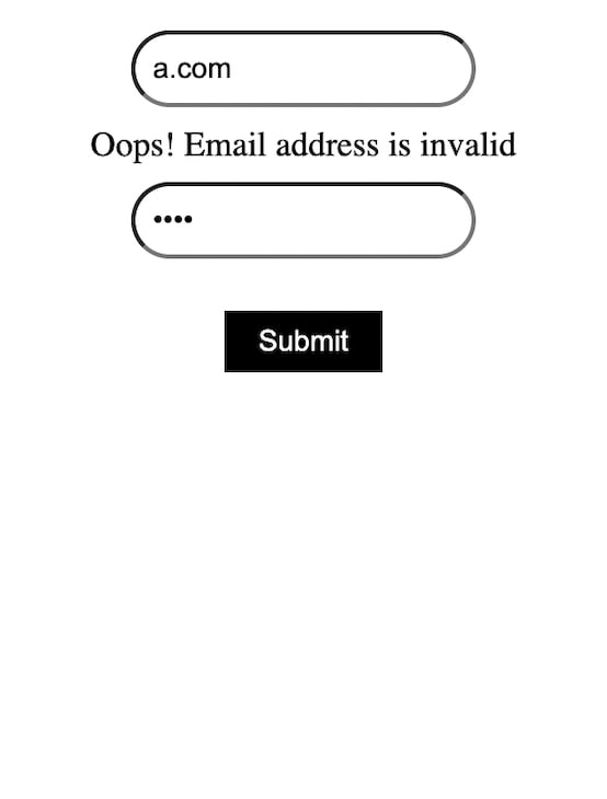 All the other libraries out there — such as React Hook Form and React Final Form — more or less follow a similar pattern. This allows you to focus more on the actual logic rather than building forms over and over again.
If you are building a form with many moving parts that requires extensive data manipulation, using a third-party library such as Formik to build forms and manage input states can be a very good idea.
Conclusion
Handing input states in React can be cumbersome at times. But with the right approach, following standards such as using controlled components, React makes it easier to handle data.
If your project is small to mid-level and form-intensive, it may be better to skip libraries and handle input states on your own. However, for a more form-intensive consumer product, it’s usually better to opt for a third-party form library.
React alleviates the challenges that come with input handling, providing events such as onFocus, onBlur, and more to make building and managing forms and data easier. Especially when pairing React with a library, building forms can be very scalable and easy to debug.
Get set up with LogRocket's modern React error tracking in minutes:
- Visit https://logrocket.com/signup/ to get an app ID.
- Install LogRocket via NPM or script tag.
LogRocket.init()must be called client-side, not server-side.
NPM:
$ npm i --save logrocket

// Code:

import LogRocket from 'logrocket';
LogRocket.init('app/id');
Script Tag:
Add to your HTML:

<script src="https://cdn.lr-ingest.com/LogRocket.min.js"></script>
<script>window.LogRocket && window.LogRocket.init('app/id');</script>
3.(Optional) Install plugins for deeper integrations with your stack:
- Redux middleware
- ngrx middleware
- Vuex plugin

Top comments (0)