The tree view control is used to represent hierarchical data in a tree-like structure, with the option of expanding and collapsing the tree nodes. Tree view has many flexible options, including data binding, node icon support, check boxes, node templates, drag and drop, and node editing supports.
This blog provides an overview of the tree view control from Essential JS 2, and also shows you the basic usage and the features of tree view.
Getting started
We can see how to gets started with the tree view component in the Angular platform through the following simple steps:
1.First, we can create a basic Angular application through the angular-cli. If you don’t have the CLI tool already, then you can install it globally with the following command.
npm install -g @angular/cli
- Create an Angular application using the following command
ng new treeview-app
This will create the application and download its dependencies.
- Once the application is created, you can install the packages for tree view component into your application by using the following command.
cd treeview-app
npm install @syncfusion/ej2-ng-navigations --save
Here, –save will include the navigations package in the dependencies list of package.json.
- Now, the environment-related configurations are completed. Next, you can create a component to place the tree view inside. You can use the following command to create a component in your application.
ng generate component home
After that, the following files will be created.
CREATE src/app/home/home.component.html (23 bytes)
CREATE src/app/home/home.component.spec.ts (614 bytes)
CREATE src/app/home/home.component.ts (261 bytes)
CREATE src/app/home/home.component.css (0 bytes)
UPDATE src/app/app.module.ts (388 bytes)
Then you need to import the tree view component in app.module.ts, and include it in the declarations.
import { BrowserModule } from '@angular/platform-browser';
import { NgModule } from '@angular/core';

import { AppComponent } from './app.component';
import { HomeComponent } from './home/home.component';

import { TreeViewComponent } from '@syncfusion/ej2-ng-navigations';

@NgModule({
  declarations: [
    AppComponent,
    HomeComponent,
    TreeViewComponent
  ],
  imports: [
    BrowserModule
  ],
  providers: [],
  bootstrap: [AppComponent]
})
export class AppModule { }
- Essential JS 2 components support a set of built-in themes, and here we will use the Material theme for the tree view. To add the material theme in your application, you need to import material.css in styles.css.
@import '../node_modules/@syncfusion/ej2-ng-navigations/styles/material.css';
- We have successfully completed the configurations related to tree view. Now you need to initialize your first tree view component in home.component.html.
<ejs-treeview id="myTree"></ejs-treeview>
Then add the home component in app.component.html (or where you want to place the tree view).
<div style="text-align:center">
  <h1>
    Welcome to the Angular TreeView sample!
  </h1>
</div>

<app-home></app-home>
- Finally, run the following command to see the output in a browser.
ng serve --open
Note: Now tree view is rendered without any nodes, since data binding is essential for this.
Data binding
Undoubtedly, tree view is a data-bound component that will need to be bound with a data source. The data source should be in the form of any valid hierarchical structure such as XML, a nested array of JSON objects, or a self-referential structure.
The tree nodes will be rendered from the dataSource based on the fields property, where the following columns are mandatory to display a tree view:
- Text – defines the display text of the tree node.
- Child – defines the child data source to render the sub-nodes (children nodes).
If the data source has different column names, then we should map those names through the fields property.
Now we can construct simple hierarchical data in home.component.ts, and map it to the tree view fields.
import { Component, OnInit } from '@angular/core';

@Component({
  selector: 'app-home',
  templateUrl: './home.component.html',
  styleUrls: ['./home.component.css']
})
export class HomeComponent implements OnInit {

  public treeData: Object[] = [
        {
            nodeId: '1', nodeText: 'Documents',
            nodeChild: [
                { nodeId: '11', nodeText: 'Team management.docx' },
                { nodeId: '12', nodeText: 'Entity Framework Core.pdf' },
            ]
        },
        {
            nodeId: '2', nodeText: 'Downloads',
            nodeChild: [
                { nodeId: '21', nodeText: 'Sales report.ppt' },
                { nodeId: '22', nodeText: 'Introduction to Angular.pdf' },
                { nodeId: '23', nodeText: 'Paint.exe' },
                { nodeId: '24', nodeText: 'TypeScript sample.zip' },
            ]
        },
        {
            nodeId: '3', nodeText: 'Music',
            nodeChild: [
                { nodeId: '31', nodeText: 'Crazy tone.mp3' }
            ]
        },
        {
            nodeId: '4', nodeText: 'Videos',
            nodeChild: [
                { nodeId: '41', nodeText: 'Angular tutorials.mp4' },
                { nodeId: '42', nodeText: 'Basics of Programming.mp4' },
            ]
        }
  ];

  public treeFields: Object = {
    dataSource: this.treeData,
    id: 'nodeId',
    text: 'nodeText',
    child: 'nodeChild'
  };

  constructor() { }

  ngOnInit() {

  }

}
Initialize the tree view in home.component.html, and assign the fields to that.
<ejs-treeview id="myTree" [fields]="treeFields"></ejs-treeview>
Once the data binding is done, the tree view will be rendered based on the data.

Load on demand
The tree view component was developed to work with large amounts of data. By default, the tree view is enabled with a load-on-demand option, so the child nodes were loaded at the time of expanding the parent node only.
Hence, even with a large amount of data-bound to the tree view, it will load the first level nodes only, which results in the high performance.
Check boxes
Tree view has a built-in option for checkboxes that allows the user to select more than one item.
The checkboxes are applicable for all the parent and child nodes, where the parent nodes only allow the tri-state. When the child nodes are partially checked at that time, the parent node becomes tri-state.
We can enable checkboxes by setting the showCheckBox property.
<ejs-treeview id="myTree" [fields]="treeFields" [showCheckBox]="true">
</ejs-treeview>
Tree view has flexible APIs to set or get the checked nodes collection at any time, which helps while making interactive applications. Here you can check the nodes through the checkedNodes property. So, we can check a few nodes at the initial time like the following.
<ejs-treeview id="myTree" [fields]="treeFields"
    [showCheckBox]="true" [checkedNodes]="['21','22','3']">
</ejs-treeview>
And the tree view becomes like this image.

Node icons
Tree view has the option to render nodes with icons and images without node templating by mapping the iconCss and imageUrl fields to the node object. The iconCss adds a CSS class through which we can add font icons and custom styling. The imageUrl field inserts an image tag with the provided image path.
First, we can provide the node type details in the tree view data source, then based on that we will define the corresponding tree node’s icons. So, in our scenario, we will differentiate the nodes by folder type or any file type and will update the details in the data source with the additional column nodeIcon.
import { Component, OnInit, ViewEncapsulation } from '@angular/core';

@Component({
  selector: 'app-home',
  templateUrl: './home.component.html',
  styleUrls: ['./home.component.css'],
  encapsulation: ViewEncapsulation.None,
})
export class HomeComponent implements OnInit {

  public treeData: Object[] = [
        {
            nodeId: '1', nodeText: 'Documents', nodeIcon: 'folder',
            nodeChild: [
                { nodeId: '11', nodeText: 'Team management.docx', nodeIcon: 'folder' },
                { nodeId: '12', nodeText: 'Entity Framework Core.pdf', nodeIcon: 'folder' }
            ]
        },
        {
            nodeId: '2', nodeText: 'Downloads', nodeIcon: 'folder', expanded: true,
            nodeChild: [
                { nodeId: '21', nodeText: 'Sales report.ppt', nodeIcon: 'ppt' },
                { nodeId: '22', nodeText: 'Introduction to Angular.pdf', nodeIcon: 'pdf' },
                { nodeId: '23', nodeText: 'Paint.exe', nodeIcon: 'exe' },
                { nodeId: '24', nodeText: 'TypeScript sample.zip', nodeIcon: 'zip' }
            ]
        },
        {
            nodeId: '3', nodeText: 'Music', nodeIcon: 'folder',
            nodeChild: [
                { nodeId: '31', nodeText: 'Crazy tone.mp3', nodeIcon: 'audio' }
            ]
        },
        {
            nodeId: '4', nodeText: 'Videos', nodeIcon: 'folder',
            nodeChild: [
                { nodeId: '41', nodeText: 'Angular tutorials.mp4', nodeIcon: 'video' },
                { nodeId: '42', nodeText: 'Basics of Programming.mp4', nodeIcon: 'video' }
            ]
        }
  ];

  public treeFields: Object = {
    dataSource: this.treeData,
    id: 'nodeId',
    text: 'nodeText',
    child: 'nodeChild',
    iconCss: 'nodeIcon'
  };

  constructor() { }

  ngOnInit() {

  }

}
Note: here the ViewEncapsulation set as None, since encapsulation is not applicable for dynamically created elements. Otherwise we need to put our custom styles under styles.css file.
An element is created for each node with the mentioned iconCss class, so we can apply our styling for that node there. You can apply the following styles in the home.component.css file.
.e-treeview {
    border: 1px solid #ccc;
    width: 400px;
}
.e-treeview .e-list-icon {
    background-repeat: no-repeat;
    background-image: url('https://ej2.syncfusion.com/angular/demos/src/images/icons/file_icons.png');
    height: 20px;
}
.e-treeview .e-list-icon.folder { background-position: -10px -552px }
.e-treeview .e-list-icon.docx { background-position: -10px -20px }
.e-treeview .e-list-icon.ppt { background-position: -10px -48px }
.e-treeview .e-list-icon.pdf { background-position: -10px -104px }
.e-treeview .e-list-icon.zip { background-position: -10px -188px }
.e-treeview .e-list-icon.audio { background-position: -10px -244px }
.e-treeview .e-list-icon.video { background-position: -10px -272px }
.e-treeview .e-list-icon.exe { background-position: -10px -412px }
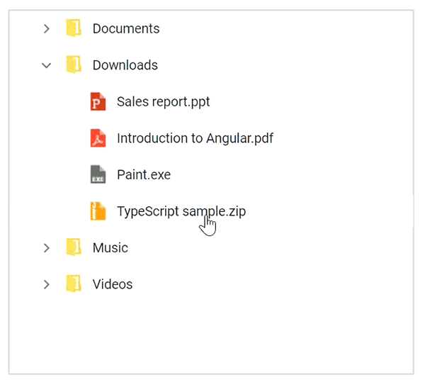
Now the tree view appearance will be changed.

Drag and drop
Another important option for tree view is node drag and drop. This allows the user to reorder the nodes through UI interaction.
We can enable the drag-and-drop option by setting the allowDragAndDrop property.
<ejs-treeview id="myTree" [fields]="treeFields" [allowDragAndDrop]="true">
</ejs-treeview>
This behavior can be customized to prevent dropping into any nodes. This was widely used in applications similar to file manager where the drop can’t be allowed into the file-type nodes.
This can be achieved through the nodeDragging and nodeDragStop event.
<ejs-treeview id="myTree" [fields]="treeFields" [allowDragAndDrop]="true"
    (nodeDragging)="onNodeDragging($event)" (nodeDragStop)="onNodeDragStop($event)">
</ejs-treeview>
Apply the conditions in the corresponding event handler.
public onNodeDragging (e) {
    if(e.droppedNode && e.droppedNode.querySelector('.folder') == null) {
        // to show the node drop not allowed icon
        var dragItemIcon = document.querySelector(".e-treeview.e-drag-item .e-icon-expandable");
        dragItemIcon.classList.add('e-no-drop');
    }
}

public onNodeDragStop (e) {
    if(e.droppedNode.querySelector('.folder') == null) {
        // to prevent the node drop action
        e.cancel = true;
    }
}
Now you can see the tree view with drag and drop enabled, where you are not allowed to drop any files or folders under the file node.
Node editing
Node editing is also an often-used feature that allows the user to rename the tree node dynamically through UI interaction. This is also a common and useful option in applications similar to file manager.
We can enable the node editing option by setting the allowEditing property.
<ejs-treeview id="myTree" [fields]="treeFields" [allowEditing]="true">
</ejs-treeview>
Now you can edit the tree nodes by double-clicking on them, or by pressing F2 key from the keyboard.

Template
The tree nodes can be templated using the built-in template support. This is a great option to give the tree view a great look and feel.
Depending on the application scenario, we can customize the tree nodes with images, multiple elements, and so on. Here, we can form a template for our file manager scenario to represent the child item count in the parent element.
First, we will update the data for the root elements to show the child count.
public treeData: Object[] = [
    {
        nodeId: '03', nodeText: 'Documents', nodeIcon: 'folder', childCount: 2,
        ...
    },
    {
        nodeId: '05', nodeText: 'Downloads', nodeIcon: 'folder', expanded: true, childCount: 4,
        ...
    },
    {
        nodeId: '01', nodeText: 'Music', nodeIcon: 'folder', childCount: 1,
        ...
    },
    {
        nodeId: '02', nodeText: 'Videos', nodeIcon: 'folder', childCount: 2,
        ...
    }
];
Then we can form the tree node element structure based on the childCount attribute.
<ejs-treeview id="myTree" [fields]="treeFields">
   <ng-template #nodeTemplate let-data>
        <div>
            {{data.nodeText}}
            <span *ngIf="data.childCount" class="files-count">
                ({{data.childCount}} files)
            </span>
        </div>
    </ng-template>
</ejs-treeview>
Now add your custom styles for your template in home.component.css.
.files-count {
    font-size: 9px;
    color: red;
}
Finally, the tree view becomes like the following image.

Summary
Overall, the tree view component was designed to be completely customizable, as well as have flexible usage from the application point of view.
If you would like to try the tree view component, you can download our free trial. You can visit the tree view source in GitHub and you can check our sample browser and documentation for detailed explanation and the understanding to proceed further.
If you have any questions or need any clarifications, please let us know in the comments section below. You can also contact us through our support forum or Direct-Trac. We are always happy to assist you!
If you like this blog post, we think you’ll also like the following free e-books:
JavaScript Succinctly
TypeScript Succinctly
AngularJS Succinctly
Angular 2 Succinctly
The post How to Create Tree View Control in Angular appeared first on Syncfusion Blogs.

Top comments (0)