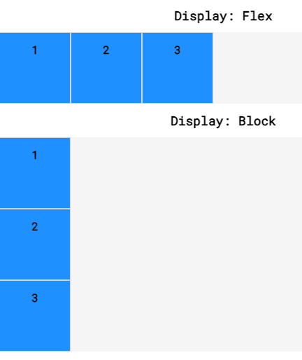
Flexbox
div.container {
  display: flex;
}
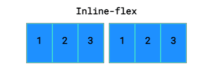
Inline-flex:
display: inline-flex;
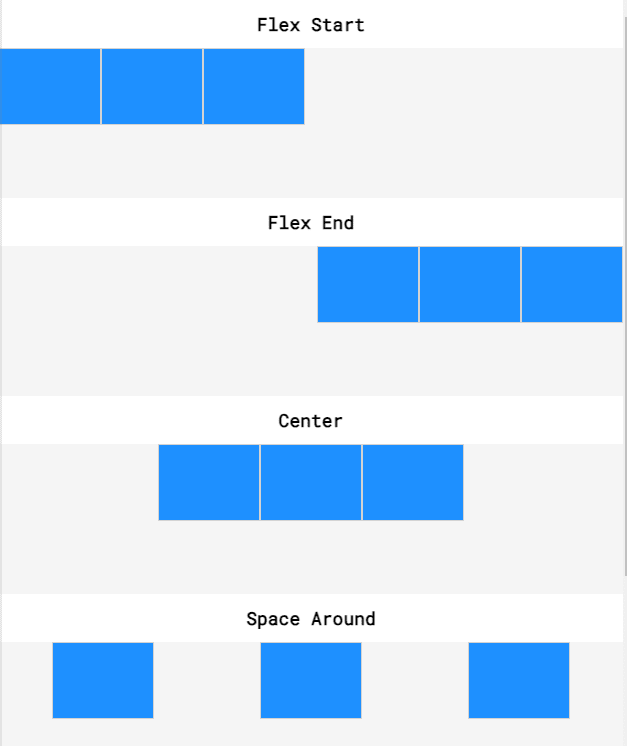
Justify-content:
.container {
  display: flex;
  justify-content: flex-end;
}
flex-start
flex-end
center
space-around
space-between

Align-items:
.container {
  align-items: baseline;
}


Flex-grow:
.center {
  width: 100px;
  flex-grow: 2;
}

Flex-shrink:
Pretty much the opposite of grow.
Flex-basis:
Another way of specifying the width of a flex item is with the flex-basis property. flex-basis allows us to specify the width of an item before it stretches or shrinks.
flex-basis: 150px;
Flex shorthand :
Flex: grow shrink basis
.big {
  flex-grow: 2;
  flex-shrink: 1;
  flex-basis: 150px;
}

.small {
  flex-grow: 1;
  flex-shrink: 2;
  flex-basis: 100px;
}
vs
.big {
  flex: 2 1 150px;
}

.small {
  flex: 1 2 100px;
}
Flex-wrap:
wrap
wrap-reverse
nowrap
.container {
  display: inline-flex;
  flex-wrap: wrap;
  width: 250px;
}
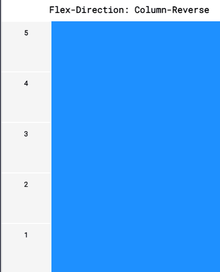
Flex-direction:


Top comments (0)