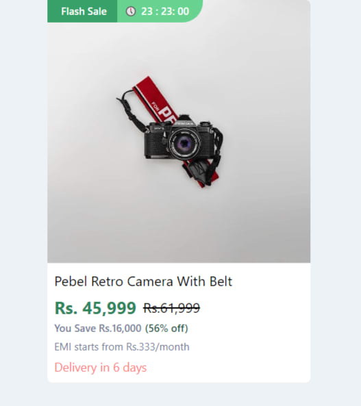
I've created a responsive e-commerce product card tile using tailwindCSS along with the hover effects and Sale labels
Web View
Mobile View

Code block:
<body class="bg-gray-200">
   <section class="w-full lg:w-1/5 hover:shadow-md transform transition duration-500 hover:scale-110 flex flex-row lg:flex-col mb-3 bg-white mx-auto rounded-md relative cursor-pointer">
      <section class="mx-auto relative w-2/5 lg:w-full lg:h-[325px] border-b">
         <section class="absolute flex flex-row items-center top-0 left-0 text-xs z-10 text-primaryFont font-semibold">
            <div
               class="py-1 desktop:px-2 px-3 lg:flex flex-row items-center bg-green-600 text-white hidden"
               >
               <i class="fi fi-sr-bolt text-primaryCyan pt-1 pr-1"></i>
               <span>Flash Sale</span>
            </div>
            <div class="flex flex-row items-center bg-green-400 pr-4 py-1 text-[11px] rounded-br-3xl text-white pl-2">
               🕔
               <span class="pl-1">23 : 23: 00</span>
            </div>
         </section>
         <img          src="https://images.pexels.com/photos/821651/pexels-photo-821651.jpeg?auto=compress&cs=tinysrgb&w=1260&h=750&dpr=1"
            alt="Product Name"
            class="mx-auto lg:rounded-t-md lg:rounded-b-none rounded-md p-1 lg:p-0"
            layout="fill"
            />
      </section>
      <section class="p-2 w-3/5 lg:w-full h-[150px] relative">
         <section class="flex flex-row items-start">
            <h1
               class="text-base text-black line-clamp-2 capitalize"
               title="Luna Fabric single seater recliner testing with the two line for line clamp test"
               >
               Pebel retro camera with belt
            </h1>
         </section>
         <section class="flex flex-row items-center mt-1">
            <div class="text-green-700 text-xl font-bold mr-2">
               Rs. 45,999
            </div>
            <div class="text-black-200 text-base line-through">
               Rs.61,999
            </div>
         </section>
         <section class="flex flex-row items-center mb-1">
            <span class="text-xs text-gray-600 font-medium">
            You Save Rs.16,000
            </span>
            <span class="text-xs text-green-900 ml-1 font-medium">
            (56% off)
            </span>
         </section>
         <section>
            <p class="text-gray-600 text-xs ">
               EMI starts from <span>Rs.333/month</span>
            </p>
            <div class="flex flex-row items-center mt-1 text-red-400 text-sm ">
               <span class="ml-1">Delivery in 6 days</span>
            </div>
         </section>
      </section>
      </Link>
   </section>
</body>
Click here Live preview: codepen link
Hope it helps you!!!

Top comments (1)
Nice card. One small caveat with
hover:scale-110on the card container: since scale affects the stacking context, adjacent cards can get visually clipped if you have tight gaps in the grid. A safer pattern is to apply the scale only to the image element inside the card, not the card wrapper, so surrounding layout stays stable.For product images specifically, another hover pattern worth knowing:
filter: grayscale()transitioning to full color draws the eye without changing dimensions at all. The three compositor-thread properties (transform, opacity, filter) are the ones you can reliably animate without triggering layout or paint — so they're the right tools for product card hover states that need to stay smooth at high refresh rates.This is especially relevant for brand/logo sections in e-commerce stores. I built a Shopify app around it (Eye Catching — apps.shopify.com/beautiful-brands) specifically because grayscale → color on hover is a common design request that needs to be applied consistently across brand logos in a grid. Same underlying CSS principles as what you're doing here.