This was originally published on my own site
I had a very productive time at Indie Web Camp Amsterdam. The format really lends itself to getting the most of a weekend—one day of discussions followed by one day of hands-on making and doing. You should definitely come along to Indie Web Camp Brighton on October 19th and 20th to experience it for yourself.
By the end of the “doing” day, I had something fun to demo—a dark mode for my website.
Y’know, when I first heard about Apple adding dark mode to their OS—and also to CSS—I thought, “Oh, great, Apple are making shit up again!” But then I realised that, like user style sheets, this is one more reminder to designers and developers that they don’t get the last word—users do.
Applying the dark mode styles is pretty straightforward in theory. You put the styles inside this media query:
@media (prefers-color-scheme: dark) {
...
}
Rather than over-riding every instance of a colour in my style sheet, I decided I’d do a little bit of refactoring first and switch to using CSS custom properties (or variables, if you will).
:root {
  --background-color: #fff;
  --text-color: #333;
  --link-color: #b52;
}
body {
  background-color: var(--background-color);
  color: var(--text-color);
}
a {
  color: var(--link-color);
}
Then I can over-ride the custom properties without having to touch the already-declared styles:
@media (prefers-color-scheme: dark) {
  :root {
    --background-color: #111416
    --text-color: #ccc;
    --link-color: #f96;
  }
}
All in all, I have about a dozen custom properties for colours—variations for text, backgrounds, and interface elements like links and buttons.
By using custom properties and the prefers-color-scheme media query, I was 90% of the way there. But the devil is in the details.
I have SVGs of sparklines on my homepage. The SVG has a hard-coded colour value in the stroke attribute of the path element that draws the sparkline. Fortunately, this can be over-ridden in the style sheet:
svg.activity-sparkline path {
  stroke: var(--text-color);
}
The real challenge came with the images I use in the headers of my pages. They’re JPEGs with white corners on one side and white gradients on the other.
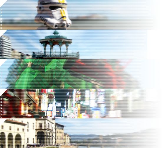
I could make them PNGs to get transparency, but the file size would shoot up—they’re photographic images (with a little bit of scan-line treatment) so JPEGs (or WEBPs) are the better format. Then I realised I could use CSS to recreate the two effects:
- For the cut-out triangle in the top corner, there’s
clip-path. - For the gradient, there’s …gradients!
background-image: linear-gradient(
  to right,
  transparent 50%,
  var(—background-color) 100%
);
Oh, and I noticed that when I applied the clip-path for the corners, it had no effect in Safari. It turns out that after half a decade of support, it still only exists with -webkit prefix. That’s just ridiculous. At this point we should be burning vendor prefixes with fire. I can’t believe that Apple still ships standardised CSS properties that only work with a prefix.
In order to apply the CSS clip-path and gradient, I needed to save out the images again, this time without the effects baked in. I found the original Photoshop file I used to export the images. But I don’t have a copy of Photoshop any more. I haven’t had a copy of Photoshop since Adobe switched to their Mafia model of pricing. A quick bit of searching turned up Photopea, which is pretty much an entire recreation of Photoshop in the browser. I was able to open my old PSD file and re-export my images.


Let’s just take a moment here to pause and reflect on the fact that we can now use CSS to create all sorts of effects that previously required a graphic design tool like Photoshop. I could probably do those raster scan lines with CSS if I were smart enough.

This is what I demo’d at the end of Indie Web Camp Amsterdam, and I was pleased with the results. But fate had an extra bit of good timing in store for me.
The very next day at the View Source conference, Melanie Richards gave a fantastic talk called The Tailored Web: Effectively Honoring Visual Preferences (seriously, conference organisers, you want this talk on your line-up). It was packed with great insights and advice on impementing dark mode, like this little gem for adjusting images:
@media (prefers-color-scheme: dark) {
  img {
    filter: brightness(.8) contrast(1.2);
  }
}
Melanie also pointed out that you can indicate the presence of dark mode styles to browsers, although the mechanism is yet to shake out. You can do it in CSS:
:root {
  color-scheme: light dark;
}
But you can also do it in HTML:
<meta name="supported-color-schemes" content="light dark">
That allows browsers to swap out replaced content; interface elements like form fields and dropdowns.
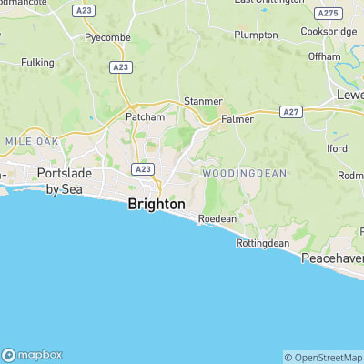
Oh, and one other addition I added after the fact was swapping out map imagery by using the picture element to point to darker map tiles:
<picture>
<source media="prefers-color-scheme: dark" srcset="https://api.mapbox.com/styles/v1/mapbox/dark-v10/static...">
<img src="https://api.mapbox.com/styles/v1/mapbox/outdoors-v10/static..." alt="map">
</picture>

So now I’ve got a dark mode for my website. Admittedly, it’s for just one of the eight style sheets. I’ve decided that, while I’ll update my default styles at every opportunity, I’m going to preservethe other skins as they are, like the historical museum pieces they are.
If you’re on the latest version of iOS, go ahead and toggle the light and dark options in your system preferences to flip between this site’s colour schemes.
This was originally published on my own site

Oldest comments (0)