
What is Flexbox ?
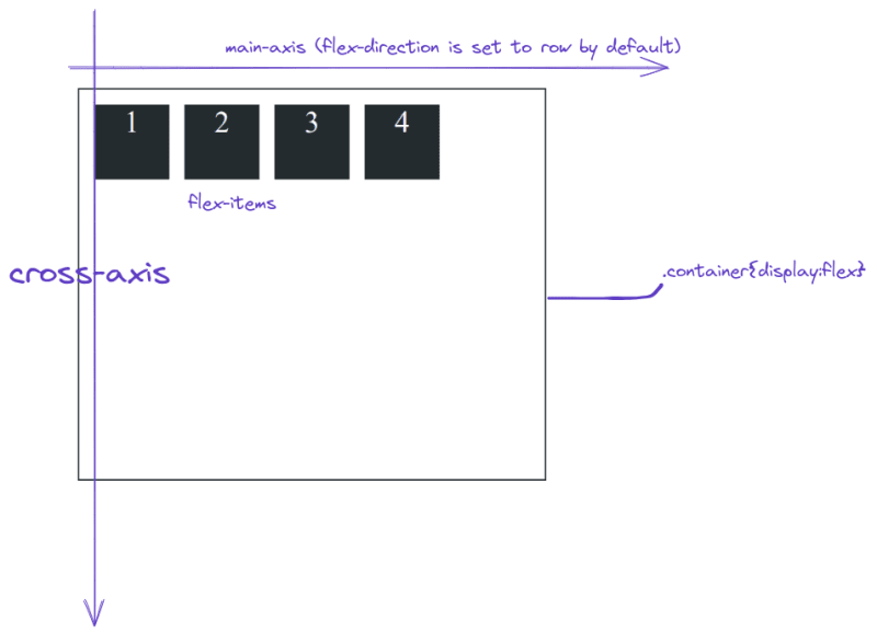
Flexbox is used for designing the one-dimensional layout, at a time you can either design your layout in columns or rows. Everything in flexbox depends on these two terms main axis and cross-axis they are perpendicular to each other. The main axis is determined by the flex-direction property.
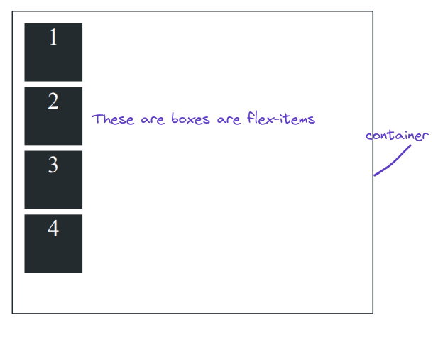
Flexbox works with the concept of containers and items, every element which is to be layout needs to be inside a container, this container is known as a flex container and the element is known as a flex-items. Let’s try to understand this with an example.
This is the HTML file we are going to use for this article, in this HTML document we have a div element with the class as container and it has five div child elements.
<!DOCTYPE html>
<html lang="en">
  <head>
    <meta charset="UTF-8" />
    <meta http-equiv="X-UA-Compatible" content="IE=edge" />
    <meta name="viewport" content="width=device-width, initial-scale=1.0" />
    <title>Positioning</title>
  </head>
  <style>
    .container {
      width: 90vw;
      height: 80vh;
      border: 2px solid #242b2e;
      padding: 10px;

      /* changes below this*/
    }
    .box {
      background-color: #242b2e;
      height: 100px;
      width: 100px;
            margin: 10px;
      font-size: 40px;
      text-align: center;
      color: #ffffff;
    }
  </style>
  <body>
    <div class="container">
      <div class="box box-1">1</div>
      <div class="box box-2">2</div>
      <div class="box box-3">3</div>
      <div class="box box-4">4</div>
      <div class="box box-5">5</div>
    </div>
  </body>
</html>
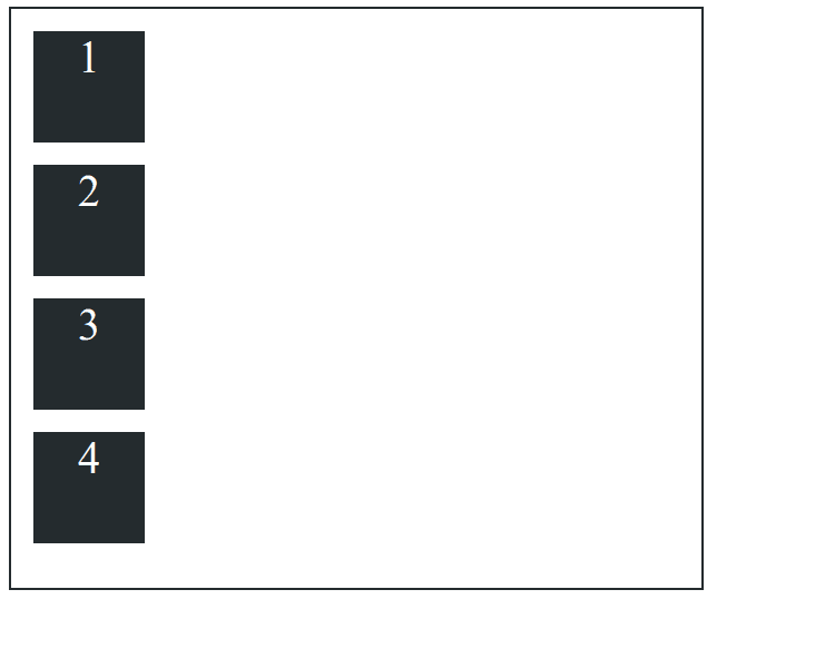
As you can see all five boxes are stacked one after another, let’s add display: flex to the container.
.container {
      width: 600px;
      height: 500px;
      border: 2px solid #242b2e;
      padding: 10px;

      /* changes below this*/
      display: flex;
    }
    .box {
      background-color: #242b2e;
      height: 100px;
      width: 100px;
      margin: 10px;
      font-size: 40px;
      text-align: center;
      color: #ffffff;
    }
Adding display: flex to the container element will define it as a flex container and all the flex items will be layout according to their main axis depending on the flex-direction by default the flex: direction is set to row so horizontal is our main axis, so the item will layout in a row.
Now let’s change the flex-direction to a column and see the changes.
.container {
      width: 600px;
      height: 500px;
      border: 2px solid #242b2e;
      padding: 10px;

      /* changes below this*/
      display: flex;
      flex-direction: column;
    }
    .box {
      background-color: #242b2e;
      height: 100px;
      width: 100px;
      margin: 10px;
      font-size: 40px;
      text-align: center;
      color: #ffffff;
    }
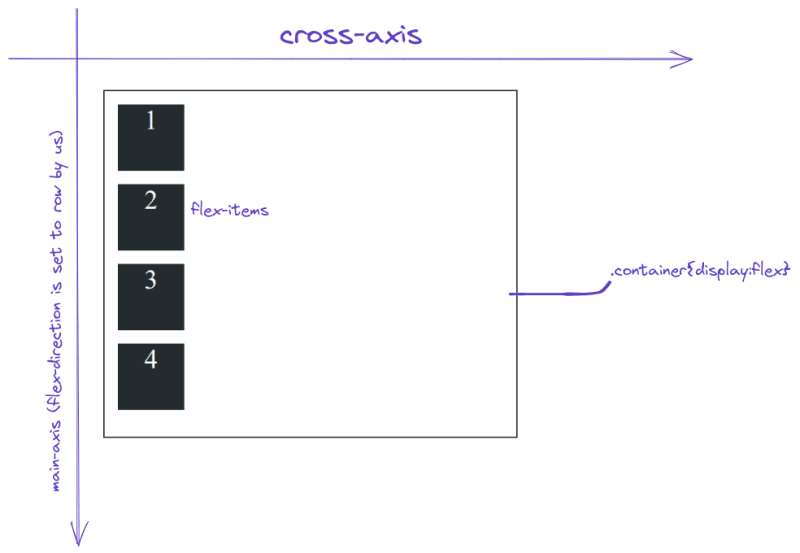
As you can see when we change the flex-direction to the column, the column becomes the main axis and the horizontal becomes the cross axis.
Flex direction
The flex-direction property is used to establish the main axis. flex-direction takes 4 values row column row-reverse and column-reverse. On webpages, the default value of `flex-direction is set to row.
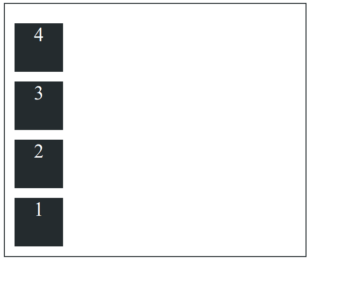
flex-direction: column
This property set’s the column as the main axis, so items are arranged from top to bottom.
flex-direction:row-reverse
This property reverses the items from left to right to right to left and moves the element toward the end of the container.
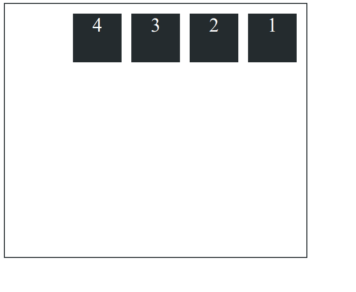
flex-direction: column-reverse
This property reverses the items from top to bottom to bottom to top and moves the item toward the end of the container.
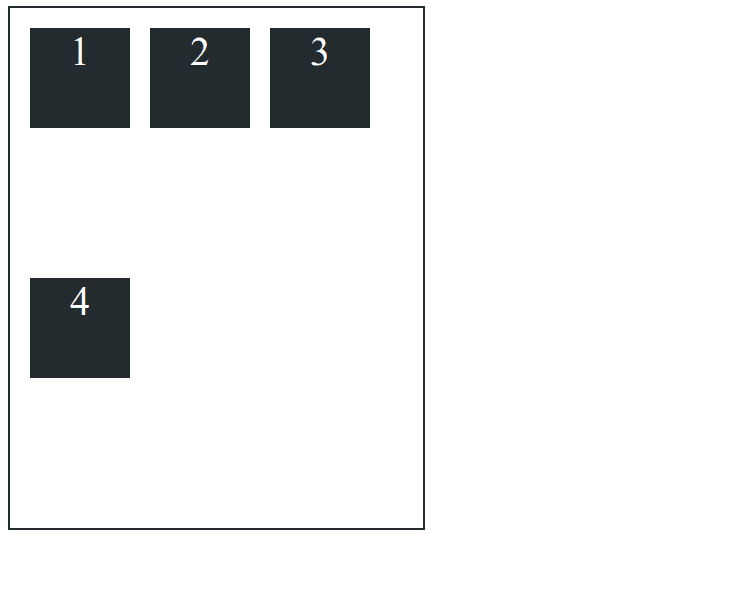
flex-wrap
Flexbox is a one-dimensional layout system, so by default, all the items will try to fit in one line, but we can allow items to wrap and move to the next line, just like word wrap in vs code. We can pass three values to flex-wrap nowrap wrap wrap-reverse By default, flex-wrap is set to no-wrap flex-wrap: nowrap.
flex-wrap: wrap
When we change the size of the container items move to the next line.
flex-wrap:wrap-reverse
Applying wrap-reverse will wrap items to the next line but from bottom to top.

justify-content
justify-content is used to align the items along the main axis. This is generally used to distribute the space between the items. justify-content takes many values but we are going to discuss the values that are used most.
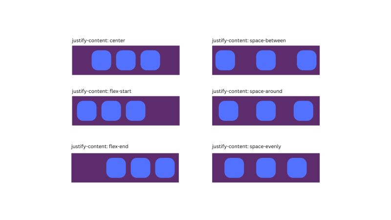
justify-content: center
the
justify-contentcenter is used to move the items to the center of the main axis.
justify-content: flex-start
This is used to move the items to the start of the main axis. This is also the default value.
justify-content: flex-end
This property is used to move the items to the end of the main axis.
justify-content:space-between
This property moves the first item to the start of the main axis and the last item to the last of the main axis and leftover space is event distributed between the items.
justify-content: space-around
This property is used to evenly distributes the items, with equal space around them.
justify-content: space-evenly
This property is used to distribute equal space around the items.
align-items
align-items is used to control the alignment of items along the cross-axis. align-items takes the following values flex-start flex-end center stretch baseline.
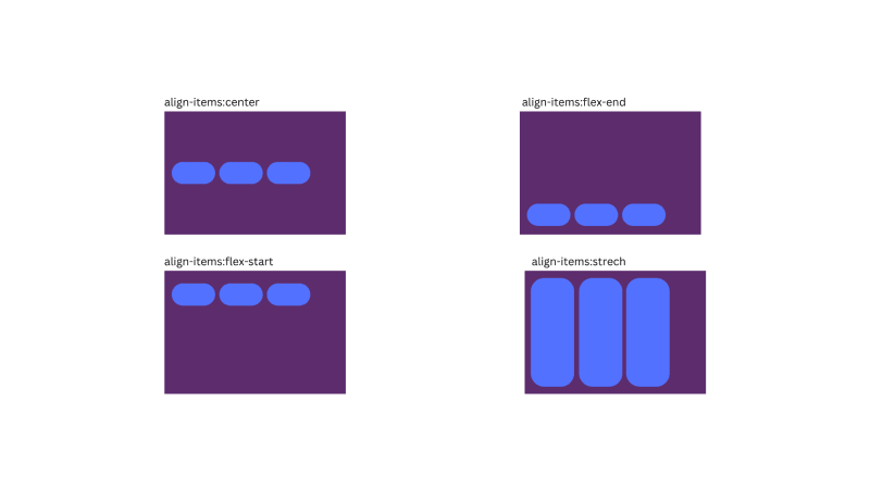
align-items: center
This property is used to align items to the center along the cross-axis.
align-items: flex-start
This property is used to align and move the items to the start of the container along the cross-axis.
align-items: flex-end
This property is used to align and move the items to the end of the container along the cross-axis.
align-items:stretch
This property is used to stretch and fill the items along the cross-axis.
align-content
align-content is very similar to justify-content property. This is also used to distribute the space between the items but along the cross-axis. align-content takes the following values. flex-start flex-end center stretch space-between and space-around
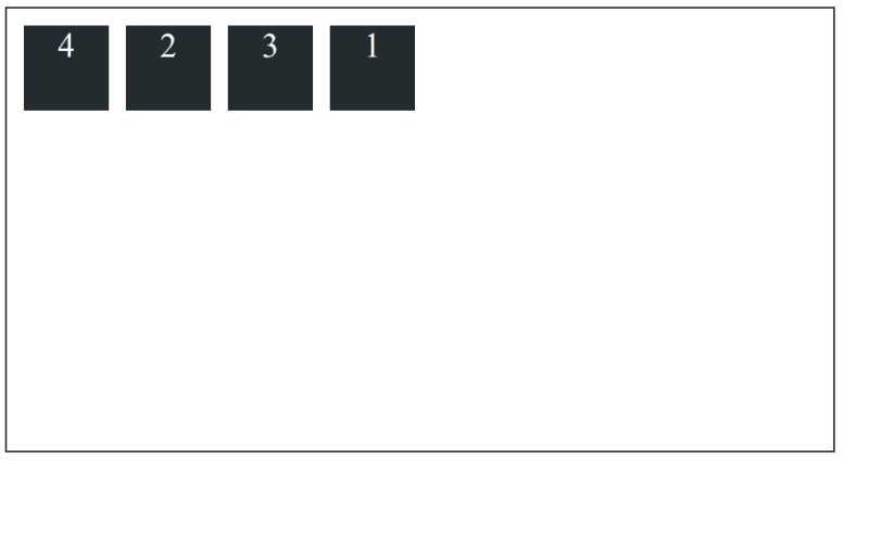
Now let’s discuss some properties which can be applied only to the items themselves.
order
order property is used to control the order of the items. By default, all the flex items have an order value of 0. The order of items is controlled by the order property.
`css
.container {
width: 50%;
height: 500px;
border: 2px solid #242b2e;
padding: 10px;
  /* changes below this*/
  display: flex;
}
.box {
  background-color: #242b2e;
  height: 100px;
  width: 100px;
  margin: 10px;
  font-size: 40px;
  text-align: center;
  color: #ffffff;
}

.box-1 {
  order: 3;
}
.box-4 {
  order: -1;
}
`
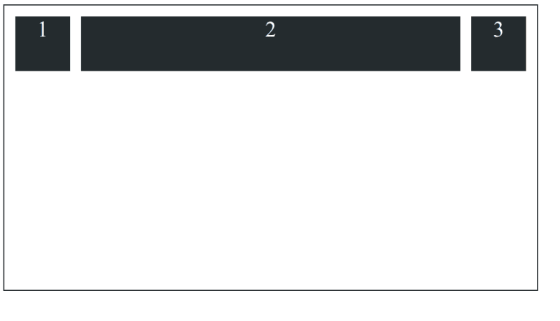
flex-grow
It specifies the amount by which an item will grow relative to the rest of the flexible items in the same container.
Conclusion
The article only discusses the most commonly used flexbox properties. If you want to learn more about flexbox, CSS Tricks has a great article on it. That's all for this article, let me know what you think in the comments.

Top comments (0)