
Unearthing insights from vast datasets is an intricate blend of art and science. In the realm of financial analysis, a pivotal instrument for visually exploring complex data is the Open-High-Low-Close (OHLC) chart. This tutorial is your roadmap to swiftly crafting your OHLC chart using JavaScript, a step-by-step journey. We'll harness S&P 500 data, and by the end of this article, you'll possess the skills to orchestrate visual stock analysis adeptly.
What Is OHLC Chart?
Before we embark on this data visualization odyssey, let's uncover the essence of the OHLC chart type. An OHLC chart — denoting Open, High, Low, Close — is a potent ally in financial data analysis and visualization. It can meticulously encapsulate stock price dynamics over chosen timeframes, be it a day, an hour, or any other. Here's the significance of each facet within an OHLC chart:
- Open (O): The open price inaugurates the financial instrument's price journey within the selected timeframe. It typically manifests as a horizontal mark on the chart's left side.
- High (H): The high price represents the zenith reached during the designated time frame, crowning the vertical line.
- Low (L): The low price marks the nadir recorded in the same timeframe, visible at the line's lower extremity.
- Close (C): The close price is the finale, signaling the financial instrument's value at the selected timeframe's closure. It is often depicted as a horizontal mark on the chart's right side.
In summary, each vertical line in an OHLC chart delineates the price range during a specific time segment. The line's height is dictated by the highest and lowest prices, while the left and right marks signify the opening and closing prices, respectively. OHLC charts serve as indispensable tools for traders and analysts to decipher price trends, gauge price volatility, and pinpoint vital support and resistance levels — making them an integral asset in financial data analysis.
OHLC Chart Example
Take a glance at an example of an OHLC chart below. Actually, it’s the very creation that awaits you at the end of this tutorial — your visual guide to financial storytelling.
Ready to unfurl the financial narrative through the art of OHLC chart development with JavaScript? Without further ado, let’s embark on this data visualization expedition!
A. Building Basic OHLC Chart with JavaScript
Creating an OHLC chart might initially seem complex, but fret not, even if you're new to this. I'm here to guide you through each essential step in crafting a clear and informative one. We can achieve this by following these four steps:
- Create a basic web page in HTML
- Include the required JavaScript files
- Load the data
- Write the OHLC charting code
1. Create a basic web page in HTML
To start, let’s create an HTML page for our JS OHLC chart. Adding a <div> element with the ID "container" will provide a place to display the graphic. We can adjust the appearance of the chart by applying CSS rules within the <style> block. Here, we set the width and height properties to 100%, and the margin and padding to 0.
<!DOCTYPE html>
<html lang="en">
<head>
  <meta charset="utf-8">
  <title>JavaScript OHLC Chart</title>
  <style type="text/css">
    html,
    body,
    #container {
      width: 100%;
      height: 100%;
      margin: 0;
      padding: 0;
    }
  </style>
</head>
<body>
  <div id="container"></div>
</body>
</html>
2. Include the required JavaScript files
Now that the basic HTML structure is in place, it's time to incorporate the JavaScript files necessary for creating our OHLC chart. We can add these to our project in two ways: by downloading and using them locally, or by linking to them through a Content Delivery Network (CDN). For this tutorial, let’s opt for the CDN approach, including links to the essential scripts in the <head> section of our HTML page. We'll use AnyChart JS Charts, and to create an OHLC chart, it’s necessary to include the Core and Stock modules, as well as the Data Adapter one, which will make it easy to load data from a file.
<!DOCTYPE html>
<html lang="en">
<head>
  <meta charset="utf-8">
  <title>JavaScript OHLC Chart</title>
  <style type="text/css">
    html,
    body,
    #container {
      width: 100%;
      height: 100%;
      margin: 0;
      padding: 0;
    }
  </style>
  <script src="https://cdn.anychart.com/releases/8.11.1/js/anychart-core.min.js"></script>
  <script src="https://cdn.anychart.com/releases/8.11.1/js/anychart-stock.min.js"></script>
  <script src="https://cdn.anychart.com/releases/8.11.1/js/anychart-data-adapter.min.js"></script>
</head>
<body>
  <div id="container"></div>
  <script>
    // The entire JS code for our OHLC chart visualization will be here.
  </script>
</body>
</html>
3. Load the data
Now, let's proceed with loading our data. As previously mentioned, we are going to visualize the S&P 500 data over time. This data is sourced from Yahoo Finance and organized in a CSV format, accessible on my GitHub gist. The CSV data contains six columns: Date, Open, High, Low, Close, and Volume, representing the date and corresponding price points for each date. To ensure the data integrates seamlessly into the OHLC view, we utilize the anychart.data.loadCsvFile() method powered by the Data Adapter script. Below is the code snippet we'll use.
anychart.data.loadCsvFile("https://gist.githubusercontent.com/awanshrestha/f234904bcc41b38dc3e6cb98ee563777/raw/c033b77d9ae698b322a6446befee4a7ed88be10e/SandP500Final.csv", function (data) {
  // The OHLC JS code lands here.
});
4. Write the OHLC charting code
Next, we’ll write a few lines of JavaScript code, and our OHLC chart will rise. To start, we employ the anychart.onDocumentReady() function, encapsulating all the code within it. This ensures that the code executes only after the page is fully loaded.
<script>
  anychart.onDocumentReady(function () {
    // The upcoming OHLC chart data and JS code will be in this section
  });
</script>
Then, we load data as explained in Step 3 and create a data table with this data.
anychart.onDocumentReady(function () {

  // load csv data
  anychart.data.loadCsvFile("https://gist.githubusercontent.com/awanshrestha/f234904bcc41b38dc3e6cb98ee563777/raw/c033b77d9ae698b322a6446befee4a7ed88be10e/SandP500Final.csv", function (data) {

    // create a data table
    var dataTable = anychart.data.table();
    dataTable.addData(data);

    // The upcoming OHLC JS charting code will be here

  });

});
As we map the columns from the data table into OHLC format, our data is completely ready.
var mapping = dataTable.mapAs({
  date: 0,
  open: 1,
  high: 2,
  low: 3,
  close: 4
});
Next, we create a stock chart instance, establish a chart plot, and add an OHLC series binding it with the mapped data.
// create a stock chart
var chart = anychart.stock();

// create the chart plot
var plot = chart.plot(0);

// create an ohlc series and bind it to the mapped data
var ohlcSeries = plot.ohlc(mapping);
While doing this, let’s also set the chart to display data within a specific time range, much like zooming into a particular timeframe on a timeline.
chart.selectRange("2021-03-01", "2023-08-20");
Finally, we name the chart, place it in the container created in Step 1, and render the resulting OHLC chart visualization.
// set the chart title
chart.title("S&P 500 OHLC Chart");

// set the container id for the chart
chart.container("container");

// initiate the chart drawing
chart.draw();
Tada! Our basic JavaScript-based OHLC chart is ready for exploration. You can find it on Playground. Additionally, for your convenience, the code is provided below. 
<!DOCTYPE html>
<html lang="en">
<head>
  <meta charset="utf-8">
  <title>JavaScript OHLC Chart</title>
  <style type="text/css">
    html,
    body,
    #container {
      width: 100%;
      height: 100%;
      margin: 0;
      padding: 0;
    }
  </style>
  <script src="https://cdn.anychart.com/releases/8.11.1/js/anychart-core.min.js"></script>
  <script src="https://cdn.anychart.com/releases/8.11.1/js/anychart-stock.min.js"></script>
  <script src="https://cdn.anychart.com/releases/8.11.1/js/anychart-data-adapter.min.js"></script>
</head>
<body>
  <div id="container"></div>
  <script>
    anychart.onDocumentReady(function () {
      // load csv data
      anychart.data.loadCsvFile("https://gist.githubusercontent.com/awanshrestha/f234904bcc41b38dc3e6cb98ee563777/raw/c033b77d9ae698b322a6446befee4a7ed88be10e/SandP500Final.csv", function (data) {
        // create a data table
        var dataTable = anychart.data.table();
        dataTable.addData(data);
        // map the columns from the data table into the ohlc format
        var mapping = dataTable.mapAs({
          date: 0,
          open: 1,
          high: 2,
          low: 3,
          close: 4
        });
        // create a stock chart
        var chart = anychart.stock();
        // create the chart plot
        var plot = chart.plot(0);
        // create an ohlc series and bind it to the mapped data
        var ohlcSeries = plot.ohlc(mapping);
        // set the date/time range displayed by default
        chart.selectRange("2021-03-01", "2023-08-20");
        // set the chart title
        chart.title("S&P 500 OHLC Chart");
        // set the container id for the chart
        chart.container("container");
        // initiate the chart drawing
        chart.draw();
      });
    });
  </script>
</body>
</html>
B. Customizing OHLC Chart
Now that our basic JS-based OHLC chart is in place, let's explore ways to enhance its visuals and functionality, making it more informative and visually appealing.
1. Color and outlook customization
A well-chosen color scheme can enhance the visual appeal and clarity of any chart. In this step, we'll tweak the default shades of the chart to infuse more vibrancy into it. First, let’s set the background color of the chart to a soothing light blueish-gray shade.
chart.background().fill("#edf4f5");
Additionally, we can customize the color of the lines, both in normal and different states.
// customize the color of the ohlc bars
ohlcSeries.fallingFill("#ff0d0d");
ohlcSeries.fallingStroke("#ff0d0d");
ohlcSeries.risingFill("#43ff43");
ohlcSeries.risingStroke("#43ff43");

// additional customization for the ohlc series
ohlcSeries.normal().risingStroke("#33ccff");
ohlcSeries.hovered().risingStroke("#33ccff", 1.5);
ohlcSeries.selected().risingStroke("#33ccff", 3);
ohlcSeries.normal().fallingStroke("#ff33cc");
ohlcSeries.hovered().fallingStroke("#ff33cc", 1.5);
ohlcSeries.selected().fallingStroke("#ff33cc", 3);
Also, let’s name the series “S&P” and customize the legend item for the OHLC series to display a rising-falling icon.
// name the ohlc series
ohlcSeries.name("S&P");

// customize the legend item for the ohlc series
// to display a rising/falling icon
ohlcSeries.legendItem().iconType("rising-falling");

2. Add Date Range Selection UI
While there is already a scroller at the bottom of the OHLC visualization to select the date range, we can still improve the navigation experience. Let’s add a date range picker and a range selector, enhancing the chart’s UI.
// create a date range picker
var rangePicker = anychart.ui.rangePicker();
rangePicker.render(chart);

// create a date range selector
var rangeSelector = anychart.ui.rangeSelector();
rangeSelector.render(chart);

3. Integrate event markers
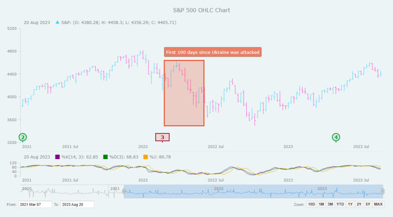
World affairs and events play a significant role in stock market prices, so it can make sense to highlight specific dates and mark these events directly within the OHLC chart. Below is how we can add event markers precisely, with data points for individual events, including symbols, dates, descriptions, and styling attributes for normal, hovered, and selected states.
// add event markers
plot.eventMarkers({
  "groups": [
    {
      "data": [
        {
          "symbol": "1",
          "date": "2020-03-11",
          "description": "The WHO declares COVID-19 a global pandemic",
          "normal": {
            "type": "rect", "width": 40,
            "fill": "#ead9d1", "stroke": "2 #990033",
            "fontColor": "#990033", "fontWeight": 600,
            "connector": { "stroke": "2 #990033" }
          }
        },
        {
          "symbol": "2",
          "date": "2021-03-08",
          "description": "The first COVID-19 vaccine is approved for use in the U.S.",
          "normal": {
            "type": "circle",
            "fill": "#d1ead9", "stroke": "2 #009933",
            "fontColor": "#009933", "fontWeight": 600,
            "connector": { "stroke": "2 #009933" }
          }
        },
        {
          "symbol": "3",
          "date": "2022-02-24",
          "description": "Russia starts a military operation in Ukraine",
          "normal": {
            "type": "rect", "width": 40,
            "fill": "#ead9d1", "stroke": "2 #990033",
            "fontColor": "#990033", "fontWeight": 600,
            "connector": { "stroke": "2 #990033" }
          }
        },
        {
          "symbol": "4",
          "date": "2023-05-03",
          "description": "The Federal Reserve announces a rate hike to combat inflation, exceeding 5%",
          "normal": {
            "type": "circle",
            "fill": "#d1ead9", "stroke": "2 #009933",
            "fontColor": "#009933", "fontWeight": 600,
            "connector": { "stroke": "2 #009933" }
          },
          "hovered": {
            "fill": "white", "stroke": "2 #990033",
            "fontColor": "#990033",
            "connector": { "stroke": "2 #990033" }
          },
          "selected": {
            "fill": "white", "stroke": "2 #4d1a00",
            "fontColor": "#4d1a00",
            "connector": { "stroke": "2 #4d1a00" }
          }
        },
      ]
    }
  ]
});

// set the event marker symbol
plot.eventMarkers().format(function () {
  return this.getData("symbol");
});

4. Add annotations
Annotations can be greatly helpful in providing additional context, emphasizing specific points or areas to enhance data interpretation. They are particularly useful for explaining trends or outliers, making charts more insightful and easier to understand. To add annotations, start by creating an annotation object.
var annotation = plot.annotations();
Next, let’s create a rectangle annotation with specified coordinates, stroke, and fill properties. The rectangle will mark a particular area on the plot between two dates and two values, with defined stroke and fill colors.
annotation.rectangle({
  xAnchor: "2022-02-24",
  valueAnchor: 3491,
  secondXAnchor: "2022-06-04",
  secondValueAnchor: 4637,
  stroke: "3 #e65a37",
  fill: "#e65a37 0.25"
});
Following this, we create a text label annotation to provide additional information.
annotation.label()
  .xAnchor("2022-02-24")
  .valueAnchor(4900)
  .anchor("left-top")
  .offsetY(5)
  .padding(6)
  .text("First 100 days since Ukraine was attacked")
  .fontColor("#fff")
  .background({
    fill: "#e65a37 0.75",
    stroke: "0.5 #2d2d2d",
    corners: 2
});

5. Add KDJ indicator
In the realm of technical analysis, numerous indicators aid in the evaluation of stock trends. Let's explore how to integrate the KDJ indicator, a popular tool for analyzing and predicting stock trends, helping identify potential buy and sell signals. To begin, we create a new plot specifically for displaying the KDJ indicator.
var kdjPlot = chart.plot(1);
To calculate the KDJ indicator, we need specific data points, typically high, low, and closing prices. We map these data points from the original data table to use with the KDJ indicator.
var kdjMapping = dataTable.mapAs({
  high: 2,
  low: 3,
  close: 4
});
We then create the KDJ indicator itself, specifying the mapping and the default periods for %K, %D, and %J.
var kdj = kdjPlot.kdj(kdjMapping, 14, 3, 3);
// (default values: 14 periods for %k, 3 periods for %d, 3 periods for %j)
kdj.kSeries().stroke("purple"); // customize the %k line color
kdj.dSeries().stroke("green");  // customize the %d line color
kdj.jSeries().stroke("orange"); // customize the %j line color
To ensure the KDJ plot is displayed appropriately, we can set its height.
kdjPlot.height("20%");

6. Display volume data in the scroller
The scroller is enabled by default at the bottom of an OHLC stock chart and is used for navigation through time. It’s possible to incorporate a series into it to enhance its functionality. For instance, let’s supply the scroller with a series representing volume data. We first map the volume data to the scroller.
var volumeMapping = dataTable.mapAs({
  "value": 5
});
Then we integrate the volume data into the scroller, making it appear as a line series.
chart.scroller().line(volumeMapping);
Our final JavaScript (HTML5) OHLC chart is complete after all these steps! Feel free to check it out with the full code below, as well as on Playground where you can make further changes as needed and continue experimenting with various other features (get inspired by the stock chart gallery and the stock chart documentation).
<!DOCTYPE html>
<html lang="en">
<head>
  <meta charset="utf-8">
  <title>JavaScript OHLC Chart</title>
  <style type="text/css">
    html,
    body,
    #container {
      width: 100%;
      height: 100%;
      margin: 0;
      padding: 0;
    }
  </style>
  <script src="https://cdn.anychart.com/releases/8.11.1/js/anychart-core.min.js"></script>
  <script src="https://cdn.anychart.com/releases/8.11.1/js/anychart-stock.min.js"></script>
  <script src="https://cdn.anychart.com/releases/8.11.1/js/anychart-data-adapter.min.js"></script>
</head>
<body>
  <div id="container"></div>
  <script>
    anychart.onDocumentReady(function () {
      // load csv data
      anychart.data.loadCsvFile("https://gist.githubusercontent.com/awanshrestha/f234904bcc41b38dc3e6cb98ee563777/raw/c033b77d9ae698b322a6446befee4a7ed88be10e/SandP500Final.csv", function (data) {
        // create a data table
        var dataTable = anychart.data.table();
        dataTable.addData(data);
        // map the columns from the data table into the ohlc format
        var mapping = dataTable.mapAs({
          date: 0,
          open: 1,
          high: 2,
          low: 3,
          close: 4
        });
        // add the volume data mapping
        var volumeMapping = dataTable.mapAs({
          "value": 5
        });
        // create a stock chart
        var chart = anychart.stock();
        // create the chart plot
        var plot = chart.plot(0);
        // create an ohlc series and bind it to the mapped data
        var ohlcSeries = plot.ohlc(mapping);
        // set the chart background color
        chart.background().fill("#edf4f5");
        // add the volume data as the scroller series
        chart.scroller().line(volumeMapping);
        // customize the color of the ohlc bars
        ohlcSeries.fallingFill("#ff0d0d");
        ohlcSeries.fallingStroke("#ff0d0d");
        ohlcSeries.risingFill("#43ff43");
        ohlcSeries.risingStroke("#43ff43");
        // additional customization for the ohlc series
        ohlcSeries.normal().risingStroke("#33ccff");
        ohlcSeries.hovered().risingStroke("#33ccff", 1.5);
        ohlcSeries.selected().risingStroke("#33ccff", 3);
        ohlcSeries.normal().fallingStroke("#ff33cc");
        ohlcSeries.hovered().fallingStroke("#ff33cc", 1.5);
        ohlcSeries.selected().fallingStroke("#ff33cc", 3);
        // name the ohlc series
        ohlcSeries.name("S&P");
        // customize the legend item for the ohlc series
        // to display a rising/falling icon
        ohlcSeries.legendItem().iconType("rising-falling");
        // create a date range picker
        var rangePicker = anychart.ui.rangePicker();
        rangePicker.render(chart);
        // create a date range selector
        var rangeSelector = anychart.ui.rangeSelector();
        rangeSelector.render(chart);
        // add event markers
        plot.eventMarkers({
          "groups": [
            {
              "data": [
                {
                  "symbol": "1",
                  "date": "2020-03-11",
                  "description": "The WHO declares COVID-19 a global pandemic",
                  "normal": {
                    "type": "rect", "width": 40,
                    "fill": "#ead9d1", "stroke": "2 #990033",
                    "fontColor": "#990033", "fontWeight": 600,
                    "connector": { "stroke": "2 #990033" }
                  }
                },
                {
                  "symbol": "2",
                  "date": "2021-03-08",
                  "description": "The first COVID-19 vaccine is approved for use in the U.S.",
                  "normal": {
                    "type": "circle",
                    "fill": "#d1ead9", "stroke": "2 #009933",
                    "fontColor": "#009933", "fontWeight": 600,
                    "connector": { "stroke": "2 #009933" }
                  }
                },
                {
                  "symbol": "3",
                  "date": "2022-02-24",
                  "description": "Russia starts a military operation in Ukraine",
                  "normal": {
                    "type": "rect", "width": 40,
                    "fill": "#ead9d1", "stroke": "2 #990033",
                    "fontColor": "#990033", "fontWeight": 600,
                    "connector": { "stroke": "2 #990033" }
                  }
                },
                {
                  "symbol": "4",
                  "date": "2023-05-03",
                  "description": "The Federal Reserve announces a rate hike to combat inflation, exceeding 5%",
                  "normal": {
                    "type": "circle",
                    "fill": "#d1ead9", "stroke": "2 #009933",
                    "fontColor": "#009933", "fontWeight": 600,
                    "connector": { "stroke": "2 #009933" }
                  },
                  "hovered": {
                    "fill": "white", "stroke": "2 #990033",
                    "fontColor": "#990033",
                    "connector": { "stroke": "2 #990033" }
                  },
                  "selected": {
                    "fill": "white", "stroke": "2 #4d1a00",
                    "fontColor": "#4d1a00",
                    "connector": { "stroke": "2 #4d1a00" }
                  }
                },
              ]
            }
          ]
        });
        // set the event marker symbol
        plot.eventMarkers().format(function () {
          return this.getData("symbol");
        });
        // create annotations
        var annotation = plot.annotations();
        // create a rectangle annotation
        annotation.rectangle({
          xAnchor: "2022-02-24",
          valueAnchor: 3491,
          secondXAnchor: "2022-06-04",
          secondValueAnchor: 4637,
          stroke: "3 #e65a37",
          fill: "#e65a37 0.25"
        });
        // create a text label annotation
        annotation.label()
          .xAnchor("2022-02-24")
          .valueAnchor(4900)
          .anchor("left-top")
          .offsetY(5)
          .padding(6)
          .text("First 100 days since Ukraine was attacked")
          .fontColor("#fff")
          .background({
            fill: "#e65a37 0.75",
            stroke: "0.5 #2d2d2d",
            corners: 2
          });
        // create a kdj indicator plot
        var kdjPlot = chart.plot(1);
        // map the necessary data for the kdj calculation
        var kdjMapping = dataTable.mapAs({
          high: 2,
          low: 3,
          close: 4
        });
        // create a kdj indicator
        var kdj = kdjPlot.kdj(kdjMapping, 14, 3, 3);
        // (default values: 14 periods for %k, 3 periods for %d, 3 periods for %j)
        kdj.kSeries().stroke("purple"); // customize the %k line color
        kdj.dSeries().stroke("green");  // customize the %d line color
        kdj.jSeries().stroke("orange"); // customize the %j line color
        // set the kdj plot's height
        kdjPlot.height("20%");
        // set the date/time range displayed by default
        chart.selectRange("2021-03-01", "2023-08-20");
        // set the chart title
        chart.title("S&P 500 OHLC Chart");
        // set the container id for the chart
        chart.container("container");
        // initiate the chart drawing
        chart.draw();
      });
    });
  </script>
</body>
</html>
Conclusion
Delving into the world of OHLC charts might have appeared daunting initially, but in just a few minutes, we’ve created a stunning one using JavaScript. I hope this tutorial has been enlightening and enjoyable, and that it has equipped you with the skills to create and customize interactive OHLC charts for your specific needs. The stage is now set for you to explore and tailor these charts further to align with your distinct requirements. If you ever find yourself in need of assistance or have any questions, don't hesitate to reach out. I'm here to help you on your charting journey. Happy charting!
Check out more JavaScript charting tutorials.
Got a guest post idea? Let’s make it work!

Top comments (0)