Button groups are a great example of a situation where you need to alter the styles of a child component based on its position within its parent. Doing this in React can sometimes be tricky, and styling components with Tailwind CSS adds its flavor to the challenge.
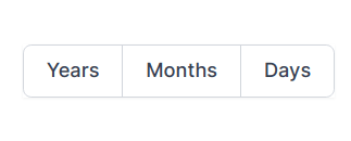
Let's recreate this Tailwind UI button group as a React component:
The JSX for this component might be something like this:
<ButtonGroup>
  <Button>Years</Button>
  <Button>Months</Button>
  <Button>Years</Button>
</ButtonGroup>
There are several different ways we could style these components with Tailwind in React. I will go through four different approaches that each teach you something new about handling parent-child relationships and styles in React.
Method 1: PostCSS @apply
This method utilizes Tailwind's @apply directive. If you've used Tailwind outside of React before, this is likely very familiar to you.
With @apply, we can write normal CSS selectors and override our child styles. To do this, we add a .btn-group class to our <ButtonGroup /> component and .btn class to our <Button />. This is very similar to how Bootstrap handles button group styles.
Our CSS looks like this:
@tailwind base;
@tailwind components;

.btn {
  @apply relative inline-flex items-center px-2 py-2 border border-gray-300 bg-white text-sm leading-5 font-medium text-gray-500 transition ease-in-out duration-150 rounded-md;
}

.btn:hover {
  @apply text-gray-400;
}

.btn:focus {
  @apply z-10 outline-none border-blue-300 shadow-outline-blue;
}

.btn:active {
  @apply bg-gray-100 text-gray-500;
}

.btn-group {
  @apply relative z-0 inline-flex shadow-sm;
}

.btn-group > .btn:not(:first-child) {
  @apply rounded-l-none -ml-px;
}

.btn-group > .btn:not(:last-child) {
  @apply rounded-r-none;
}

@tailwind utilities;
And our React components look like this:
import React from "react";

const ButtonGroup = ({ children }) => {
  return <span className="btn-group">{children}</span>;
};

const Button = ({ children }) => {
  return (
    <button className="btn" type="button">
      {children}
    </button>
  );
};

function ButtonGroupExample() {
  return (
    <>
      <Button>Single</Button>{" "}
      <ButtonGroup>
        <Button>Years</Button>
        <Button>Months</Button>
        <Button>Years</Button>
      </ButtonGroup>
    </>
  );
}

export default ButtonGroupExample;
As you can see, our JSX <ButtonGroup /> and <Button /> components are minimal and have only a single class. All the styles are coming from our CSS file.
Pros 👍
- Our JSX looks beautiful, as we can reuse our
<Button />component and just put it inside a<ButtonGroup />. - Easy to use, if you're already familiar with Tailwind (or CSS frameworks like Bootstrap).
- Component class-attributes are short (instead of tens of classes, vs. examples below).
Cons 👎
- We're writing quite a bit of new CSS for our components, instead of just reusing Tailwind's styles. This can quickly bloat our CSS file size.
- Every change to our component styles will cause all of our CSS to be rebuilt, which can make development slow.
- You have to invent new class names for all of your components.
.btnand.btn-groupare quite straight-forward, but sooner or later you might end up with something like.common-navigation__top-right-navigation--wide. - Our component styles are not visible in the components, and we might forget to delete them when we delete the components.
Method 2: Pseudo-Class Variants with Class Overrides
In this approach, we utilize Tailwind's pseudo-class variants and the classnames library to override styles for the first and the last button in the.
In order to do this, we need to add a new component that we will name <ButtonGroupButton /> (I know, the name sucks!). If we added our pseudo-class variants to our <Button /> component, it would break when it would be the first or last child of its parent.
In this approach, our CSS has just Tailwind's basic styles:
@tailwind base;
@tailwind components;
@tailwind utilities;
And our JSX has plenty of classes:
import React from "react";
import classnames from "classnames";

const ButtonGroup = ({ children }) => {
  return <span className="relative z-0 inline-flex shadow-sm">{children}</span>;
};

const Button = ({ children, className }) => {
  return (
    <button
      className={classnames(
        "relative inline-flex items-center px-2 py-2 border border-gray-300 bg-white text-sm leading-5 font-medium text-gray-500 hover:text-gray-400 focus:z-10 focus:outline-none focus:border-blue-300 focus:shadow-outline-blue active:bg-gray-100 active:text-gray-500 transition ease-in-out duration-150 rounded-md",
        className
      )}
      type="button"
    >
      {children}
    </button>
  );
};

const ButtonGroupButton = ({ children }) => {
  return (
    <Button className="-ml-px first:ml-auto rounded-r-none rounded-l-none first:rounded-l-md last:rounded-r-md">
      {children}
    </Button>
  );
};

function ButtonGroupExample() {
  return (
    <>
      <Button>Single</Button>{" "}
      <ButtonGroup>
        <ButtonGroupButton>Years</ButtonGroupButton>
        <ButtonGroupButton>Months</ButtonGroupButton>
        <ButtonGroupButton>Years</ButtonGroupButton>
      </ButtonGroup>
    </>
  );
}

export default ButtonGroupExample;
Did you notice, how <ButtonGroupButton /> uses the pseudo-variant classes first:rounded-l-md last:rounded-r-md in order to override our button styles? If you try to do this on a normal Tailwind CSS installation, it won't work. The reason is that by default, Tailwind does not generate these pseudo-variants for border-radius classes. We need to configure our variants in order to add "first" and "last" pseudo-variants. The same is true for first:ml-auto.
In practice, this means that we need to change our tailwind.config.js "variants" section to this:
module.exports = {
  ...
  variants: {
    margin: ["responsive", "first"],
    borderRadius: ["responsive", "first", "last"]
  },
  ...
};
Pros 👍
- Our styles are visible in the components themselves, so we can see what is going on right inside the components.
- We have an explicit
<ButtonGroupButton />that has the styles specific for button group child buttons. - If we delete our components, we won't leave dead CSS to our project.
Cons 👎
- Overwriting
<Button />styles outside the component itself is quite tedious. For example, we have to userounded-r-none rounded-l-noneinstead of simplyrounded-md. Otherwise, the override won't work. -
<Button />component has to allow overriding its styles with additional classes, which means that its styles are no longer strictly encapsulated. - We need to update out
tailwind.config.jsvariants, which adds to our CSS build time. Moreover, it is very hard to know when we should remove the extra variants when we delete code.
Method 3: Passing Additional Props to Children Using React.cloneElement
What if we would like to get rid of the <ButtonGroupButton /> component in the above example? This is possible by using React's cloneElement. This trick is found in the wild, e.g. in reach-ui's tabs.
For this method, our CSS and tailwind.config.js is identical to Method 2. We only change our components. We remove the <ButtonGroupButton /> and move its className override to the <ButtonGroup /> component:
import React from "react";
import classnames from "classnames";

const ButtonGroup = ({ children }) => {
  return (
    <span className="relative z-0 inline-flex shadow-sm">
      {children.map(child =>
        React.cloneElement(child, {
          className: classnames(
            "-ml-px first:ml-auto rounded-r-none rounded-l-none first:rounded-l-md last:rounded-r-md",
            child.props.className
          )
        })
      )}
    </span>
  );
};

const Button = ({ children, className }) => {
  return (
    <button
      className={classnames(
        "relative inline-flex items-center px-2 py-2 border border-gray-300 bg-white text-sm leading-5 font-medium text-gray-500 hover:text-gray-400 focus:z-10 focus:outline-none focus:border-blue-300 focus:shadow-outline-blue active:bg-gray-100 active:text-gray-500 transition ease-in-out duration-150 rounded-md",
        className
      )}
      type="button"
    >
      {children}
    </button>
  );
};

function ButtonGroupExample() {
  return (
    <>
      <Button>Single</Button>{" "}
      <ButtonGroup>
        <Button>Years</Button>
        <Button>Months</Button>
        <Button>Years</Button>
      </ButtonGroup>
    </>
  );
}

export default ButtonGroupExample;
Pros 👍
- The same pros as Method 2, except we now don't need a separate
<ButtonGroupButton />for<ButtonGroup />to work.
Cons 👎
- The same cons as Method 2.
-
React.cloneElementis not commonly used and might confuse developers.
Method 4: Fully Separate Styles for Button and ButtonGroupButton
If the class overrides in all of the previous methods make you feel iffy, you can choose to have totally separate components for <Button /> and <ButtonGroupButton />. This might make you yell, "hey, duplicating components is not DRY!" or ask, "what happens when I update my Button styles?" Neither one of these is a problem.
The reason is that on a contextual level, our <Button /> and <ButtonGroup /> components are tightly coupled. In practice, this means that whenever you make a change to <Button />, you'll have to check that you did not accidentally break our <ButtonGroup />. In most applications, you cannot contextually separate the too, because in most cases, the definition for how the <ButtonGroup /> should look is something like "multiple <Button />s next to each other, but a bit different."
If you look closely at the code in previous, there are multiple possible changes to the <Button /> component that would break our <ButtonGroup /> component:
- We use the class
-ml-pxthat adds a negative left margin to remove a "double border" between the buttons in the group. If we remove<Button />'s border or change its width,<ButtonGroup />will break and has to be updated. - We use
last:rounded-r-mdto make the last button in the group has rounded borders on the right. If we remove<Button />'s rounded borders,<ButtonGroup />will break and has to be updated.
Because of this contextual coupling, it will be very hard to create these components so that they will never break. You just have to remember to check that the styles in <ButtonGroup /> still work, whenever you change <Button />. Because of this, you might just decide to skip the tedious work of overriding classes and only share the common styles.
This is what I ended up doing when developing Tailwind button groups for morco.app. The result is like this:
import React from "react";
import classnames from "classnames";

const ButtonGroup = ({ children }) => {
  return <span className="relative z-0 inline-flex shadow-sm">{children}</span>;
};

const commonButtonClasses =
  "relative inline-flex items-center px-2 py-2 border border-gray-300 bg-white text-sm leading-5 font-medium text-gray-500 hover:text-gray-400 focus:z-10 focus:outline-none focus:border-blue-300 focus:shadow-outline-blue active:bg-gray-100 active:text-gray-500 transition ease-in-out duration-150";

const Button = ({ children }) => {
  return (
    <button
      className={classnames(commonButtonClasses, "rounded-md")}
      type="button"
    >
      {children}
    </button>
  );
};

const ButtonGroupButton = ({ children }) => {
  return (
    <button
      className={classnames(
        commonButtonClasses,
        "-ml-px first:ml-auto first:rounded-l-md last:rounded-r-md"
      )}
      type="button"
    >
      {children}
    </button>
  );
};

function ButtonGroupExample() {
  return (
    <>
      <Button>Single</Button>{" "}
      <ButtonGroup>
        <ButtonGroupButton>Years</ButtonGroupButton>
        <ButtonGroupButton>Months</ButtonGroupButton>
        <ButtonGroupButton>Years</ButtonGroupButton>
      </ButtonGroup>
    </>
  );
}

export default ButtonGroupExample;
Pros 👍
- Styles are encapsulated in components.
- Common styles are explicitly stated in code.
- + Same Pros as in Method 2.
Cons 👎
- We still might accidentally break
<ButtonGroup />styles when changing<Button />'s styles. The common variable only gives a hint to the developer but does not "type-check" CSS class relationships. - If you add special behavior to your
<Button />component, you will have to duplicate this to<ButtonGroupButton />, or have some kind of<BaseButton />that is used by both of these components. -
<ButtonGroupButton />still looks kind of ugly. 😜 - We might not remember to remove the
tailwind.config.jsadditional variants when we delete code.
Conclusion
There are multiple ways for achieving the same result when using React with Tailwind CSS. All approaches have their strengths, and what you end up going with depends on the practices that you and your team might like best.
What method do you think is the best? Why? Do you have a better way of creating a ButtonGroup with Tailwind CSS in React?

Top comments (1)
The "Method #4" here shows how Tailwind with React gives you the same benefits as CSS-in-JS.