Astrolabe Diagnostics is a fully bootstrapped five-person biotech startup. We offer the Antibody Staining Data Set (ASDS), a free service that helps immunologists find out the expression of different molecules (markers) across subsets in the immune system. Essentially, the ASDS is a big table of numbers, where every row is a subset and every column a marker. Recently, the Sean Bendall lab at Stanford released the preprint of a similar study, where they measured markers for four of the subsets that the ASDS covered. Since the two studies used different techniques for their measurements I was curious to examine the correlation between the results. However, the preprint did not include any of the actual data. The closest was Figure 1D, a heat map for 98 of the markers measured in the study:
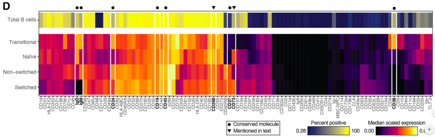
I decided to take the heat map image and "reverse engineer" it into the underlying values. Specifically, what I needed was the "Median scaled expression" referred to in the legend in the bottom right. Since I could not find any existing packages or use cases for easily doing this I decided to hack a solution (check out the code and PNG and CSV files at the github repository).
First, I manually entered the marker names from the X-axis into a spreadsheet. Then, I cropped the above image, removing the legends, axes, and the top heat map row which includes an aggregate statistic not relevant to this exercise.
I loaded the image into R using the readPNG function from the png package. This results in a three-dimensional matrix where the first two dimensions are the X- and Y-values and the third is the RGB values. The X axis maps to the markers and the Y axis maps to the four subsets ("Transitional", "Naive", "Non-switched", and "Switched"), and I wanted to get a single pixel value for each (Subset, Marker) combination. Deciding on the row for each subset was easy enough: I loaded the image in GIMP and picked rows 50, 160, 270, and 380. In order to find the column for each marker I initially planned to iterate over the tile width. Unfortunately, tile widths are not consistent, which is further complicated by the vertical white lines. I ended up choosing them manually in GIMP as well:
Marker,Pixel
CD1d,14
CD31,40
HLA-DQ,70
CD352,100
CD21,128
CD196,156
CD79b,185
CD1c,219
...
I could now get the RGB value for a (Subset, Marker) from the PNG. For example, if I wanted the CD31 value for the "Non-switched" subset, I would go to heat_map_png[270, 40, ]. This will give me the vector [0.6823529, 0.0000000, 0.3882353]. In order to map these values into the "Median scaled expression" values, I used the legend in the bottom left. First, I cropped it into its own PNG file:

I imported it into R using readPNG, arbitrarily took the pixels from row 10, and mapped them into values using seq:
# Import legend PNG, keep only one row, and convert to values. The values "0"
# and "0.86" are taken from the image.
legend_png <- png::readPNG("legend.png")
legend_mtx <- legend_png[10, , ]
legend_vals <- seq(0, 0.86, length.out = nrow(legend_mtx))
At this point I planned to reshape the heat map PNG matrix into a data frame and join the RGB values into the legend values. However, this led to two issues.
One, reshaping a three-dimensional matrix into two dimensions is a headache since I want to make sure I end up with the row and column order I need. Sticking to the spirit of the hack, I iterated over all (Subset, Marker) values instead. This is inelegant (iterating in R is frowned upon) but is a reasonable compromise given the small image size.
Two, I can't actually join on the legend RGB values. The heat map uses a gradient and therefore some of its values might be missing from the legend itself (the reader can visually infer them). Instead, I calculated the distance between each heat map pixel and the legend pixels and picked the nearest legend pixel for its "Median scaled expression".
heat_map_df <- lapply(names(marker_cols), function(marker) {
  lapply(names(cell_subset_rows), function(cell_subset) {
    v <- t(heat_map_png[cell_subset_rows[cell_subset], marker_cols[marker], ])
    dists <- apply(legend_mtx, 1, function(x) sqrt(sum((x - v) ^ 2)))
    data.frame(
      Marker = marker,
      CellSubset = cell_subset,
      Median = legend_vals[which.min(dists)],
      stringsAsFactors = FALSE
    )
  }) %>% dplyr::bind_rows()
}) %>% dplyr::bind_rows()
I now have the heat_map_df values I need to compare to the ASDS! As a sanity check, I reproduced the original heat map using ggplot:
heat_map_df$Marker <-
  factor(heat_map_df$Marker, levels = names(marker_cols))
heat_map_df$CellSubset <-
  factor(heat_map_df$CellSubset, levels = rev(names(cell_subset_rows)))

ggplot(heat_map_df, aes(x = Marker, y = CellSubset)) +
  geom_tile(aes(fill = Median), color = "white") +
  scale_fill_gradient2(
    name = "Median Scaled Expression",
    low = "black", mid = "red", high = "yellow",
    midpoint = 0.4) +
  theme(axis.text.x = element_text(angle = -90, hjust = 0, vjust = 0.4),
        axis.title = element_blank(),
        legend.position = "bottom",
        panel.background = element_blank())

The resulting code gets the job done and can be easily repurposed for other heat maps. There will be some manual work involved, namely, setting cell_subset_rows to the rows in the new heat map, updating marker_cols.csv accordingly, and setting the boundary values in the seq call when calculating legend_vals. Furthermore, we should be able to adapt the above into a more autonomous solution by calculating the boundaries between tiles using diff, running it separately on the rows and the columns (getting the row and column labels will not be trivial and will require OCR). For a one-time exercise, though, the above hack works remarkably well -- sometimes that is all the data science you need to get the job done. Check out this YouTube video for the actual comparison between the data sets!

Top comments (0)