
We have several material-tabs on one of the pages in our app. For the user's convenience, we wanted one of the tabs to look a bit input taking up the whole space.
Just placing a form-field with a textarea didn't provide too much magic.
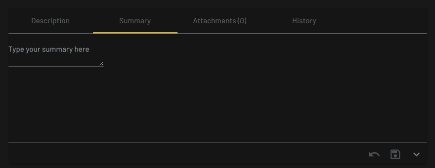
First, the real textbox inside had to take up the whole tab space, or as much as possible of it. Thankfully, the tabs height it fixed and defined in rems, so just playing around with height of the text area brought us near enough.
.mat-form.field textarea {
    height: 11rem;
}
To give the text area all the space it needs, we wrapped the form-field with a parent and set a class summary with settings to get it to cover all the space available:
.summary {
    display:flex;
    flex-direction: column;
    height: 100%;
}
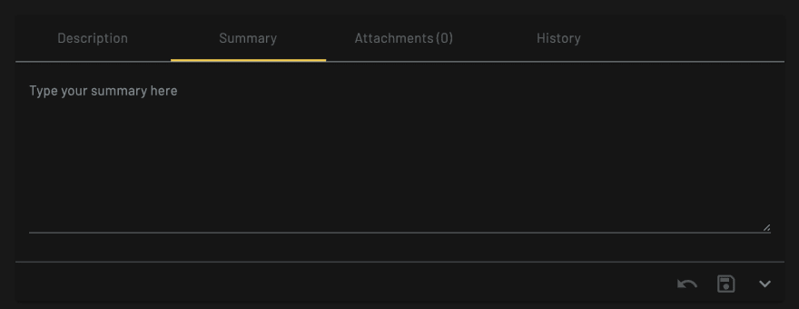
Next, we wanted to have the background of the whole tab set to a color, so it stands out as a different component/entity. A simple background-color gives us a nice shade.
.summary {
    ...
    background-color: rgba(134, 144, 149, 0.25);
}
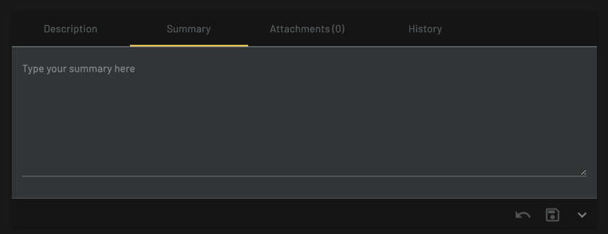
Finally, we had to get rid of that pesky bottom border (underline) so it's seamless to the user. I say pesky, but really, it was my fault. I was sure there's a border setting somewhere. Looking through the source code for Form Field I couldn't find any styling applied to a border. Inspecting the Angular Material's Form Field Overview page, I grabbed the line itself and discovered it is an independent elements.
mat-form-field-underline takes care of the bottom line at "rest", while mat-form-field-ripple is used when hovering over the component or when it is focused (.mat-form-field.mat-focused). The underline is set using background-color so I eliminated it using transparent.
.mat-form-field.no-underline {
    .mat-form-field-underline,
    .mat-form-field-ripple {
        background-color: transparent;
    }
}

Notes
A note about the source code - be sure to check the version you are using in your own project and choose the right branch on the library. Changes may be subtle but important.
Another note about material component styling - There are various scss files and the rules you are looking for may be in any of them, but the general guideline I've picked up so far is *-theme.scss files hold the colors and typography, while the *component*.scss holds the structural styling._
A final note about overriding code from inside a library (that isn't publicly exposed through the docs - it's risky. The source code can change in the next version and break your app.
P.S.
Some of you keen eyed readers (who've reached this far) may have noticed that the resize element is still available. I'm telling myself that's OK because it gives the user a small hint that this is an input component and not just a strangely colored tab. To remove it use resize: none. It is supported in all the latest browsers.

Top comments (0)