
Introduction:
When building a web application, creating flexible and reusable UI components is crucial for maintaining a scalable and maintainable codebase. In this article, I will delve into the process of creating a "Flex" component using the powerful trio of Next.js, Styled-Components, and TypeScript. By harnessing the synergy of these tools, you'll gain the capacity to effortlessly construct flexible and dynamic layouts that adapt harmoniously to various devices.
Prerequisites
Before you begin, make sure you have the following installed:
Node.js and npm (Node Package Manager)
Basic understanding of React.js, Next.js, Styled-Components, and TypeScript
Step 1: Set Up Your Next.js Project
If you haven't already set up a Next.js project, follow these steps:
npx create-next-app my-flex-app
cd my-flex-app
- This will create a new Next.js project in a folder called my-flex-app.
Step 2: Install Dependencies
Inside your project directory, install the required dependencies: styled-components, @types/styled-components, and typescript.
npm install styled-components @types/styled-components typescript
Step 3: Create Components Folder
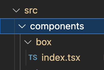
Create a folder named components inside the src directory of your Next.js project. This is where you'll store your flexible components.
Step 4: Create a Flexible Component
Inside the components folder, create a new file for your flexible component. Let's create a FlexBox.tsx component as an example:
interface StyleProps {

  display?: string
  justifycontent?: string
  alignitems?: string
  width?: string | number
  height?: string | number
  flexWrap?: string
  flexdir?: string
  aligncontent?: string
  maxwidth?: string
  margin?: string
  gap?: string
  flexgrow?: string
  order?: string
}

export const FlexibleDiv = styled('div')<StyleProps>`
  display: flex;
  justify-content: ${({ justifycontent }) => justifycontent ?? 'center'};
  align-items: ${({ alignitems }) => alignitems ?? 'center'};
  flex-wrap: ${({ flexWrap }) => flexWrap ?? 'wrap'};
  flex-direction: ${({ flexdir }) => flexdir ?? 'row'};
  width: ${({ width }) => width ?? 'max-content'};
  height: ${({ height }) => height ?? 'max-content'};
  max-width: ${({ maxwidth }) => maxwidth ?? '100%'};
  gap: ${({ gap }) => gap ?? '0'};
  flex-grow: ${({ flexgrow }) => flexgrow ?? '0'};
  order: ${({ order }) => order ?? '0'};
`;
Step 5: Use the Flexible Component
Now you can use the FlexbleDiv component in your pages or other components. For instance, let's create a HomePage.tsx:
// pages/HomePage.tsx

import React from 'react';
import FlexBox from '../components/FlexBox';

const HomePage: React.FC = () => {
  return (
    <FlexibleDiv flexdir="column" justifycontent="center" alignitems="center">
      <h1>Hello, Flex Components!</h1>
      <p>This is a flexible component example.</p>
    </FlexibleDiv>
  );
};

export default HomePage;
Step 6: Run Your Next.js Application
Start your Next.js development server to see the results:
npm run dev
Your flexible FlexibleDiv component can now be used throughout your application. By importing it and passing the desired props, you can easily create flexible layouts and components.
Conclusion
In this tutorial, we've learned how to create flexible components using Next.js, Styled-Components, and TypeScript. This approach provides a solid foundation for building scalable and maintainable UI components within your web application. By following these steps, you can enhance the reusability and flexibility of your code, making it easier to manage and extend as your project grows.

Top comments (0)