
With Riverpod we can extract the state management from the Widgets. However, this also means that the Widget has no control over the value changes. When we want to start an animation when the value changes, we have to look for updates to handle the animation in the Widget. In this blog post, we will show you three different animations based on value changes. After writing about animations in Flutter, and about Riverpod it was about time to combine both!

Setting up the project
Before we can start with coding, we are going to add a dependency to the project.
dependencies:
  flutter_hooks: ^0.15.0
  hooks_riverpod: ^0.12.1
Do not forget to install the dependency, running the following command:
flutter pub get
Animation on value changed
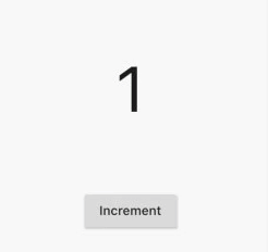
For the first example, we are going to create a counter with an increment button. We will quickly go through the code of this example before we rewrite it with an animation.
final countProvider = StateNotifierProvider((_) => CountProvider(1));

final currentCount = Provider((ref) => ref.watch(countProvider.state));

class CountProvider extends StateNotifier {
  CountProvider(int state) : super(state);

  void increment() {
    state += 1;
  }
}
The CountProvider maintains the current value of the count and has a function to increment the value of the count. We will create a Provider based on the StateNotifierProvider. With the context.read(countProvider).increment() we will toggle the increment function and with the var _count = useProvider(currentCount) we can retrieve the current value of the count.
class MemoryExample extends StatelessWidget {
  @override
  Widget build(BuildContext context) {
    return MaterialApp(
      theme: ThemeData(
        primarySwatch: Colors.green,
        visualDensity: VisualDensity.adaptivePlatformDensity,
      ),
      home: Scaffold(
          appBar: AppBar(
            title: Text("Riverpod Animation Example"),
          ),
          body: Column(
            children: [
              AnimatedWidget(),
              RaisedButton(
                  child: Text("Increment"),
                  onPressed: () {
                    context.read(countProvider).increment();
                  }),
            ],
          )),
    );
  }
}

class AnimatedWidget extends HookWidget {
  @override
  Widget build(BuildContext context) {
    var _count = useProvider(currentCount);

    return Center(
            child: Container(
              margin: EdgeInsets.all(10),
              height: 200,
              width: 200,
              child: Center(
                  child: Text(
                _count.toString(),
                textScaleFactor: 5,
              )),
            ),
          );
  }
}
We have the AnimatedWidget, but it does not animate anything yet. To start with the animation, we can use the useAnimation hook, to create an AnimationController. We are going to pass the duration. For this animation, we are going to reverse the animation once it is completed. Since we highlight the value, we are going to remove the highlight after the animation is finished. For this, we add a status listener to the controller and reverse the animation once it is completed.
To trigger the animation, we will use another hook provided by Flutter Hooks. The useValueChanged hook will trigger when the count is changed. Here we can start the controller to start the animation. The animation itself is done with an AnimatedBuilder. The AnimatedBuilder expects a controller. In the builder, we can then access the value of the controller we defined earlier. Since we passed no extra parameters, the forward call on the controller moves the value from zero to one during the duration we defined. We use this value as opacity for the circle we added to the Widget.
class AnimatedWidget extends HookWidget {
  final Duration duration = const Duration(milliseconds: 1500);

  @override
  Widget build(BuildContext context) {
    final _controller =
        useAnimationController(duration: duration, initialValue: 0);
    _controller.addStatusListener((status) {
      if (status == AnimationStatus.completed) {
        _controller.reverse();
      }
    });

    var _count = useProvider(currentCount);
    useValueChanged(_count, (_, __) {
      _controller.forward();
    });

    return AnimatedBuilder(
        animation: _controller,
        builder: (context, child) {
          return Center(
            child: Container(
              margin: EdgeInsets.all(10),
              decoration: BoxDecoration(
                  color: Colors.green[300].withOpacity(_controller.value),
                  shape: BoxShape.circle),
              height: 200,
              width: 200,
              child: Center(
                  child: Text(
                _count.toString(),
                textScaleFactor: 5,
              )),
            ),
          );
        });
  }
}
With these changes, we have now completed the first animation!
Animation moving between different values
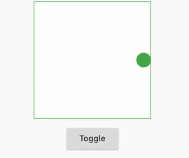
For the second animation, we are going to change a boolean value. Based on the value of the boolean, the circle will be on the left or right side of the container. This is the animation we are going to implement:
Managing the state is mostly the same for a boolean value. The difference is that we do now have a toggle button instead of an increment button. We again have a provider and a boolean state that the AnimatedWidget can access. The button is working in the same way except that it does now trigger the toggle function: context.read(booleanProvider).toggle().
class BooleanNotifier extends StateNotifier {
  BooleanNotifier(bool state) : super(state);

  void toggle() {
    state = !state;
  }
}

final booleanProvider = StateNotifierProvider((_) => BooleanNotifier(false));

final booleanState = Provider((ref) => ref.watch(booleanProvider.state));

class MemoryExample extends StatelessWidget {
  @override
  Widget build(BuildContext context) {
    return MaterialApp(
      theme: ThemeData(
        primarySwatch: Colors.green,
        visualDensity: VisualDensity.adaptivePlatformDensity,
      ),
      home: Scaffold(
          appBar: AppBar(
            title: Text("Riverpod Animation Example"),
          ),
          body: Column(
            children: [
              Card(),
              RaisedButton(
                  child: Text("Toggle"),
                  onPressed: () {
                    context.read(booleanProvider).toggle();
                  }),
            ],
          )),
    );
  }
}
So let’s take a look at the AnimatedWidget. We again define a duration. We also define the width of the container and the circle. Based on this we can compute the beginning and end of the circle during the animation. These values are passed to the animation controller as a lower bound and upper bound. This means that we can use the controller value as offset during the animation.
The useValueChanged is almost the same as in the previous step. The difference is that we reverse the controller when the new value is false and forward the controller when the new value is true. For the AnimatedBuilder, we pass the controller as animation. This time we use the Transform.translate function to move the circle by using the controller value as an offset.
class AnimatedWidget extends HookWidget {
  final Duration duration = const Duration(milliseconds: 1000);
  static double containerWidth = 200;
  static double circleRadius = 25;
  static double beginPoint = (containerWidth / 2 - circleRadius / 2) * -1;
  static double endPoint = (containerWidth / 2 - circleRadius / 2);

  @override
  Widget build(BuildContext context) {
    final _controller = useAnimationController(
        duration: duration,
        lowerBound: beginPoint,
        upperBound: endPoint,
        initialValue: beginPoint);

    var _boolState = useProvider(booleanState);
    useValueChanged(_boolState, (_, __) async {
      if (_boolState) {
        _controller.forward();
      } else {
        _controller.reverse();
      }
    });

    return AnimatedBuilder(
        animation: _controller,
        builder: (context, child) {
          return Center(
            child: Container(
              margin: EdgeInsets.all(10),
              height: containerWidth,
              width: containerWidth,
              decoration: BoxDecoration(
                  color: Colors.white70,
                  border: Border.all(color: Colors.green)),
              child: Transform.translate(
                offset: Offset(_controller.value, 0),
                child: Align(
                  child: Container(
                    width: circleRadius,
                    height: circleRadius,
                    decoration: BoxDecoration(
                        color: Colors.green, shape: BoxShape.circle),
                  ),
                ),
              ),
            ),
          );
        });
  }
}
Animation switching view halfway through
For the last animation, we again will use a boolean value, however, this time we will change the value halfway through the animation to achieve the following effect:
The notifiers and providers have remained the same, so let’s look at the AnimatedWidget. Here we use another hook provided by Flutter Hooks, namely useState. This way we can look at the value of useState instead of the value we get from the provider. We will watch when the value of the provider changes. Then we will reverse the animation. This will rotate the card to the middle point. After this, we can change the value of the useState which is used in the Widget. This makes sure that we do not see the orange color before the card is flipped.
The animation is again done by an AnimatedBuilder. This time we are going to use the Matrix4.rotationX to make it look like the card is rotating!
class AnimatedWidget extends HookWidget {
  final Duration duration = const Duration(seconds: 1);

  Color getColor(bool isUp) {
    if (isUp) {
      return Colors.orange;
    }
    return Colors.blue;
  }

  IconData getIcon(bool isUp) {
    if (isUp) {
      return Icons.arrow_upward;
    }
    return Icons.arrow_downward;
  }

  @override
  Widget build(BuildContext context) {
    final _controller =
        useAnimationController(duration: duration, initialValue: 1);

    var _isUp = useProvider(booleanState);
    final isUp = useState(_isUp);

    useValueChanged(_isUp, (_, __) async {
      await _controller.reverse();
      isUp.value = _isUp;
      _controller.forward();
    });

    return AnimatedBuilder(
        animation: _controller,
        builder: (context, child) {
          return Transform(
            transform: Matrix4.rotationX((1 - _controller.value) * pi / 2),
            alignment: Alignment.center,
            child: Container(
              height: 100,
              margin: EdgeInsets.symmetric(horizontal: 20),
              padding: EdgeInsets.symmetric(vertical: 12),
              alignment: Alignment.center,
              decoration: BoxDecoration(
                  color: getColor(isUp.value),
                  border: Border.all(color: Colors.grey)),
              child: Icon(
                getIcon(isUp.value),
                size: 40,
                color: Colors.white70,
              ),
            ),
          );
        });
  }
}
At first, I was struggling to get the animations working in combination with the useProvider that is offered by Riverpod. I was considering triggering the animation through keys to the Widgets even though managing animations and other parts of your UX in your state are considered bad practice. Luckily enough with the useValueChanged hook provided by Flutter Hooks, it was pretty simple to keep the animations in the Widgets. The code can be found here on Github. If you have any questions, suggestions or remarks feel free to leave a comment!
The post Animations on Value Changed with Flutter & Riverpod appeared first on Barttje.

Top comments (0)