
Have you seen Tableau in the job description and wondered what that it?
Tableau is the fastest growing data visualization tool and it's widely used in the industry. It converts a raw dataset into a data visualization, such as graphs and tables, and helps users to interpret the dataset in a more understable format. Also, Tableau is very easy to use as you can simply drag and drop columns to create data visualizations.
Now, let's dive into the fundamentals of Tableau!
This blog will teach you how to create a Tableau dashboard in the following steps:
- Step 1: Connect to a data source
- Step 2: Create a table with filters
- Step 3: Create a line graph with a date filter
- Step 4: Format the dashboard
Step 1: Connect to data source
Please follow the link below for download. A 1-year free trial is available for students and teachers!
https://www.tableau.com/products/desktop/download
If you would like to download the dataset I used, please follow the link below and select New_York_Times >> covid-19-county-level-data.csv and convert the csv file into an excel file.
https://www.kaggle.com/roche-data-science-coalition/uncover
Once you open Tableau, you need to connect to a data source.
We will use a Microsoft Excel file for this dashboard.

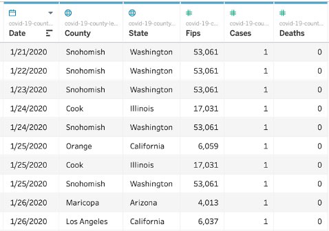
After connection, you will see the raw data: COVID-19 cases by county.
With thousands of rows listed out like this, we wouldn't be able to get any insights. But, if we create data visualization with Tableau, then we can interpret the spread of COVID-19 cases.
If you'd like to try a different COVID-19 dataset, you can explore more in the following link:
https://www.kaggle.com/roche-data-science-coalition/uncover
Step 2: Create a table with filters
In the first sheet, we will create a COVID-19 stat table with state and county filters.
This step is broken into three parts:
- Create table
- Remove abc column
- Add filters
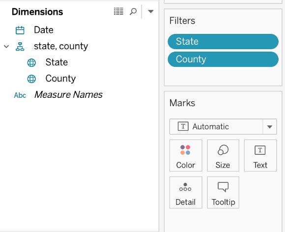
1. Create table
This is what you will see on the left side.
Dimensions display Date, State, and County and Measures display numeric columns, such as Cases and Deaths.

In the table, we would like to display Date, State, County, Cases, and Deaths columns. So we will drag those column names into "Rows" section.
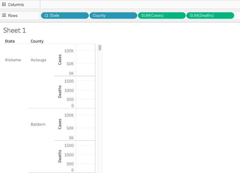
But the table looks weird since it thinks the values here are continuous.
We need to set Cases, Deaths columns to "Discrete."
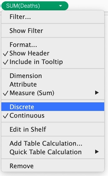
Once we change Cases and Deaths to Discrete, this is what it looks like!
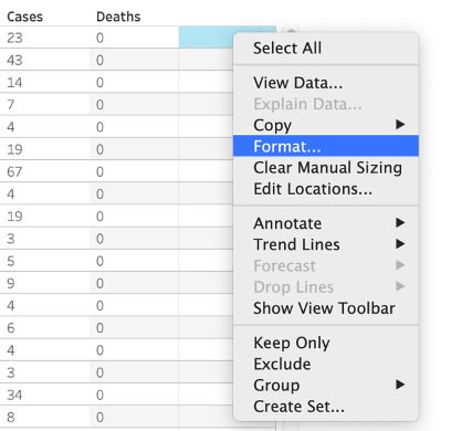
This is what we want, except that there is an Abc column. This Abc column will appear every time you create a table in Tableau. So, let's figure out how to remove the Abc column!

2. Remove Abc column
This part will cover how to remove the Abc column step by step.
But, feel free to check out the video below if you would like to follow a video tutorial.
https://www.youtube.com/watch?v=6FTZ6TnYaF0
First, click any abc column and click Format.
Change Default Pane color to White.
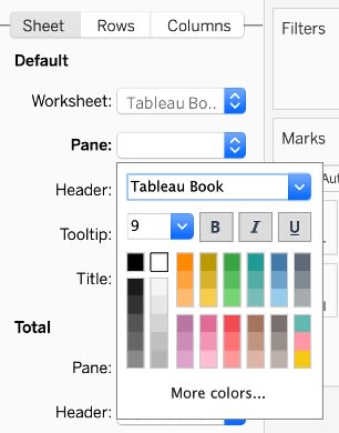
This is what it looks like after you change the color.

Choose the column on the left of Abc and click Format.
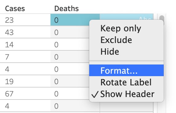
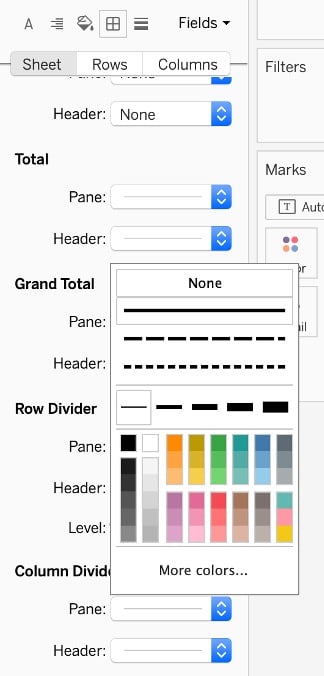
Under the “Borders” (Square icon), set Column Divider Pane to None.
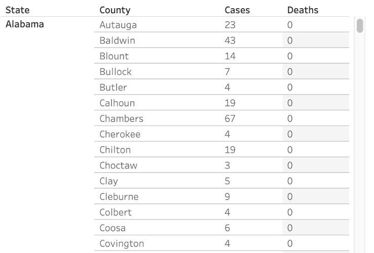
Lastly, shrink the width of the blank column. This is the final table!
3. Add filters
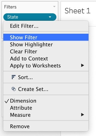
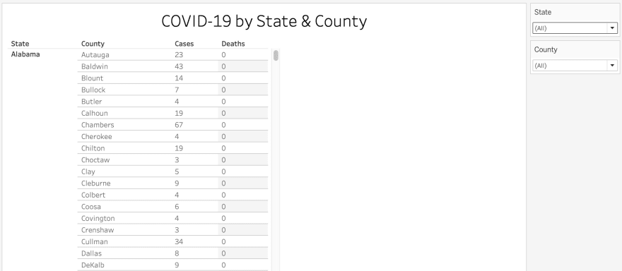
Now, let’s add State and County filter. (Choose Select All from List)
Right click on the State filter and choose "Show Filter."
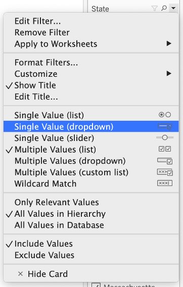
This filter shows all of the states. It's too lengthy!

Click on the drop down arrow in the State filter and change it to the format you'd like - I choose "Single Value (dropdown)"
The lengthy filter list changed to a dropdown list!
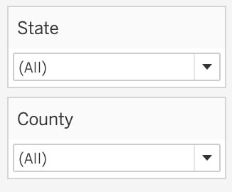
Change the title and this is the final product!
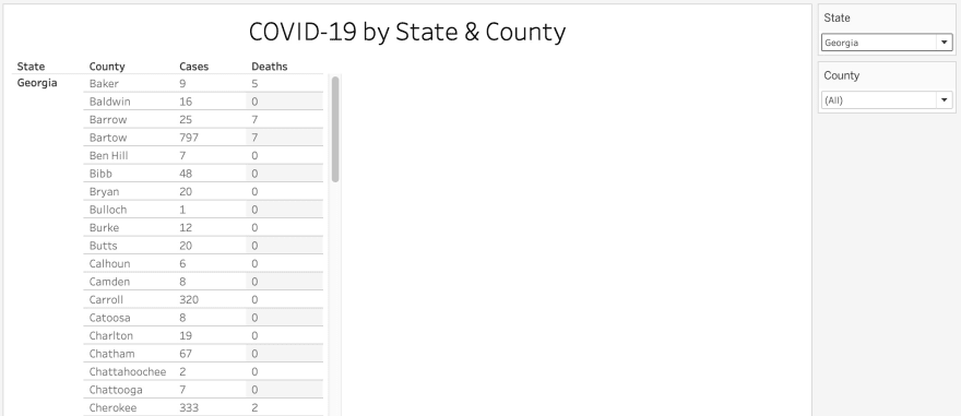
Let's see if the State filter works. Georgia State is selected on the right side and now it displays the data for Georgia state only!
Step 3: Create a line graph with a date filter
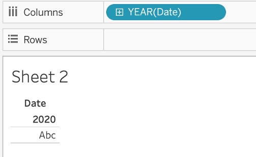
In Sheet 2, we would like to draw a graph that displays the number of Cases by each state.
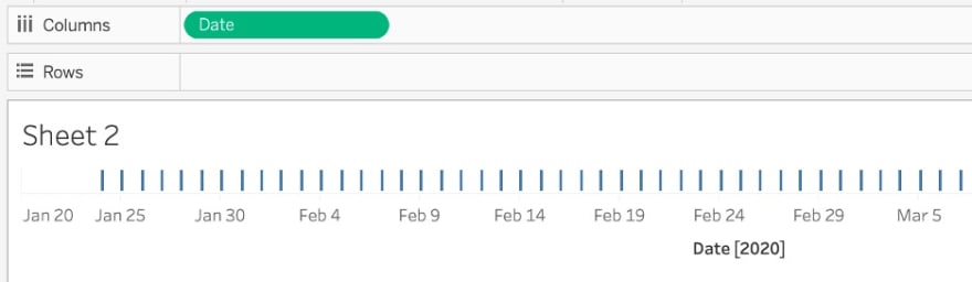
Add Date as a column – default is Year(Date)
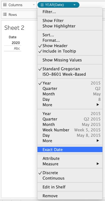
Change Year to Exact Date (You can choose Month, Week Number, etc.)
Now, it shows the date!
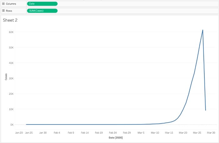
Let’s add #Cases to Rows and it draws a graph!
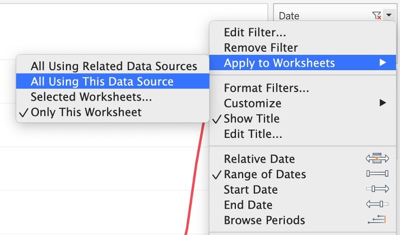
Now, let's apply a date range filter.
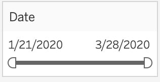
Add Date column to Filters and select “Range of Dates.”
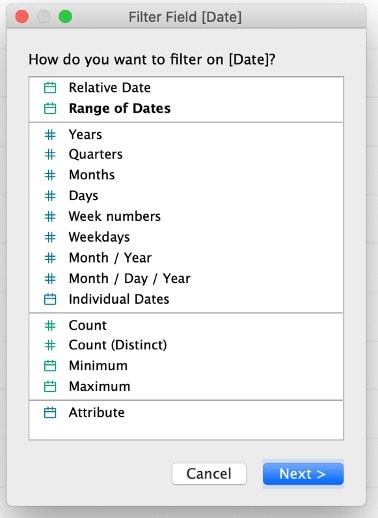
The range of dates automatically shows the range from start date to end date. Hit OK.

Click the Date filter and select “Show filter.”
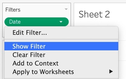
Here we go! The date filter appears on the right side of the dashboard.
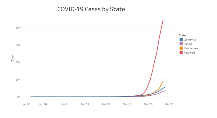
As mentioned earlier, we would like to display #Cases by state. Drag state dimension to Marks >> Color

This warning pops up because the dataset contains 54 states, so we will apply a filter to select top states. Click “Filter and then add.” But if you would like to see all states, click “Add all members."
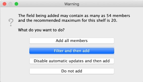
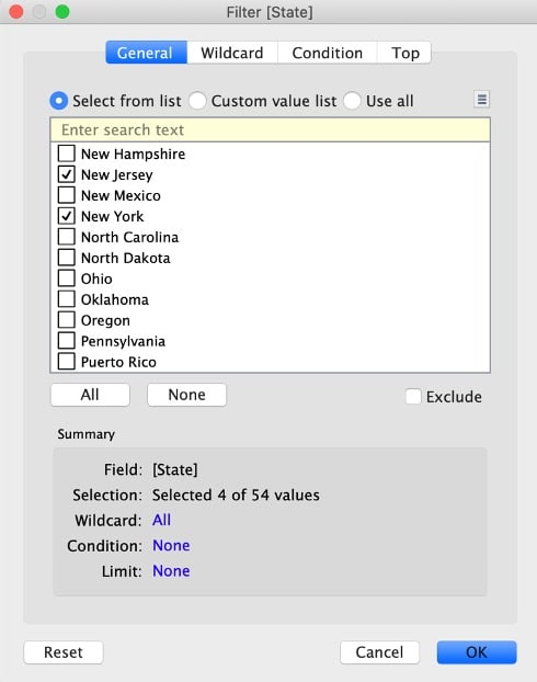
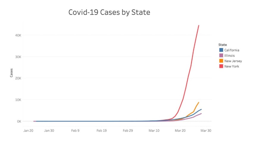
Select California, Illinois, New Jersey, and New York, which are the states with most coronavirus cases.
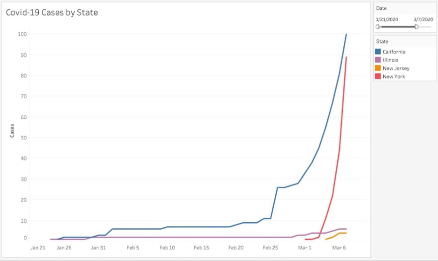
Tada!
The graph below displays COVID-19 cases by state.

If you change the date range, the bar graph updates accordingly.
If you would like to apply the date range filter to sheet 1 (COVID-19 Case by State and County), you can do so by applying the date filter to all worksheets using the same data source. Now, the date filter will be applied to both sheet 1 and sheet 2.
Step 4: Format the dashboard
In dashboard 1, drag sheet 1 to the blank page.
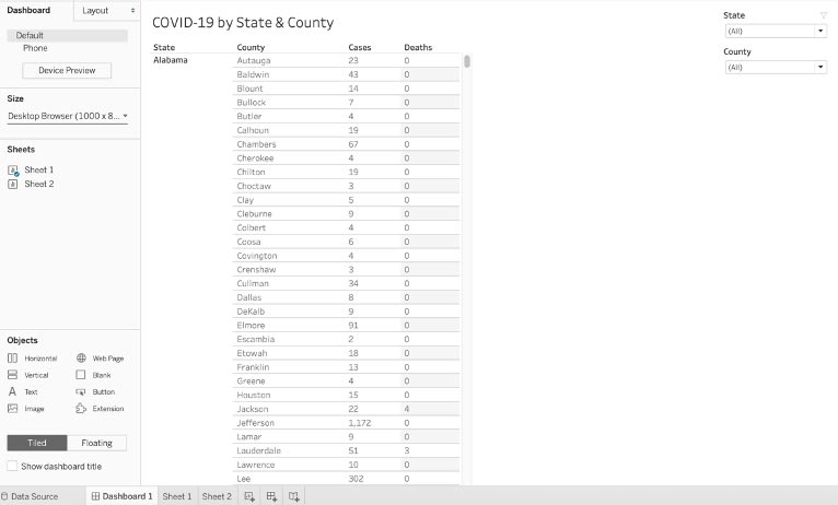
Then you will notice that this dashboard does not have any space to display the bar graph we created in sheet 2. We should expand the size of the dashboard.
The default size is 1000 x 800. Let’s increase the height to 1600.

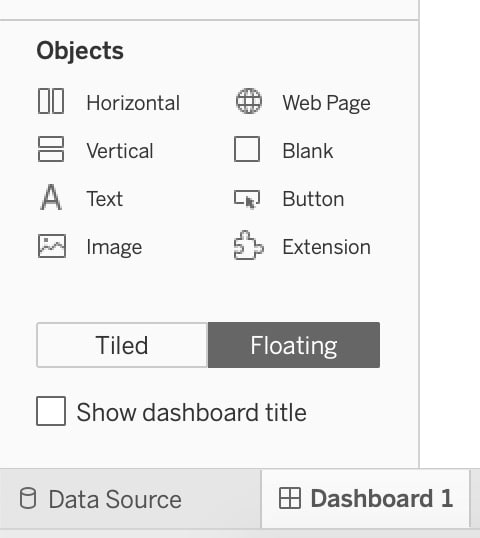
Select sheet 1 and click the downward arrow and select Floating. This allows you to freely move the table and resize the table.
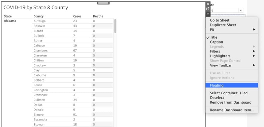
Click “Floating” on State and County filter as well and move them around as you'd like.
Follow the same steps above and add sheet 2 to the dashboard.
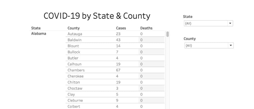
Now, let's add title to the dashboard!
Select "Show dashboard title" in the Objects section and add the title.
The dashboard looks too plain, so let's add a background color to the title.
Right click the title and click "Format title…"
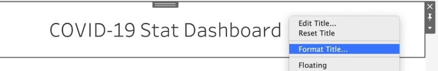
Apply Shading in the Dashboard Title section.

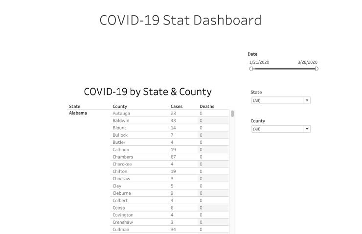
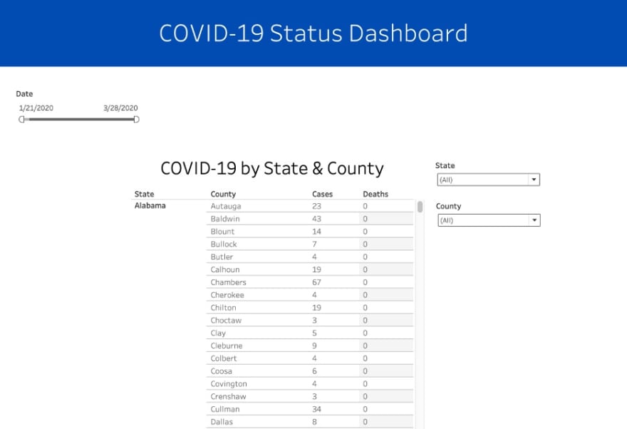
Here is the final product of the dashboard!
Feel free to check out the dashboard we just created! Play around with the date range filter, state and county filter and see what happens!
In this blog, we have learned how to connect to a dataset, create a table and a line graph, and add different types of filters. As these features are the basics of data visualization, you can apply these features when you create any Tableau dashboards.
If you would like to dive into Tableau further, I would recommend working with a more complicated dataset and looking into the following features:
- Create a calculated field, which allows you to create a new column from data that already exists in your dataset
- Work with maps in Tableau

Top comments (0)