CSS-Box Shadow
What did I want to learn and why
Am writing about the CSS shadow box I learnt about few days ago.
I got across this property while learning about CSS on freecodecamp.com before and had to implement it on a project I did both individually and with my coding partner at Microverse.
I was trying hard to understand what it does and how the values work. Like most other CSS property, the value was not consistent (varying number of value).
The values for the property can range from just one to six values and more if it is nested (shadow on another shadow)
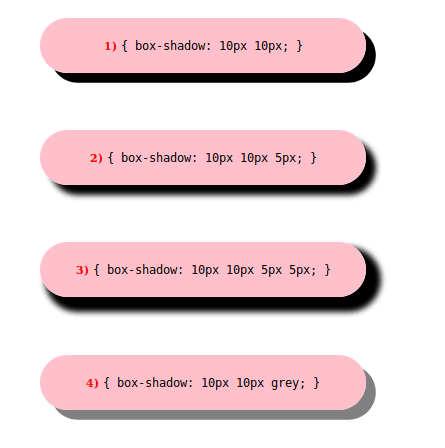
Below are examples of the property value varying size which hard different effect:
.shadowone {
  box-shadow: 10px 10px;
}
.shadowtwo {
  box-shadow: 10px 10px 5px;
}

.shadowthree {
  box-shadow: 10px 10px 5px 5px;
}
.shadowfour {
  box-shadow: 10px 10px grey;
}
What I learned and built
The pattern I observed about the CSS box-shadow property is as follows:
- When only one value is given, it is usually one of these global keywords
.shadow {
box-shadow: initial;
}
.shadow {
box-shadow: none;
}
.shadow {
box-shadow: unset;
}
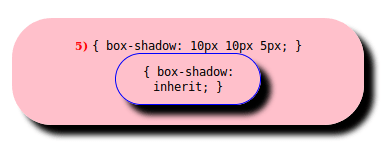
.shadowfive {
box-shadow: 10px 10px 5px;
}
.inherit {
box-shadow: inherit;
}
-
{box-shadow: inherit;}This value Inherits the box-shadow property from its parent element. -
{box-shadow: initial;},{box-shadow: none;}and{box-shadow: unset;}sets the property to its default value.
When two, three or four length values are given, the first two will represent the horizontal-offset and vertical-offset and the next two will represent the blur-radius and spread-radius. The other two values are optional, which are the inset keyword and color value. To specify multiple shadows, a comma-separated list of shadows can be provided to achieve this.
{box-shadow: horizontal-offset vertical-offset}
horizontal-offset - which is a length value for setting a horizontal distance from the element box.
.shadowsix {
  box-shadow: 10px 0px;
}

A negative value will set the shadow to the left of the element while the positive will set the shadow to the right of the element.
.shadowseven {
  box-shadow: -10px 0px;
}

vertical-offset - which is also a length value for setting a vertical distance from the element box.
.shadoweight {
  box-shadow: 0px 10px;
}

A negative value will set the shadow above the element while the positive will set the shadow below the element.
.shadownine {
  box-shadow: 0px -10px;
}

blur-radius - the third value in the diagram below is the blur-radius
.shadowten {
  box-shadow: 0px 0px 24px;
}
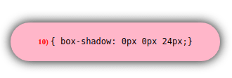
This shows that even if both offsets (first two values) values are zero the shadow is behind the element and still generates blur effects. This is also the same for spread-radius.
.shadoweleven {
  box-shadow: -10px -10px 24px;
}
.shadowtwelve {
  box-shadow: -10px -10px 48px;
}

The larger this value, the bigger the blur, so the shadow becomes bigger and lighter (or more blur) as shown above.
Negative values are not allowed for this value. This results in an error and invalidates the box-shadow property
spread-radius - This is the fourth length value.
.shadowfourteen {
  box-shadow: 0px 0px 0px 16px;
}

Positive values will cause the shadow to expand and grow bigger, negative values will cause the shadow to shrink as seen below.
.shadowfifteen {
  box-shadow: 10px 10px 5px 5px;
}
.shadowsixteen {
  box-shadow: 10px 10px 5px -5px;
}

If not specified as we have been seeing earlier it will be 0 and the shadow will be the same size as the element.
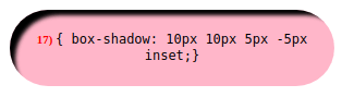
inset The inset keyword changes the shadow from being drop shadow to one inside the element box, above the background but below the content with respect to the length values as shown below:
.shadowseventeen {
  box-shadow: 10px 10px 5px -5px inset;
}
color
If the color is not specified as we have been seeing in earlier examples, the color used will depend on the browser - it is usually the value of the color property which is the default in the above examples.
.shadoweighteen {
  color: blue;
  box-shadow: 10px 10px 5px -5px;
}

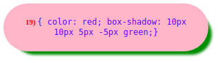
Here the color property is set to blue and hence have the box-shadow color as blue as it is not specified, but when the color is specified as shown below, the box-shadow color changes to that value.
.shadownineteen {
  color: blue;
  box-shadow: 10px 10px 5px -5px green;
}
Common application of CSS box-shadow property
CSS box-shadow is used mostly for navigation bars and button. Examples of projects I applied box-shadow to is below:
New York Times Clone - Navigation bar - View in browser - View on Github
Mint.com’s signup page clone - Button - View in browser - View on Github
Footer link Hover effects - View in browser - View on Github
Here are some resources if you want to learn more...

Top comments (0)