CSS: Flexbox
Intro
This article will be about a very important and useful CSS position attribute, the flex layout.
To understand flex, we can think of it as a box, a flexbox. A flexbox is especially useful when you want to arrange your elements in a certain row or column matter, and also make the elements in the flexbox automatically resize to suit with spaces around them.
Context
Main axis vs Cross axis
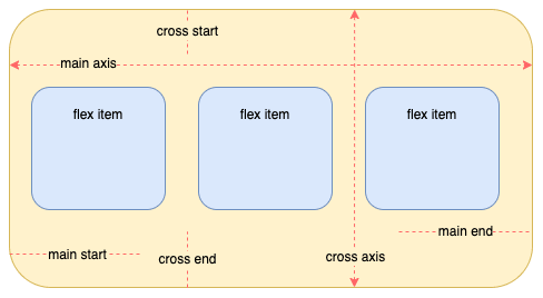
To understand flex, the first thing is to understand the concept of the main axis and cross axis.
Any element that uses the flex layout should be viewed as a "Flex container", every sub-element within the container is a flex item. A flex container has two default axis, a horizontal main axis and a vertical cross axis. The start of the main axis, starting from the left side of the container, is called main start, the point where it ends is called main end. Similar with cross axis, let's take a look at the picture below.
Container attributes
Below is all the listed attributes for the flex container and flex items. And we'll look at how every attribute works.
Flex container
For the flex container, there are six different attributes listed below:
- flex-direction
- flex-wrap
- flex-flow
- justify-content
- align-items
- align-content
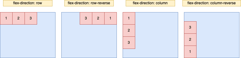
flex-direction
flex-direction controls the direction of the main axis. It sets how the flex items arrange.
flex-direction: row | row-reverse | column | column-reverse;
| option | description |
|---|---|
| row(default) | Horizontal main axis, starts from the left |
| row-reverse | Horizontal main axis, starts from the right |
| column | Vertical main axis, starts from the top |
| column-reverse | Vertical main axis, starts from the bottom |
flex-wrap
As in default, all flex items stay in the same line horizontally, no matter if the flex items are given a width, it wouldn't change lines.
.main {
  width: 500px;
  height: 300px;
  background: skyblue;
  display: flex;
}

.main div {
  width: 100px;
  height: 100px;
  background: pink;
  font-size: 20px;
}
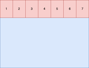
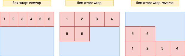
Notice that in this case, even we set the width of each div to 100px, the div's width has been resized to 500/7 px. In this case, we might want the flex items to change to the next line if there isn't enough space, therefore also making the width as wide as we assigned in code. flex-wrap helps us with this along with three options.
flex-wrap: nowrap | wrap | wrap-reverse;
| option | description |
|---|---|
| nowrap(default) | no newline |
| wrap | newline, the first row is above |
| wrap-reverse | newline, the first row is below |
flex-flow
flex-flow is just a succinct way to combine the flex-direction and flex-wrap attribute in the following form, nothing more special:
flex-flow: <flex-direction>|| <flex-wrap>;
justify-content
justify-content defines how flex items align according to the main axis.
justify-content: flex-start | flex-end | center | space-around | space-between |
  space-evenly;
| option | description |
|---|---|
| flex-start(default) | left aligned |
| flex-end | right aligned |
| center | centered |
| space-around | two sides of each flex items equally spaced |
| space-between | left and right aligned, and space between any two flex item equally spaced |
| space-evenly | each space between any two flex item equal to the space between container and item itself |
Here we show the case where flex-direction is default, which items should be horizontally arranged on the main axis.

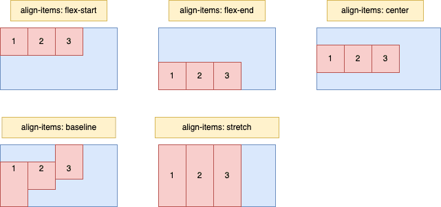
align-items
align-items defines how flex items align according to the cross axis.
align-items: flex-start | flex-end | center | baseline | stretch;
| option | description |
|---|---|
| flex-start | cross-start aligned |
| flex-end | cross-end aligned |
| center | cross axis center aligned |
| baseline | aligned based on the first line of flex item texts as the baseline |
| stretch(default) | if flex items are not height set or set to auto, then the flex item will stretch till it fits the container |
align-content
For this option, we can think of align-content as a multiple line version of align-items. So if the elements are only in one single line, this attribute will not make any difference.
align-content: flex-start | flex-end | center | space-between | space-around |
  stretch;
| option | description |
|---|---|
| flex-start | cross-start aligned |
| flex-end | cross-end aligned |
| center | cross axis center aligned |
| space-between | cross-start and cross-end aligned, evenly spaced between each line |
| space-around | two sides of each flex items equally spaced |
| stretch(default) | flex item will stretch till it fits the container |
Flex Item
After looking at how flex container works, next we should keep on digging, understand how flex items work within flex containers.
order
order indicates the sequence of flex items according to its container settings.
order: <integer>;

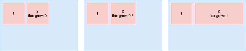
flex-grow
flex-grow indicates how much of the space left should be assigned to a flex item. flex-grow has a max value of 1, default is 0.
flex-grow: <number>;
flex-shrink
flex-shrink indicates how a flex item shrink. Notice that it is only when flex items' default width surpasses the container's width will this attribute take effect.
flex-shrink: <number>;
/* default 1 */
Here I don't really want to say too much about flex-shrink, because it's really just not that useful.
flex-basis
flex-basis indicates the width of a flex-item on the main axis, where it prioritizes the default width of the item.
flex-basis: 0 | 100% | auto | <length>;
If our css code is written as below:
.item {
  width: 400px;
  height: 300px;
  background: skyblue;
  display: flex;
  padding: 5px;
}

.item div {
  height: 100px;
  font-size: 20px;
  width: 200px;
  flex-basis: 300px;
  background: pink;
}
It renders as below:

flex
flex is just an shorter combined version of flex-grow, flex-shrink and flex-basis. The last two options, flex-shrink and flex-basis are optional.
flex: none | [ < "flex-grow" >, < "flex-shrink" >? || < "flex-basis" >];
align-self
align-self allows one single item to align differently with other items. It is able to override align-items. Its default value is auto, which indicates that it inherits its parent item's align-items. If there isn't a parent item, then its value will be stretch.
align-self: auto | flex-start | flex-end | center | baseline | stretch;
For example, if out css code written as below:
.item {
  width: 400px;
  height: 300px;
  background: skyblue;
  display: flex;
  padding: 5px;
}
.item div {
  height: 100px;
  width: 200px;
  flex-basis: 300px;
  font-size: 20px;
}
.item div:nth-child(1) {
  background: pink;
  align-self: flex-start;
}
.item div:nth-child(2) {
  background: violet;
  align-self: center;
}
.item div:nth-child(3) {
  background: greenyellow;
  align-self: flex-end;
}
Then the three items will be rendered as below:

Conclusion
Above is all about flex in css. To conclude, flex is a very powerful layout in css that we often see and use, pretty much one of the most powerful and one of the most common used css tool.

Top comments (0)