This originally was published on my Medium blog
The eyes are the window to your soul and your personal site is the porthole to your code. As someone who is looking for their first developer position, my portfolio is always on my mind. Every day I find myself wondering “should I re-do this thing?”. My day is riddled with anxieties and caffeinated streaks, so it is a bit much that something so nominal is taking up part of my day. Until a few days ago, my personal site has gone through two overhauls. The debut iteration came about when I had reached the half-way point of Rutger’s Coding Bootcamp. At that point, I had just gotten comfortable with server-side technologies and I was pretty stoked that I had all the necessary ingredients for bootstrapping a website.
It wasn’t an ambitious undertaking, I planned to keep it minimal and simple. Running on Express.js and templating with Express-Handlebars, I kept it a single-page website with some typing animations (because I thought it was cool) and a list of projects I made thus far. It was bland, with monospace font and Twitter Bootstrap (3) serving as the skeleton. Despite the unimaginative design, it was super responsive and I spent a good two hours resizing my browser window watching the media queries work their magic.
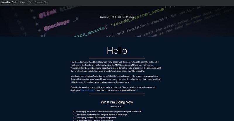
After two months I had gotten tired of the design, those media queries could only keep my interest so far. So for the next version, I wanted to re-build it from the ground up. I was curious about Bootstrap 4, mostly because it was in Alpha for 3 years. Besides the easter egg that rained emojis to the page, I wasn’t attached to v2.
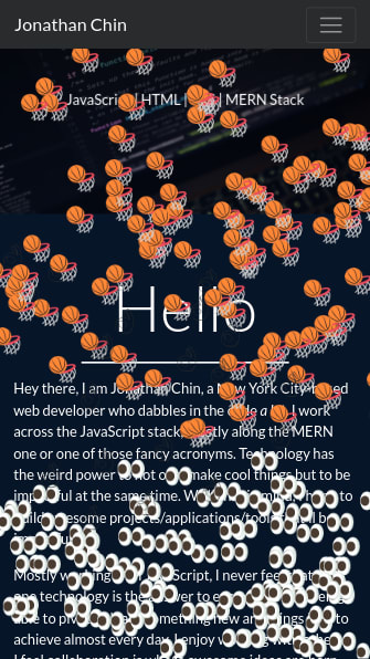
Problems with v2:
- it’s slow
- it’s a glob of cringe design
- it’s lame
- too Bootstrap-y
Goals with v3:
- make it simple
- snappy
- minimal
- responsive
- more like me
Milligram is choice
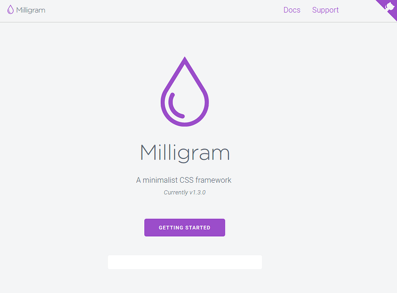
The main problem with the more well-known frameworks is the bloat. Bulma is a nice alternative but there are some issues and it’s still not out of alpha. I was considering using the markdown-inspired framework Hack CSS by Egoist, but after working with it, the style looked a bit janky, and this is coming from someone who LOVES writing in markdown. Enter Milligram. I used it once before, but the lack of styling hurt me since I wasn’t that comfortable making components in CSS.
It’s only 2kb zipped and its purpose is to lay the groundwork for your site without any intrusive styles.
The Declutter
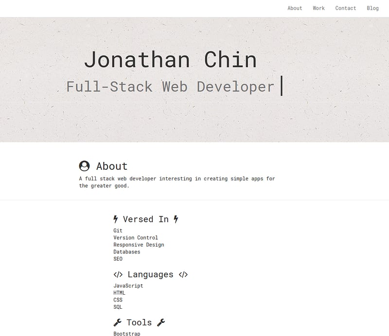
One of the main problems with v2 is that it’s too gaudy, but without the bling or sleek design. It feels knobby and ogre-ish, like a PT Cruiser. I was thinking about React but I felt that it was overkill for something that just needed to be simple. Templating has gotten much easier for me now compared to a few months ago, so I went with Handlebars again. I was looking at Pug (FKA Jade) but since I was knee deep in the job search, this had to be done now rather than later.
I caught a thread on the /r/web_design subreddit about “ridiculously simple portfolio sites” and it got me thinking that I didn’t really need to make something so elaborate. I just had to make something that reflected me and got the message across, or just showcase my work and contact information. I really enjoyed the simplicity of v1, with gray text and a white background. Simple and straight to the point.
Fresh Faced

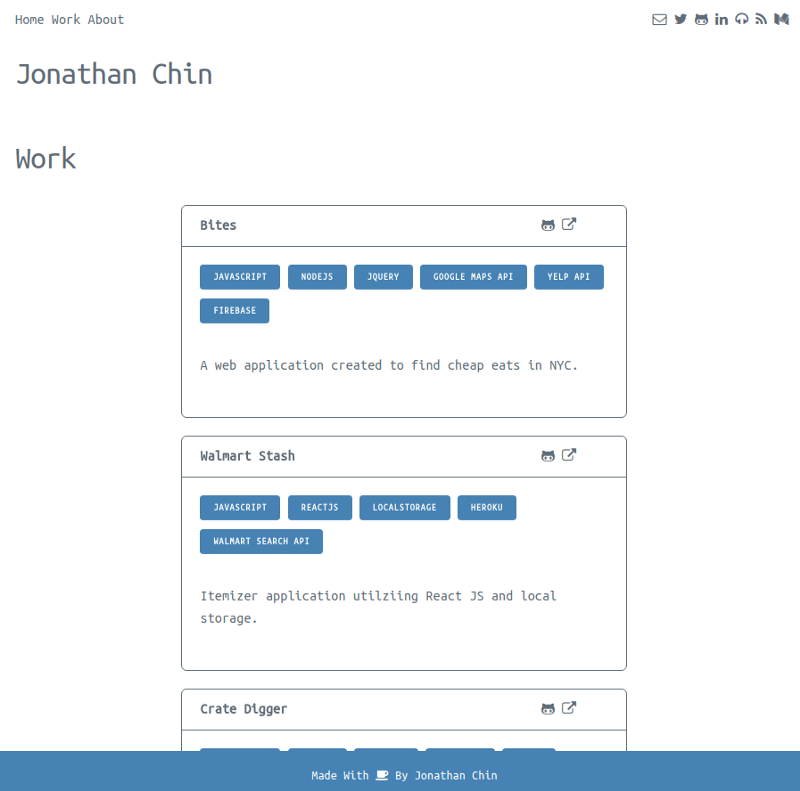

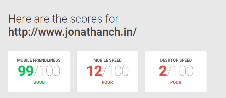
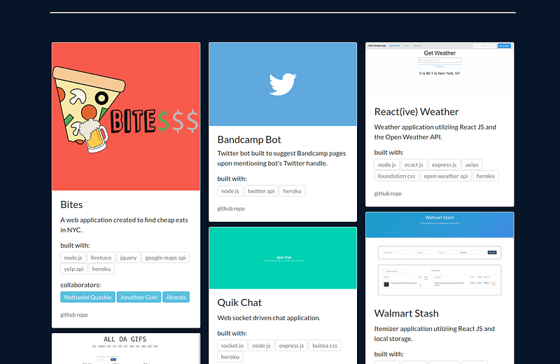
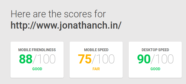
The result is just a three paged site with very little components, and it took me about three days. I decided against the single-page layout to keep everything cleaner and organized. The problem I had with the single-page layout is that you had to prioritize information and maybe the scrolling thing took too much work. But then, on the other hand, the three-page layout could also be a bust, as the visitor would have to click to fish for info. They both have trade-offs but they’re subjective. To make it a bit easier, I kept a persistent navigation bar with icons linking to my various online entities. I used Font Awesome since their overall style paired well with the font I decided on, Ubuntu Mono, and they had icons for everything. Benchmarked with Google’s Page Speed Tool, v3’s performance crushed the sluggish marks of v2 so that’s a plus too, I guess. It’s also mobile friendly, thanks to Milligram’s use of flexbox.
Is this a keeper? Probably not. Like with the previous overhauls, a developer’s personal site is like an artist statement, it reflects where you are in life and your frame of thought. Hopefully, for v4 I’ll brush up on my very bad design skills. But in the meantime, take a gander.


Top comments (7)
I've been putting off a portfolio site for way too long. Thanks for the inspiraton/motivation.
The only thing is I don't want it to be a carbon copy of my CV on the web. I want it to tell more and be something unique.
Nice work dude! 👏 This is great inspiration for my future personal website. I'm definitely going to give you a shout out when I mention this to other people looking to get a dev job.
Hey Andy, thanks a lot and thank you for reading. Means a lot! I really enjoyed your post on contributing to Open Source.
Same! Really exciting to hear that someone who read my post wrote a post, too!
Also, glad I have another comrade on the journey of being a developer. :)
Geocities kid in me loves the v2!
That's a lot of portfolio sites. wow.
Great piece! Makes me feel better about my minimalist portfolio :)
Quick question? What's the tool in the screenshots you used to check the speed of your site?
I used Google's PageSpeed Tool probably not the absolute best, but it's the best free option I could find. The screenshots I took were from a few weeks ago, they changed the look of the tool recently.