
I made this photo slider for a CodePen challenge; the prompt was to create something using a sequenced animation. I'm not trying to make a tutorial for the whole thing, but I'd like to record a few interesting bits here. You can check out the finished product CodePen.
This post is going to cover some of the CSS styles used in the slider; I'll make another soon with more details about the animation itself!
Cutting up an Image with background-position
I wanted to chop up each image into smaller pieces so I could create an effect of each piece sliding across the screen. Instead of using multiple <img> tags, I created several <div>s with the same background image. Then I used the background-position property to position the image exactly how I wanted it.
I generally passed 2 values to the background-position property. The first defines the position of the image on the x-axis, and the second defines the position on the y-axis. So, for example, background-position: -100px 100px will move the background image 100px to the left and 100px down. Here's a quick demo of some background-position properties:
I used this behavior to generate a few differently-positioned blocks with the background photo aligned in different ways. I wanted them to be close to lining up but not exactly, so I tweaked the numbers a bit and in some cases made blocks wider than their container. Often these tweaks meant adjusting the background-size property as well.
So after some fiddling I came up with something like this:
.section {
   background-repeat: no-repeat;
   position: relative;
}
.one {
  width: 110%;
  height: 80px;
  background-size: calc(100% + 100px);
  background-position: -100px -100px;
  top: 20px;
}
.two {
  width: 120%;
  height: 30px;
  left: 20px;
  background-position: 0px -120px;
  z-index: 99;
}
.three {
  width: 115%;
  height: 60px;
  background-size: 100% auto;
  background-position: 0 -200px;
  top: 60px;
  left: -50px;
}
.four {
  width: 105%;
  height: 65px;
  background-size: 105% auto;
  background-position: 20px 100%;
  top: 165px;
  left: 40px;
  z-index: 99;
}
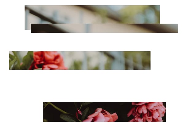
Here's what these pieces look like so far:
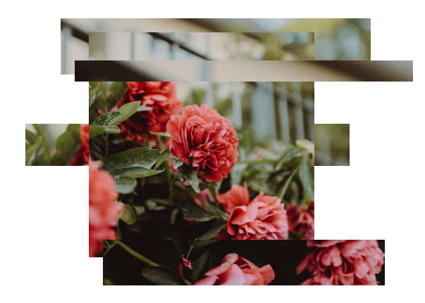
And here's what it looks like once we add the full image into the slide:
CSS Blend Modes and Filters
The above layout looks pretty neat, but I wanted to bring in a little more variation. So I used mix-blend-mode: overlay on the sections positioned over the main image. Check the MDN Docs for info on several other blend modes available in CSS.
The filter property was new to me and fun to play with! I used this to adjust contrast, saturation, brightness, and hue (just a little bit) of a few of the sections.
.one {
   filter: brightness(1.6) hue-rotate(10deg) contrast(1.2);
}
.two {
   mix-blend-mode: overlay;
}
.three {
   filter: brightness(1.3) saturate(.9) hue-rotate(10deg);
}
.four {
   mix-blend-mode: overlay;
   filter: brightness(1.3) hue-rotate(20deg);
}
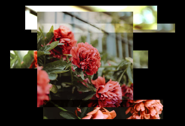
Then I added a black background to the page, so the image looked like this:
Next up: The actual animation!
I'm going to write another post soon about how the slider actually moves. For now you can check out the finished product on CodePen!

Top comments (0)