Downsampling is the process of transforming data, reducing its resolution so that it requires less space, while preserving some of its basic characteristics so that it is still usable.
There are a number of reasons why we may want to do this.
We may for instance have sensors reporting readings on a high frequency, imagine every 5 seconds, and we may have accumulated historical data over a period of time. This may start to consume lots of disk space.
Looking at data from last year there may never be a need to go down to the 5 seconds level of precision, but we may want to keep data at a lower level of granularity for future reference.
There is another case where we may want to downsample data. Let’s consider again the same scenario with a reading every 5 seconds. A week of data would require 120,960 data points, but we may be presenting this information to users as a graph which may be only 800 pixels wide on the screen. It should be possible then to transfer just 800 points, saving network bandwidth and CPU cycles on the client side. The trick resides in getting the right points.
There are many ways to tackle this problem, sometimes we can just do something like keep a reading per day and drop the rest (think stock prices at closing time), and sometimes we can get good results with averages, but there are cases where these simple approaches result on a distorted view of the data.
Sveinn Steinarsson at the University of Iceland looked at this problem and came out with an algorithm called Largest-Triangle-Three-Buckets, or LTTB for short, and this is published under the MIT license in sveinn-steinarsson/flot-downsample: Downsample plugin for Flot charts. (github.com).
Let’s take a look at how we can use this with CrateDB and the kind of results we can get.
Getting some sample data
I will be using Python and Jupyter Notebook for this demonstration, but you can use any language of your choice.
I will start by installing a few dependencies:
pip install seaborn
pip install crate[sqlalchemy]
I will now import the demo data from Sveinn Steinarsson’s GitHub repo into a table called demo in my local CrateDB instance:
import urllib.request,json,pandas as pd
txt=urllib.request.urlopen("https://raw.githubusercontent.com/sveinn-steinarsson/flot-downsample/8bb3db00f035dfab897e29d01fd7ae1d9dc999b2/demo_data.js").read()
txt=txt[15:(len(txt)-1)]
txt=txt.decode("utf-8")
data=json.loads(txt)
df=pd.DataFrame(data[1])
df.columns=['n','reading']
df.to_sql('demo', 'crate://localhost:4200', if_exists='append', index=False)
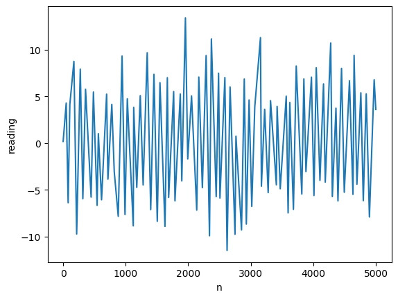
And taking advantage I already have this data set of 5000 points in a data frame I will plot it using seaborn to see what it looks like:
import seaborn
seaborn.lineplot(df,x="n",y="reading")

So this is the actual profile of this noisy-looking signal.
A basic approach using averages
Let’s try downsampling this down 50 times to 100 data points with a simple query in CrateDB:
avg_query = """
    SELECT (n/50)*50 AS bucket,avg(reading) AS reading
    FROM demo
    GROUP BY bucket
"""
dfavg_data = pd.read_sql(avg_query, 'crate://localhost:4200')
seaborn.lineplot(dfavg_data,x="bucket",y="reading")`
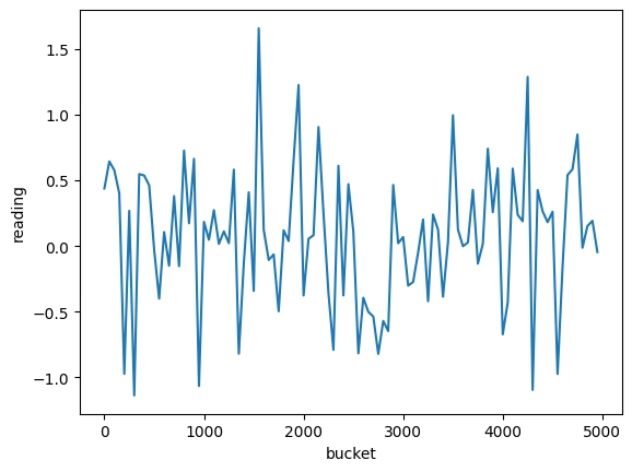
This is not wrong if we know we are looking at an average, but if we are doing this downsampling behind the scenes to save space, bandwidth, or CPU cycles we risk now giving a very wrong impression to the users, notice for instance that the range on the y-axis only goes as far as 1.5 instead of 10+.
Enter LTTB
The reference implementation of the LTTB algorithm is written in JavaScript and this is very handy because CrateDB supports JavaScript user-defined functions out of the box.
Take a look at the linked script, compared to the original JavaScript we have just made some very minor adjustments so that the variables in input and output are in a format that is easy to work with in SQL in CrateDB. This is using some very useful CrateDB features that are not available in other database systems, arrays and objects, this particular version requires CrateDB 5.1.1 but it is perfectly possible to make this work on earlier versions with some minor changes.
In this case we are working with an x-axis with integers, but this approach works equally well using timestamps, just changing the script where it says ARRAY(INTEGER) to ARRAY(TIMESTAMP WITH TIME ZONE).
Another cool feature of CrateDB we can use here is the overloading of functions, we can deploy multiple versions of the same function, one accepting an xarray which is an array of integers and another one which is an array of timestamps and both will be available to use on SQL queries.
We can check the different versions deployed by querying the routines tables:
SELECT routine_schema, specific_name
FROM information_schema.routines
WHERE routine_name='lttb_with_parallel_arrays';
Now that we have our UDF ready let’s give it a try:
lttb_query = """
    WITH downsampleddata AS
     (  SELECT lttb_with_parallel_arrays(
            array(SELECT n FROM demo ORDER BY n),
            array(SELECT reading FROM demo ORDER BY n)
            ,100) AS lttb)
    SELECT unnest(lttb['0']) as n,unnest(lttb['1']) AS reading
    FROM downsampleddata;
"""
dflttb_data = pd.read_sql(lttb_query, 'crate://localhost:4200')
seaborn.lineplot(dflttb_data,x="n",y="reading")
As you can see this dataset of just 100 points resembles much better the original profile of the signal, we are looking at a plot where the range is now -10 to 10 same as in the original graph, the noisy character of the curve has been preserved and we can see the spikes all along the curve.
We hope you find this interesting, do not hesitate to let us know your thoughts.

Top comments (0)