The story behind a year of successful improvements to the Braintree help user experience, the learnings, metrics, and our plans for a bumper 2019.
Every day we need assistance: help finding packages that aren’t delivered, figuring out confusing apps, troubleshooting defective products, you name it. As makers, we’re constantly asking questions. Sometimes we find answers on our own, other times we have to ask humans for guidance. If my experience is anything to go by, getting help can range anywhere between so excellent it turns me into a loyal client for life, to so bad I want to avoid ever having questions again.
At Braintree, we’re passionate about offering some of the industry’s best documentation and support to our customers. By writing about the work we’re doing, we hope to improve our process and invite feedback from our users.
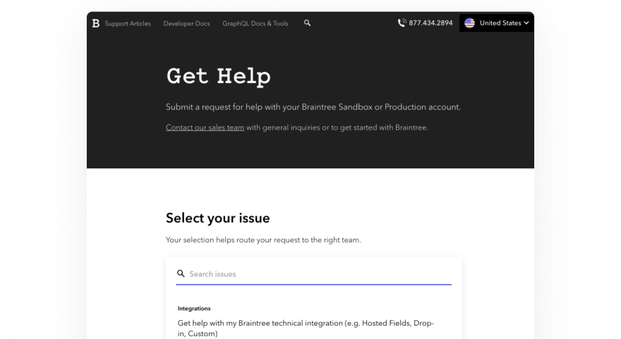
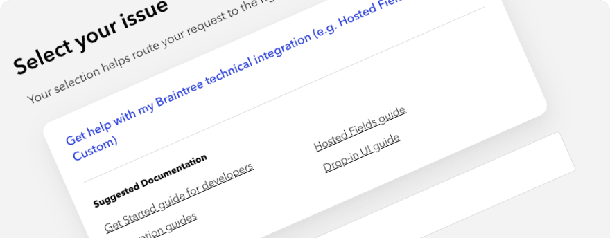
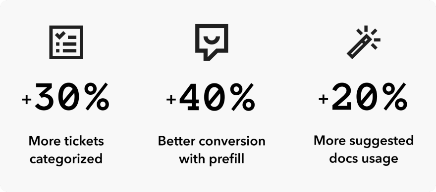
Over the last year, our product and operations teams have been working closely to improve every part of our Help Contact Form. We’ve delivered issue search, a new look and feel, prefilled fields for users coming from documentation or the merchant panel, more robust suggested documentation, a new, easy-to-remember domain, and better wayfinding through a shared navigation with our other sites (developer docs and support articles).
“Get Help” is now front and center in our navigation on almost all of our sites, giving our users quick access to our Help Contact Form. The form serves the primary functions of offering curated content to help users help themselves, and connecting those users to the appropriate support teams if they need additional assistance.
Before we dive into the improvements we made in 2018 and the ones we’re going to make in 2019, we’d like to share some of the ways we measure success.
How we define and measure success
To quantify success on our help site, we sought to understand exactly what a successful help experience means for our users. On help.braintreepayments.com, users can achieve their goal of getting help by either accessing self-help resources or contacting a human.
Accessing self-help resources: By providing links to relevant docs when a user selects a specific issue, we’re helping users find answers quickly and independently. This also allows our support teams to spend more time on issues where our users need us most. Either way, we’re focused on providing the support our users need as efficiently as possible, and that makes for a better overall experience.
Contacting a human: When a user submits a ticket or uses the phone number to contact us, they have easy access to our white-glove support teams.
By combining the number of users who achieved our two outlined goals (self-help or contacting us), we have a measure of success that in most cases represents the things that matter to our users.
2018 successes
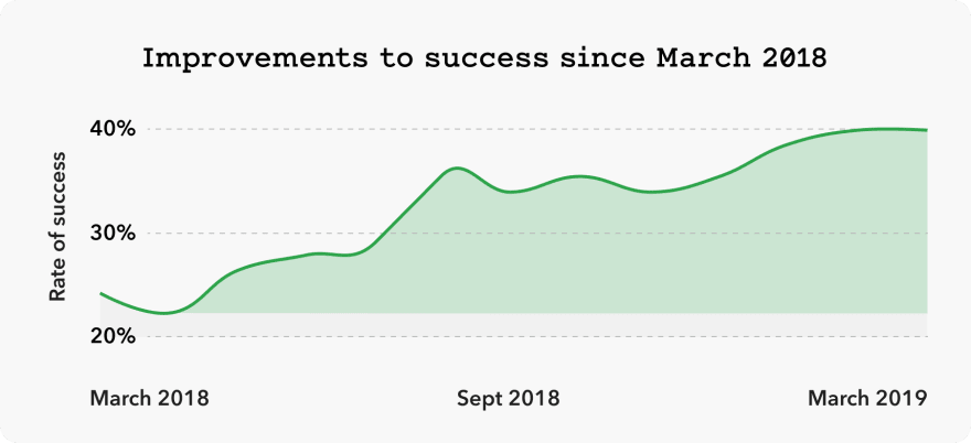
The largest portion of our success in 2018 can be attributed to users taking clear actions that they were not before. Over the year we slowly released and iterated on our functionality. This approach meant that we could measure the impact of releases and make sure we weren’t driving up the number of users dropping out of the workflows we were improving.
The trend line below indicates the impact these improvements had to the combined “success” metric of users interacting with suggested documentation and contacting us.
Learnings so far
Here’s a summary of what we learned in 2018.
Learning 1 — Some users just want to speak to a human: We’ve seen companies trend toward making it harder to reach real humans for assistance. This tactic is never for the benefit of the user. We chose instead to focus on making it easy to contact a human and give users the opportunity to provide enough context to get quick help from our support team.
Learning 2 — We can solve simple problems without tickets: By improving product experiences and giving users ways to help themselves directly from our help form, we can comfortably drive more traffic to our sites without having to hire additional support staff.
Learning 3 — There’s a balance in reducing user effort and operational cost: It’s tempting to ask users many questions to reduce process and time internally. We believe users should always be the ones doing less work. We had to dig deeper into the user experience (UX) as well as the relevance and presentation of content to both get users to solutions easily and not increase support wait times.
Help in 2019
We’re taking these learnings and supercharging our help site even further. Our theme for 2019’s improvements is Going Beyond the Form. We will be breaking out of the current form layout in an effort to improve two key features of our help site: issue selection and self-help content.
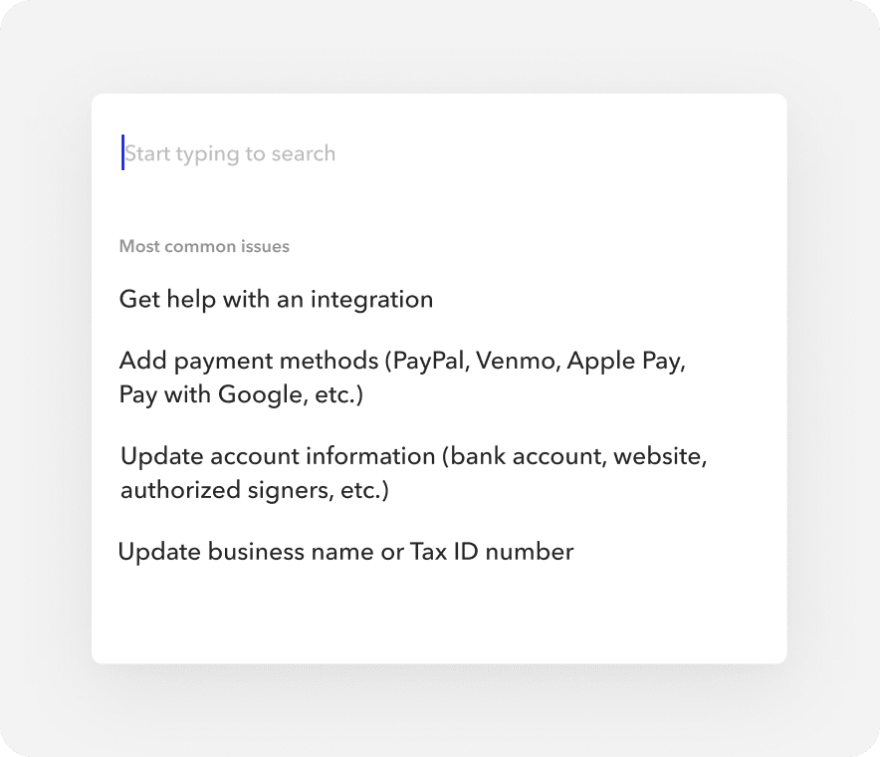
Issue selection: In order to get help, a user has to select a single issue on our form, giving us the context we need to serve relevant content and route the request to the right support team. This means it’s critical that the issues on the form be straightforward enough for users to identify which one accurately matches their problem.
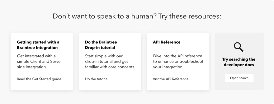
Self-help content: The quality of the self-help content and its relevance to the issues users are facing determine whether they use the content or submit a ticket to get the answers they need.
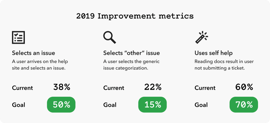
With these two features in mind, we have identified three data points as measures of the impact of these improvements. More users selecting an issue, more specific issues selected and more interactions with self-help content. These three metrics will drive up the success metric we outlined at the beginning of this article.
Ideas & mockups
Creating an experience that breaks the current mold presents a fun challenge for our design team. We’re currently working on some early ideas and mockups that will likely change dramatically as we work on them. Here are some of the ideas we’re exploring:
Detach issue selection and form-filling.
To access self-help today, you have to first start filling out the help form. This means users are mentally prepared to fill in a form and we spring self-help documentation on them. Lots of users will opt out of filling in a rather robust-looking form and instead seek help through other avenues (like our support phone number, for example), meaning they’ll miss out on potentially finding their answer quickly through our self-help links.
We think that being more open about the benefits of selecting an issue will help more users know whether they should put in the effort to do so.
A smarter selector
We think we can improve the issue selection experience by using data we have on the most common issues selected this time of year.
For example, during tax season, our tax-related issues are more popular and should bubble up to the top of the list of issues. We believe if users see their issue up at the top, they will be more inclined to start interacting with the site.
More robust resources
Currently, we offer plain links to suggested documentation. We plan to improve on this by including messages with the links that let users know why we think the suggested doc will solve their problem. In giving our users more information about these links, more of them might interact with our suggestions.
What’s next
As we get more insights by testing these ideas in the real world, we will continue to document our journey here on the Braintree Product and Technology publication.
Thanks for following along!




Top comments (0)