Custom input, select
Custom input
<!DOCTYPE html>
<html lang="ko">

<head>
    <meta charset="UTF-8">
    <meta http-equiv="X-UA-Compatible" content="IE=edge">
    <meta name="viewport" content="width=device-width, initial-scale=1.0">
    <title></title>
    <style>
        .txt-hide {
            position: absolute;
            left: -9999px;
            top: auto;
            width: 1px;
            height: 1px
        }

        .labl-hold {
            display: block;
            height: 22px;
            margin: 17px 0 21px;
            text-align: left;
            font-weight: 500;
            font-size: 16px;
            line-height: 20px;
            color: #767676;
            cursor: pointer;
        }

        .labl-hold::before {
            display: inline-block;
            content: "";
            width: 22px;
            height: 22px;
            margin-right: 8px;
            vertical-align: -5px;
            background-image: url(icon_check_empty.png);
            background-size: 22px;
        }

        .inp-hold:focus+.labl-hold::before {
            outline: 2px solid #000;
            outline-offset: 5px;
        }

        .inp-hold:checked+.labl-hold::before {
            background-image: url(icon_check.png);
        }
    </style>
</head>

<body>
    <!-- hide the input with class txt-hide -->
    <input type="checkbox" id="inpHold" class="inp-hold txt-hide">
    <label for="inpHold" class="labl-hold">로그인 상태 유지</label>

</body>

</html>
Custom select
<!DOCTYPE html>
<html lang="ko">

<head>
    <meta charset="UTF-8">
    <meta http-equiv="X-UA-Compatible" content="IE=edge">
    <meta name="viewport" content="width=device-width, initial-scale=1.0">
    <title></title>
    <style>
        h2 {
            margin: 30px;
        }

        .btn-select {
            width: 200px;
            height: 30px;
            background: purple;
            color: #fff;
        }

        .list-member {
            display: none;
            width: 200px;
            height: 30px;
        }

        .list-member.on {
            display: block;
        }

        .btn-select:active+.list-member {
            display: block;
        }

        .list-member li {
            height: 30px;
            width: 200px;
        }

        .list-member li button {
            display: block;
            height: 100%;
            width: 100%;
            background-color: #fff;
            border: 1px solid black;
            border-top: none;
        }

        .list-member li button:hover {
            background-color: bisque;
        }
    </style>
</head>

<body>
    <h2>셀렉트 박스 만들기</h2>
    <button class="btn-select">What's your favourite genre of music?</button>
    <ul class="list-member">
        <li><button type="button">R&B</button></li>
        <li><button type="button">Pop</button></li>
        <li><button type="button">Rock</button></li>
        <li><button type="button">Classic</button></li>
    </ul>

    <script>
        const btn = document.querySelector('.btn-select');
        const list = document.querySelector('.list-member');
        btn.addEventListener('click', () => {
            list.classList.toggle('on');
        });
        list.addEventListener('click', (event) => {
            if (event.target.nodeName === "BUTTON") {
                btn.innerText = event.target.innerText;
                list.classList.remove('on');
            }
        });
    </script>

</body>

</html>
IR(Image Replacement)
Image replacement is technique of replacing a text element with an image. An example of this would be including a logo on a page. You might want to use <h1> tag for the accessibility and SEO benefits but ideally you'd want to show the logo not the text. Also, sometimes you don't need the element on the screen visually but want that to be there inside html so that can be read through screen reader.
How Kakao does this?
When you are replacing meaningful text for PC screenn
.ir_pm{
  display:block;
  overflow:hidden;
  Font-size:1px;
  line-height:0;
  text-indent:-9999px;
}
pm means Phark Method. It hides the element text by giving extremely large negative text indent that pushes the text off the screen where it can't be seen.
When you are replacing meaningful text for mobile screen
.ir_pm{
  display:block;
  overflow:hidden;
  font-size:1px;
  line-height:0;
  color:transparent;
}
color:transparent is supported from ie9, therefore can be used on mobile only. However, there are many places don't support ie, more places are starting to use this.
When you are replacing text that doesn't need to be read by screen reader but need it for markup.
.screen_out {
  overflow: hidden;
  position: absolute;
  width: 0;
  height: 0;
  line-height: 0;
  text-indent: -9999px;
}
If an element doesn't have width & height, screen reader cannot read it. (If you want the element to be read by screen reader, you should give width:1px; and height: 1px;
Also, screen reader doesn't read visibility: hidden; not only display: none;
Replacement for meaningful text.
.ir_wa{
  display:block;
  overflow:hidden;
  position:relative;
  z-index:-1;
  width:100%;
  height:100%
}
There will be replacement element and background image will be set for that element. Text will be wrapped with <span> and if you give z-index: -1; to that, the text goes to the behind of the layer. But the text is still behind of that image, so even if the browser shut down CSS or it fails to load CSS for any reason, the text will be shown.
How Naver does this?
.blind {
  position: absolute; / * it doesn't affect layout */
  clip: rect(0 0 0 0);
  width: 1px; /* screen reader can still read */
  height: 1px;
  margin: -1px;
  overflow: hidden;
}
** But why is there margin: -1px where there is overflow: hidden; ??
It seems like it's to take outside of parent element.
(Also, there was opinions about the class name because it's bit aggressive. Maybe the class name can be something like visually-hidden instead.)
clip: rect();
It defines a visible portion of an element. It only applies to elements with position: absolute; or position: fixed;
When clip: rect(0 0 0 0);, nothing appear because it means there isn't any part that is clipped. clip: rect() won't be applied when overflow: visible;
It is recommended to use clip-path and clip these days.
CSS Sprites
You can combine multiple images into a single image file for use on a website, to help performance.
It's used to reduce the amount of img tags in html. It takes longer time to load the file the more img tags are included in html there are more images that need to be downloaded. It will render again after downloading the image and then it will download the image again when it finds img tag. It will keep repeating this which makes it slower.
BUT!
- Maintainability of your site will suffer from using them. Only combine images that belong to the same logical unit and are unlikely to be updated separately. Keep images that are likely to change separate to begin with.
- Sprites should never be used when the size of images are very different. Because in that case the size of sprite is quite huge.
- These are good for utilities. Use sprites for images that don't mean something important that needs alt / explanation for the image.(but it's okay to use for images need to be added for the design)
Check stackoverflow - when not to use CSS Sprites
Sprites generator
About sprites
Some links
- for optimising image: Kraken
- Clipping images
CSS for Retina Displays
What's retina?
With Retina, Apple squeezed four times as many pixels into the same space, creating a density of 326 pixels per inch (ppi). When viewing at 10-12 inches people stop seeing individual pixels at densities of around 300 ppi, making Retina displays smooth and crisp.
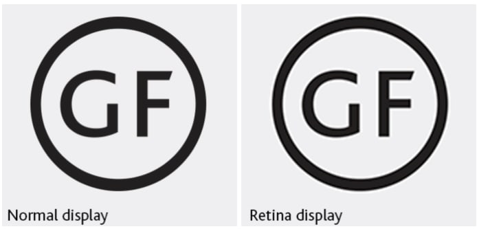
To solve this problem, we need to use images that are twice the pixel dimensions(2x).
.link-sns-login::before {
  display: block;
  content: "";
  float: left;
  width: 22px;
  height: 22px;
  margin-left: 16px;
  background-image: url(../images-login/css_sprites_for_retina.png);
  /* The original size of image is 232 * 166 , position is -104px -20px
But set them as half of them.
*/
  background-size: 116px 83px;
  background-position: -52px -10px;
  /* shortand */
  /* background: url(../images-login/css_sprites_for_retina.png) -52px -10px / 116px 83px; */
}

.link-sns-login.icon-naver {
  border-color: #00bf18;
}
.link-sns-login.icon-naver::before {
  background-position: -10px -10px;
}

.link-sns-login.icon-facebook {
  border-color: #2d9cdb;
}
.link-sns-login.icon-facebook::before {
  height: 24px;
  background-position: -93px -10px;
}

.link-sns-login.icon-kakao {
  border-color: #f2c94c;
}
.link-sns-login.icon-kakao::before {
  background-position: -10px -52px;
Or can do it using media query!
 @media screen and (-webkit-device-pixel-ratio: 2) {
/* image for retina display here */
  .link-sns-login::before {
    display: block;
    content: "";
    float: left;
    width: 22px;
    height: 22px;
    margin-left: 16px;
    background-image: url(../images-login/css_sprites_for_retina.png);
    background-size: 116px 83px;
    background-position: -52px -10px;
  }
}

Top comments (0)