CSS Combinators
A CSS selector can contain more than one simple selector. Between the simple selectors, we can include a combinator. There are four different combinators in CSS:
Descendant selector (space)
Child selector (>)
Adjacent sibling selector (+)
General sibling selector (~)
Descendant Selector: The descendant selector matches all elements that are descendants of a specified element.
CSS Code:
div p {
  background-color: yellow;
}
Child Selector (>):The child selector selects all elements that are the children of a specified element.
CSS Code:
div > p {
  background-color: yellow;
}
Adjacent Sibling Selector (+):The adjacent sibling selector is used to select an element that is directly after another specific element. Sibling elements must have the same parent element, and "adjacent" means "immediately following".
CSS Code:
div + p {
  background-color: yellow;
}
General Sibling Selector (~):The general sibling selector selects all elements that are siblings of a specified element.
CSS Code:
div ~ p {
  background-color: yellow;
}
CSS Pseudo-classes
A pseudo-class is used to define a special state of an element. it can be used to:
- Style an element when a user mouse over it
- Style visited and unvisited links differently
- Style an element when it gets focus.
CSS Code:
selector: pseudo-class {
  property: value;
}
Anchor Pseudo-classes: Links can be displayed in different ways:
CSS Code:
/* unvisited link */
a:link {
  color: #FF0000;
}
/* visited link */
a:visited {
  color: #00FF00;
}
/* mouse over link */
a:hover {
  color: #FF00FF;
}
/* selected link */
a:active {
  color: #0000FF;
}
a:hover MUST come after a:link and a:visited in the CSS definition in order to be effective! a:active MUST come after a:hover in the CSS definition in order to be effective! Pseudo-class names are not case-sensitive.
Pseudo-classes and CSS Classes: Pseudo-classes can be combined with CSS classes:
CSS Code:
a.highlight:hover {
  color: #ff0000;
}
CSS pseudo-element: CSS pseudo-element is used to style specified parts of an element. For example, it can be used to: Style the first letter, or line, of an element Insert content before, or after, the content of an element.
CSS Code:
selector::pseudo-element {
  property: value;
}
The ::first-line Pseudo-element: This is used to add a special style to the first line of a text.
CSS Code:
p::first-line {
  color: #ff0000;
  font-variant: small-caps;
}
The ::first-line pseudo-element can only be applied to block-level elements.The following properties apply to the ::first-line pseudo-element:
- Font properties
- Color properties
- Background properties
- Word-spacing
- Letter-spacing
- Text-decoration
- Vertical-align
- Text-transform
- Line-height
- Clear
Multiple Pseudo-elements: Several pseudo-elements can also be combined.
CSS Code:
p::first-letter {
  color: #ff0000;
  font-size: xx-large;
}

p::first-line {
  color: #0000ff;
  font-variant: small-caps;
}
CSS - The ::before Pseudo-element: The ::before pseudo-element can be used to insert some content before the content of an element.
CSS Code:
h1::before {
  content: url(smiley.gif);
}
CSS - The ::after Pseudo-element: The ::after pseudo-element can be used to insert some content after the content of an element.
CSS Code:
h1::after {
  content: url(smiley.gif);
}
Create Stunning Websites and Web Apps
Trying to build out all user interfaces and components for your website or web app from scratch can become a very tedious task. A huge reason why we created Contrast Bootstrap to help reduce the amount of time we spend doing that, so we can focus on building some other aspects of the project. Contrast Bootstrap PRO consists of a UI Kit featuring over 10000+ component variants. Together with a template of 5 admin dashboards and 23+ additional multipurpose pages template for building almost any type of website or web app. You can view a demo and learn more about Contrast by clicking here.
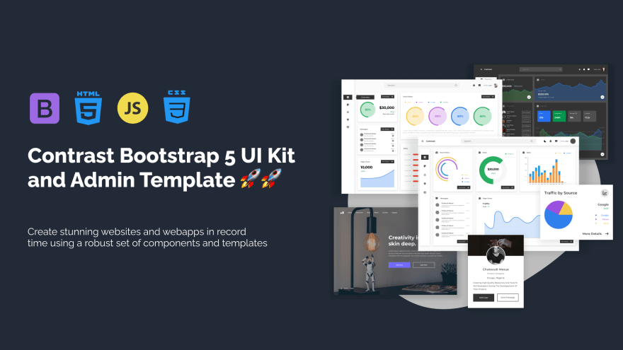
Contrast Bootstrap PRO was built using the most popular CSS
framework Bootstrap to help build your next landing, admin SAAS, prelaunch etc. project with a clean, prebuilt and well documented template and UI components. Learn more about contrast.
Resources
- Contrast Design Bootstrap
- Accordion
- Alert
- Animation
- Autocomplete
- Badges
- Box
- Breadcrumb
- ButtonGroup
- Button
- ButtonToolbar
- Card
- Carousel
- Checkbox
- Collapse
- DataTable
- DatePicker
- DropDown
- Footer
- Forms
- Icon
- Iframe
- Input
- InputGroup
- ListGroup
- Mask
- Modal
- Multiselect
- Notification
- Pane
- Panel
- Pop Over
- Progress
- Radio
- Rating
- Select
- Select 2
- Slider
- Spinner
- Stepper
- Switch
- Table
- Forms
- Navbar
- Pagination
- Tab
- Sidebar
- Time Picker
- Data Table
- Fixed Data Table
- Table
- Widgets

Top comments (0)