What is an Internal tool UI design?
Creating a compelling visual design for your internal tool is something that will make your users super productive.
Whether it is an onboarding tool or an admin panel dashboard, having a delightful UI design for your internal tools can help make your employee's work easier, faster, and better.
A poorly designed one can make workers inefficient, annoyed, and unhappy.
So, how to make sure that your internal tool UI design is user-friendly? What elements should it contain? How to bring the users’ attention to the most important elements?
Whether you’re looking for a simple, clean interface for your employees or a more complex, feature-rich interface for your customers, DronaHQ has you covered. With its easy-to-use drag-and-drop interface, you can quickly create beautiful and user-friendly interfaces for your internal tools.
What impact does the internal tool UI have?
Today, a better user interface is not just a nice thing to have, it’s a necessity. Products that are complex and hard to use are not just frustrating, they prevent users from being as effective as they could be. This is especially true for internal tools that employees use on a daily basis. Employees spend more than 80% of their work day using tools inside their enterprise, which means that they have to be effective, efficient, and easy to use.
A good UI design can make an internal tool:
- Easier for users to learn and use
- Efficient for them to complete tasks
In addition to this, a good UI design will help users avoid mistakes and errors that might cause inconvenience or loss of data.
A good user interface design will help you in achieving your objectives and will also help in increasing the performance of your workforce.
What makes an internal tool UI design effective?
The UI design of an internal tool is a crucial step toward its success. Internal tools have to be easy to use and understand by employees. The UI of an internal tool helps the employees to perform their tasks faster and with more accuracy.
An intuitive user interface means that there are fewer steps involved in performing an action on the application.
Characteristics of an effective UI design:
Accuracy
Avoid unnecessary complexity in your UI design by being consistent with your designs across different applications and platforms.
Building average UIs for internal tools can lead to inaccuracy, meaning users input the wrong values for a given action. Building UIs that assure optimum accuracy is therefore essential.
Efficiency
There is no question that good UI design in internal tools can increase the efficiency of users. By making tools easy to use and navigate, users can spend less time trying to figure out how to use the tool and more time actually using the tool to do their work.
UI design can have a significant impact on the efficiency of users, helping them to save time and avoid errors.
Usability
Usability is a measure of how easy it is for users to take the actions they need to in order to accomplish their goals. A good UI design ensures that your apps are completely suitable for different kinds of users and devices. This means taking into account the various ways users might interact with your app and making sure those interactions are as simple and straightforward as possible.
What role do interfaces play in your apps?
The UI is a key differentiator between an average app and an exceptional one.
Your UI is what users see when they open your app and what they interact with when they use it. It can include anything from buttons, menus, text fields, and other controls to multiple-choice questions or data entry forms.
The user interface should be designed with the end-user in mind. The end user will have many tasks to complete during their day and need to be able to perform them without spending too much time on them.
Users will use your app more if it has a well-designed interface that makes it easier for them to accomplish their goals.
Create Stunning UI Design: Know your stack
With DronaHQ’s easy-to-use drag-and-drop interface, you can quickly create beautiful interface designs that are both functional and visually appealing.
Plus DronaHQ comes with:
Over 150+ in-built controls:
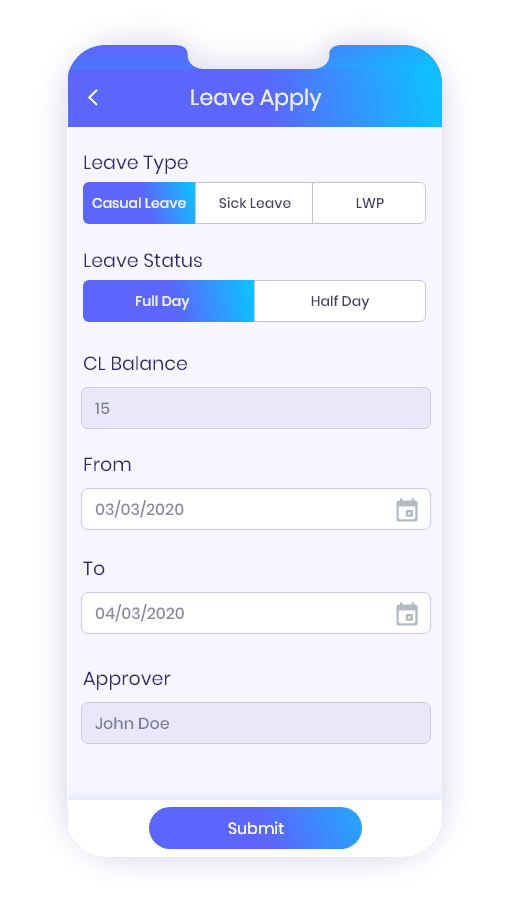
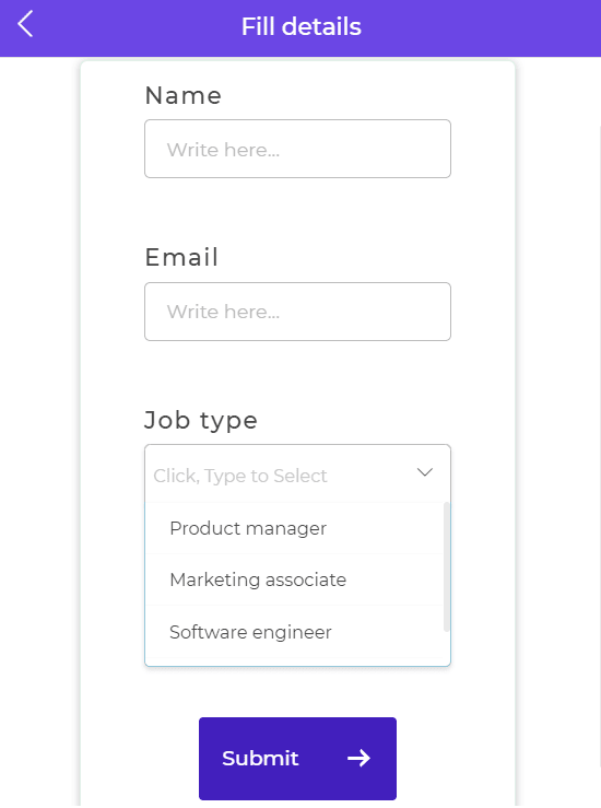
With drag and drop functionality, significant controls like table grid, charts, dashboards, date time picker, form controls, and many more can be added to app screens and are responsive across devices like mobile, desktop, and tablets.
Multiple screen types:
Based on the requirements you can have multiple screens with different screen types like menu, popup, tray, and more. You can choose the right screen type based on the kind of information or actions you are trying to display.
Ready templates:
Whether you want to build a demo request form or a sales dashboard, DronaHQ comes with pre-defined templates. Using a ready template nearly halves the efforts. This way you save a lot of time.
Here are our top 12 tips for designing an internal tool UI
Know the user
One of the most important things to do when designing a product is to understand your users. The more time you spend with them, the more likely you are to build something that they will love and use. Involve them in your ideation process. The best way to do that is by shadowing them and talking with them about their needs and frustrations with current tools.
You can also use survey data and user feedback from previous products or services as a starting point for your ideation process. This will help you find out what the most important features are for your users, how they use those features, and what other features they wouldn’t mind having in addition to the ones you identified in your surveys and interviews.
Maintain consistency
One of the most common challenges in designing interfaces is maintaining design consistency across all of your internal tools. You may have a design that looks great on one platform but not on another.
The key here is to keep your designs as consistent as possible or define a style guide.
Once you’ve created your style guide, begin using defined components and layouts for all of your internal tools. This will ensure consistency across all of the different tools in your company and help keep things organized and easy to navigate for your users.
The major benefit of having consistent designs across internal tools is that users will be able to quickly transfer skills between them without having to learn new interfaces or layouts every time they switch tools.

Keep reusable components in mind
While it’s essential to create a unique and customized UI for internal tools, don’t neglect the importance of reusable components.
When designing your UI, consider which components can be reused across multiple tools. Here DronaHQ offers a wide range of components, for example, tables, forms, buttons, all these components can be used across all internal tools, while individual tools may have unique content areas. By using reusable components, you can make your UI more flexible and adaptable, which can save you time and effort in the long run.
Keep it simple
Simplicity is a key factor in user interface design. It’s all too easy for a product to become cluttered and complicated especially if you’re trying to provide multiple different functions within your app.
The goal of any user interface is to provide a means by which users can achieve their goals. This can be as simple as logging into a website or as complex as editing an internal database. The most successful user interfaces are those that allow users to accomplish their goals quickly, easily, and with little effort.

Focused CTAs
If you are not using CTAs, then it is time to start thinking about how you will implement them in your internal tools.
A CTA is a call to action that tells users what they need to do next. It’s a clear path for them to take in order for them to complete their actions.
The primary objective is to develop compelling CTAs that are suitable for the particular use case of your application.
CTAs should be easy for users to see, understand, and follow without requiring too much work from them. You can use different colors or sizes of text to make CTAs stand out more quickly.
Interestingly DronaHQ comes with button control, by which you can perform actions that are suitable for users.

Easy navigation
It is vital that users have an easy time navigating your platform and finding the information they need. The navigation of your platform should be straightforward and simple.
Navigation can be created in many ways like:
- Tabs can be used to navigate between different sections of an app, or they can be used to switch between different views within the same section.
- Bottom navigation is particularly well-suited for mobile devices, where users often hold their devices in one hand and use their thumb to navigate.
- Card UI designs are small, rectangular blocks of content. Cards can be used to display a variety of information, such as photos, text, or even action buttons.
This will help increase user engagement and improve productivity by making it easier for users to find their way around the platform.
Proper Alignment
Why is alignment so important? It’s because Alignment can improve user experience by making products easier to use, reducing confusion, and strengthening brand consistency.
Alignment also plays an important role in reducing cognitive load: users will spend less time figuring out where they should click or type when they have an aligned interface with consistent spacing between elements (such as buttons, form fields, images, etc.).

Dropdown with relevant options
Dropdowns can reduce confusion and make it easier for users to find the information they need.
For example, if you have a long list of options under your “Account Settings” section on your website, then it would be nice if instead of having all those options listed separately under each header, you could collapse each one into its own dropdown box instead.
Maximize engagement through personalization
Personalization is key to maximizing user engagement. By tailoring content and experiences to individual users, you can keep them coming back for more.
For example, your organization has an employee engagement app, now providing them with forums, chat rooms, and other social features that allow them to interact with each other.
Personalization can be a lot of work, but it’s worth it when you see your users engaged.
Display labels
While the role of labels may seem straightforward, there is actually a lot to consider when designing them. The first thing to keep in mind is that labels should be concise and easy to understand.
The names you give to different attributes within your app’s UI are crucial in helping users understand what they are and how to use them.
Role-based access
When designing your user interface, it’s important to take into account your existing role-based access control system. If certain user roles can’t access specific features, they shouldn’t see these elements in your UI. This will help prevent confusion and frustration and will make for a better overall user experience.
Take a look at how you can manage users’ permissions with DronaHQ.
Mobile UI
Creating a responsive design is key to ensuring that your UI works well on mobile devices. By using responsive design, on-screen elements will automatically scale and resize to fit the device they’re being viewed on.
By making your UI responsive, you can ensure that your users will have a positive experience no matter what device they’re using.
DronaHQ offers responsive layouts and dynamic themes. Also, cut down mobile app development time by 20x.
Define, Design, and Develop with DronaHQ
DronaHQ makes it easy to create great-looking UIs in a fraction of the time that it would take you if you were to code from scratch.
Whether you want to build a CRUD app or an inventory management app, we have ready templates that are easy to use. Our intuitive drag-and-drop UI builder enables you to create rich, and responsive UIs.
DronaHQ has been used by leading companies like Wipro, Mondelez, Purplle, and many more to build their internal tools and help teams stay more productive. It’s a proven solution that helps you build high-quality internal tools faster than ever before.
Now Define, Design, and Develop with DronaHQ!

Top comments (0)