This article shows a simple and efficient way to create review ratings for stores and products using font awesome icons, and class attribute in Angular.
Font Awesome Icon provides us with amazing icons that are very performant for frontend development. The icons provide accessibility supports.
Prerequisite
It is assumed that you have a basic understanding of Angular and how to place font awesome CDN link in a website - that is adding the link to the head of the HTML code.
Steps
Create an angular app using the Angular CLI. Run
ng new my-app-name.Add the Font-Awesome CDN link to the head of
index.html.In the
app.component.html, add the following code to add a div for the reviews
<div class="review" *ngFor="let review of reviews">
  <p class="review-rating" *ngIf="review.rating">
    <!--This is were we perform the magic-->
  </p>
  <p class="review-summary">{{ review?.reviewSummary }}</p>
  <p class="review-feedback">{{ review?.reviewMessage }}</p>
  <p class="reviewBy">
    <span class="review-date">{{ (review?.reviewDate ?  review?.reviewDate : 1581470956443) | date}}</span>
    by
    <span class="review-author">{{ review?.name }}</span>
  </p>
</div>
Now, let you look at the logic - magic.
The Logic
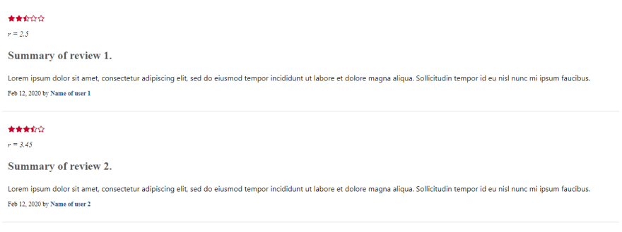
Font Awesome has a regular (far) and solid (fas) category of icons. The regular has outlines while the solid is completely filled. We want the solid star to represent a point and the regular star to represent zero points. We also want to represent half-point for points greater than zero but less than one. We can use solid half-star.
We have 5 stars to represent each of the ratings - let us call these stars Rep-Stars.
First Rep-Star - This is used to represent rating(
r) forr = 0,0 < r < 1, andr >= 1. This means if the rating is 0, use a regular star icon. Else if the rating is greater than 0 but less than 1, use the solid half-star icon. Else, the rating is 1 or greater than 1, then use the solid star.Second Rep-Star - with rating still as
r, we represent1 < r < 2,r >= 2andr <= 1- which meansrwas never greater than the previous rep-star maximum rating. This means if the rating is 1, use a regular star icon. Else if the rating is greater than 1 but less than 2, use the solid half-star icon. Else, the rating is 2 or greater than 2, then use the solid star.Third Rep-Star - with rating still as
r, we represent2 < r < 3,r >= 3andr <= 2. Similar to the second rep-star, if the rating is 2, use a regular star icon. Else if the rating is greater than 2 but less than 3, use the solid half-star icon. Else, the rating is 3 or greater than 3, then use the solid star.
The same process if applied for Four Rep-Star and Five Rep-Star. This logic can be applied to 10 and more stars.
Binding this logic to the class attribute, we have
  <p class="review-rating" *ngIf="review.rating">
    <!-- 1 star  -->
    <i [class]="(review.rating == 0) ? 'far fa-star' : (review.rating > 0 && review.rating < 1) ? 'fas fa-star-half-alt' : 'fas fa-star'"></i>

    <!-- 2 star  -->
    <i [class]="(review.rating > 1 && review.rating < 2) ? 'fas fa-star-half-alt' : (review.rating >= 2) ? 'fas fa-star' : 'far fa-star'"></i>

    <!-- 3 star  -->
    <i [class]="(review.rating > 2 && review.rating < 3) ? 'fas fa-star-half-alt' : (review.rating >= 3) ? 'fas fa-star' : 'far fa-star'"></i>

    <!-- 4 star  -->
    <i [class]="(review.rating > 3 && review.rating < 4) ? 'fas fa-star-half-alt' : (review.rating >= 4) ? 'fas fa-star' : 'far fa-star'"></i>

    <!-- 5 star  -->
    <i [class]="(review.rating > 4 && review.rating < 5) ? 'fas fa-star-half-alt' : (review.rating >= 5) ? 'fas fa-star' : 'far fa-star'"></i>
  </p>
The complete code below:
<div class="review" *ngFor="let review of reviews">
  <p class="review-rating" *ngIf="review.rating">
    <!-- 1 star  -->
    <i [class]="(review.rating == 0) ? 'far fa-star' : (review.rating > 0 && review.rating < 1) ? 'fas fa-star-half-alt' : 'fas fa-star'"></i>

    <!-- 2 star  -->
    <i [class]="(review.rating > 1 && review.rating < 2) ? 'fas fa-star-half-alt' : (review.rating >= 2) ? 'fas fa-star' : 'far fa-star'"></i>

    <!-- 3 star  -->
    <i [class]="(review.rating > 2 && review.rating < 3) ? 'fas fa-star-half-alt' : (review.rating >= 3) ? 'fas fa-star' : 'far fa-star'"></i>

    <!-- 4 star  -->
    <i [class]="(review.rating > 3 && review.rating < 4) ? 'fas fa-star-half-alt' : (review.rating >= 4) ? 'fas fa-star' : 'far fa-star'"></i>

    <!-- 5 star  -->
    <i [class]="(review.rating > 4 && review.rating < 5) ? 'fas fa-star-half-alt' : (review.rating >= 5) ? 'fas fa-star' : 'far fa-star'"></i>
  </p>
  <p><em>r = {{review.rating}}</em></p>
  <p class="review-summary">{{ review?.reviewSummary }}</p>
  <p class="review-feedback">{{ review?.reviewMessage }}</p>
  <p class="reviewBy">
    <span class="review-date">{{ (review?.reviewDate ?  review?.reviewDate : 1581470956443) | date}}</span>
    by
    <span class="review-author">{{ review?.name }}</span>
  </p>
</div>
Click Here to See Code Repo
Conclusion
There are many fun and effective ways we can explore the power of frontend frameworks. In this example, we eliminated the need to use various images (about 10) or packages to represent the various review ratings.

Latest comments (0)