Dark mode can be implemented with a single line of code. Let’s see how it's done and the benefits and drawbacks of this simple approach.
...
For further actions, you may consider blocking this person and/or reporting abuse


This is to solve all that above problems with a little modification. Like you suggested, inverting the whole page would also be inverting the images which are not a complete solution. We can apply two steps to make it a nearly silver bullet.
Step #1: invert all elements
Step #2: invert-back and restore image color
Invert and rotate the hue color to 180 degrees to revert and restore the image original color with this below.
Optional compensation for element that is stubborn.
Loouis, I partially agree with you - this is a great way to solve the inverted images problem. But, there is a whole list of problems to be solved separately when inverting all the pixels, not only images. E. g. if you just invert the colors of the complex UI, there is a great chance it won't look good and you'll need a lot of adjustments. So, yes, nearly silver bullet but only for very simple design.
I was going to say that haha. Adjustment required. I should read all the comments first.
If you just use the :not() css selector you don't need the code above. This solves the issue and doesn't waste processor power on converting and unconverting images with the filter tag
.dark-mode :not(img):not(.inverted){ filter: invert(100%) }
I tried to resolve the issue according to both Loouis Low and Daniel Ruiz way. Both are great solutions. But facing problem with the background image. Any workaround, guys?
That
[class="invert"]scared me a little bit. Great solution though.I've never seen filter CSS property and invert(100%) value, how affect this.
I'm really glad about get read the post!
Thank you so much! 🤗
I'm glad it was helpful!😉
This was featured on the DesignCourse youtube channel (with attribution) - youtube.com/watch?v=qimopjP6YoM - and I used it on a project today.
I also had to wrap my head around serving the javascript toggle functionality on the client-side of my express app, but once I did that, it worked perfectly for my prototype! Thanks!
I tried this at codepen:
The mode changes if you press enter on the results view.
Great solution :)
If anyone is interested, you can make yourself a quick "darkmode" switch button. Create bookmark and copy paste this code in url field:
This article is rubbish and promotes wrong techniques and the title is nothing but a clickbait.
It's important to note why this is a bad idea:
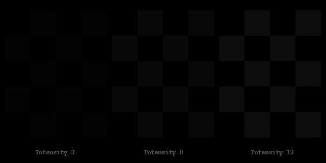
The eye perceives the lighter shades with much better contrast than the darker shades. Simply inverting changes the balance of the ratios!
Simply put: What you distinguish as multiple shades with good contrast when using lighter shades will look like a single color when using darker shades and therefore you will lose the UI elements.
This is basically the same image, but inverted. Notice the loss of detail when inverting White UI to Black UI.


source: simandl.cz/stranky/fotky/kalibrace...
Since this approach has its downsides, I prefer Tailwind CSS Dark mode. I have used it on all web apps that require it, and I'm happy with it 😉
Edit: just realized this article is very old, but anyways...
I tried to do this trick on my personal blog but I noticed some performaces issue on smartphone view when I scroll fast. So I go back to CSS specific rules and thes lags disapears.
Amazing trick, the page looks even better. Saved me to write tons of CSS. Thanks.
Very nice :) Thanks
wow, that's great!
I wish you would've posted this 1 year ago when I had to write big javascrip method just to achieve this feature 😆 nice post 👌