
The A11y Project
("A"-eleven-"Y") is a community driven effort to make digital accessibility easier.

Accessibility is the goal of incorporating a set of practices and principles that make your application, website, or product useful for a broader audience. It is in nature a humanitarian effort, and the following is my small contribution to that effort, which aims to help newer developers establish a big picture overview of what it means to incorporate great accessibility practices.

While completing a Full Stack bootcamp in 2022 I learned a ton about web development, but one of the things that gets overlooked in programs like the one I did is accessibility. This is common in these types of programs because the focus is on building projects and gaining practical experience, which is a great fit for the stage of learning most bootcamp attendees are at. If you have recently finished a bootcamp and are considering what to learn next, learning about accessibility practices is one way to make yourself more valuable as an engineer, expand your understanding of technology and improve your decision-making in your day-to-day workflow. The best way to create stellar accessibility in your projects is to think about it from the start as you work on a project. If you wait until the end of your project, making it accessible can be expensive and time-consuming. So as an engineer, we want to cultivate workflows that produce beautiful, clean, accessible code from the start. An important thing to understand is that when done correctly, the investment in creating a robust inclusive experience pays off.
Who benefits from accessibility?
Individuals with...
- Cognitive Disabilities: ADHD, Dyslexia, Autism, Down Syndrome, Traumatic Brain Injury, Seizure Disorders, etc. (this is the largest and most varied group!)
- These individuals may benefit from great practical and informational design.
- Physical Limitations: Using a mouse, using a keyboard, using a touchscreen, using your voice.
- These individuals may benefit from great focusability in our designs.
- Visual Disabilities: Blindness, Color Blindness, etc.
- These individuals may benefit from thoughtfully designed layouts, good contrast, and resizability.
- Audio Disabilities: Deafness, Hardness of hearing, etc.
- These individuals may benefit from captioning, sign language interpretation, and video with audio.
Accessibility benefits everyone.
Accessibility is not just about ensuring that your text is visible on a black background, but rather considering the needs of a diverse range of individuals.

Where do we learn about accessibility best practices?
This blog serves as a brief guide and overview of the topics covered in Carie Fisher's Web Accessibility 101 Seminar, which is a one hour live stream provided by Scrimba and led by Carie Fisher, a Senior Accessibility Trainer.
Terminology
AT devices/AT Compatible
Assistive Technology (Devices) can refer to screen readers, keyboards, displays that magnify, but also things like Google Assistant/Siri. Any technologies that allow someone to organize what their viewing in a way that works for them.
Accessibility Overlays
Accessibility Overlays are technologies and strategies that we can slap in place to improve accessibility either as developers or in some cases as users.

Developing an Accessibility Plan
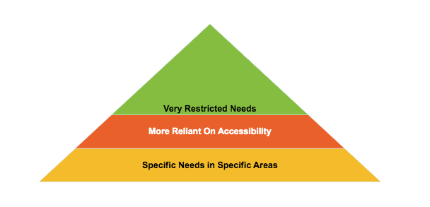
We will adopt a good, better, best approach. Fisher explains in the seminar that when we wait until the end to implement accessibility we tend to start at the bottom of our "pyramid" of needs, which imagines those at the top as a group dependent on the narrowest window of informational presentation formats, and those at the bottom as being limited in some ways but able to utilize a wider range of designs than those at the top. However, when we begin by presenting our information in a way that works for folks at the top, it generally has the effect of making our product work for everyone below them on the pyramid too. "Good" might be implementing good contrast practices, "Better" might be using a many-pronged approach where we're also offering choices between different fonts-- and "Best" might be where we are doing those things, but where our primary concern and starting point is making sure our information is presented in an order that makes it easy to follow, where we're offering images for visual learners and text for folks who absorb information best by reading, and videos for folks who learn best that way-- where we're optimized for screen readers, for use without a mouse, across different screens etc. etc. and thinking about our designs in terms of the whole being greater than the sum of the parts.
Accessibility isn't necessarily about following a set of prescribed rules rather than it is about developing an understanding of what works for who. Don't worry though! We will get to some checklists and more granular tips soon.
According to Fisher, the most important tenant of accessibility is the skeleton. And I really love this approach, because it tickles the part of my brain that thinks about visual design (an area where I have more experience) as being much more than aesthetics. The idea that where we put information and how "big" it is, or even when we encounter it is the biggest thing that determines how readily we can follow along and relate to what we're engaging with highlights why the skeleton is so important and helps us understand why Accessibility Overlays may fall short. AT tools typically address the top level, for example by ensuring the focus highlighting is large enough or giving users control over font size, but we want to adopt a mindset where we understand that...
Tools that only address the top level cannot fix poor design language.

Informational Hierarchy & Design Language
If you're familiar with visual design and the concept of using size to determine the order in which information is digested and the way that size can be used to communicate the importance and scope of related items automatically-- the following will make a lot of sense and is sort of the code-equivalent of that concept.
We will first discuss the main goal, the skeleton, structure, and HTML, and then move on to tips that focus on the middle of the pyramid. When using a screen reader, the HTML is the biggest factor in determining the accessibility of the content. So how do we write legible HTML?
Great HTML
- Use semantic HTML: Use the appropriate HTML element for the type of content it contains, such as lists for lists, quotes for quotes, p for paragraphs etc. This provides information about the structure and purpose of the content to assistive technology.
- Use heading structure: Use the HTML heading tags (H1-H6) to structure the content of the page, with H1 being the main heading and H2-H6 being subheadings. This helps users understand the page structure and allows assistive technology to accurately navigate the page.
- Use descriptive link text: Use descriptive link text that clearly describes the purpose or destination of the link. Avoid using generic text such as "click here".
- Use tables appropriately: Use tables only for tabular data, not for layout purposes. Use the appropriate table elements such as TH for header cells and TD for data cells to provide context and structure to the table.
- Organize content with ordered and unordered lists: Use ordered and unordered lists to organize content into manageable sections, making it easier to read and understand.
- Use descriptive title and alt attributes: Use the title and alt attributes to provide descriptive text for images, links, and other elements. This provides additional information to assistive technology and is also used to display a text description for images that do not load properly.
- Use ARIA attributes: Use ARIA (Accessible Rich Internet Applications) attributes to provide additional information about the purpose and role of elements on the page, such as a landmark region, a tooltip, or a dialog box.
More broadly speaking, putting information in front of someone when it is useful to them is essential not just to great UX, as you may already think of it being, but to great accessibility too.
It may sound overly simplified, but after working with a senior developer friend and improving my skills, I have come to realize that using code (especially HTML tags) for their intended purpose (as outlined in item 1) is key.
More Quick Tips
The following tips are based on the Web Content Accessibility Guidelines (WCAG) and Fisher's personal perspective on accessibility.
- Provide text alternatives for non-text content: All non-text content such as images, videos, and audio files should have text descriptions or transcripts that can be read by assistive technology.
- Provide visual cues for audio content: For audio content such as videos or podcasts, provide visual cues such as captions or transcripts to make it accessible to people with hearing impairments.
- Avoid flashing content: Avoid using flashing or blinking content, as it can cause seizures in people with photosensitive epilepsy.
- Make sure content is resizeable: Web content must be scalable and readable without the need for zooming, as many people with visual impairments may not be able to use a mouse or trackpad to zoom in on the content.
- Provide context for icons: When using icons, ensure that they are accompanied by text that provides context or a clear label that explains their meaning and vice versa. This will make the content more accessible to users with visual impairments or cognitive disabilities who may have difficulty understanding the purpose of an icon on its own. Tooltips can help as well!
- Use sufficient contrast: The contrast between text and its background must be high enough to ensure readability for people with visual impairments. To get more granular, The color contrast ratio between text and its background must be at least 4.5:1 for regular text and 3:1 for large text (24 point or larger and bold text or 19 point or larger).
You can use online tools such as the WebAIM Color Contrast Checker or the Accessibility Checker in Adobe Photoshop to test your color contrast and see if it meets the minimum requirements.
It's important to keep in mind that while this is a general rule, there may be exceptions for logos, graphs, and charts, among other things. It's always best to consult the WCAG guidelines directly for a more complete understanding of the requirements.
Fisher suggests using the Color Contrast Analyzer by TPGi for checking contrast because it can analyze the code itself. But let's breifly look at how to perform a manual check to find problems that the automated checker can't catch.
Contrast Checker Quick-Demo
We can select colors on our page using this checker by selecting the background color first...

Then, selecting the font color...

Now we can see our contrast ratio-- in this case, 1.57:1, which according to Fisher is "horrible".

In her demonstration, Fisher goes on to resize the window and check the same area on screen. This demonstrates how the contrast ratios a user encounters can change as the elements move around.

These kinds of checkers (specifically their automated code analyzing features) can highlight problems of many kinds, for example showing us whether elements are focusable when we might want them to be. Fisher says by far this is her favorite one!
Fonts

Fonts tend to be more accessible when each character is very distinct. To my surprise, comic sans is a very accessible font. But when you know what makes a font accessible it makes sense! Dyslexie and Atkinson Hyperlegible are two fonts that are designed specifically to be useful for individuals with dislexia.


However, Arial is a font that individuals with dyslexia have encountered many times. Studies have found that Arial is just as good as these specialty fonts in terms of reading comprehension and speed. So it isn't always intuitive which choices will work for a largest number of users and for that reason...
One of the best things we can do in our teams is to run our designs by and get feedback from the individuals who will benefit from accessibility the most.
Font choice largely comes down to personal preference. But avoiding cursive fonts, since cursive is no longer taught in schools, or avoiding fonts that do not have distinct characters can be a great place to start.
Providing Options
Now with the above in mind, you can do something like implementing a toggles for different fonts, but you can also do something like not locking down your CSS so that someone can utilize their own style sheets using an AT tool or Screen Reader or something that would allow them to control how the page looks.

Conclusions
Accessibility is a crucial aspect of web development that is often overlooked due to the fast pace of most bootcamp programs. However, it is an important area for new developers to focus on as it helps make applications, websites, and products useful for a wider audience, including those with physical, cognitive, and visual disabilities. Developing with great accessibility doesn't take extra time most of the time, it just requires an awareness of a few basic principles, and that awareness can actually help us make decisions more easily about where to put what and how to do things. Hopefully, this brief introduction to key terms and concepts, and overview of how to develop and incorporate an accessibility plan will help you as you encounter new codebases and begin to make more specific decisions with regard to accessibility. If I've learned anything from Carie Fisher's seminar, it's that having a broad understanding of accessibility will go a lot further than any one technology or practice could! By making accessibility a priority, we can create a more inclusive and accessible digital world for all.
I hope this overview helps someone develop a more well-rounded understanding of accessibility. Take care!
-Elliot


Top comments (2)
Thanks for this article. it is very important to build awareness about a11y among developers. Often, clients are not aware that the a11y aspect is omitted in their projects, which then is a big barrier for the excluded group of users.
💯💯💯