
I’m a big fan of layout systems like CSS Grid and Flexbox. Whether you choose Grid to build a web page from scratch or Flexbox or both at the same time, either one of them can get the job done for you. Add a few media queries and you can build a responsive layout for multiple devices and screen sizes.
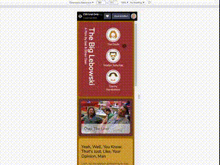
In this example (link to Codepen below) I have built a web page using only CSS Grid. Maybe for some specific styles in the example Flexbox might have been a more suitable choice, but CSS Grid will definitely get the job done.
Because I’m also a big fan of the Coen Brothers movies, I gave the web page example a Big Lebowski movie theme. Hopefully you’ll enjoy it and if you’ve got any feedback please feel free to respond.

Top comments (0)