Stacked Column Chart ** is a basic Excel chart type. It is used to compare things across various categories. In this chart, the data series are stacked one on top of others in vertical order. It can show the change over time because it is easy to compare total column lengths. Usually, this chart is used for graphical representation of part-to-whole comparison over time. Here, we come up with the simple steps to **Create a Stacked Column Chart in Excel Office 365.
Steps to Create a Stacked Column Chart:
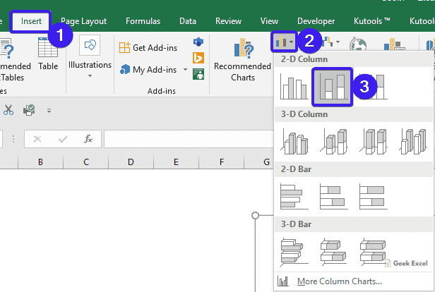
- You need to Open the workbook where you want to create the chart.
- Then, select the data range that you want to chart based on.

- Go to the Insert tab, select the Stacked Column Chart in the Charts section.
- You will get the chart based on your data as shown in the below screenshot.

Pros & Cons of Stacked Column Chart:
Pros:
- It has multiple categories and data series in compact space.
- This chart will display the change over time.
Cons:
- It is difficult to compare all series except first.
- Visual complex.
Bottom-Line:
In this post, you can easily understand the steps to Insert a Stacked Column Chart in Excel Office 365. Drop your comments in the below comment box. Thanks for visiting Geek Excel. Keep Learning!

Top comments (0)