In today's data-driven landscape, the ability to effectively visualize and communicate insights is crucial. Various tools have emerged to streamline the process of creating interactive dashboards and reports. In this article, we'll explore some of the leading tools in this space, including Shiny, Streamlit, Dash, and Bokeh, providing examples of their usage and deployment.
Introduction
Data visualization tools have revolutionized the way we interact with data, enabling us to transform raw information into actionable insights. Among the plethora of options available, Shiny, Streamlit, Dash, and Bokeh have garnered significant attention for their capabilities in creating interactive dashboards and reports.
Shiny: Interactive Web Applications with R
Shiny, developed by RStudio, empowers users to build interactive web applications directly from R scripts. With its intuitive framework, Shiny enables seamless integration of R code with HTML, CSS, and JavaScript to create dynamic dashboards and reports.
Example: Sales Performance Dashboard with Shiny
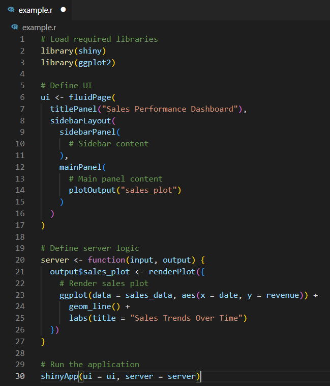
Deployment: Deploy the Shiny app to shinyapps.io or any other hosting service supporting Shiny applications.
Conclusion
Each of these visualization tools offers unique strengths and capabilities for creating interactive dashboards and reports. Whether you're proficient in R or Python, there's a tool tailored to your needs. By exploring and experimenting with Shiny, Streamlit, Dash, and Bokeh, you can discover the ideal solution for your data visualization requirements.
Author: Cesar F. Chavez Linares

Top comments (0)