I work as an Embedded C Engineer. Interested in expanding my knowledge in other areas of software development. Building a collaboration community for devs at https://inspirezone.tech
I work as an Embedded C Engineer. Interested in expanding my knowledge in other areas of software development. Building a collaboration community for devs at https://inspirezone.tech
Image in nav, 'learn to code code to learn' image
The text that says 'A developer community inspiring you to code' should be a bit larger for text hierarchy
Links in the footer are not attractive im not gonna click on any of them you know add some preview, CTA, date length in terms on reading
I work as an Embedded C Engineer. Interested in expanding my knowledge in other areas of software development. Building a collaboration community for devs at https://inspirezone.tech
Whenever the user wants to comment on a blog post and they haven't entered their name or email, they get redirected to a new page and have to click back.
An inline error is advised and doesn't distract the user.
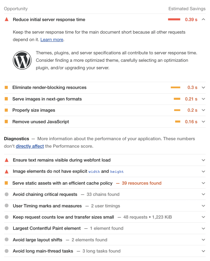
Second, is that there a lot of things you can improve on in terms of performance/best practises.
Check out the lighthouse reports in order to find points to improve on.
I work as an Embedded C Engineer. Interested in expanding my knowledge in other areas of software development. Building a collaboration community for devs at https://inspirezone.tech

Please have a look at: inspirezone.tech
harsh criticism is highly welcome!
I didnt like the logo in the header and some images are cliche
Thanks for your feedback! Which images in particular don't you like?
Image in nav, 'learn to code code to learn' image
The text that says 'A developer community inspiring you to code' should be a bit larger for text hierarchy
Links in the footer are not attractive im not gonna click on any of them you know add some preview, CTA, date length in terms on reading
Thanks. I'll keep those points in mind in my next redesign
Thanks for sharing Fum!
2 things I noticed:
Whenever the user wants to comment on a blog post and they haven't entered their name or email, they get redirected to a new page and have to click back.

An inline error is advised and doesn't distract the user.
Second, is that there a lot of things you can improve on in terms of performance/best practises.
Check out the lighthouse reports in order to find points to improve on.
Thanks for your feedback, very helpful :)